Update for ShowMeMore!
We are happy to announce that we have released the new version of ShowMeMore (Version 2.5) with an update and many exciting new features, making your experience in data visualization with ShowMeMore even more amazing. ShowMeMore aims to make the process of visualizing your information more effortless and effective. So, this time we have two new visualizations on offer. The first is an improved version of the Network Diagram with many new features the Network Diagram 2.0! The second one is a tool inspired by the already existing Sankey Diagram, The Geo-Sankey. We have now added a new type of Sankey Diagram which visualizes the flow in different magnitudes from different locations geographically.
Let’s start with the Geo-Sankey first!
As the saying goes, “A Sankey Diagram says more than 1000 pie charts”. Sankey Diagrams are commonly used to visualize data flows for all sorts of data sets, from personal budgets to job application results, this type of visualization has a much longer and more interesting history.
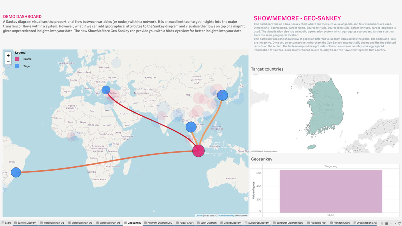
A Sankey Diagram visualizes the proportional flow between variables (or nodes) within a network. It is an excellent tool to get insights into the major transfers of flows within a system. However, what if we can add geographical attributes to the Sankey Diagram and visualize the flows on top of a map? It gives unprecedented insights into your data. This is the question that triggered the development process of the Geo-Sankey. The new ShowMeMore Geo-Sankey can provide you with a birds-eye view for better insights into your data.
How does it work?
The Geo-Sankey requires six dimensions and a measure. The measure shows the flow (value in the links), and the dimensions include source and target names and coordinates. The width of the links and the radius of the nodes can be configured to represent the value.
Are you interested to know more? Or are you in the process of trying it out with our trial page? Then please take a look at our product guides. Configure your Geo-Sankey Diagram in two different ways by always having the links visible or just when the user clicks on a specific node.
Example Use Case
We have created an example use case to demonstrate how you can use the Geo-Sankey. The large map on the left side of the screen is an instance of ShowMeMore with Geo-Sankey. On the right, you have a bar chart representing freight movement from different cities around the globe. The map above the bar chart shows country-wise aggregated information on the origin of freight movement.
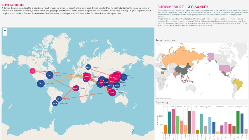
All the visualizations are interactive with the Geo-Sankey, where you can click on a country to see the freight movements from that country to different destinations.
This way of data visualizations with geo spatial attributes helps you tell a story by curating data in an easy-to-understand manner and highlighting trends and outliers, thereby unlocking the hidden insights in the available data. The visual reports generated by Geo-Sankey can be extremely interactive and allow for easy investigation of stopgaps and concerns of the business.
Network Diagram 2.0
A network diagram is a data visualization method that allows users to understand relationships in data easily. Network diagrams are composed of nodes and paths. Nodes are singular data points that are connected to other nodes through paths. The paths show the relationship between two or more nodes. Consider an organization with three employee types: directors, managers, and associates. A network diagram would show each employee type as a node and the relationship between those individual employees as edges. A network graph reveals patterns and helps to detect anomalies. There is huge potential for network visualization applications in the healthcare field.
In the past, we have been looking into ways to improve the ShowMeMore network diagram. We found many customers who are extremely happy with the existing diagrams, and we have been receiving so many new ideas and suggestions to make it even more amazing. So instead of completely revamping the existing Network Diagram, we decided to go with a new one with more custom features for those who need a little more.
Business Applications of Network Diagrams
- Network Diagrams can model many types of relations and processes in physical, biological, social, and information systems and many practical problems can be represented by them. By emphasizing their application to real-world systems, the term network is sometimes defined as a graph in which attributes (e.g. names) are associated with the vertices and edges. The subject that expresses and understands real-world systems as a network is called network sciences.
- Network Diagram is used to depict a picture of the Relationship and Co-relationship analysis. This type of visualization shows how things are interconnected and helps illuminate the type of relationships between a group of entities. Social media activity is usually always showcased using a network diagram.
Highlighter
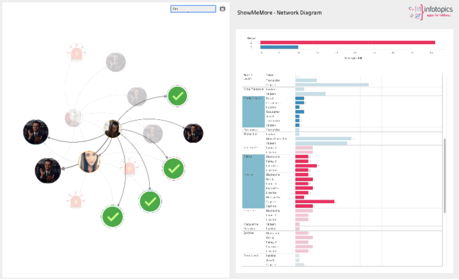
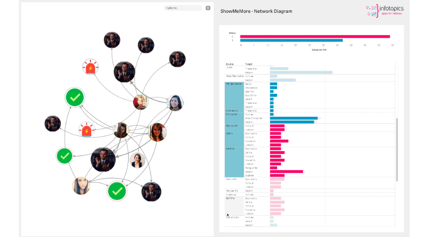
Now in the top right corner, you can see a highlighter which you can use to highlight the nodes and links through a text search bar. Simply typing the name will highlight the node along with the connecting links. In a busy Viz, the highlighter will allow users to highlight their intended node while staying in the flow.
Icons
The nodes can be configured in three different ways:
- As a plain circle with no colors
- With images, where you can use a link to replace the circles with images (it also works with GIFs)
- Icons, as you can see in the GIF, the nodes can also be changed into an icon of your choice (also with a link)
In this example, the icons represent the values in different nodes. The icon with the light (alert) shows that the value needs attention. The second one with the green tick shows the value is okay. At last, the clapping DiCaprio image shows “Good Job.”
Custom node positioning
So what if you don’t want the simulation (animated movement of nodes) of the Network Diagram to decide the position of some nodes? What if you wish to arrange a few nodes at the side of the screen and want to stay there, and the simulation runs only on other nodes? In the new Network Diagram, we got it covered. Now you can drag and drop nodes at a custom position, and the nodes will stay in your desired place until you restart your Viz. We believe it will significantly impact the user experience, especially when dealing with network diagrams with a larger number of nodes.
We love to make solutions and help Tableau users to do things more efficiently. If you have feedback, ideas, questions or need support, please share them with us! Also, don’t forget to follow us on social media for our latest news and updates.