Using PowerKPI’s to Visualize Financial Metrics
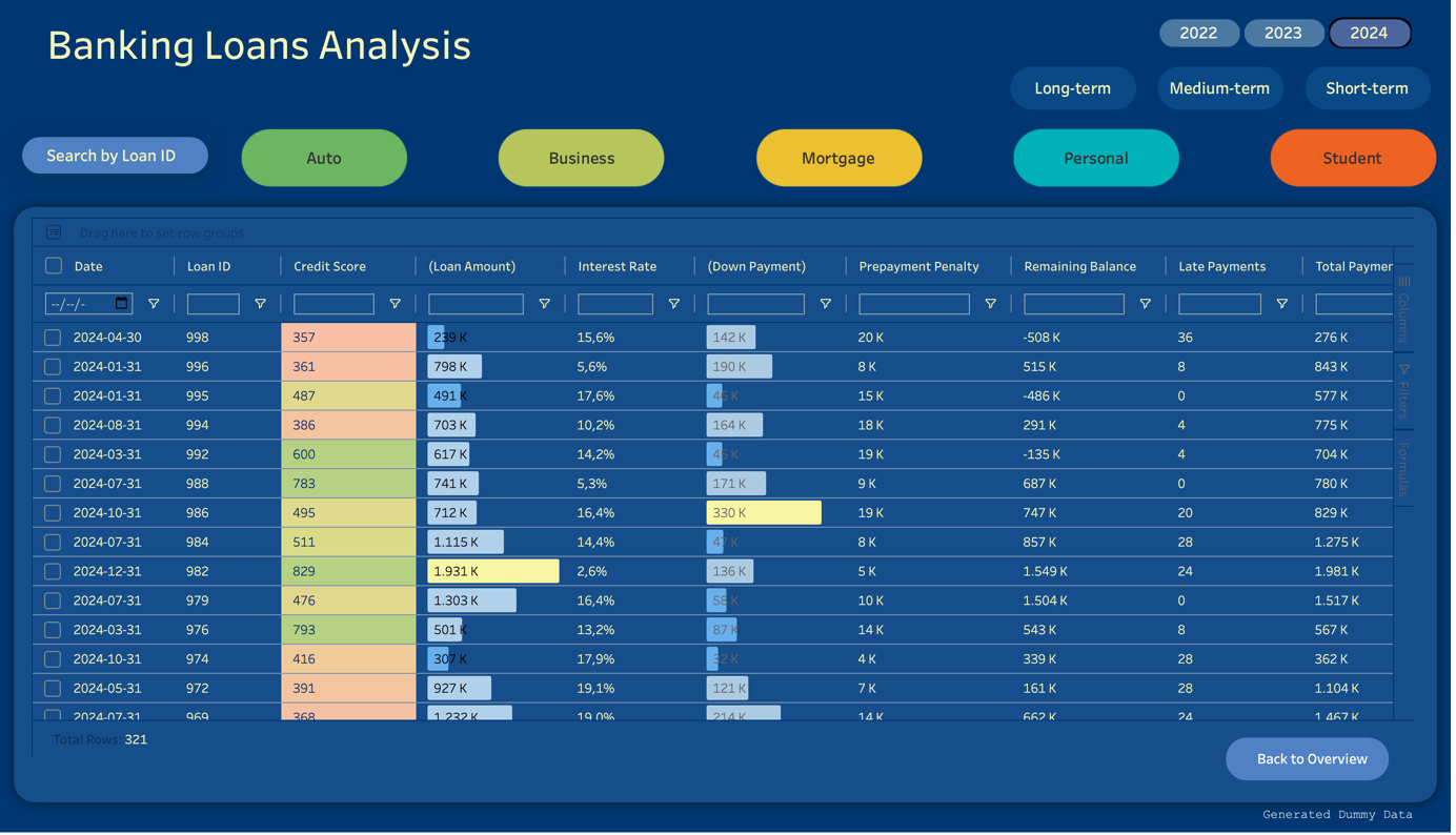
The Banking Loans Analysis Dashboard provides a detailed analysis of loan performance metrics across various loan types. This tool can help financial institutions monitor loan trends, manage risk, and make informed decisions based on projected outcomes and borrower profiles.
A Fresh look
We have completely revamped the rendering method to give the decomposition tree a fresh look. The layout can now be optimized to position nodes either at the centre of the screen or at the top, based on user preference. Nodes are meticulously aligned at each level relative to the previous level, providing a visually appealing and intuitive experience for analysts. This enhanced alignment ensures a clear and organized view, facilitating easier data exploration and analysis.
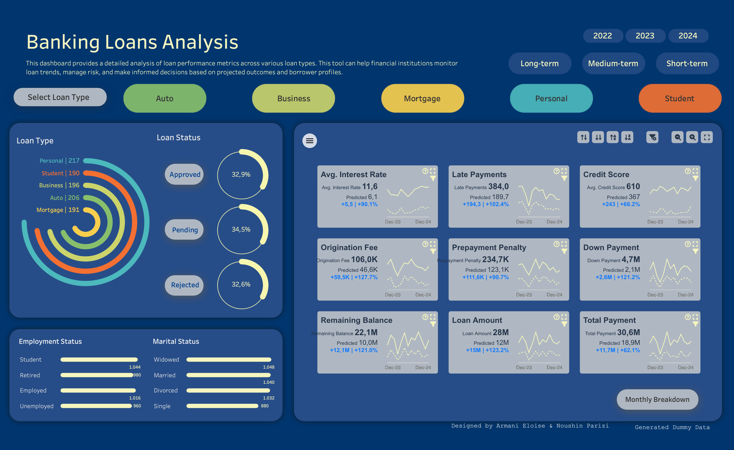
The dashboard allows users to filter based on year, loan terms, loan status and loan types. Users can view the proportions of the following dimensions as well as information such as the marital and employment status of clients. The PowerKPIs section allows you to dive into the detailed metrics and allows comparison to the predicted values of each measure.
Why PowerKPIs?
With the use of Viz Extensions, adding PowerKPIs has become easier as there is no need for an additional sheet to be added to the dashboard; it can all be set up in a single sheet. A big advantage is that there is no need to create individual charts and calculations since it can all be configured within a few clicks. As for formatting, there are many ways you can customize the cards to match the theme of your dashboard or even complement it, such as changing icon colors, borders, chart types and layouts.
How to add financial metrics using PowerKPIs
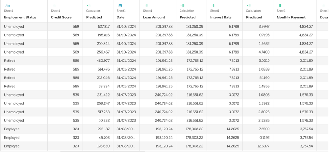
The process of adding PowerKPI’s to the dashboard can be easy. In this case the data loaded into Tableau has a simple structure:
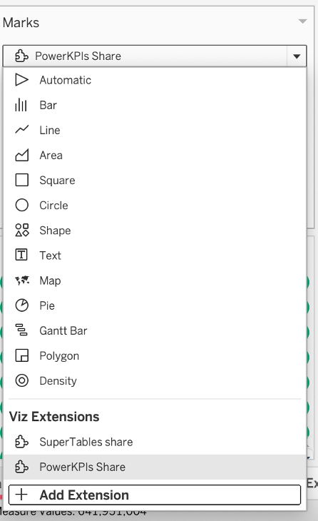
The Extension can be selected from the marks card once the Trex file has been downloaded:
Next, is a case of adding the needed measures and dimensions to the marks card:
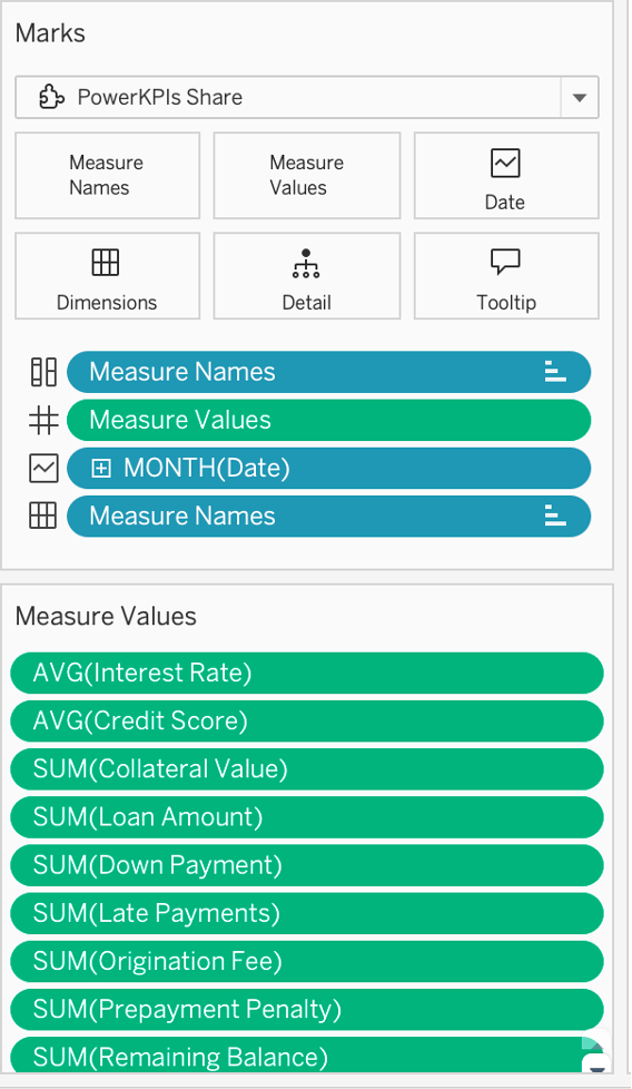
For the dotted line to show, a secondary predicted measure for each original measure has also been added to the marks card. The name has been changed to ‘Predicted’ for each one so the PowerKPI picks this text up for each card.
The Viz extension can now be configured within the sheet or from the dashboard once the sheet has been bought out:
The configuration steps involve the following:
– Select a grid layout
– Select the data structure
In this case, a KPI card per dimension member has been selected, where scenarios are dimension members.
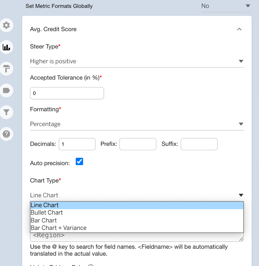
– Assigning the fields for main and comparison values.
Each measure has a predicted value which has been entered under the Scenario label, as this will not be the main value the compare 1 option has been selected for both roles of the chart.
The calculations against the predicted values will be automatically computed, you can go into the formatting tabs to change the colors positive and negative values:
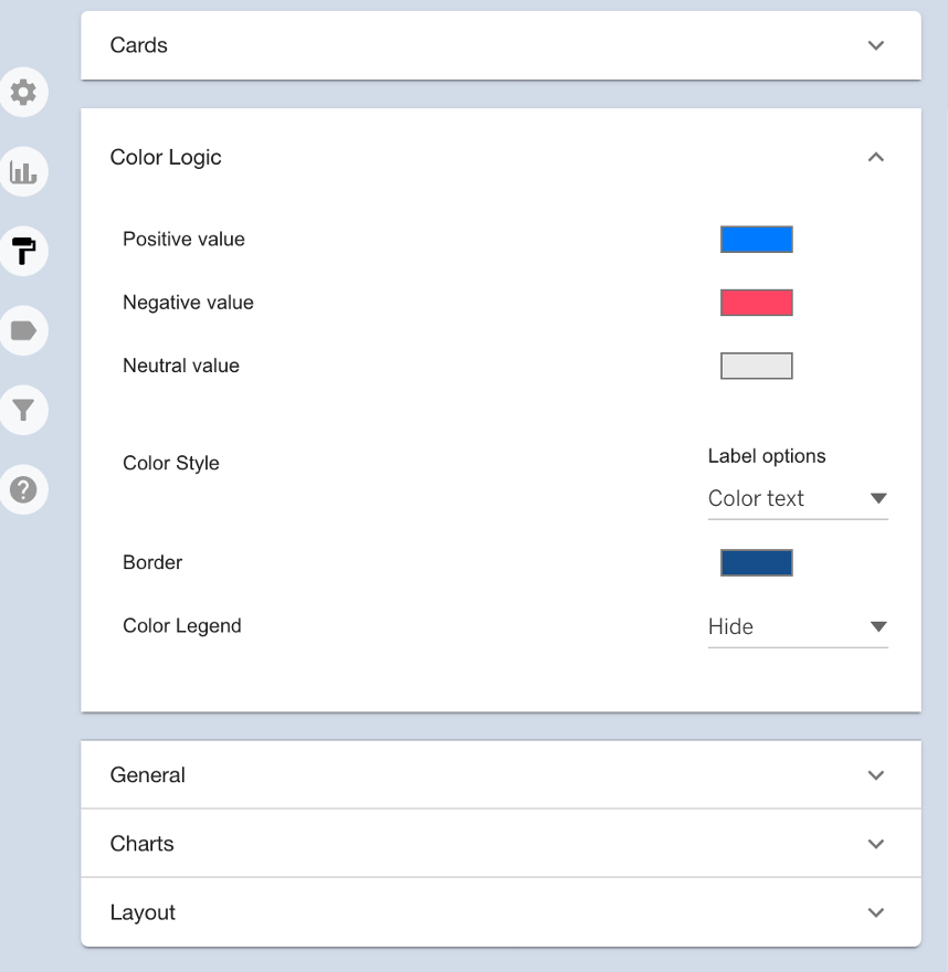
In the chart tab you can also choose the chart types for each measure, as well as additional time saving formatting options:
SuperTables Add on:
By selecting the monthly overview button in the dashboard, users can navigate to the monthly breakdown where more details can be viewed on a detailed basis such as Loan ID and exact date. The search icons make it very simple to find records very easily:
PowerKPIs has added great value and a great look to the Banking Analysis dashboard with easy configuration steps and plenty of formatting options to fit the theme.
We look forward to creating more use cases and sharing them with you!

