TU Delft enhanced Dashboard and Data Stories with ShowMeMore
TU Delft uses Tableau to create and share dashboards to answer key questions related to policy making within their university. These dashboards are used for a better understanding of how a department functions in subjects like diversity, inclusion, student journeys, turnover rates, and more. Getting insights in these kind of subjects helps the management in their informed decision-making process, policy formulation and sharing data stories.
About TU Delft
Top education and research are central values to the oldest and largest technical university in The Netherlands. Our 8 faculties offer 16 bachelor’s and more than 30 master’s degree programs. More than 25.000 students and 6.000 employees share a fascination for science, design, and technology. Our joint mission? Make impact for a better society.
Easy visualizations to answer questions
As the dashboard user base grew, the questions became more complex. When a specific requirement arose, for example a student journey through different departments and course transfers, dashboard users needed a clear and easy visualization to answer their questions. It became complex to visualize with the standard graphs in Tableau and the dashboard designers and analysts had to look for extended data visualization capabilities.

Discovering the Radar Chart and Sankey Diagram
The university looked for solutions which enhanced the capabilities of their existing dashboard to make it more intuitive and exciting which led them to the premium ShowMeMore Extension. Before using ShowMeMore, manual creation of Radar Charts to show scores on university rankings, posed challenges and consumed valuable time. ShowMeMore’s Radar Chart replaced that manual process and saved lots of time in designing and publishing the dashboards. Another visual that’s being used is the Sankey Diagram. In just a few clicks, TU Delft can visualize how bachelor students switch from faculties within the university.
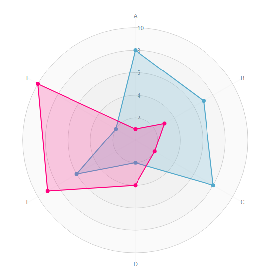
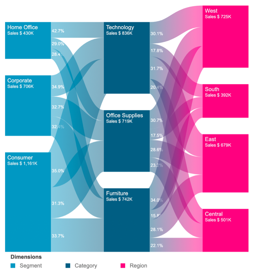
*This is an example of the Radar Chart and Sankey Diagram
Saving time while creating scalable dashboards
With visually interesting graphs, simplified graph creation and more interactivity, ShowMeMore is a valuable solution in the process of information decision and policy making within the university. Analysts from TU Delft experienced ease of use and simplicity as it replaced some of their complex visualizations which required numerous calculated fields. This saves them a lot of time and effort while making the dashboard more scalable with little maintenance as they don’t have to worry about dashboards breaking because of data changes.
“We interact with partners all the time, and I have to say that with you guys it’s been so fast and so easy. I have had the best experience with Apps for Tableau.”
– Zhané Hunte, Data Analyst at TU Delft
A Seamless Experience: Customer Success at its best
Throughout their journey with ShowMeMore, the university enjoyed a seamless interaction with Apps for Tableau. The responsiveness and efficiency of the support team has enabled TU Delft to get all questions and feature requests resolved with a short span of time.