
ProcessMining V2.0 – Everything you need to know
Based on customer feedback we have improved the useability and functions of our popular ProcessMining extension for Tableau. In this blog we will explain and illustrate the improvements and benefits of the new ProcessMining 2.0 extension for Tableau.
The most important changes are:
- The extension now uses only one single datasheet to connect to the extension.
- The datasheet only needs 4 columns, no complex calculations needed
- The extension calculates all the process mining KPI’s, no need to create calculated fields
- End users now have an analytics pane to support self-service analysis
- Show/Hide Happy Path by the end user
- Export the process map to PDF file
- ProcessMining shows the animation of cases flowing through the process
- ProcessMining now has Variant analysis to see what paths occur most frequently or take the longest
- Dashboard actions can be triggered by selecting Activities, Paths and Variants
Single datasheet
The biggest technical change is the fact that the ProcessMining extension only needs one datasheet to be connected. We used to configure two separate sheets for LINKS and NODES, now you just need one sheet. Inside that datasheet you can also omit calculating measures like #cases and durations since those important process mining KPI’s are now calculated within the extension automatically.
Your datasheet requires only 4 columns that will be present in your process event log:
- Case Identifier
- Activity
- Start timestamp of activity
- End timestamp of activity (not required)
In the example below we illustrate how to create a datasheet from your process event log datasource. The columns are sorted based on the minimum of the start timestamp to make sure the data is represented in a chronological order.
Configure the extension
Because we changed the number of datasheets to be used from 2 to 1 and the measures are no longer required in the datasheet, the configuration also slightly changed.
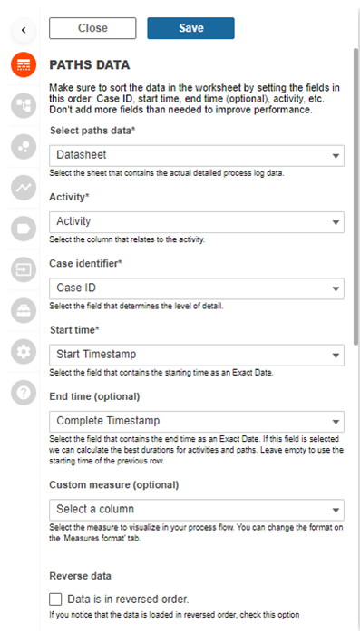
Connect the datasheet
The image below shows the new configuration for the single datasheet. Just select the datasheet, select the column for your activity identifier, also select the column for the case identifier and the columns for your start and end timestamps. There is also the possibility to select a custom measure if you have a measure available on your datasheet.
Since the ProcessMining extension now calculates all the important KPI’s we are done configuring the extension.
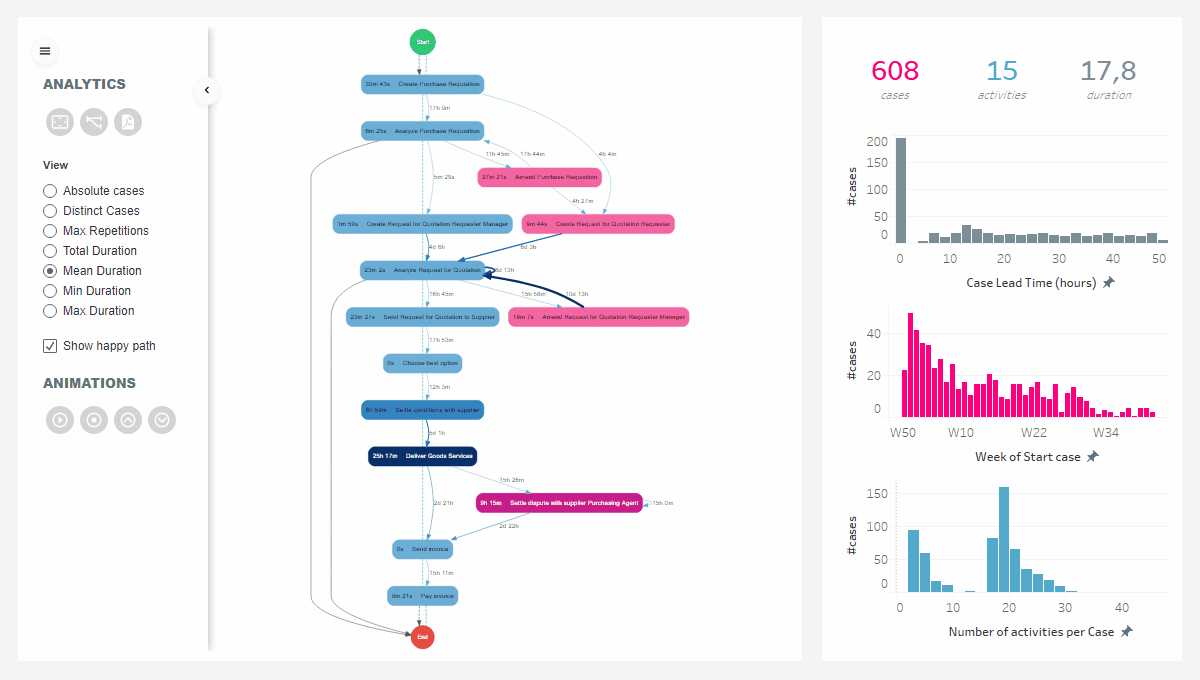
The Analytics pane configuration
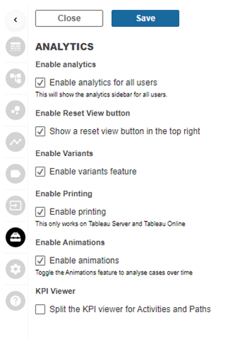
An extra configuration option is added to the extension’s menu. This option is called the Analytics Configuration. This option allows you to configure the Analytics pane that is shown to the dashboard viewers. (see image to the right)
With this new Analytics pane configuration option you can:
- Enable/disable the analytics pane for dashboard viewers
- Enable/disable the View button to return to default zoom
- Enable/disable the Variant analysis button
- Enable/disable the Print button
- Enable/disable the animations function
- Split the KPI viewer to allow different KPI’s on activities and paths
The new Analytics pane offers your dashboard viewers the possibility to analyze their data the way they prefer using the functions described above.
Select your KPI
The new ProcessMining extension allows dashboard users to switch between different KPI’s with a single click in the Analytics pane (when enabled of course). The dashboard user can choose from these KPI’s to be shown on activities or paths:
- Absolute cases (#hops)
- Distinct cases (#unique cases)
- Max repetitions
- Total duration
- Mean duration
- Min duration
- Max duration
- Custom measure, can be configured in combination with your datasheet
If a dashboard user selects a different KPI this KPI will be shown in the process map. The color intensity of activities and paths will also resemble the newly selected KPI. Therefore it is visually emphasized where bottlenecks occur with respect to the selected KPI (what activity has the highest mean duration versus what activity is touched by the most unique cases….).
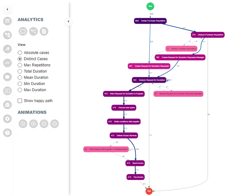
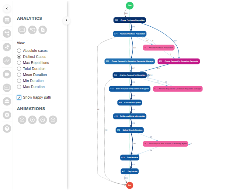
Show/Hide Happy Path
We think it is very user friendly to have dashboard users to enable or disable the visualization of the happy path in the process map. Sometimes you want to visualize the Happy Path, sometimes you don’t.
Below we illustrated the differences
Export the process map to PDF
On a published dashboard your dashboard users can now easily export the process map to a PDF file. This allows dashboard users to integrate the process map in reports or to share with other people in the organization that have no access to the dashboards. Until Tableau Software supports the export of web elements and extensions to PDF files or Images on the server platform this is a much requested feature!
Tableau Desktop does not allow this Print to PDF function. The use is solely restricted to the Tableau Server or Tableau Online platform.
Animation of cases through the process
A very visual and much requested feature for the ProcessMining extension is to animate how cases flow through the entire process. This brand new function shows the flow of cases in a 5 minute animation. It really shows congestions in your process and helps identifying bottlenecks. You can easily speed up or slow down the animation. The animation will use the minimum of the start time in your dataset as the first moment and the maximum of the end time (if present) as the end mark. The below image shows the animation function in action.
Variant Analysis
This is a real cool and much requested feature as well. When exploring your process event logs you also want to know what routes are most common or rare in your dataset. The extension automatically calculates all variants that occur in your dataset and shows a bar char comparison of all variants on:
- Number of unique cases
- Activity duration
- Path duration (Waiting time)
The variant analytics pane allows you to sort either ascending or descending on each of the KPI’s listed above. And once you configured a dashboard action to be triggered by variant selection you can click on a variant to filter on the process map as well as on your Tableau sheets with the meta information on the entire process.
Below an illustration I created to show the flexibility and power of the Variant analysis.

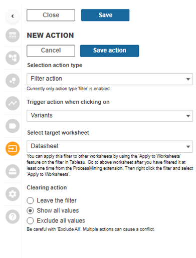
Trigger dashboard actions by variant selection
The ProcessMining extension already had an impressive Dashboard Action function. It is now expanded with the possibility to use Variants as a trigger for your dashboard actions.
The screenshot on the right shows the actions configuration to be triggered by Variants.
Once you configured the dashboard action your interactivity is also guaranteed when clicking on one or more variants in the Variant Analysis pane.
Roadmap
So my conclusion is that the new ProcessMining extension for Tableau has improved a lot on useability. Besides the improved useability it is now equipped with a lot of new ProcessMining core functions to give you a head start in analyzing your processes in your favorite reporting platform: Tableau Software!
We love to make extensions and help Tableau users to do things more efficiently. If you have feedback, ideas, questions or need support, please make sure to share it with us! Also, don’t forget to follow us on social media for our latest news and updates.