ShowMeMore VizTypes
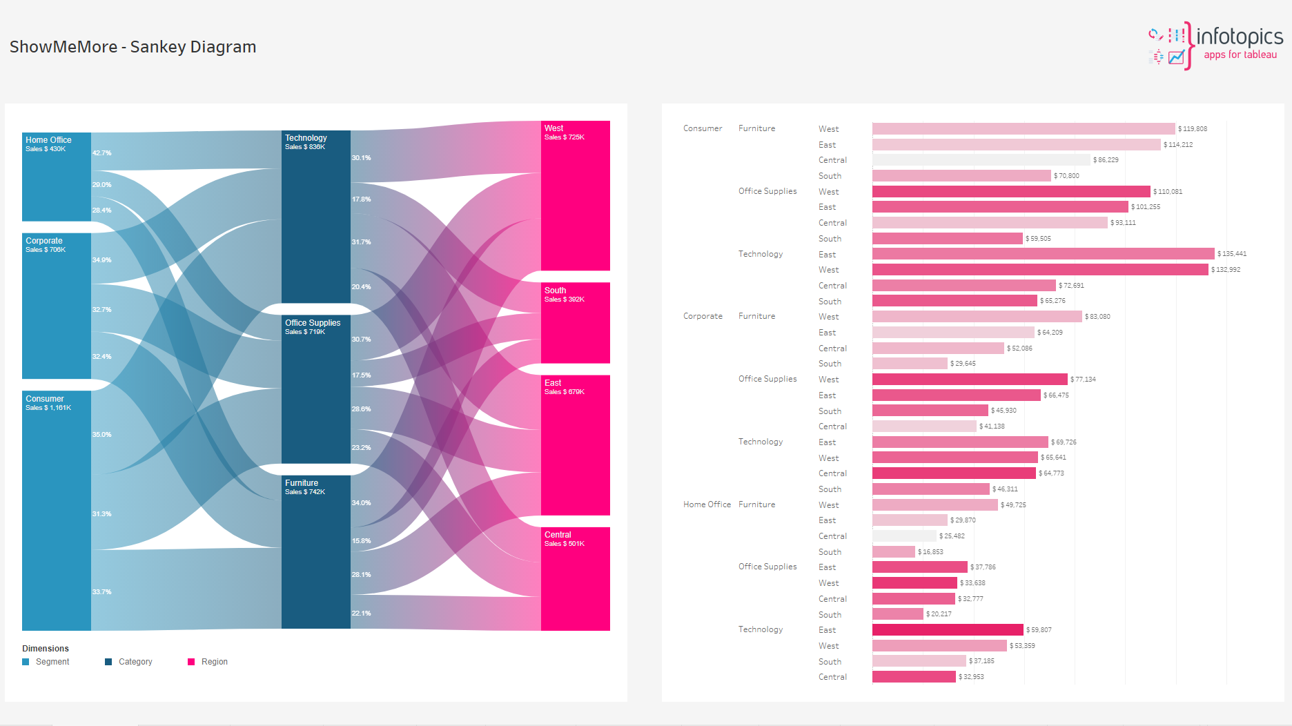
Sankey Diagram
The Sankey Diagram visualizes the flow of a measure over multiple dimensions. Start visualizing the flow of money through your organizations departments or see what paths your visitors enjoy on your website. You can create your first Sankey Diagram in under a minute….
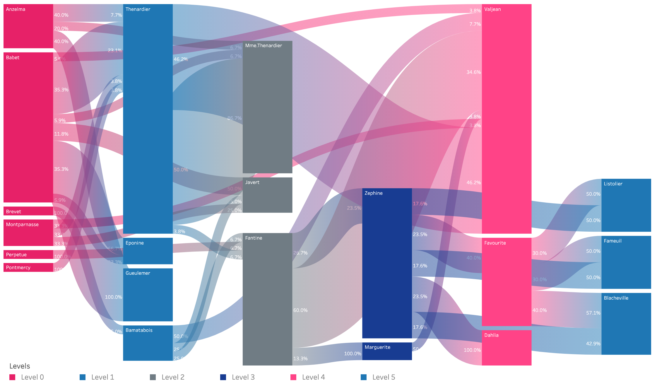
Source Target Sankey Diagram
A source-target Sankey diagram is a visualization that displays the flow of a particular set of data from its origin (source) to its destination (target). It consists of nodes, representing the sources and targets, and links, indicating the flow between them. The width of the links corresponds to the quantity being measured. This type of diagram is often used to depict the flow of energy, money, or materials in a system, among other things. Source-target Sankey diagrams are useful for identifying patterns and bottlenecks in a system, as well as for demonstrating the impact of changes or interventions.
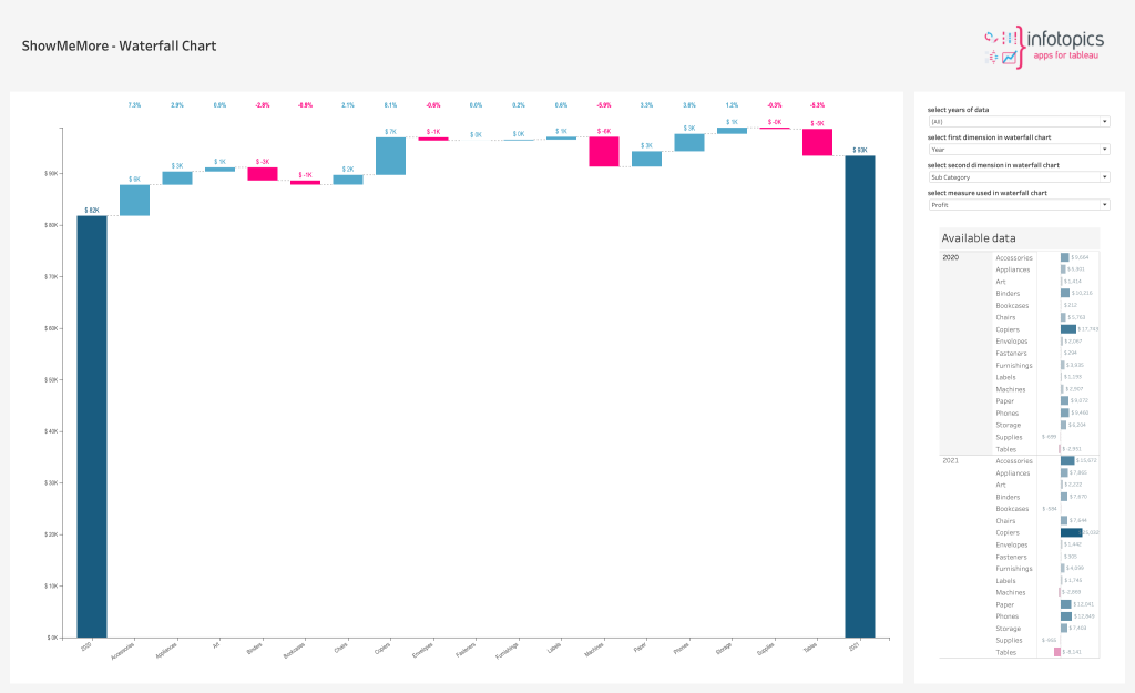
Waterfall chart
A waterfall chart is a form of data visualization that helps in understanding the cumulative effect of sequentially introduced positive or negative values. These intermediate values can either be time-based or category based. The waterfall chart is also known as a flying bricks chart or Mario chart due to the apparent suspension of columns (bricks) in mid-air. Often in finance, it will be referred to as a bridge. A waterfall chart can be used for analytical purposes, especially for understanding or explaining the gradual transition in the quantitative value of an entity that is subjected to increment or decrement. Often, a waterfall or cascade chart is used to show changes in revenue or profit between two time periods.
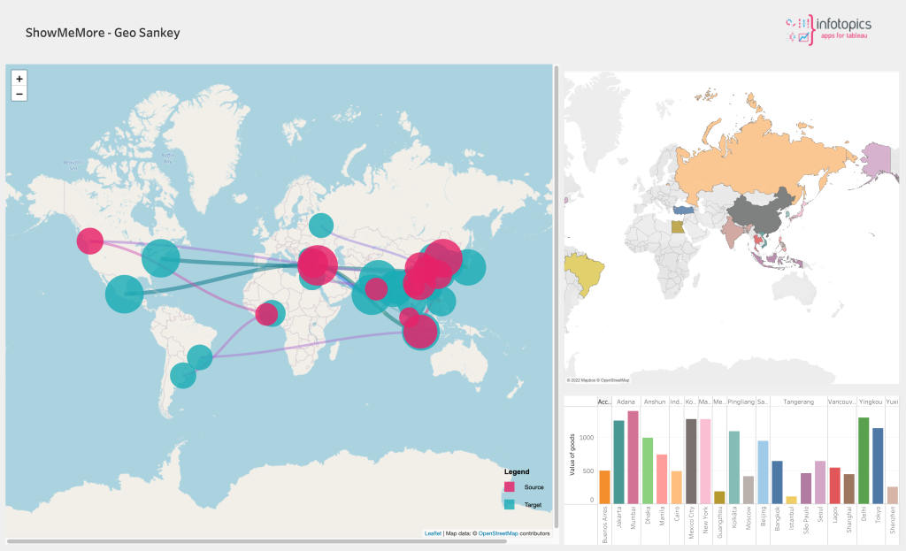
Geo Sankey Diagram
A Sankey diagram visualises the proportional flow between variables (or nodes) within a network. It is an excellent tool to get insights into the major transfers or flows within a system. However, what if we can add geographical attributes to the Sankey diagram and visualise the flows on top of a map? It gives unprecedented insights into your data. The new ShowMeMore Geo-Sankey can provide you with a birds-eye view for better insights into your data.
Network Diagram 2.0
A network diagram is a data visualization method that allows users to understand relationships in data easily. Network diagrams are composed of nodes and paths. Nodes are singular data points that are connected to other nodes through paths. The paths show the relationship between two or more nodes. Consider an organisation with three employee types: directors, managers, and associates. A network diagram would show each employee type as a node and the relationship between those individual employees as edges. A network graph reveals patterns and helps to detect anomalies.
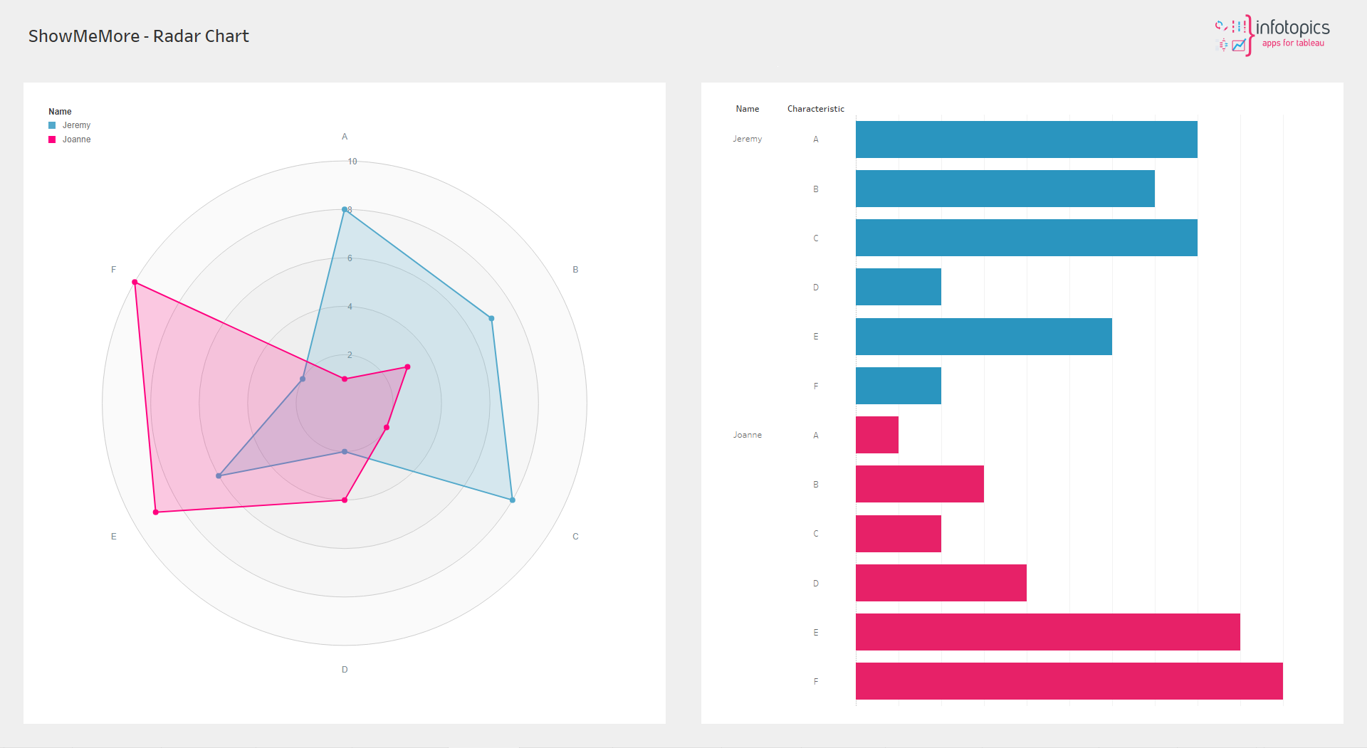
Radar Chart
A radar chart is a graphical method of displaying multivariate data in the form of a two-dimensional chart of three or more quantitative variables represented on axes starting from the same point. Visualize a persons characteristics or plot your department security assesment results in the characteristic spider web plot.
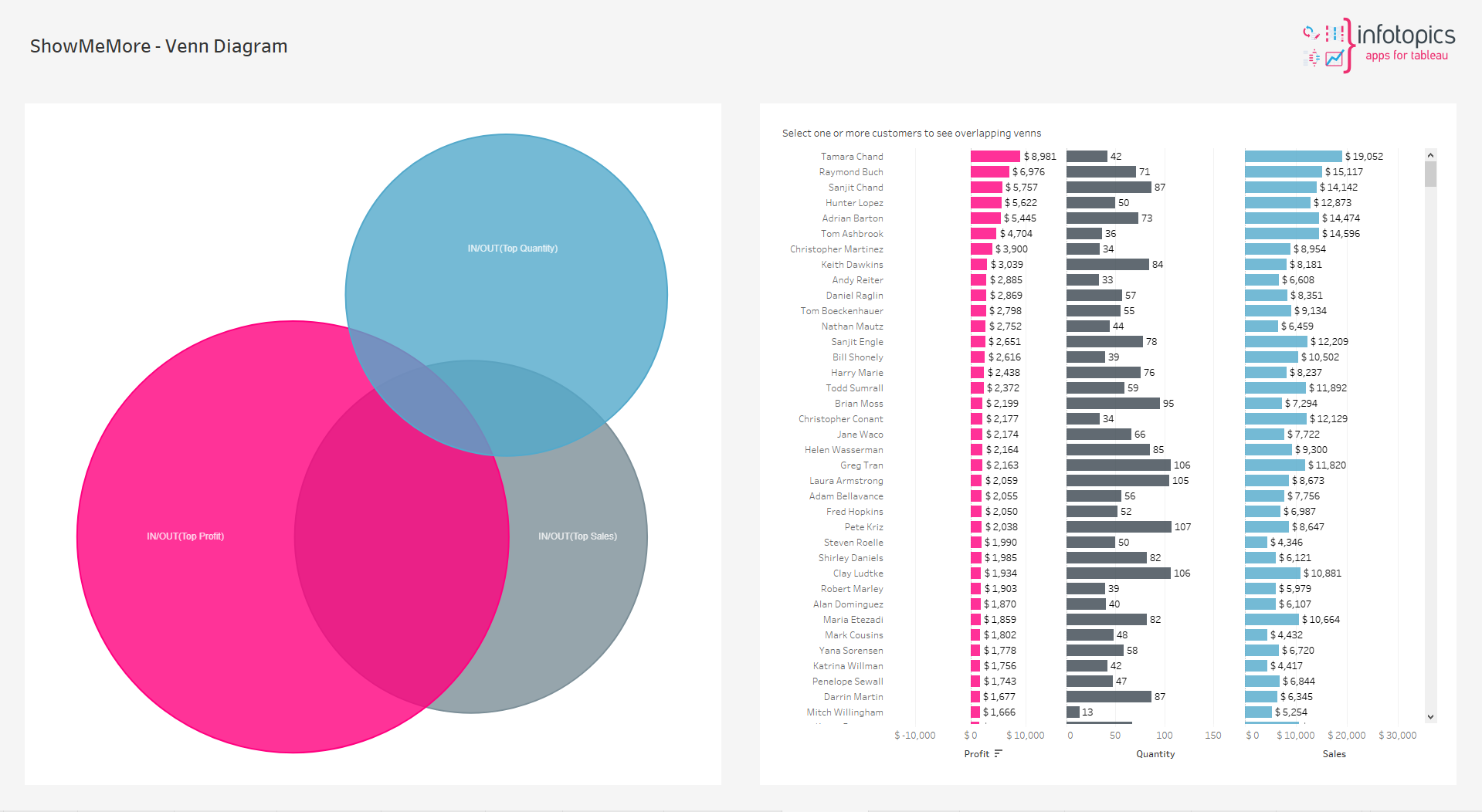
Venn Diagram
A Venn Diagram is a diagram that visually displays all the possible logical relationships between a collection of sets. Each set is typically represented with a circle. Contained within each set is a collection of objects or entities that all have something in common. When sets overlap, it’s known as the intersection area. This is where entities that have all the qualities of the overlapping sets.
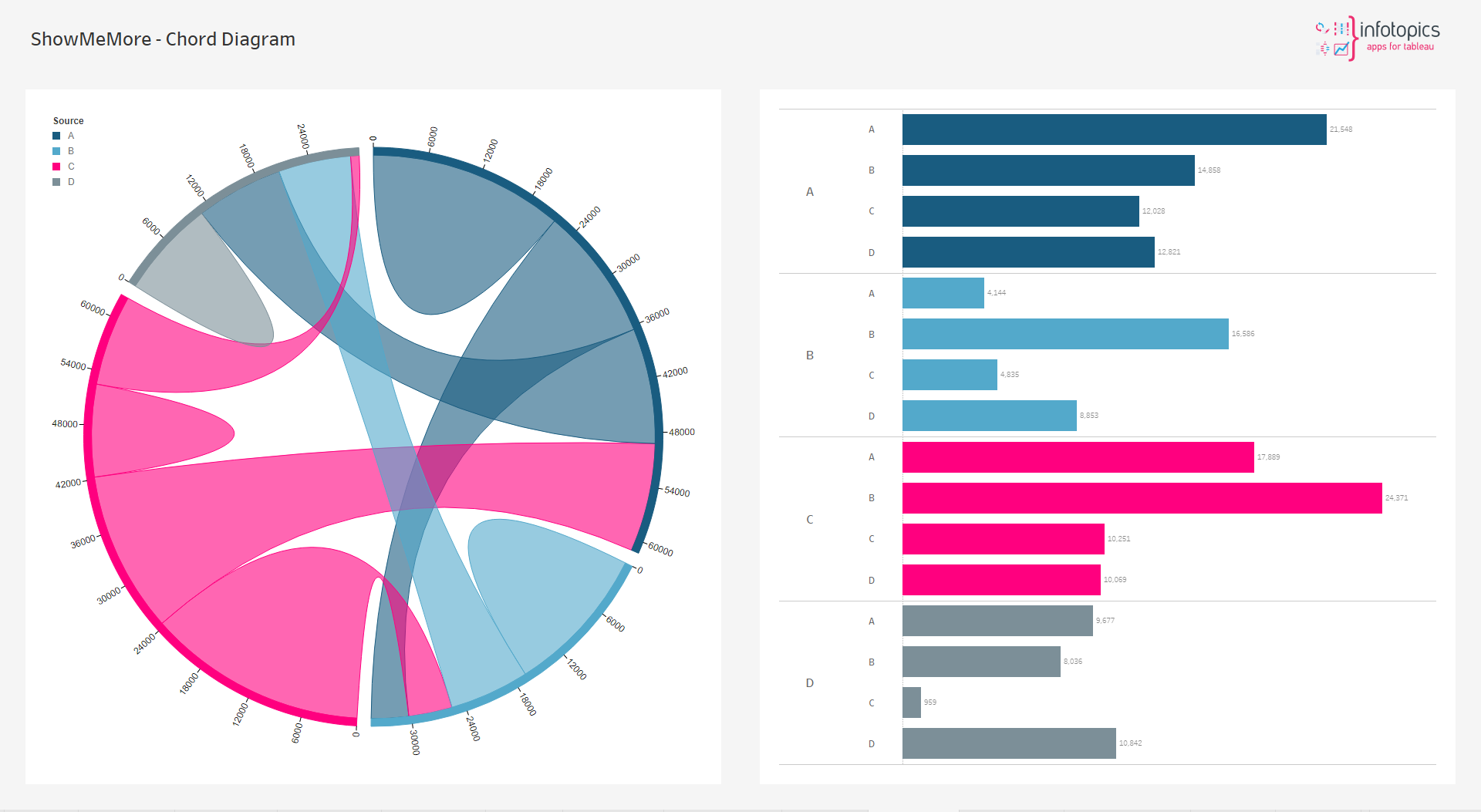
Chord Diagram
This type of diagram visualises the inter-relationships between entities. The connections between entities are used to display that they share something in common. This makes Chord Diagrams ideal for comparing the similarities within a dataset or between different groups of data.
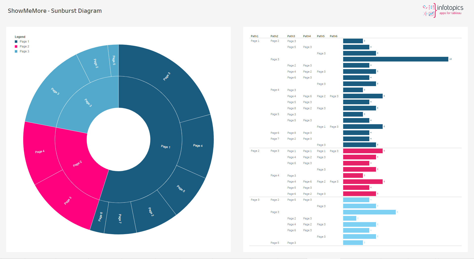
Sunburst Diagram
This type of visualisation shows hierarchy through a series of rings, that are sliced for each category node. Each ring corresponds to a level in the hierarchy, with the central circle representing the root node and the hierarchy moving outwards from it. Rings are sliced up and divided based on their hierarchical relationship to the parent slice. The angle of each slice is either divided equally under its parent node or can be made proportional to a value.
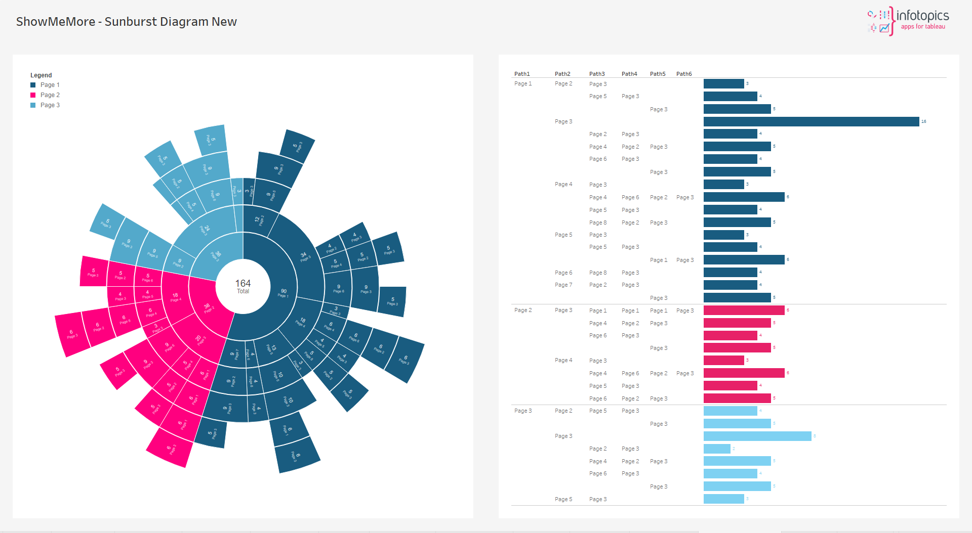
New Sunburst Diagram
This type of visualisation shows hierarchy through a series of rings, that are sliced for each category node. Each ring corresponds to a level in the hierarchy, with the central circle representing the root node and the hierarchy moving outwards from it. Rings are sliced up and divided based on their hierarchical relationship to the parent slice. The angle of each slice is either divided equally under its parent node or can be made proportional to a value.
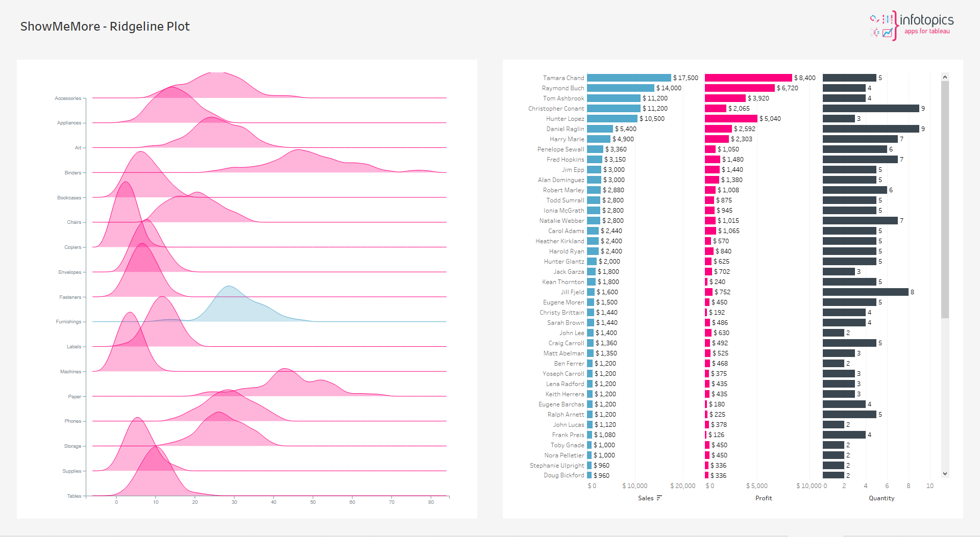
Ridgeline Plot
Definition. A Ridgeline plot (sometimes called Joyplot) shows the distribution of a numeric value for several groups. Distribution can be represented using histograms or density plots, all aligned to the same horizontal scale and presented with a slight overlap.
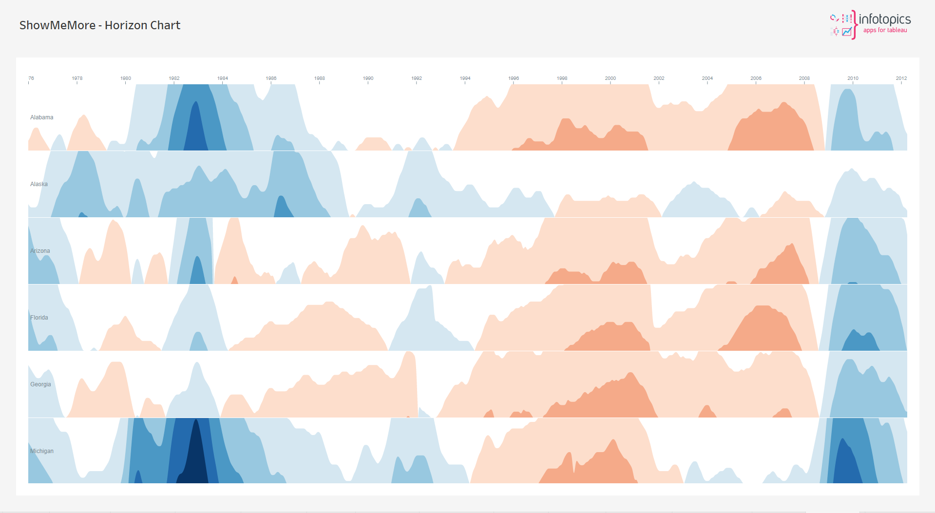
Horizon Chart
Horizon charts are an alternative to ridgeline plots and small-multiple area charts that allow greater precision for a given vertical space by using colored bands. These charts can also be used with diverging color scales to differentiate positive and negative values.
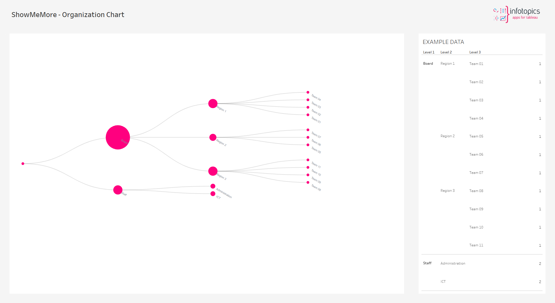
Organization Chart
The organization chart is a diagram showing graphically the relation of one official to another, or others, of a company. It is also used to show the relation of one department to another, or others, or of one function of an organization to another, or others. This chart is valuable in that it enables one to visualize a complete organization, by means of the picture it presents.
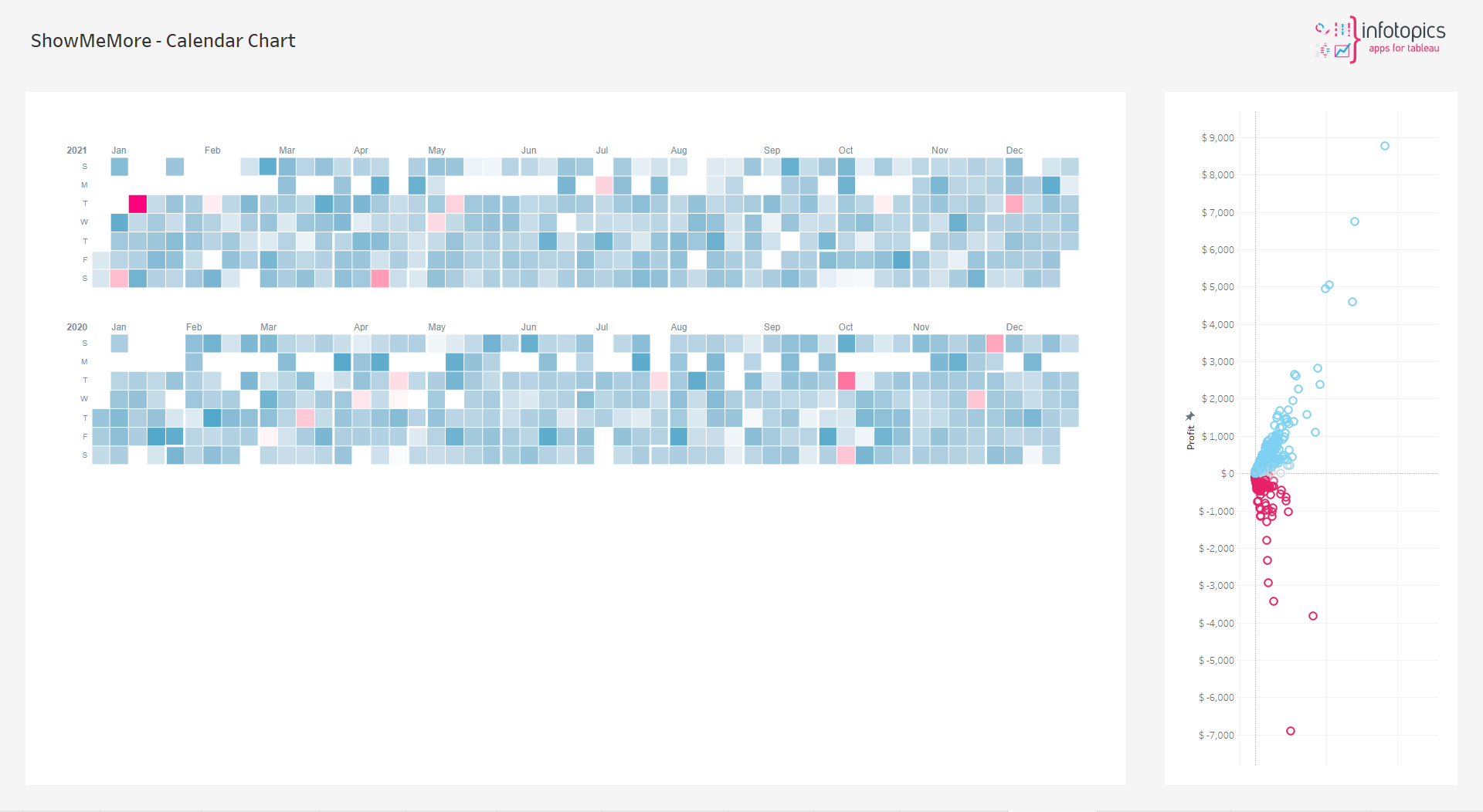
Calendar Chart
Calendars as a visual tool are used to display periods of time and to display the organisation of events. Periods of time are often displayed and divided into units such as days, weeks, months and years. A date is the designation of a single, specific day within such a system.
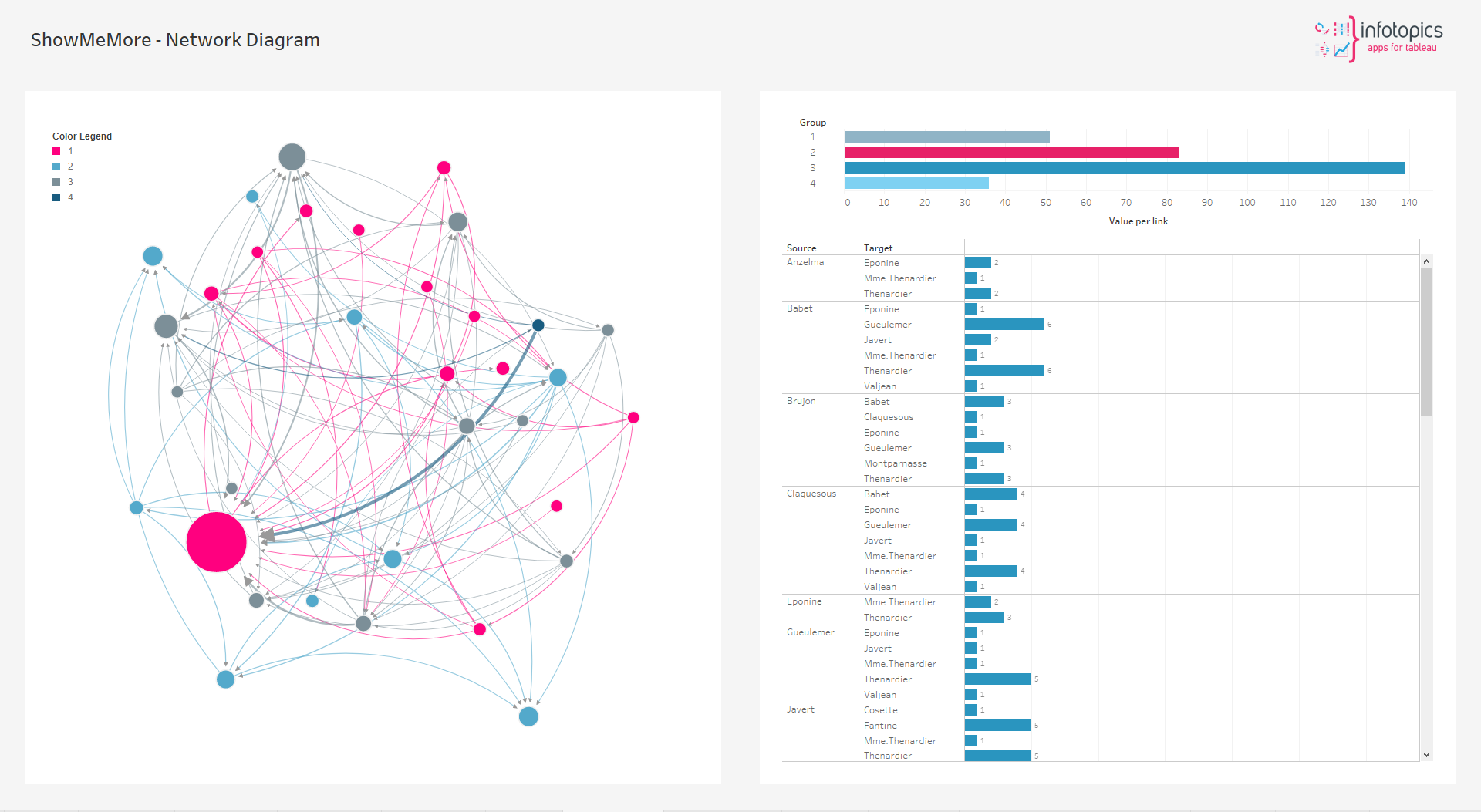
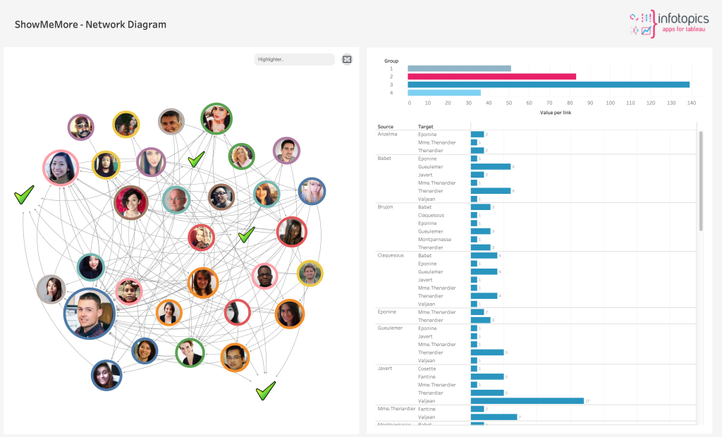
Network Diagram
This type of visualisation shows how things are interconnected through the use of nodes / vertices and link lines to represent their connections and help illuminate the type of relationships between a group of entities. Start connecting the dots in your customer base or visualize team relationships with this viz type.
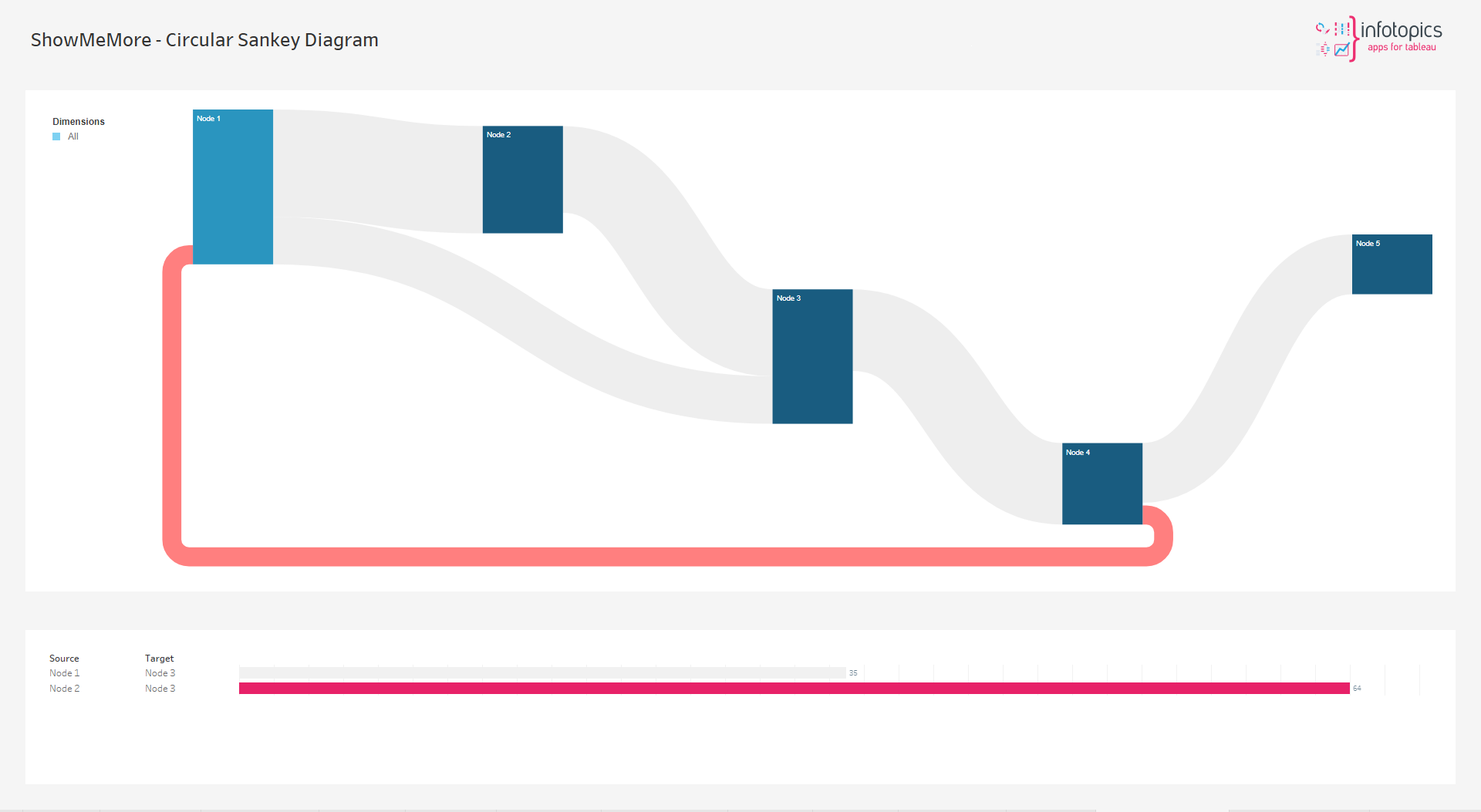
Circular Sankey Diagram
The Circular Sankey Diagram visualizes the flow of a measure over multiple dimensions with internal loops. Sankey diagrams are a type of flow diagram in which the width/height of the arrows is proportional to the flow rate.
We love to make solutions and help Tableau users to do things more efficiently. If you have feedback, ideas, questions or need support, please make sure to share it with us! Also, don’t forget to follow us on social media for our latest news and updates.