
Introduction to Process Mining
Process mining is an analytical technique that helps to discover, monitor and improve operational business processes. Using process mining, you can see how the process actually goes, instead of assuming how the process goes. Process mining helps you to discover, explore, audit, analyze and improve your processes by answering both compliance-related and performance-related questions. The ProcessMining extension for Tableau can be offered as a on-premise (we call it Enterprise) or as SaaS (we call it Share) deployment.
Preparing your data
To get the best value from the Process Mining extension preparing your data correctly is not difficult, but it is important. To get started with the ProcessMining extension you just connect your Tableau Desktop to a datasource containing your process event logs. These log files must contain:
- A Case identifier that identifies each unique case flowing through your process.
- An activity identifier (or “Process step”) that will be shown as the nodes in your process map
- A start Date/Timestamp
- An end Date/Timestamp (not required but really helpful)
You don’t need any measures or calculations, the most relevant process KPI’s are automatically calculated within the extension. With these 4 dimensions create a separate ‘datasheet’. It is best practice to not connect your extension to an existing visualization, use a dedicated ‘datasheet’ instead. Using a dedicated ‘datasheet’ for your ProcessMining extension will result in better performing dashboards and increased interactivity.
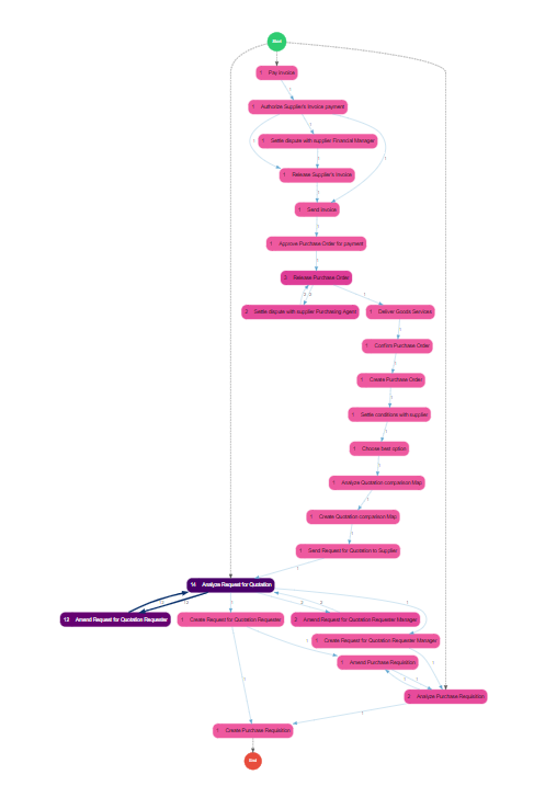
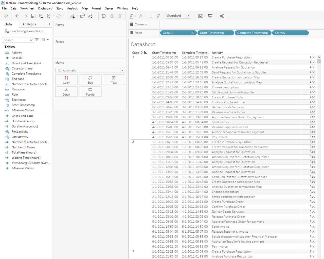
Creating the ‘datasheet’ is a straight forward procedure. Just drag the dimensions to the rows. Make sure your “Start” and “End” Date/Timestamps are of datatype date/time, are set to exact date and are presented as discrete values. It is recommended to use the order represented in the screenshot below.

Make sure you do a nested sort of your Case ID (and the next dimensions) on the minimum of the “Start” Date/Timestamp. This will make sure that your activities are sorted in a chronological way. The content of the ‘datasheet’ should look something like the screenshot below:
Getting started
This chapter will cover all steps to create a dashboard with the ProcessMining extension for Tableau. In the previous step we explained how to prepare your data. So once your datasource is set-up and your ‘datasheet’ has been created, we start creating the dashboard.
Create a new dashboard with the datasheet
First thing to do is create a new Dashboard. Tableau Extensions are Dashboard objects and cannot be deployed on just sheets. Therefore we need to add some data. In the previous steps we already showed you how to create a ‘datasheet’ so on the new dashboard just add your ‘datasheet’. This is a sheet that we only want to use to feed the extension so don’t mind the layout of the ‘datasheet’, we are going to hide it. For tips and advice check out our BLOG.
Hiding the datasheet
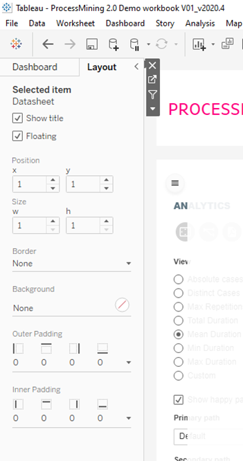
The datasheet is not an attractive sheet to be present on your dashboard. That’s why we are going to hide it. Remember, the datasheet must be present on the dashboard, but that doesn’t mean we can’t hide it. To hide the ‘datasheet’ just select the container it is in and open the “Lay-out” tab on the left pane in Tableau Desktop (see screenshot on the right).
Now enable the ‘Floating’ option and resize the container to 1×1 pixels (wxh) and change the position to the 1×1 x,y position. This will resize the floating container to one single pixels in the upper left corner of your dashboard (virtually invisible).
Add the ProcessMining extension to your dashboard
Next step is to add the ProcessMining extension to your dashboard. To complete this step you need the trex file that matches your subscription. This can either be downloaded from
- The Tableau Extensions Gallery
- Your personal trial download page when you are on a free 14 day trial
- Your appsfortableau.com account when you are on a Share subscription
- Your system administrator when you are on an Enterprise subscription
In your dashboard now drag the Extensions object to your dashboard and release it where you want to put it in your dashboard. A Tableau Modal window will pop-up that will ask you to select the extension or trex file you want to use.
In Tableau 2021.1 and higher you will see an interface where it is made easy to use a trex file from the Tableau Extensions Gallery. You can choose to select a trex file from your filesystem (marked yellow in the screenshot)
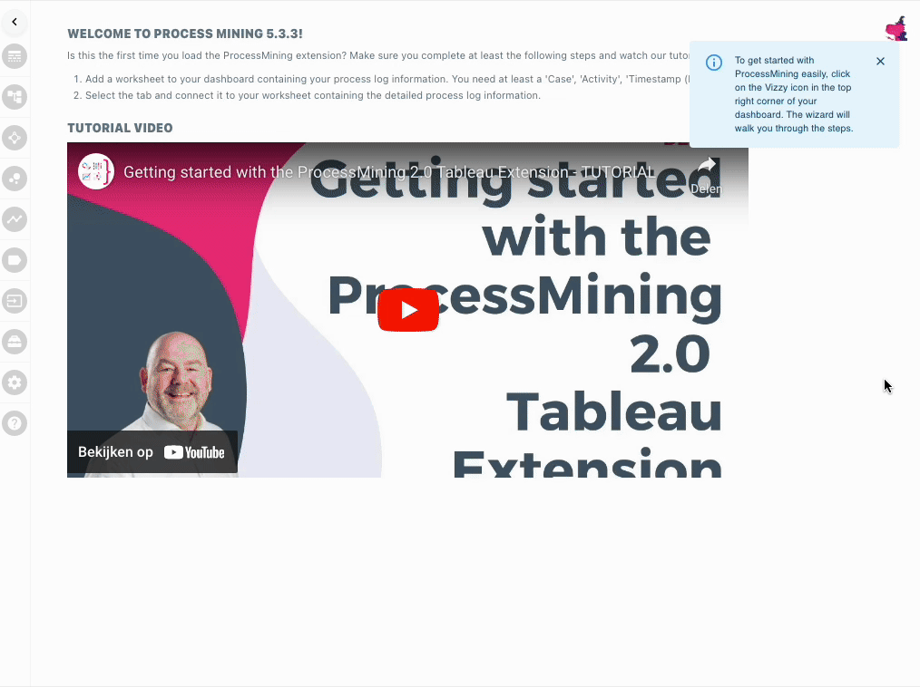
In this case we already prepared a trex file so we will use the yellow marked option and select the ProcessMining trex file. You will be asked to allow the extension in your dashboard. This message cannot be suppressed in Tableau Desktop but can be suppressed on Tableau Server / Tableau Online. Once the extension is properly loaded in your dashboard you will see the start screen that holds a getting started YouTube movie that explains the steps you need to take from here.
First we will connect the extension to our already prepared ‘datasheet’.
Configuration Wizard
When adding the ProcessMining extension to a dashboard, it will open the configuration wizard by default. This wizard will take you through the initial steps of configuration:
- Configuring the datasheet and (optionally) limiting data for testing purposes
- Assigning the “Activity”, “Case Identifier”, “Start time” and optionally the “End time” and “Custom measure” roles to the relevant data from the data source
- Initial configuration of the color, shapes and layout of the Process Mining visualisation
Alternatively, you can follow the steps below to configure the extensions manually, and in more detail.
Configure the ProcessMining extension
This chapter will explain the steps that need to be taken to get your ProcessMining extension up and running in your dashboard. First step is to open the
First make sure your configuration menu is visible. The top-left corner of the ProcessMining container sometimes shows a hamburger menu Click this hamburger menu because we need to access the configuration menu. You should see a menu bar on the left side of the ProcessMining container looking somewhat like the image shown to the right.
With this set of icons/menu options we will configure the ProcessMining extension.

Connect the datasheet and configure the paths
Use the “PATHS DATA” tab to connect to your datasheet and configure the behaviour and look-and-feel of all paths in you Process Mining extension.
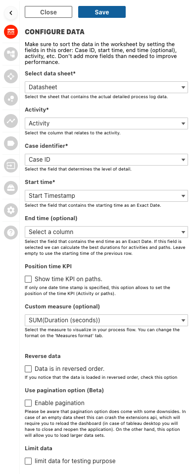
Select Paths Data
This is where you select the sheet that holds your data, also referred to as the ‘datasheet’
Once you selected the ‘datasheet’ the rest of the fields will be populated with all the available fields of that sheet. So next option to configure is the “Activity” field.
Activity
The activities in your process are what will be shown on as nodes in your process map, they are the events of the process. This is where you will be able to see where the real bottlenecks are in your organisation, which events are taking too much time and which are taking the happy paths. ProcessMining will clearly show which activities need more attention than others.
Case Identifier
Choose which column holds the unique identifier of the cases flowing through your process. Each case will have a complete flow of the activities and time taken. Use dashboard actions for example to link to a sheet on your dashboard to see the flow of each individual case within the extension.
Start Time
Select the Date/Timestamp from your ‘datasheet’ that represents the start of an activity. As stated before the best way to store your dates is in a discrete “exact date” value.
End time (optional)
Select the field that contains the end Date/Timestamp on your ‘datasheet’. This field is not a required field to operate the ProcessMining extension but enables you to calculate the ‘Waiting time’ it takes for cases to move from one activity to another (so the time between the end of axtivity X and the start of activity X+1)
Position of Time KPI
If only one date time stamp is specified, this option allows for the configuration of the time KPI. By default, time between start dates will be displayed on the activities. But by checking this box, they will be displayed on the paths instead.
Custom Measure
When the default KPI’s / measures in the ProcessMining extension are not sufficient for your use case you can also add an extra custom measure to your ‘datasheet’ and select it in this field to be part of your ProcessMining analytics.
Reverse Data
If the sorting in your ‘datasheet’ is not as expected but it seems to be in reversed order, this switch can easily help you out in reversing the order of your activities.
Pagination
Enabling pagination will set your data to load in chunks (or “pages). This enables use-cases with large numbers of rows.
Limit Data
When configuring or changing the extension, limiting data will improve performance. This allows users to quickly have their changes reflected in the visualisation.
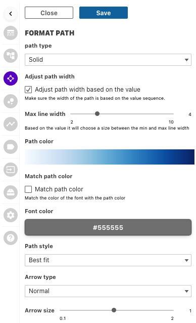
Format Path
Have the ability to format your paths to give yourself the most effective visualisation. Color, sizing and styles can all be changed here.
Path type
Change the style of your path using the dropdown menu. We all like choices so go ahead and choose which best suits your use case.
Adjust Path width
Check the tick box to allow the width of the path be based on the value of the selected KPI. This can give you extra value on your viz by seeing at a glance the value of each link. A path will be bigger when the KPI has a larger value.
Max line width
Use the scroll bar to change the maximum width of the line. It may not be of benefit to have huge lines throughout your process, keeping this low may give a nicer overall look, setting the value higher will differentiate more between lower and higher KPI values.
Path color
Click on the color gradient to change the color of the path shown in your viz. Once popped up click again to see the list of colors available for you. Select the color shades of your liking.
Match Path color
Before deciding on your font color, have the option to match the color of the path you’ve chosen. The Path labels will be shown in the same color as the path will be shown. So coloring of the labels will be depending on the KPI values for the links
Font Color
Pick your font color using the color palette as well as RGB, HEX and HSL. This will set a fixed font color for the labels on Paths in your Process Map.
Path Style
Allow the algorithm to choose the path style by selecting best fit or choose from the other options below. You can choose to have straight lines, curved lines, polygon lines etc. By default the style is set to “Best Fit”
Arrow Types
Choose from the selection of arrow types and use the slider to change the arrows size. Nice and simple.
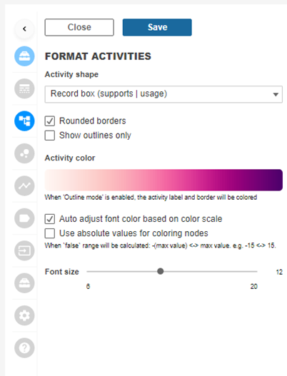
Format Activities
Here you can change the look and feel of activities in your ProcessMining visualisation. Format your activities to give the best looks to your dashboard with respect to yout use case.
Activity Shape
Change the shape of your activities in your process map. Select a shape you like to visualize the nodes in the process map. By default the ‘Record box’ is used. This is the most common activity shape used in Process Maps. Here you have the option to have rounded edges turned on or off on your nodes. Change the whole look of your viz by having the nodes outlined only. This will trigger below the option to change the style of your outlines.
Activity Color
Click on the gradient to choose from the selection of colors for your viz. This may effect the visibility of the font color to be sure check the ‘Auto adjust font color based on color scale’ for the extension work out the best color balance. This option sets the default color of activities in your Process Map. In a later step we tell you how to set the color of activities that reside in your Happy Path. The ‘outliers’ of your happy path will have the default color that is set with this option. So if you plan on using and visualizeing a happy path, it might be wise to select a signaling color as default color…
Use absolute values for coloring nodes
The values will round to the nearest absolute node and then be colored by that value. It often results in wider color variations in your process map, just try and see what best fits your use case.
Font size
Use the scroller to change the font size within your activities.
START & END NODE
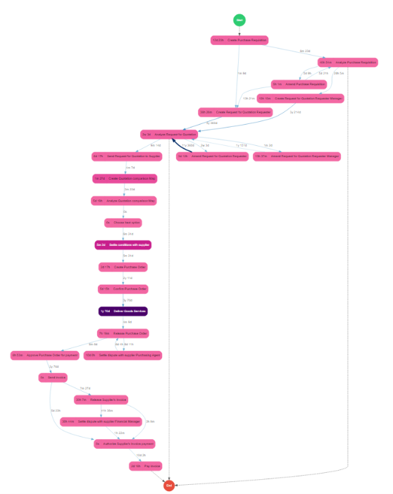
Here is where you can format the nodes at the start and end of your process independently to the rest of your nodes in the view. The Start and End nodes are not real nodes in your process event log but they indicate where your cases start their process. The lines from/to your Start/End nodes indicate the real Start/End points that are present in your data.
Have full formatting to edit these nodes including editing the text within the nodes under ‘label’

The configuration menu speaks for it self. You can enable/disable the StartEnd nodes, set line styles, coloring and labels. It is up to you if and how you visualize these nodes on your Process canvas.

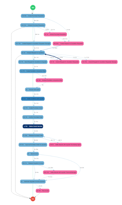
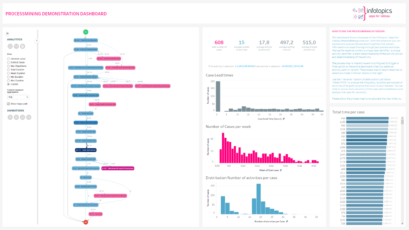
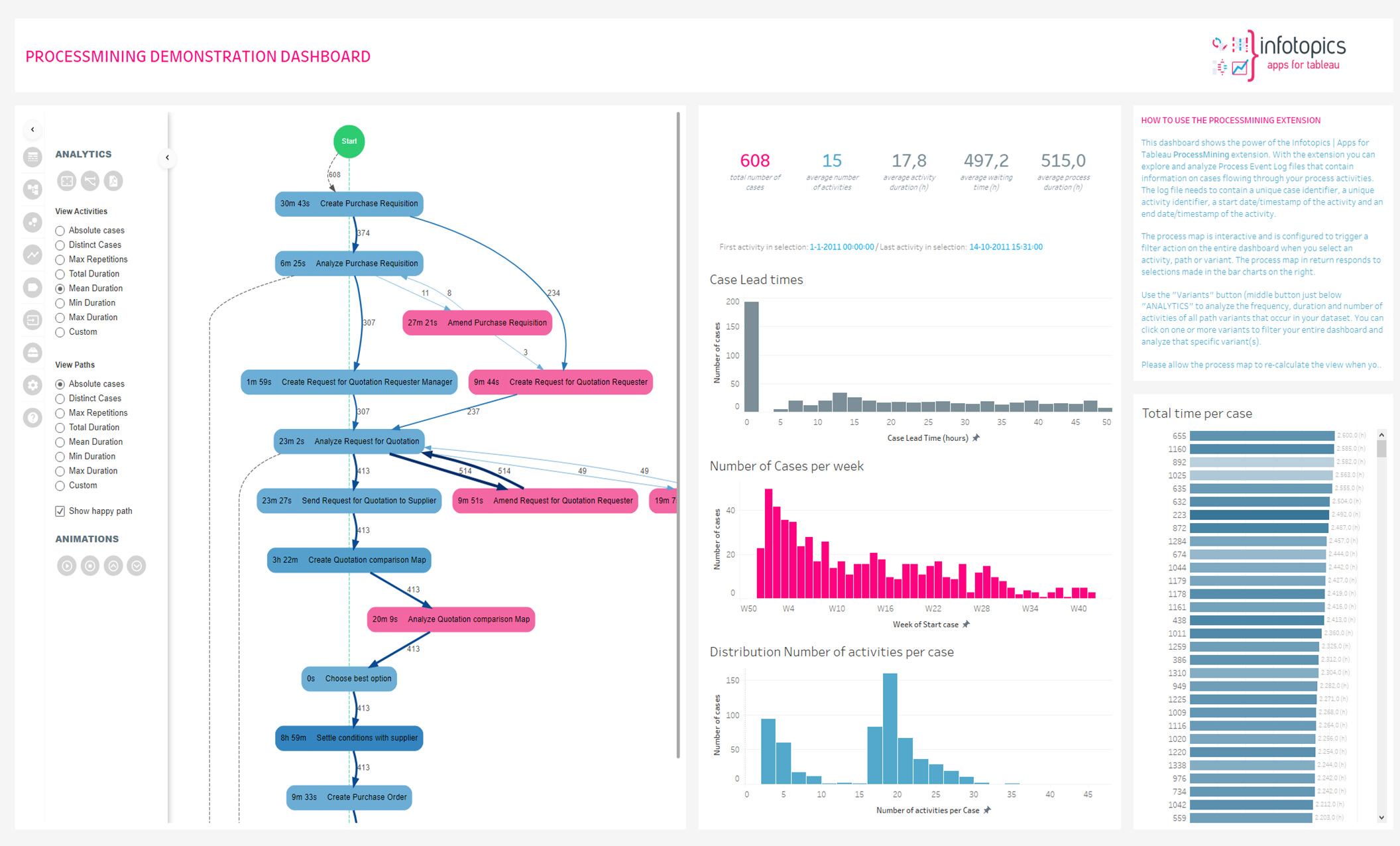
Happy Path
ProcessMining allows you to configure a “Happy Path”. The Happy Path is not automatically calculated, it is not the most common nor the most frequent occurring path in your dataset but can it be configured as the (imaginary) ideal path you want to be followed for the process. Outliers can be spotted immediately and action can be taken!
- The Happy Path is drawn as a vertical straight line from the Start node to the End node
- The Happy path activities and paths can be represented in a different color
Hit “Enable happy path” to have the opportunity to show the Happy Path in your Process Map. Click the ‘Visible when filter sheet(s)’ this will show the activities of the Happy Path in the visualisation even when your filtered data does not contain the Happy Path activities. The unused “Happy Path” nodes will be greyed out but still be visible. When false all non-connected nodes will be filtered from the tree.

Happy Path Color
Use the color palette to change the happy path color for activities shown in your viz. You’re able to use RGB, HEX & HSL codes.
Check the ‘Use a different color schema for happy path nodes’. The same scale will be used, but the color palette can be changed. Therefore outliers are easier to spot. Outliers will not be shown on the vertical line and have a different color. Clicking the color palette will open up the color gradients you’re able to choose from.
Creating the Happy Path
Now we can use the “HAPPY” and “INACTIVE” panes to configure the Happy Path. Initially there will be no activities shown under “HAPPY” and all activities will be present in the “INACTIVE” pane. You can now drag activities from the “INACTIVE” pane to the “HAPPY” Pane. Make sure you position the activities in the order of the process flow you want to be visible in your Happy Path.
Per activity you can indicate if the activity is allowed to be a start point of your process or an exit point (end point). This will draw Happy Path lines to the start and end nodes of the Process Map.
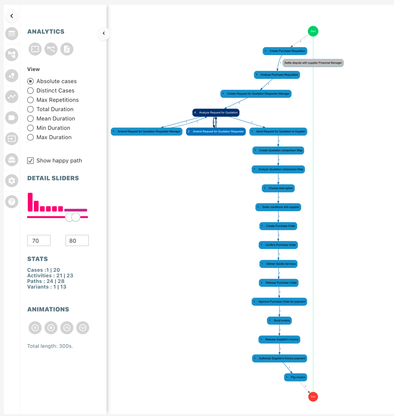
Detail Slider (Variants)
Detail slider, based on variants, allows the user to understand the flow of the process better. It lets the user focus on the most occurring or least occurring processes to understand and optimize the process flow. The histogram associated with the slider represents the overall distribution of variants, height of the bar represents the total number cases in the respective bucket. The distribution is based on buckets (for example if there are 100 cases then first 10 cases will be in the first bin). The text boxes below the histogram can be used to manually enter the range the user wants to focus on.
The variant slider can also be used as a filter to change the focus of your whole dashboard to variants in selected range. The configuration is the same as the variant filter available in dashboard actions pane. The same configuration responds to the filter in variants pane.
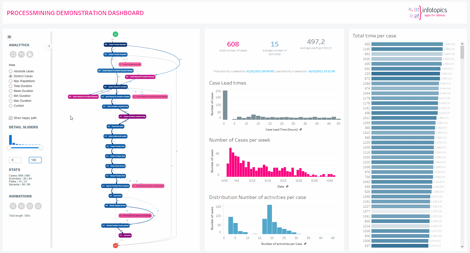
Stats
Content of the stats section represents what is shown in the process map, the values represent
“current count | total count”.
Happy Paths with Detail Slider
While moving the detail slider, if the nodes configured in the happy path is not available in the filtered path, then the nodes in the happy path will change color to grey without any value associated to it. In this way it is easy to analyze the process map and check if certain process skip important steps or following the structure.
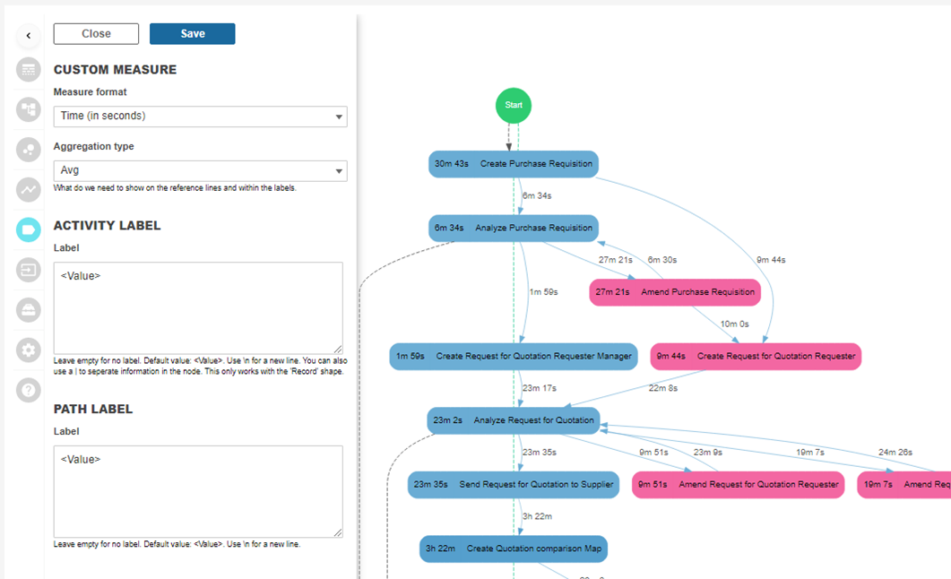
Custom Measure
If you decided to use a custom measure / KPI that is not part of the basic ProcessMining KPI’s, this is where you can format the custom KPI.
You can set the measure format. Basically this is the representation of the measure. You can set the default aggregation type (like SUM, Average, MIJ or MAX) and add prefixes or suffixes to the measure being shown in your process map (on either Paths or activities)
The example below shows a custom measure that is formatted as Time (in seconds). The extension will automatically use the time hierarchy to represent a logical representation.
Dashboard Actions
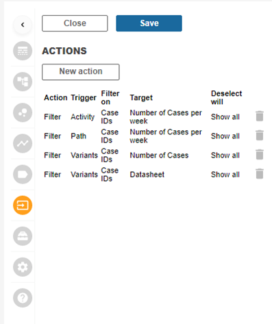
Interactions and actions are always an important part of efficient dashboards. That’s why we added the option to create Dashboard Actions in the ProcessMining extension.
The ProcessMining extension allows you to create dashboard actions to trigger other sheets (target sheets) on your dashboard. You can have multiple actions, acting on different target sheets and it’s also possible to have different types of actions. The ProcessMining extension supports Filter actions as well as Parameter actions.
Dashboard actions can be triggered by:
- Selecting an Activity
- Selecting a Path
- Selecting a Variant
We have two types of Dashboard actions:
- Filter actions. This action will filter the target sheet, based on the selection
- Parameter actions. This action type will change the value of a parameter based on the selection.
Below an example of the interactive that can be obtained by using dashboard actions.

Creating an action is straight forward. Click on the “New Action” button and you will be shown a form that allows you to configure your action.
It’s not just the activities and paths within your process flow you are able to filter on, use the variants in the analytics tab too! Show the unique paths of your process filtered to the worksheets on your dashboard.
It’s not just the activities and paths within your process flow you are able to filter on, use the variants in the analytics tab too! Show the unique paths of your process filtered to the worksheets on your dashboard.
Setting up a new action
Hitting the ‘New action’ button will open a new view for you to configurate the dashboard action. Decide between having a filter action or a parameter action. Where would you like to have the action to be triggered? Activities, Paths and Variants are your options from the dropdown menu. When clicking on an activity on your viz they can be filtered on the ‘Cases’ or ‘Event label’ these options are dependant on which trigger is chosen.
Select target worksheet
Using the dropdown you will see the list of active worksheets on your dashboard, choose which one you would like to be your target worksheet. You can apply this filter to other worksheets by using the ‘Apply to Worksheets’ feature on the filter in Tableau. Go to above worksheet after you have filtered it at least one time from the ProcessMining extension. Then right click the filter and select ‘Apply to Worksheets’.
Clearing action
What will happen when you clear the action? ‘Leave the filter’ will leave the filter active in your view. ‘Show all values’ will clear the filter and finally ‘Exclude all values’ will filter out from the view (Be careful as Multiple actions can cause a conflict)
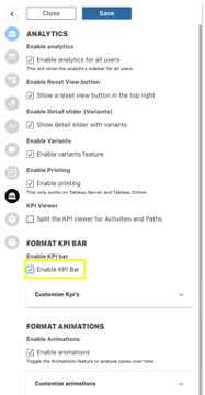
Analytics Tab
In the analytics tab you will have full control of what analytics options are shown with your process mining interface for dashboard users. Enable and disable analytics, variants, printing and animations etc.
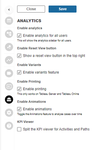
Enable analytics for all users
This is the “Main Switch” to enable or disable the analytics pane for your dashboard users. The analytics pane is the left sidebar shown in the screenshot below.
Enable reset view button
This enables the automatic resize view button that allows dashboard users to zoom to the ddefault format of the process map.
Enable variants
This will enable/disable the button to show the Variant Analysis screen where all variants are shown with different KPI’s as bar charts. With the button disabled Dashboard users can never access the Varaint screen.
Enable printing
Tableau Server and Tableau Online do not support the printing/exporting of web elements. That is why we have integrated a printing button that allows you to export your Process Map to a PDF file. With this switch you can aneable/disable the showing of the print button for dashboard users.
Enable animations
The ProcessMining extension supports animations of cases flowing through your process (End Date/Timestamp is required). This option enables or disables the option to play animations for dashboard users.
KPI Viewer
This option allows Dashboard users to select different KPI’s for activities and Paths independently. An example is shown in the screenshot below where the activities show the mean duration and the paths show the number of hops
General Format
Here you able to change the general look of your viz such as background color as well as changing the layout.
Layout
The ‘Dot’ layout is the default view presented when using Process mining. The flow starts at the top and ends at the bottom. The ‘Circo’ layout will be presented as a circle.
Direction
Use the dropdown to change the direction your flow is presented. By default the extension uses the Top Down direction. This may help when your dashboard requires a horizontal container, changing it to ‘Left -> Right’ will give you the best view.
Background Color
Match your dashboard color by changing the background color. Be sure to format your nodes and link colors to ensure they don’t clash with your chosen background color.
Reset position
Have your viz reset to its default position once data has been changed. This will help you to not miss any important changes. Once clicked and saved, reload the extension for the changes to be implemented.
Usage of the Analytics Pane
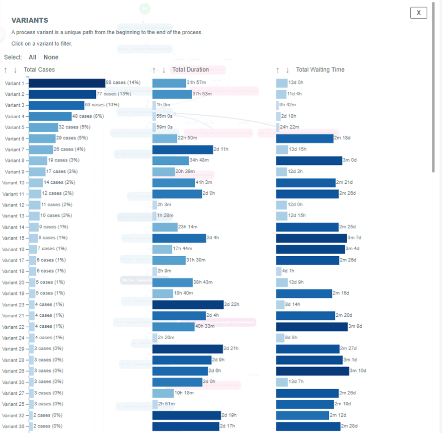
Tableau Desktop does not allow this Print to PDF function. The use is solely restricted to the Tableau Server or Tableau Online platform.
View
Choose from the list of which KPI you would like to see represented in your process, click and instantly see the process visualized. All nodes will show your chosen measure and all links will show the time between the two activities.
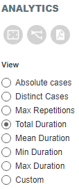
Below you will find a brief explanation of which each one will show in the viz.
Absolute Cases – Your process map will show all hops that are present in your dataset. If a case passes an activity or link twice it will be represented/counted as 2 when you selected this KPI. You may notice that some nodes will show more than the original amount of cases, this is because each node represents how many cases run through it including all that divert to another activity and run back through. Showing absolute cases will give you a good view of which activities are the most active as well as the least.
Distinct Cases – Choosing distinct cases will show all unique cases within your dataset, but each activity or path will only count and represent distinct unique cases, any node that has multiple ‘hops’ from a single case will just show the single case. Your KPI can never show a bigger value than the total number of Unique cases in your dataset!
Max Repetitions – Rather than the showing the number of cases this will count the maximum number of repetitive ‘hops’ for an activity and/or a path. Vital information like this can quickly show you your processes bottlenecks. If a single cases passes a specific activity and/or path 11 times and no other cases will top that, the KPI shown on the activity and/or path will be ‘11’.
Total Duration – Show the total duration of time taken through your process. This will show the time taken per activity on the activity labels as well as waiting times on the paths labels. It is the SUM of all ‘activity time’ on the activities and the SUM of all ‘waiting time’ on the Paths.
Mean Duration – Show the mean time through your process. Mean time will show the average time spent per case in the activities and paths (waiting time). This is the most popular view used in Process Mining. Many times it’s important to see the average time to get a feel for which activities are the bottlenecks of your process. Is the average duration of a particular activity longer than expected? Are there any surprising results?
Min Duration – Setting your view showing ‘Min Duration’ will show you the shortest duration from all cases on Activities and Paths. This could give you insight in to how quick an activity can be done or the time taken to start an activity. Why aren’t the other cases as quick? Good information, shown clearly.
Max Duration – The max duration will show the longest time taken for each activity or path. Was you aware one activity could take as long as the data is showing? Has this one time effected the average time much? An idea would be to compare to the min time to see the differences.
Custom – Use the drop down to run a custom measure aggregation through your process flow.
Animations
A very visual and much requested feature for the ProcessMining extension is to animate how cases flow through the entire process. This brand new function shows the flow of cases in a 5 minute animation. It really shows congestions in your process and helps identifying bottlenecks. You can easily speed up or slow down the animation. The animation will use the minimum of the start time in your dataset as the first moment and the maximum of the end time (if present) as the end mark.
The animation is calculated using the endtime of an activity and the starttime of the next activity. The animation is showing the waiting time between 2 activities. We are working on animating the duration time which is the time a case spends in an activity.

To have animations shown in your process flow, use the buttons in the pane. The 4 available buttons are Play, Stop, Increase speed & decrease speed. Once you press play you will see the animation start and will be shown the speed that’s depicted in the animation. Use the buttons to increase or decrease the speed to get true value from the animations to find the bottlenecks.
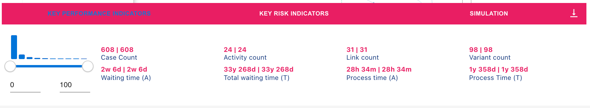
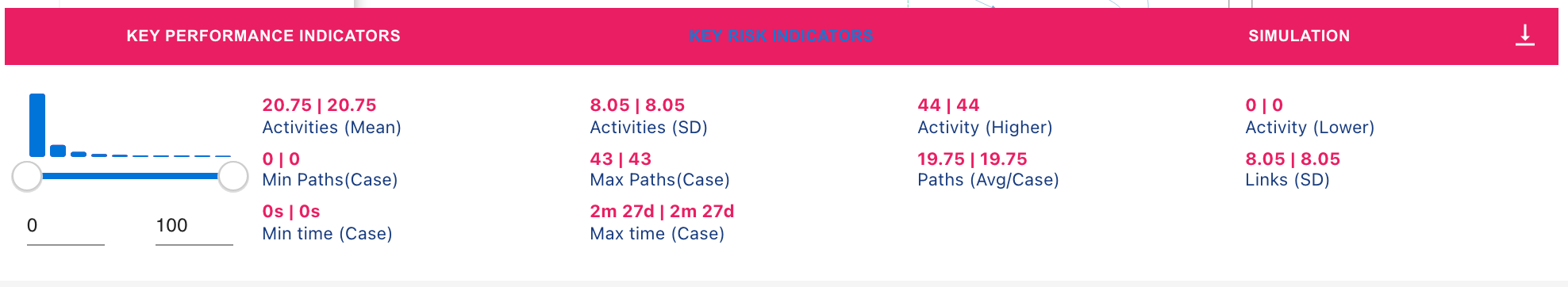
Analyzing using the KPI and KRI Bar
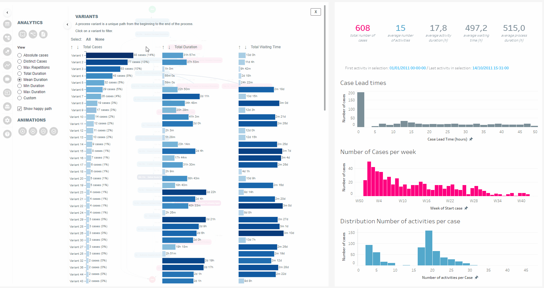
In the analytics configuration pane, you can enable the Key Performance Indicator (KPI) bar. By doing so, a bar will appear at the bottom of the container displaying the detail slider and the several KPI’s, Key Risk Indicators (KRI) and Simulation Options. These KPIs and KRIs measure the performance and risks of the entire process. They do not represent individual activities or paths.
KPI and KRI Summary
Key Performance Indicators (KPIs)
- Case Count: Total (unique) number of cases
- Activity Count: Total number of activities
- Link Count: Total number of paths
- Variant Count: Total number of variants
- Waiting Time (A): Average time cases spent as waiting time (requires end date/time stamp per activity)
- Waiting Time (T): Total time cases spent as waiting time (requires end date/time stamp per activity)
- Process Time (A): Average time cases spent in the total process (activities plus waiting time)
- Process Time (T): Total time cases spent in the total process (activities plus waiting time)
Key Risk Indicators (KRIs)
- Activities (Mean): Mean number of activities per case
- Activities (ST): Standard deviation of number of activities per case
- Activities (Higher): Maximum number of activities per case
- Activities (Lower): Minimum number of activities per case
- Min Paths (Case): Minimum number of paths per case
- Max Paths (Case): Maximum number of paths per case
- Paths (Avg/Case): Average number of paths per case
- Paths (SD): Standard deviation of number of paths per case
- Min Time: Minimum time spent in the process (one case)
- Max Time: Maximum time spent in the process (one case)
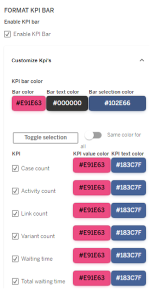
Formatting the KPI/KRI Bar
As a designer you decide which KPIs and KRIs to display by using the checkboxes in the customization pane. The appearance of the KPI bar can be customized to fit within the thematic guidelines of the rest of your dashboard and ProcessMining experience. Each KPI or KRI can also be individually styled, or a general style can be applied to all measures at once.
KPI and KRI details
Key Performance Indicators (KPIs) and Key Risk Indicators (KRIs) are essential metrics used in process mining to measure and evaluate process performance and identify potential risks. Here’s a description of each:
Key Performance Indicators (KPIs):
KPIs are quantifiable metrics that provide insights into the performance and efficiency of a process. They help measure how well a process is meeting its objectives and can be used to monitor, analyze, and improve process performance. KPIs are typically aligned with the goals and objectives of an organization or specific process. By tracking and analyzing KPIs, process analysts can identify bottlenecks, inefficiencies, and areas for improvement. KPIs provide a quantitative basis for decision-making and performance management.
Example: In a customer service process, some KPIs might include Average Resolution Time, Customer Satisfaction Score, First-Contact Resolution Rate, or Number of Service Requests Handled per Agent. These KPIs would provide insights into how efficiently and effectively the customer service process is performing, helping identify areas for improvement or resource allocation.
Key Risk Indicators (KRIs):
KRIs are metrics used to identify and monitor potential risks associated with a process. They help organizations proactively identify and mitigate risks that may impact process performance, compliance, or overall business objectives. KRIs are designed to measure and track specific risk factors or indicators that are critical to the organization. By monitoring KRIs, organizations can detect early warning signs, trigger risk mitigation actions, and ensure adherence to compliance regulations.
Example: In a financial transaction process, some KRIs might include Average Transaction Value, Percentage of Transactions Above a Certain Threshold, Number of Suspicious Transactions, or Frequency of Failed or Rejected Transactions. These KRIs would help identify potential risks such as fraud, non-compliance, or operational inefficiencies in the financial transaction process, allowing organizations to take appropriate actions to mitigate those risks.
Both KPIs and KRIs play a crucial role in process mining by providing objective measures and insights into process performance and risk exposure. While KPIs focus on evaluating performance and efficiency, KRIs focus on identifying and managing risks. By monitoring and analyzing these indicators, organizations can make informed decisions, optimize processes, and ensure that performance objectives are met while mitigating potential risks.
- Case Count: This KPI represents the total number of unique cases in the event log. It provides an overview of the volume or size of the process dataset.
Example: Let’s say you have an event log of a customer support process. If the Case Count KPI shows 500, it means that there are 500 unique cases (e.g., 500 customer support requests) recorded in the event log.
- Activity Count: This KPI indicates the total number of activities recorded in the event log. It provides insights into the complexity or granularity of the process.
Example: Suppose you are analyzing a procurement process. If the Activity Count KPI displays 100, it means that there have been 100 unique activities involved in the procurement process, such as “Create Purchase Order,” “Receive Goods,” or “Approve Payment.”
- Link Count: This KPI represents the total number of paths or transitions between activities in the process. It helps identify the complexity of the process flow and the presence of alternative or parallel paths.
Example: Consider a loan approval process. If the Link Count KPI shows 200, it means that there have been 200 transitions or links between activities in the loan approval process, representing the various paths taken by loan applications through different stages.
- Variant Count: This KPI indicates the total number of distinct process variants or sequences of activities observed in the event log. It helps understand the process’s flexibility and the existence of different process paths.
Example: Let’s say you are analyzing an order fulfillment process. If the Variant Count KPI displays 10, it means that there are 10 different process variants observed in the event log, representing various ways orders have been fulfilled based on different conditions or decisions made during the process.
- Waiting Time (A): This KPI represents the average time cases spend in a waiting state between activities. It requires end date/time stamps per activity to calculate waiting times accurately.
Example: Suppose you are analyzing a patient care process. The Waiting Time (A) KPI might show an average waiting time of 2 hours, indicating that, on average, patients spend 2 hours waiting between different medical procedures or consultations.
- Waiting Time (T): This KPI represents the total time cases spend in a waiting state between activities. It requires end date/time stamps per activity to calculate waiting times accurately.
Example: Imagine you are analyzing an IT support process. The Waiting Time (T) KPI might display a total waiting time of 50 hours, indicating the cumulative waiting time across all cases in the event log between the submission of support tickets and their resolution.
- Process Time (A): This KPI represents the average time cases spend in the entire process, including activities and waiting times. It provides insights into the overall process duration per case.
Example: Consider a travel booking process. The Process Time (A) KPI might display an average process time of 5 days, indicating that, on average, it takes 5 days for a travel booking case to go through all the necessary activities and waiting times before completion.
- Process Time (T): This KPI represents the total time cases spend in the entire process, including activities and waiting times. It provides insights into the cumulative process duration across all cases.
Example: Let’s say you are analyzing a manufacturing process. The Process Time (T) KPI might show a total process time of 1,000 hours, indicating the combined time spent by all cases in the event log from the start of the process until completion.
These KPIs help quantify and analyze different aspects of the process, such as its size, complexity, time durations, waiting times, and variations. By monitoring and analyzing these KPIs, process analysts can gain valuable insights into process performance, identify bottlenecks, and make data-driven decisions for process improvement.
- Activities (Mean): This KPI represents the mean or average number of activities per case in the event log. It provides insights into the typical number of activities executed per case.
Example: Suppose you are analyzing an employee onboarding process. The Activities (Mean) KPI might display an average of 8 activities per case, indicating that, on average, employees go through 8 different activities during the onboarding process.
- Activities (ST): This KPI represents the standard deviation of the number of activities per case in the event log. It measures the variation or dispersion in the number of activities across cases.
Example: Consider a project management process. The Activities (ST) KPI might show a standard deviation of 2, indicating that the number of activities per case varies by approximately 2 activities on average.
- Activities (Higher): This KPI represents the maximum number of activities observed in a single case within the event log. It indicates the highest number of activities executed in a single instance of the process.
Example: Let’s say you are analyzing a software development process. The Activities (Higher) KPI might display 15, indicating that one particular case in the event log had the highest number of activities observed, involving 15 different tasks.
- Activities (Lower): This KPI represents the minimum number of activities observed in a single case within the event log. It indicates the lowest number of activities executed in a single instance of the process.
Example: Imagine you are analyzing an order processing process. The Activities (Lower) KPI might show 3, indicating that there is at least one case in the event log with the minimum number of activities observed, involving only 3 tasks.
- Min Paths (Case): This KPI represents the minimum number of paths or transitions observed in a single case within the event log. It indicates the lowest number of paths taken by a case.
Example: Suppose you are analyzing a customer complaint resolution process. The Min Paths (Case) KPI might display 1, indicating that there is at least one case in the event log with the minimum number of paths observed, representing a straightforward resolution without any deviations or alternative paths.
- Max Paths (Case): This KPI represents the maximum number of paths or transitions observed in a single case within the event log. It indicates the highest number of paths taken by a case.
Example: Consider a supply chain process. The Max Paths (Case) KPI might show 5, indicating that there is at least one case in the event log with the maximum number of paths observed, representing a complex supply chain scenario involving multiple decision points and alternative paths.
- Paths (Avg/Case): This KPI represents the average number of paths or transitions per case in the event log. It provides insights into the typical number of paths followed by cases.
Example: Let’s say you are analyzing a customer support process. The Paths (Avg/Case) KPI might display an average of 3 paths per case, indicating that, on average, customer support cases follow 3 different paths based on various conditions or decisions.
- Paths (SD): This KPI represents the standard deviation of the number of paths per case in the event log. It measures the variation or dispersion in the number of paths across cases.
Example: Suppose you are analyzing a logistics process. The Paths (SD) KPI might show a standard deviation of 1.5, indicating that the number of paths per case varies by approximately 1.5 paths on average.
- Min Time: This KPI represents the minimum time spent in the process by a single case within the event log. It indicates the shortest duration from the process start to completion for a specific case.
Example: Imagine you are analyzing an insurance claims process. The Min Time KPI might show 2 days, indicating that there is at least one case in the event log where the claim was processed and resolved within 2 days.
- Max Time: This KPI represents the maximum time spent in the process by a single case within the event log. It indicates the longest duration from the process start to completion for a specific case.
Example: Consider a patient treatment process. The Max Time KPI might display 30 days, indicating that there is at least one case in the event log where the patient treatment process took a maximum of 30 days from admission to discharge.
These additional KPIs provide further insights into the characteristics, variations, and durations of activities and paths within the process. By analyzing these KPIs, process analysts can identify outliers, measure process efficiency, and uncover potential areas for improvement.
We love to make solutions and help Tableau users to do things more efficiently. If you have feedback, ideas, questions or need support, please make sure to share it with us! Also, don’t forget to follow us on social media for our latest news and updates.