Energy Consumption and CO2 Emission Dashboard with Tableau Extensions
We have created a dashboard about energy and utilities in the Netherlands, which is aimed to give the users a magazine like reading experience.
Extensions have been used to enhance the look and value in this dashboard, in this blog we will dive into how those extensions are used.
Featured Extensions:
ShowMeMore, PictureThis
Electricity access
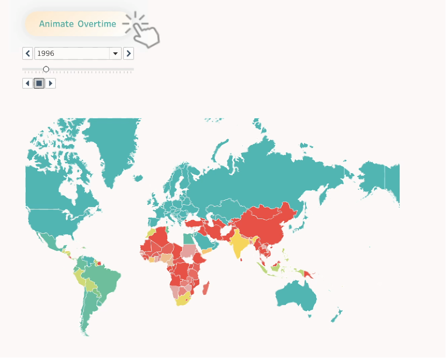
The journey starts with a map where you can view animated electricity access in the world overtime:
Energy Consumption
The Sankey chart has been used to show the percentage of different types of energy consumed in the Netherlands. This is a great way to split the proportion in a stylish way whilst hovering or filtering:
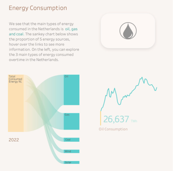
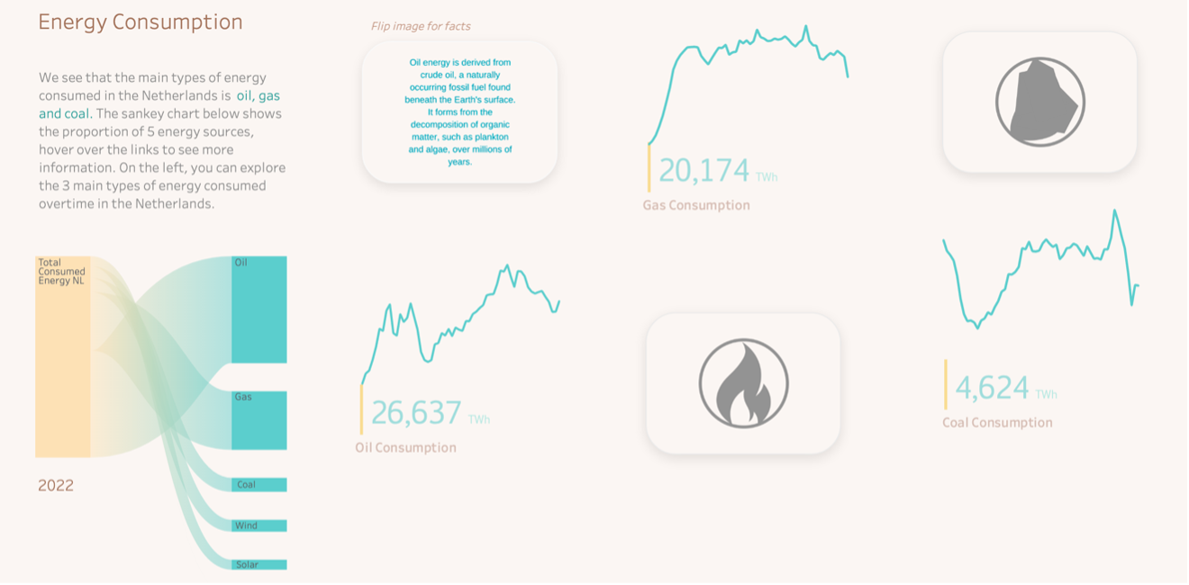
Next, you can explore the trends overtime of the 3 main types of energy consumed. The PictureThis Extension has been used to create the tiled images of different energy types.
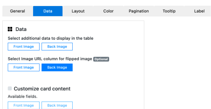
In this example, the Flip Image feature within the Extension has been selected:
When hovering over the chart, this allows us to view some facts about where the type of energy is derived from:
Electricity production
The Horizon chart from ShowMeMore has been used to show the amount of energy produced overtime, the darker the area, the higher the production.
You can also explore the electricity production overtime from different sources such as wind, hydro, solar and bioenergy:
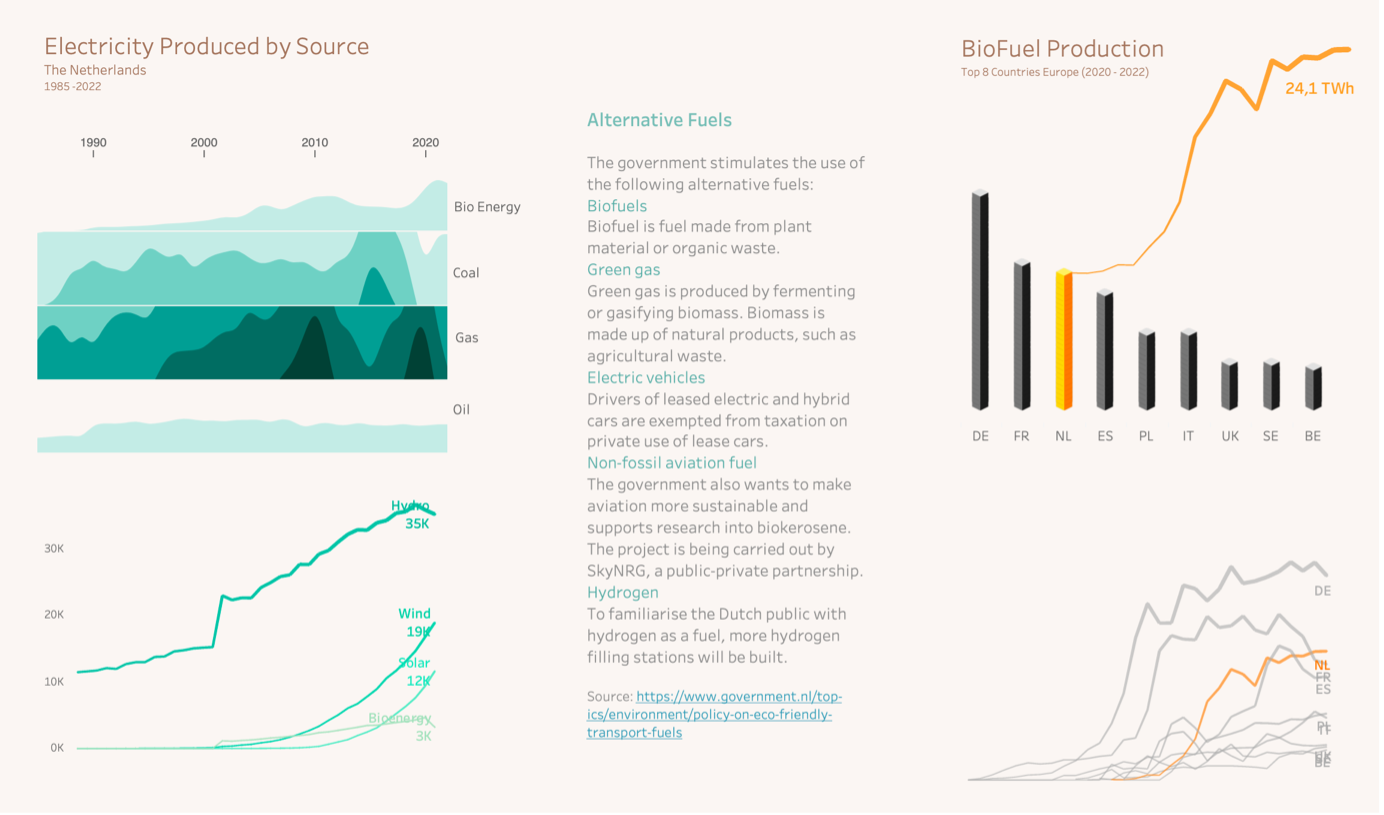
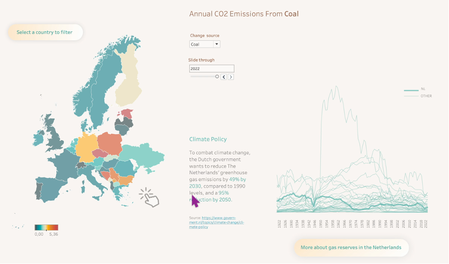
Finally you can use the parameter to explore the Co2 emissions from oil, coal or gas within Europe, as well as viewing the emissions overtime per country:
Start your Journey
We hope you enjoyed learning about this dashboard and the Extensions used.
The dashboard is also available to download from the link below.
