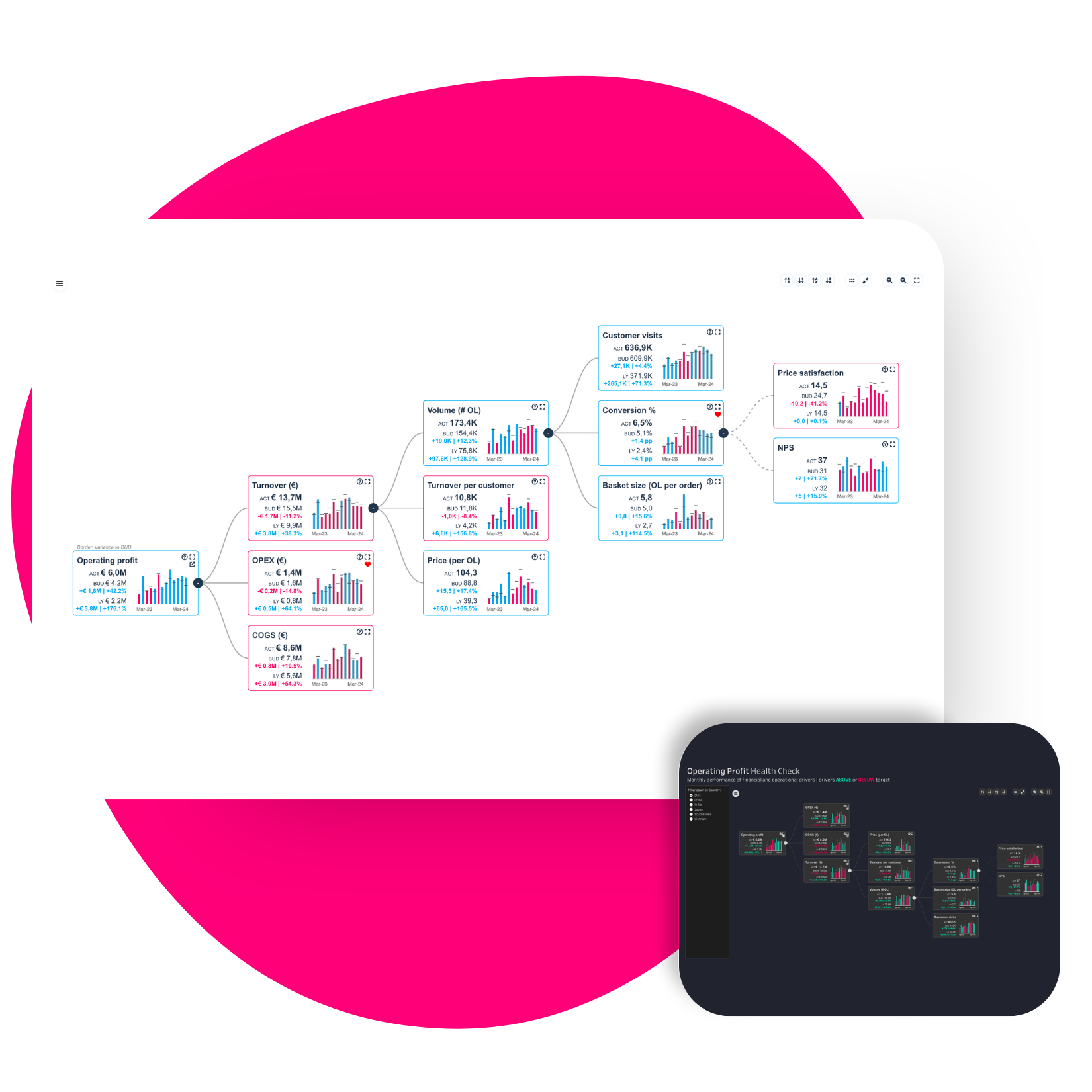
Crafting an Operational Planning & Target Setting Dashboard with PowerKPIs
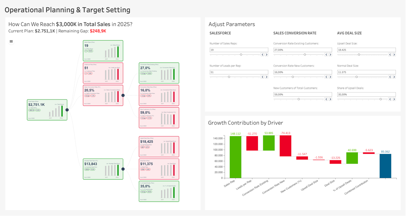
The Operational Planning & Target Setting Dashboard is a powerful solution designed to visualise and adjust (key performance indicators) KPIs, allowing businesses to see what it takes to achieve their ambitious goals. In this example, the dashboard aims to answer the question “How can we reach $3,000K in total sales by 2025?” in real-time.
To access the complete demo workbook and all the use-cases download it for free.
in this blog, we’ll walk through building a simplified version using Superstore data that maintains the same powerful analytical capabilities, so you can customize it to fit your own business needs and goals.
Business Value and Adaptation
For businesses, this dashboard serves as both a strategic planning solution and an operational guide. It can be customized to reflect unique performance drivers, adapting to diverse industries.
Breaking Down the Dashboard
1. Target Visualization with PowerKPIs Tree
The central decomposition tree illustrates a breakdown of key metrics, such as Leads per Rep, Sales Conversion Rate, and Average Deal Size. Each node shows the current plan versus the target, accompanied by mini bar charts to track the yearly trends.
2. Interactive Parameter Adjustment for Scenario Planning
The Adjust Parameters panel on the top right allows users to control key drivers. Adjusting these parameters automatically updates the values within the KPI cards, instantly showing how each change affects the projected total sales.
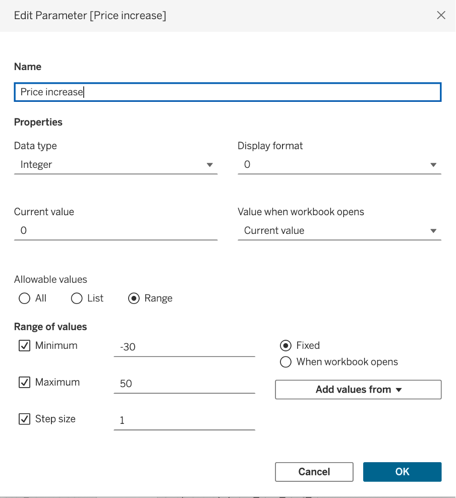
Start with a new tableau worksheet and connect to superstore dataset. To set up the adjustment panel, we start by creating a parameter for the percentage of price change.
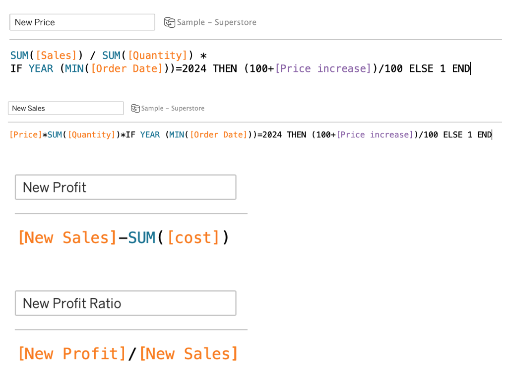
Then we create new measures based on the changed price,
in this example changing the price will change the sale, profit and profit ratio so we need four new measures for the main value.
Meaning that for 2024, we will use the parameter to set the goal, and for other dates, we will only use the main measure on the KPI card.
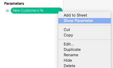
Show the parameter on the sheet to be able to interact with it. you can create a parameter per measure in your own use-case and define the criteria based on your own objectives.
Lets build the tree together
To set up the tree we need the PowerKPIs Extension.
Locate to the trex file on your system or use the free version to see a screen on the second picture.

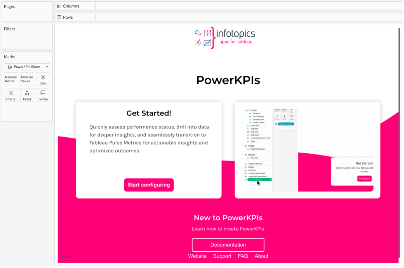
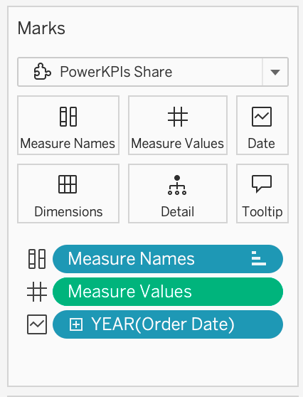
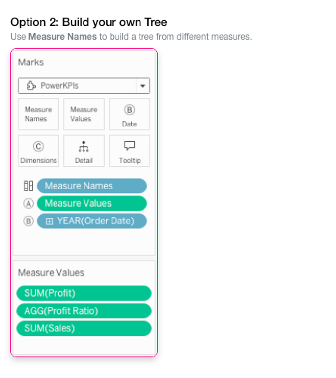
Then we need to add the required fields in the Marks pane (measure names, measure values and order date).
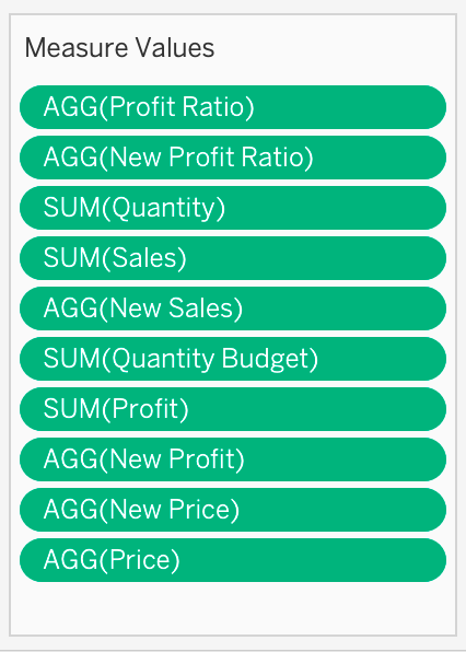
After we add Measure Names to the marks pane, we remove the measures that we don’t want to be a part of the tree. Each measure will be shown in one KPI card. We also add the measures that we created in the previous step for the comparison.
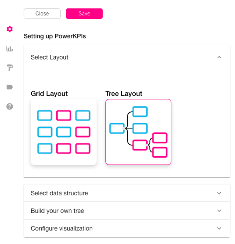
Once done click on the gear icon to start:
Select the Tree layout
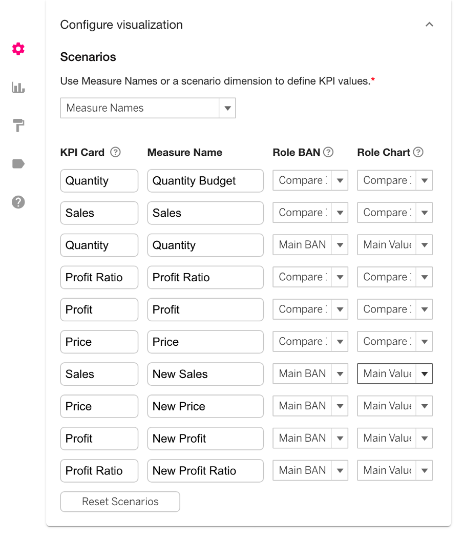
In this step you need to determine which measures should be the comparison values and which ones should be the main values on a kpi card.
The text in the ‘KPI Card’ column has to be the same for the main and comparison values, and it will be the name shown on each card.
Note that the measures that have the parameter in their calculation are the main values here.

Select the second option for data structure (build your own tree).
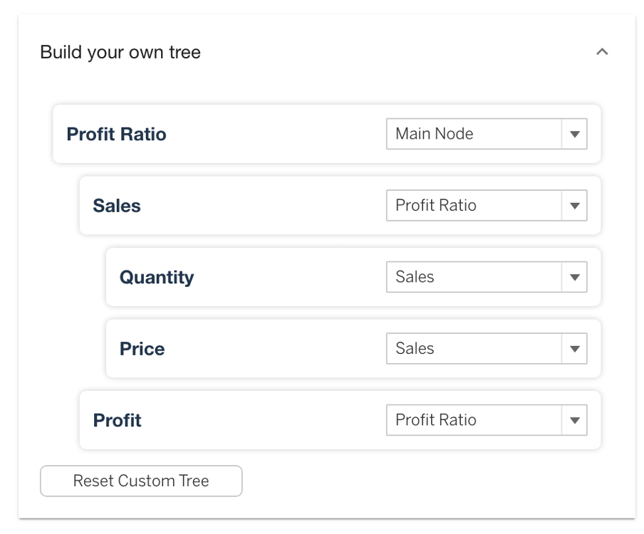
And the last step. It’s time to build your tree. You will define a main node, and from there, for each measure, you have to select one measure from the dropdown as its parent node until you are done with all the measures.
When you save the setting you will be able to see the tree as below:
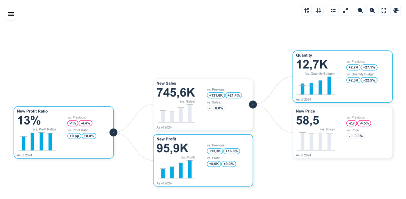
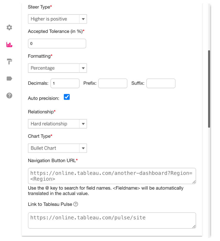
The chart type on cards can be selected from a drop down menu in the style KPI cards tab in configuration panel, we keep bar chart for all of them in this example.
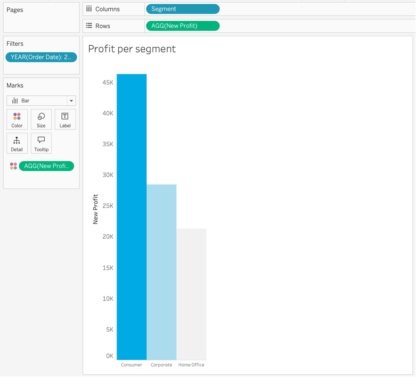
An optional step is to add another chart next to PowerKPIs, here we have a simple bar chart to filter the tree for each.
And the final dashboard is ready:
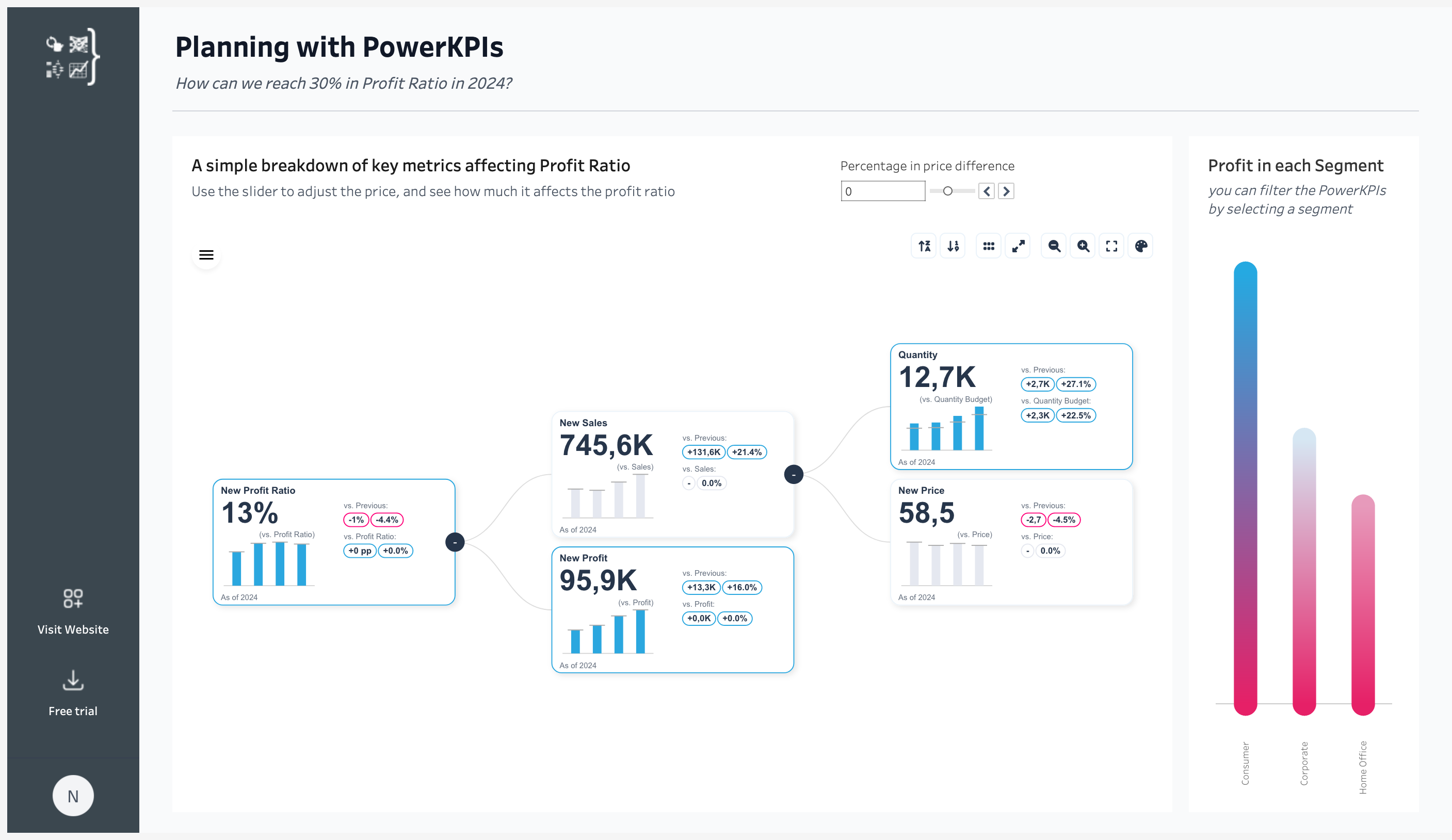
Here we can answer a similar question, for instance how can we reach 30% growth in profit ratio in 2024 and by adjusting the parameter you can find out the answer.
Business Value and Adaptation
Imagine a SaaS company aiming to increase subscriptions. By implementing the Operational Planning & Target Setting Dashboard, the company’s leadership is able to take a more strategic approach. The decomposition tree allows them to break down their top-line target into granular drivers like lead volume, conversion rates, and average deal size. And the interactive parameter adjustment feature empowers the sales team to experiment with different scenarios in real-time.
Now, when the VP of Sales needs to report on progress towards the annual subscription goal, she can quickly pull up the dashboard and show exactly what levers the team needs to pull to get back on track. With data-backed decisions and the ability to course-correct on the fly, hitting those stretch targets is no longer a daunting challenge – it’s an achievable, measurable objective.
And this is just one example of million possibilities for this solution.
This flexibility, powered by PowerKPIs, and Waterfall chart makes the Operational Planning & Target Setting Dashboard a versatile solution that empowers teams to explore data-driven strategies and optimize performance. By experimenting with various scenarios, businesses can stay agile, and ensure their plans align with both current realities and future goals.
Want to try it yourself? Get started for FREE!
