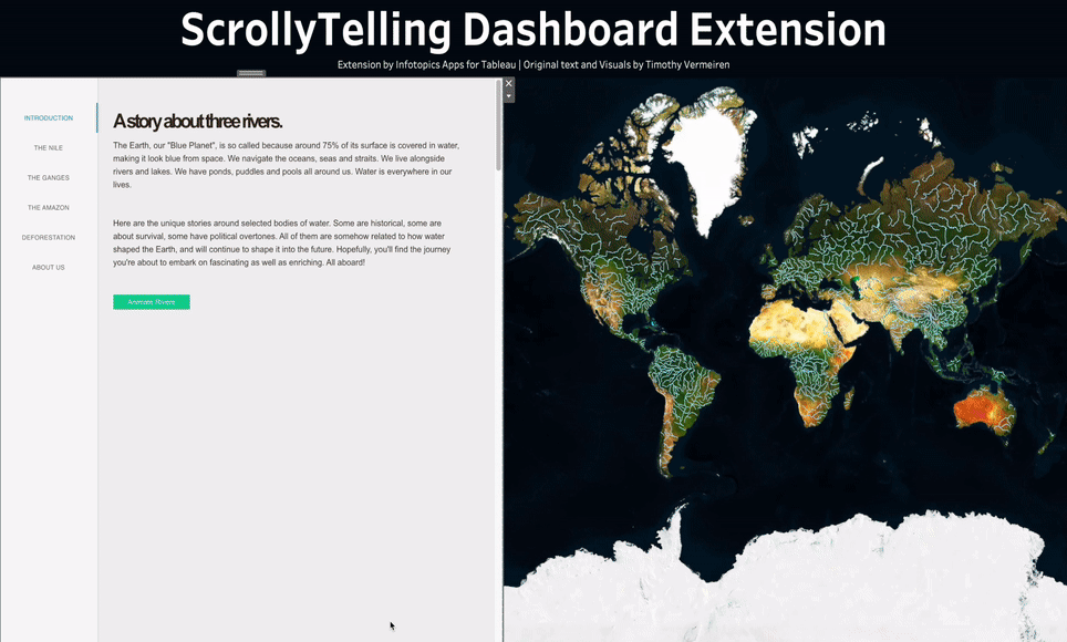
Introduction to ScollyTelling
Creating stories with extensive amounts of text, motivations, conclusions and rich layout functions combined with illustrative visualisations is not easily done in Tableau. Even though tableau allows you to add story points to create bullet-point stories, a very welcome function in explaining the findings of your analysis in predefined clicks or guiding your visitors along with your dashboards. However, don’t you think you need more than that? Something more advanced, Interactive, flexible and extendable? A dynamic way to engage with your audience?
That’s why we bring you an easy-to-use and powerful way of communicating with your dashboard users, ScrollyTelling. ScrollyTelling lets you change the way the dashboard user interacts with a dashboard. Imagine a new way of data-driven stories in your dashboard, where the story changes the look and feel of the dashboard as you progress. It lets you show the appropriate Tableau vizzes/illustrations where you want them to show up in your story. Allow animations in your dashboards and use the set of filters, parameters and highlights to create stunning stories with impact. All without ever leaving the dashboard.
- Allow dynamic settings of filters, highlights and parameters
- Create the best-looking stories
- Animate visuals while your visitor scrolls the content of your story
- Scalable subscriptions
- Online in seconds – no complicated setup required
- No programming skills – drag and drop and start creating your dialogues
Creating your first story with ScrollyTelling
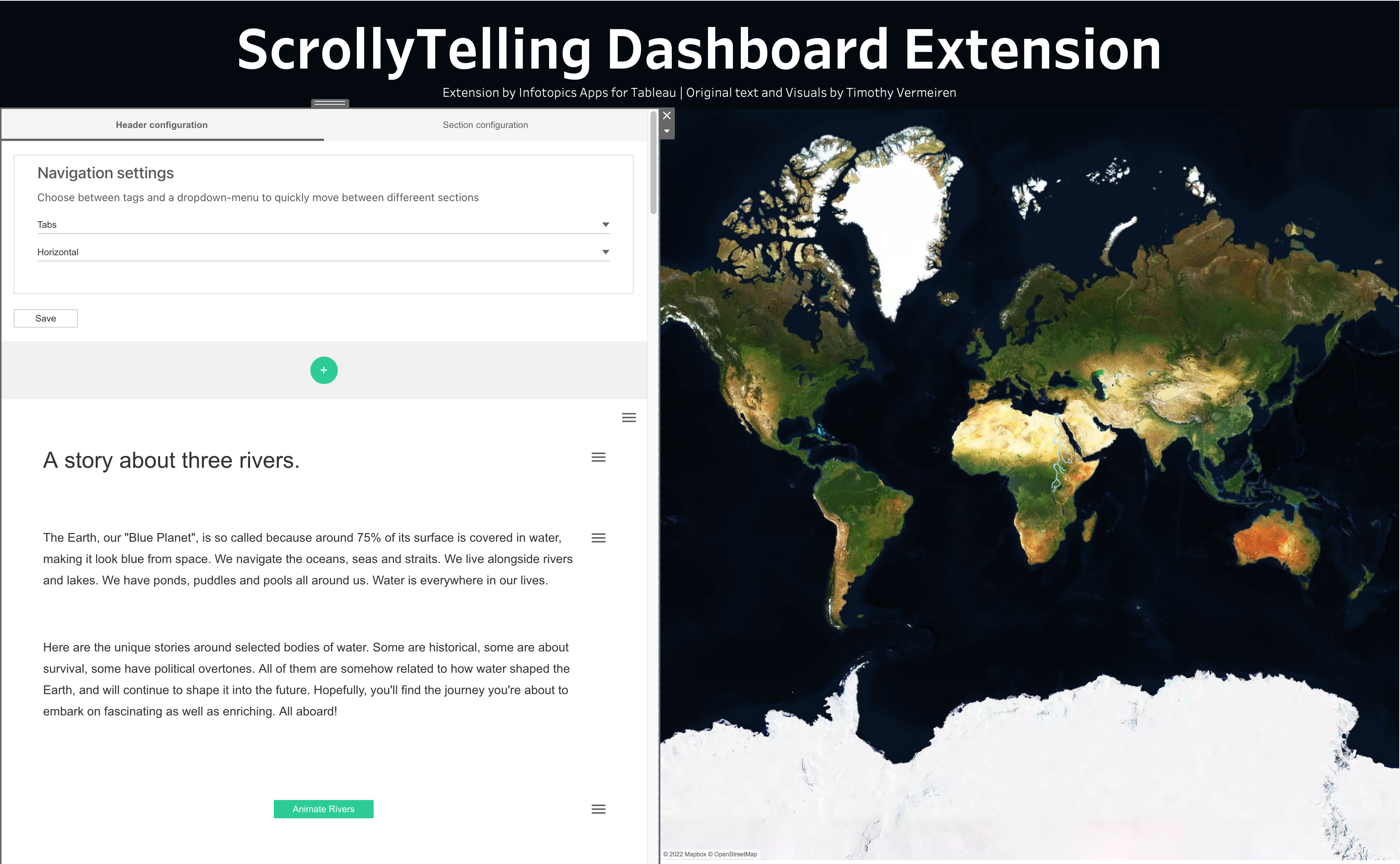
Let’s start your first section! Click on configure in the extension dropdown this will open the edit mode where you will be presented with options to create a story as well as to configure the look and feel of it. The two tabs at the top are to configure the layout and the navigation options. The green plus button is where you actually start the story. Let us begin with how to write your first interactive story with ScrollyTelling.
Creating your story
In the configuration pane below the tabs will get you started with the story. Try to imagine sections as a block in your story, for example, an explanation of a particular viz, inference etc. The stories are created by using sections and can be separated by the gradient option.

On click, you generate a section container which will hold your block of story. Now it’s time to decide what type of content you want to add to that section. On hover, you can see a plus button (with grey background) inside the section you just created. On click, you will be presented with three options to decide what kind of content you want to add to the section

A paragraph holds the textual content of the story, it can be a heading or a brief description of what you want to convey with the respective block of the story. Media lets you add either an image or a youtube video. The third one is the most powerful one where you can create custom tableau actions which can trigger various custom dashboard actions.
Open your story by choosing a paragraph. This opens a text box for you to begin to tell your story. Highlighting your text will give you options to style your text for example you can choose the H1 or H2 option from the context menu to create a title. Later when you configure the layout you can opt to generate the accordion (which will be explained later) text from the H1 tags or a custom one .
.
When choosing media you will be prompted on whether you would like an image or a Youtube link in your story. Simply place your copied link and hit the save button. Your video link can either be a video ID or URL. The video’s unique ID will be saved.

Tableau Actions
Make your story interactive by adding Tableau actions. This is the core part of this extension with which you can make your dashboard stand out. Here you can create a custom button which can be configured to trigger a specific or a series of tableau actions, like a highlight, or a filter. You can also change the visual with the help of a parameter-based switch.

Here you can see a list of actions which you can customize. Animations are basically filter or highlight actions which is triggered on a predefined time interval.

You can also configure a tableau action on scroll without a button. If you press the hamburger menu for the sections (the blocks ) you can see a pane with a tableau action section. there you can configure similar actions scroll without the need for a button. It is also important to configure "at what time instance you want to initiate the action" if the percentage is set to 30% that means the action will execute when 30% of that section is visible on the screen.
Setting up a Tableau Action
ScrollyTelling offers various configurable tableau actions to enhance your story. The following sections help you to get started with tableau actions. The guide might not go through all the actions as the configuration part is similar. In the following sections, you can find steps to configure the parameter actions and the filter animations.
Parameter Action
A parameter action within your story will load the sheet targeted within your parameter. First, let's set up a parameter to link to. Within your worksheet create a parameter, see our example of how we set up one of ours.
Step 1 – Create your parameter. Name it so it’s easily identifiable in which parameter you wish to use.
Step 2 – Create a boolean calculation using the parameter to hide or show the container, use the calculation as a filter.
Step 3 – Link to parameter when setting up your parameter action. Choose a parameter from the dropdown menu, select the parameter you just created and finally change the parameter value to the one chosen in the filter.
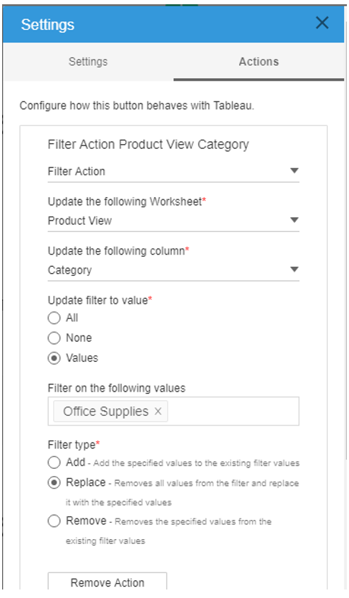
Filter Action
Similarly, you can configure the filter actions to only one value. When telling your story it may be important to show all the data and then be able to filter down on a particular dimension to be able to explain in more detail.
To set up a filter action, head to the settings within ScrollyTelling and choose Filter Action from the first dropdown. Select your worksheet where the filter is stored and then the column you wish to filter on.
Update the filter to value will allow you to show all values, none or to filter the values you choose by clicking on the ‘Filter on the following values’ box
Filter animation
Filter actions trigger a predefined filter to the dashboard. You can configure the same as the parameter configuration. Animations are basically a way to trigger a set of filters with a prespecified time interval. In the configuration pane, you can list This could be a cool feature to show in your story if you’re comparing data over time for example. For example, the GIF below shows filter animations for 4 years.
The configuration is very simple and straightforward. To set up a filter animation, head to the settings within ScrollyTelling and choose Filter Animation from the first dropdown. Select your worksheet where the filter is stored and then the column you wish to filter on.
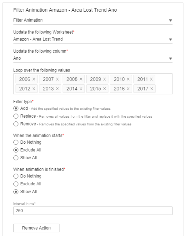

In the configuration pane, you can configure how your filter animations should work. Once you select the sheet and the column you want to apply a filter on, then you can select the values which the filter should loop through.
Filter type: Here you can choose the type of filter action, which works similar to the filter actions in Tableau.
- Add – Add the specified values to the existing filter values, this will keep values displayed in the visual.
- Replace – Removes all values from the filter and replaces them with the specified values.
- Remove – Removes the specified values from the existing filter values.
When the animation starts: A cool feature where you can decide to exclude all before the animation starts. This will show a clear view before the animation starts. Below you will be able to choose what is shown once the animation is finished.
- Do Nothing: Does not apply any filters
- Exclude all: Excludes the specified filters
- Show all: Shows viz with all the filters.
When animation is finished: Here you can specify what happens when the animation is finished.
- Do Nothing: Stops the animation and leaves the filters the last applied the filter
- Exclude all: Removes all applied filters
- Show all: Applies all the filters.
Interval in milliseconds: Type how long in milliseconds each filter action shall take in the text box.
Parameter Animation
Parameter animation can be used to trigger parameter value changes similar to filter actions and animations. One good use case is using parameter to hide or show containers on scroll.
Setting up a parameter – Within your data worksheet right click in the left pane and choose ‘Create Parameter’
Here you will be able to edit your parameter. Choose the data type that correlates to the names of your sheets. Our example sheets are numbered so have set ours as an Integer data type.
To set up a parameter animation button, go to the settings of your button using the hamburger menu. Choose the Parameter Animation from the dropdown as well as your parameter. Enter the names of the sheets you wish to be animated using a comma to separate. Lastly decide in MS how long the intervals should be between each animation.
Highlight action and animation
Highlight areas of your story using the configurable highlight animation tableau action. It highlights certain areas that need the listeners to focus on. Have multiple areas highlighted in a sequence chosen at the speed you determine.
In the configuration menu, you can choose the worksheet and column you wish to apply the highlight on. Similar to tableau you can choose options like highlight 'none' or 'values'. if you select values then you can specify the value you wish to highlight. In the next step you can choose the highlight type and the options are the same as how you configure it in tableau.
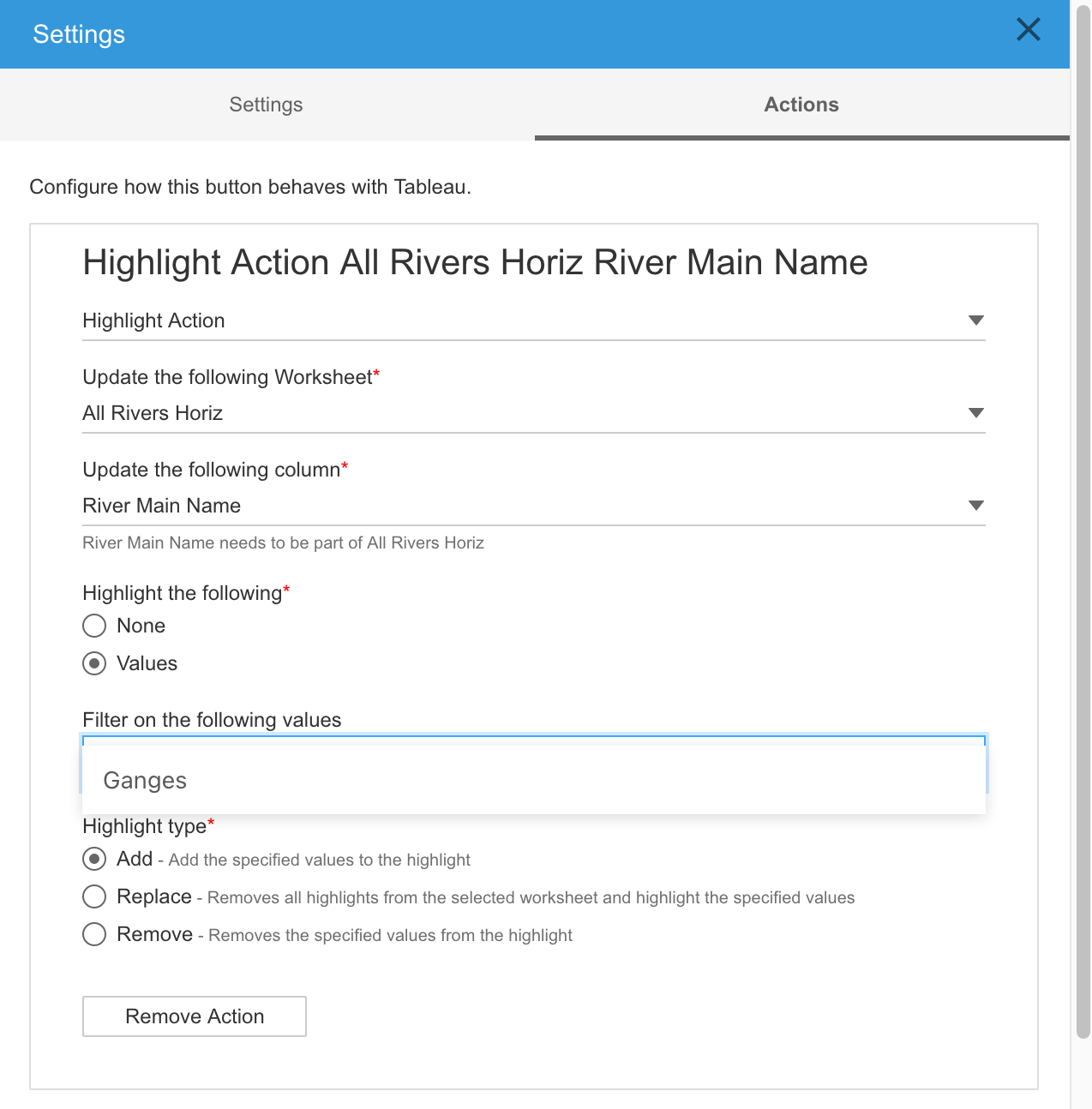
‘Loop over the following values’ is where you decide which values from your chosen column you wish to highlight on. Click within the box to choose your value(s) Decide if you wish to leave the highlighted values or tick the box to clear once the animation finishes. The interval per animation is in milliseconds which can be entered at the bottom.
ScrollyTelling in action.
This small tutorial will give you a better context on how to configure the tableau actions in ScrollyTelling. A combination of some native tableau tricks with ScrollyTelling unleashes a plethora of custom actions to make your dashboard amazing. For example, you can use parameter actions to switch between different visualizations in the dashboard. Here is a small tutorial on how to create a dashboard which changes the worksheet on scroll.
For reference on how the end product looks, you can download our demo workbook from the portal to see the tutorial in action. For this particular example, we use the tableau parameters to switch the visibility of the workbooks.
- Prepare all the visualizations and tableau visualizations needed for the project and use a vertical container in the dashboard to hold all sheets.
- Next, we need an object with resembles a page number. So create a tableau parameter with the datatype "int", and add it to the dashboard, make sure to set the default value as 1.

- Create a calculated field and add the parameter to the calculated field. Create a Boolean like calculation (TRUE/FALSE) and make it show or hide the sheet (by adding the calculation as a filter)

- Add the calculated field which you created in the previous step as a filter in the sheet. Under the general tab click on ‘Custom value list’ where you can enter the value below. This will be the page number you will need when setting up ScrollyTelling parameter actions to show and hide this sheet in the dashboard. Do this on each worksheet with a different value representing a different page in your story.
- Now in the extension configuration, create a tableau action button with the "Parameter action option", then configure with the parameter you created and choose the page you want to be visible when you click on the tableau action button.
- Repeat these steps for all sections and visualizations which you want to switch on scroll or action.

Header configuration
Header configuration lets you choose navigation options for your story. For example, if you are a great storyteller with over 50 sections, scrolling or navigating through the story will be difficult for the reader especially if the reader wants to jump between sections.
To make the navigation in your story easier, there are two types of headers that can be used, dropdowns or tabs. You can position the Dropdown menu on any corner of the extension. By default the section name will be auto-generated (section + section number), you can also choose to have custom text which you can configure while creating the sections. This option can be found if you click the section settings.
You can configure the tabs also in a similar way with the option to position the tabs at the top or at the left side of the screen. The selection highlighter in tabs moves automatically when you scroll through the story.
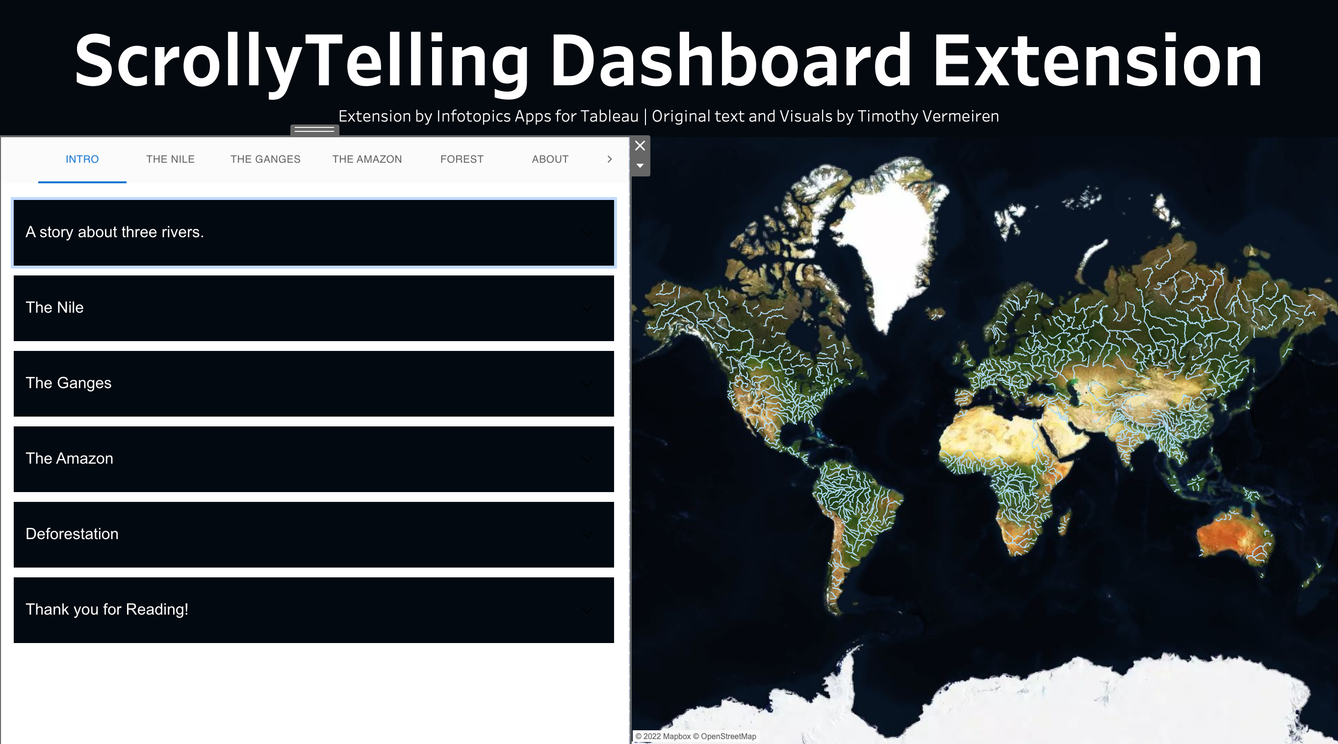
Tabs
Using the tab view will allow you to click on the tab to the section you wish to show in your view. The tabs will stay at the top or to the left of the pane the whole time. When scrolling through your story the tabs will update to show you which section you’re currently visualizing. We recommend using tabs when you have a considerable amount of sections in your story. If you have a larger number of sections an arrow will appear at the end of tabs with which you can scroll through available tabs.


Dropdown
When your story has many sections, using a drop-down menu will best suit your story. Decide where on your viz you’d like to place it in the configuration screen and jump to any section.
Section configuration
New to ScrollyTelling is Accordion sections. Accordion sections will be presented in collapsible headed sections. This allows a more condensed and details story in to a smaller area. Using the section option will give you a continuous story which can be sectioned off with H1 headers for example.
Section View
The section view will show your story as an open page, like you’d see on a website. Each section will be split with the header of the next section.
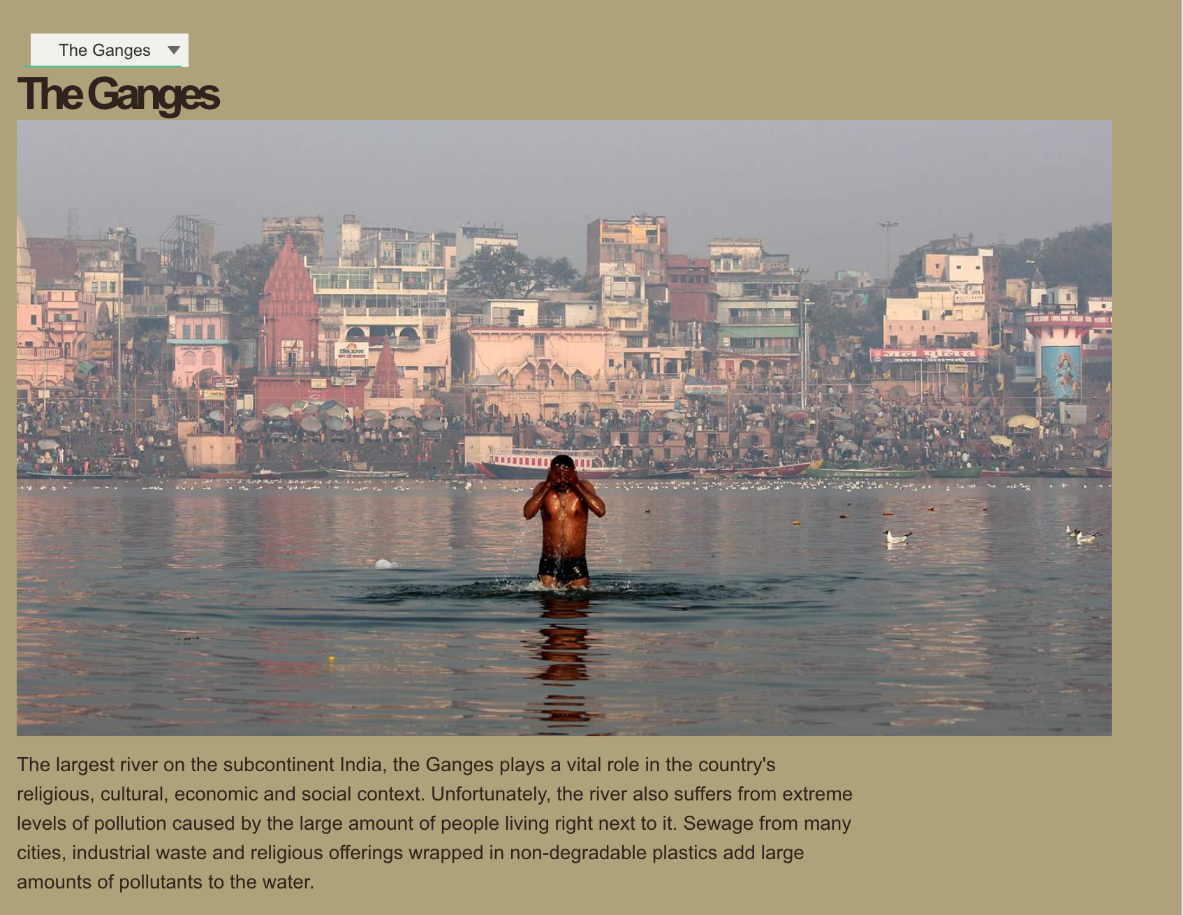
Accordion View
An accordion is a menu composed of vertically stacked headers that when opened will show your story under each header. If your story has parts that you wish to jump to, the accordion headers will make your life easier. Describe what the content on the header to easily navigate to the correct section. When opened your configured worksheets will react to your opened section.

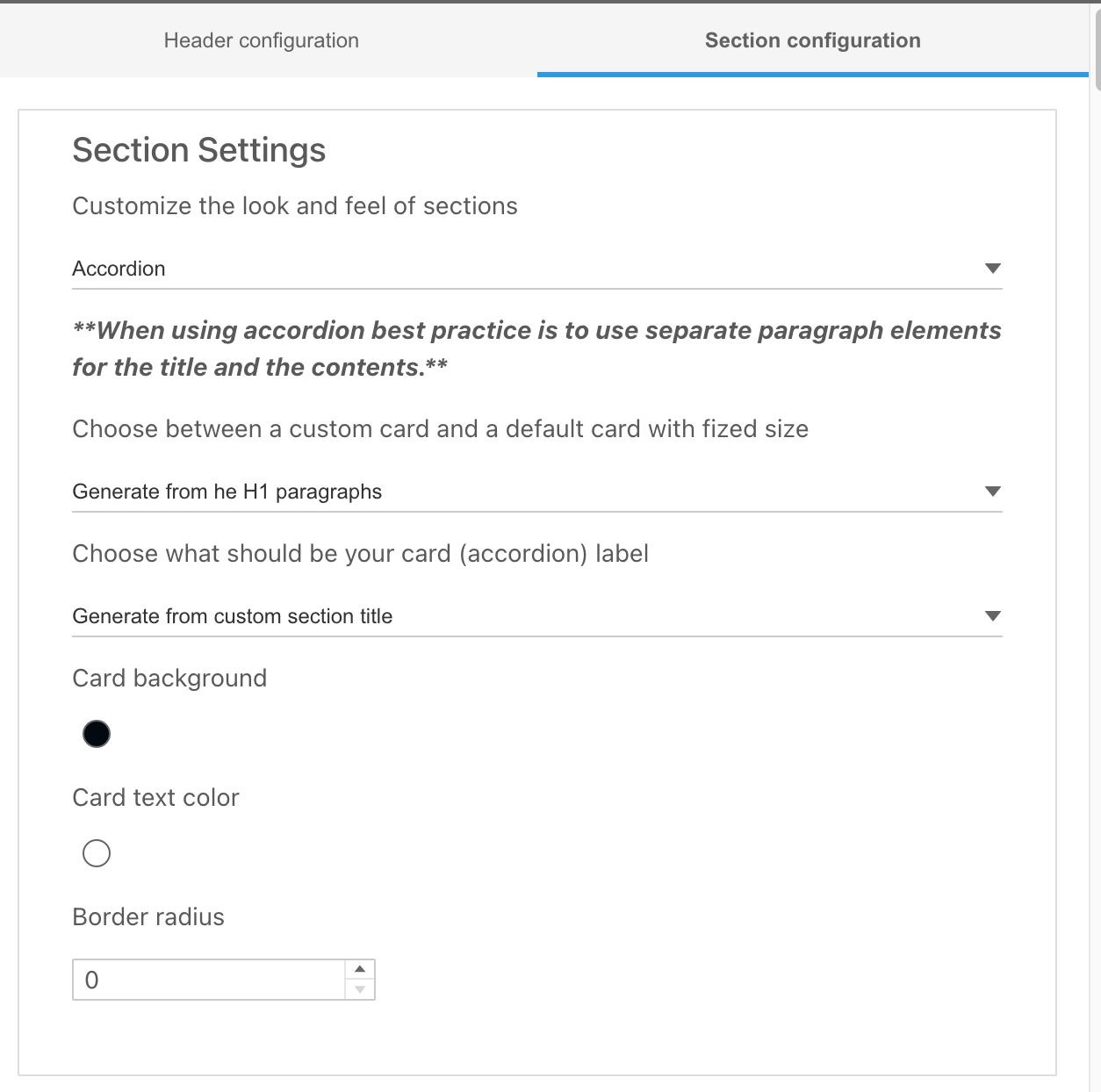
Styling your Accordion headers
In the section configuration tab of the configuration screen, you’re able to format the headers. Decide what headers are shown and their styling.
Choose between a custom card and a default card with a fixed size
Choosing the custom card you’ll be presented with extra options to choose the text size and card size. With the default configuration (generate from H1) the accordion text will be generated from section titles with H1 tag.
Choose what should be your (accordion) label
This is where you decide what text is on the label. This can be fed from the custom section title or from the H1 paragraphs within your section already. The custom section title is the one you save in the settings while creating the sections.
Styling your Accordion headers
In the section configuration tab of the configuration screen, you’re able to format the headers. Decide what headers are shown and their styling.
Choose between a custom card and a default card with a fixed size
This is where you can decide on the size of the accordion headers. Choosing the custom card you’ll be presented with extra options to choose the text size and card size.
Choose what should be your (accordion) label
This is where you decide what text is on the label. This can be fed from the custom section title or from the H1 paragraphs within your section already.
Card Background
The card background option lets you choose the background of accordions
Card text colour
The card text colour option lets you choose accordion text colour
Border radius
The border-radius option lets you choose the accordion border-radius