
This extension adds 10+ visualization types to your Tableau toolkit that are not present in the “Show Me” function of Native Tableau.
Create stunning Sankey Diagrams in minutes, enable your dashboard designers to use Radar Charts or compare sets using super attractive Venn Diagrams and many many more! All with the flexible power and interactivity of Tableau!
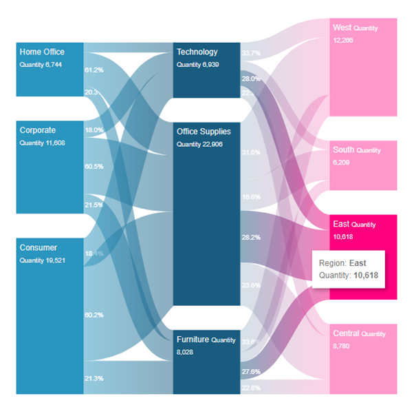
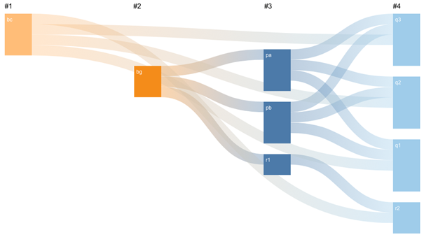
Sankey Diagram
The Sankey Diagram visualizes the flow of a measure over multiple dimensions. Start visualizing the flow of money through your organizations departments or see what paths your visitors enjoy on your website. You can create your first Sankey Diagram in under a minute…
Setting up your datasheet
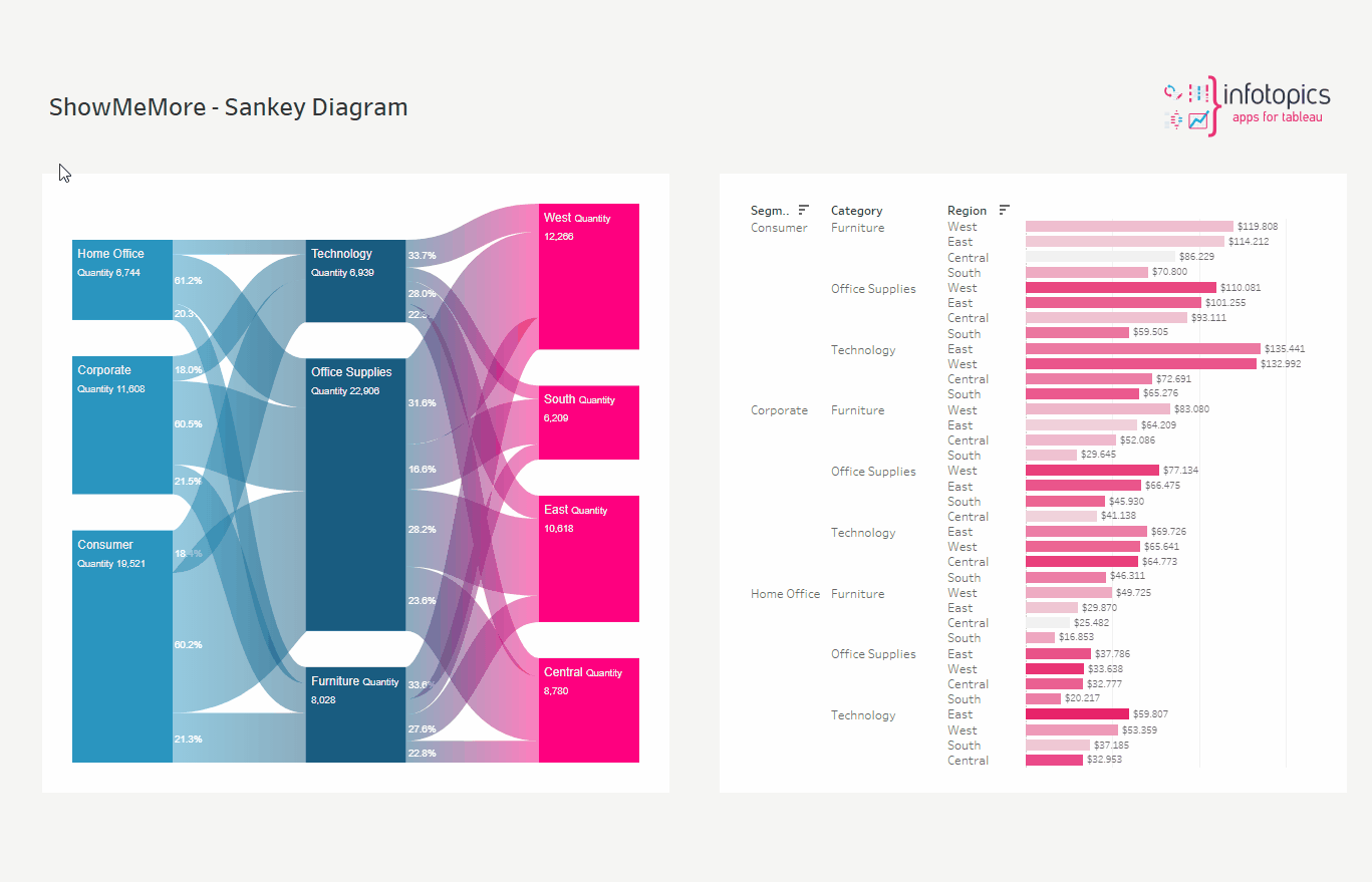
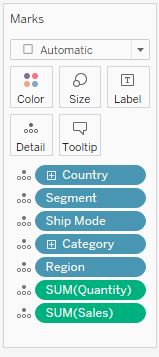
The ShowMeMore extension can connect to an existing visualization (or table) in your dashboard to retrieve the data. Best practice and performance wise however we recommend creating a dedicated datasheet for the Sankey diagram. To create a dedicated datasheet we recommend dropping all dimensions and measures you want to use in your Sankey Diagram on the details of the marks pane. This will enable the best performance and allows dashboard actions to act on this dedicated Sankey datasheet. See screenshot showing how our demo workbook has been set up. For tips and advice check out our BLOG.

You do need to add the datasheet to your dashboard since the ShowMeMore extension is a Dashboard Object that retrieves data from another sheet in the dashboard. Once you added the blue squared datasheet to your dashboard you can hide it by making it a floating container and resizing the container to 1×1 pixel. The datasheet has to remain on the dashboard!
Configure Screen
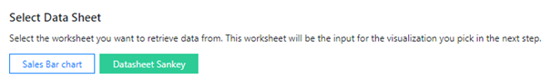
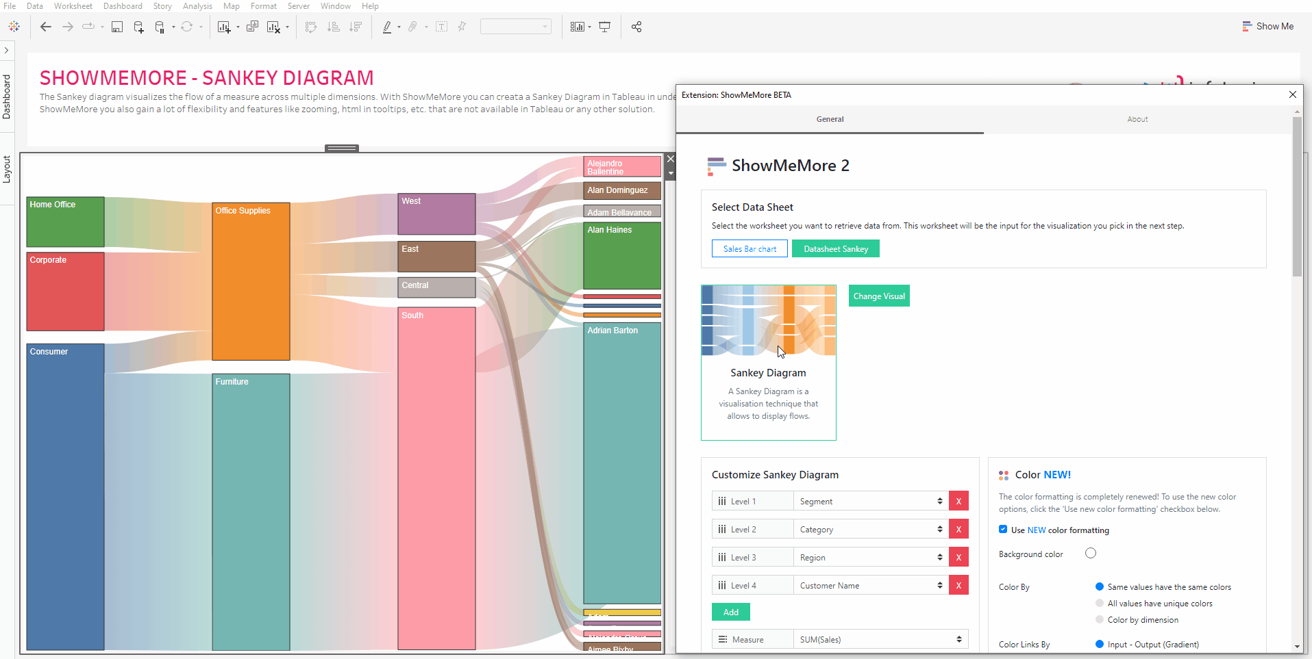
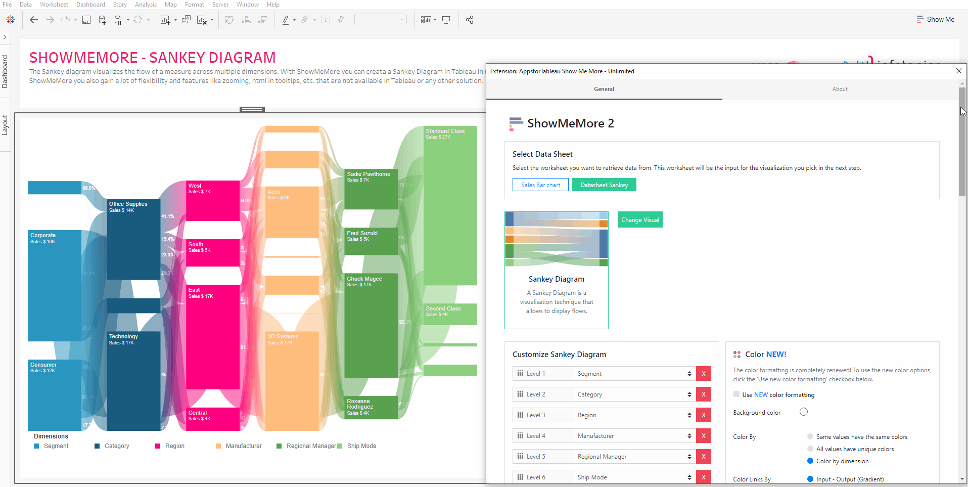
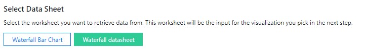
Select Data Sheet
Once you start configuring ShowMeMore, the extension automatically scans the dashboard for available sheets. Make sure you added your datasheet to the dashboard before opening the configuration screen. Don’t panic If you forgot to add the datasheet to the dashboard. Just close the configuration, add the datasheet to your dashboard and start the configuration again. Select the worksheet you want to retrieve data from (preferably your blue squared datasheet). This worksheet will be the input for the visualization you pick in the next step.

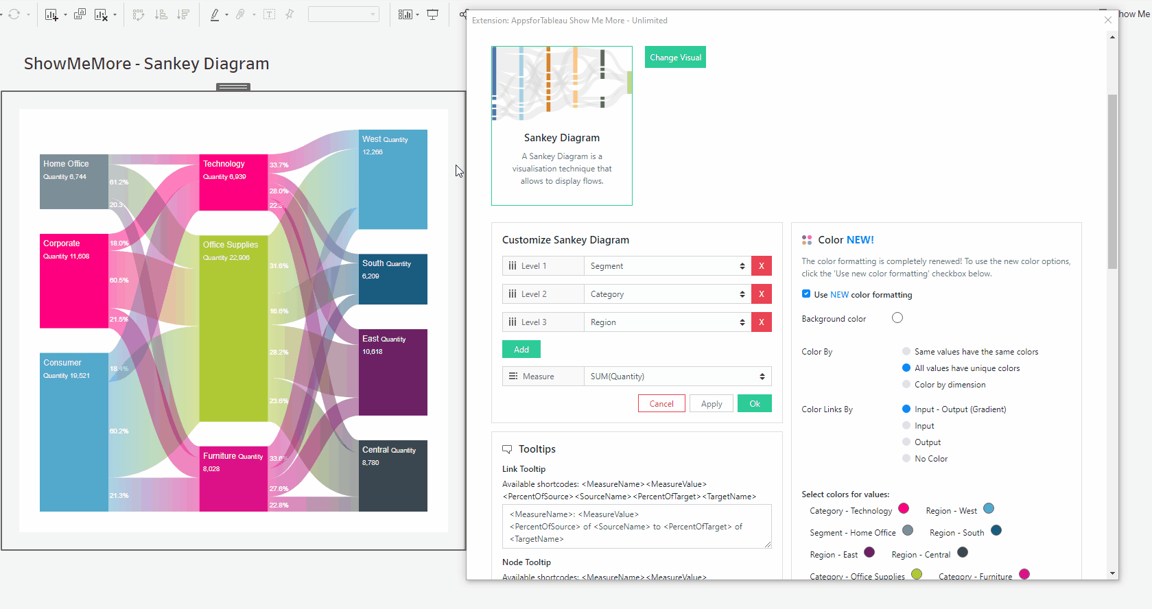
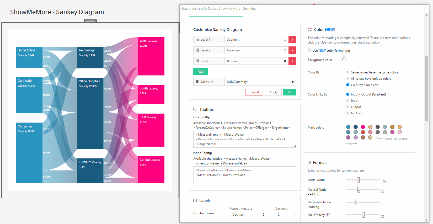
Customize Sankey Diagram
Choose the dimensions you wish to show in your Sankey Diagram. Use the dropdown menu to select the dimensions from your datasheet that you want to be present as levels in your Sankey Diagram. These levels will be visualized in the Sankey diagram from the left to the right. Use the ‘Add’ button to add another level. Assign the measure you want to use in the Sankey by clicking on the measure dropdown menu.
Tooltips
Format your link and node tooltip. Use the short codes and/or free text. You will see the list of available short codes you can use. How they are displayed in the box will be how you will see them in your tooltip.
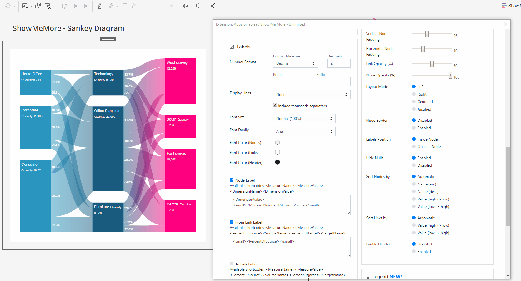
Labels
Number format
Format your measure to a decimal or a percentage using the dropdown menu. Enter the amount of decimal spaces shown under ‘decimals’. Add a ‘Prefix’ and/or a ‘Suffix’ in the text boxes. A prefix will go before the word and the suffix after. A prefix for example could add a currency ‘$’ and a Suffix could add a ‘%’.
Display Units (Decimal only)
Within your data there could be large values. Here you can format using separators. Use the dropdown menu to display numerical units. Example: 6,744 – 6.74K. Use the tick box to include thousands separators. Example: 1234 – 1,234.
Font Size
Use the dropdown menu to change the size of the font from 50% – 150%. Changing the font size will affect all fonts within your Sankey Diagram.
Font Family
Use the dropdown menu to change the font best to suit your dashboard.
Font Color
Clicking on the circle shapes will open the color palette. Nodes, Links and Headers can all be changed separately using their own palette.
Header Aliases
You can display the names of dimensions used in your Sankey Diagrams by enabling the headers under the “Format” tab. Once enabled, you can use header aliases the change the names of dimensions displayed above the Sankey Nodes.
Label Editing
Format what is shown on your nodes, to and from them. You may add free text as well as using short codes from your data (Example: ) For extra formatting try using HTML like H1, IMG tags or Bold. Bold a word and reduce text sizing is available. Add more than 1 measure to labels or tooltips by adding them to the datasource.
Percentage of Group/Total
It is possible to add a calculated percentage of group or total to labels and tooltips. Percentage of total is calculated based on the SUM of the measure in the first level of the Sankey Diagram.
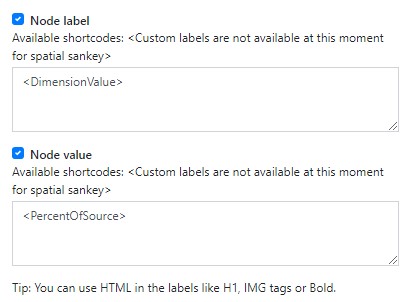
Node Label
Within the text box, enter what you wish to be displayed within your node labels. Format to get the best look for your Sankey Diagram. See above for tips.
From Link Label
Next to each of your node labels, you will be able to display a label which can be entered within the text box. An example would to show the percentage of target. Example.
To Link Label
Have a label shown before your node labels. This could be useful to show a percent of your target. Use the text box to enter your information and see animated gif on how this will look when displayed.
Dashboard Actions
Dashboard actions are available within your Sankey Diagram! Use the ‘New Action’ to begin setting up the dashboard action.

Action type
Set up your dashboard action using a filter or a parameter from the dropdown menu. With the filter option you can trigger a dashboard action that filters on other sheets in your dashboard. A parameter action will change the value of a parameter to the node or link you selected in the Sankey. Very powerful features to control interactivity and usability!
Trigger On
Decide whether to trigger the dashboard action when you click on a node or a link from your Sankey Diagram.
Target Sheet
Here you can select the sheet(s) you want to be the target of your dashboard action. Beware that you do not set your datasheet as a target sheet for the actions otherwise it will be hard to reset your filters!
Deselecting will
This powerful feature will give you control of your configured dashboard action. Use the dropdown to decide what you wish to happen once you’ve deselected your mark(s) in the Sankey. You can choose to show all data again in the target sheet(s), show no data at all or leave the filter as it was.
Refresh
Warning! We are continuously looking to improve our solutions, clicking refresh will give you the latest release with all the new features. Your Sankey Diagram will reset to its initial factory settings including color palette, measures and columns. This is option will let you re-configure your extension from scratch.
Color
Click the ‘Use new color formatting’ checkbox to use the new color options. This will allow you to color your dimensions, individually on a named basis. When not using the new color formatting option, the Mark Colors will be colored by sorting order. This will allow you to customize your dashboard greatly and improve your user experience!
Background color
Use the circle to open the color palette to change the background color of your Sankey Diagram. Extension objects can not be transparent in Tableau so to blend in your Sankey Diagram you are able to set your background color to match the design of your entire dashboard.
Color By
Same values have the same colors
Where your dataset shows the same value, your Sankey Diagram will display the same color. This can be helpful to show exact matches, within different categories. When choosing this you will be presented with all the dimension members available, click on each palette to edit.
All values have unique colors
Each value will have it’s own unique color. Ideal if you wish to differentiate all measures for example. When selecting you will be presented with the values that are available, click on each palette to edit.
Color by dimension
This will only be available when clicking on ’Color by dimension’. All nodes and links will be colored by dimension. This would be ideal to show the flow from one dimension to the next. When clicking you will be presented with the categories available for you to then change the colors of your dimensions.
Color Links By
Here you can decide how you would like the links from your nodes to be colored by.

Input – Output (Gradient)
Links will show a gradient from input color (source node) to output color (target node).
Input
Links will be colored with the input nodes color.
Output
Links will be colored with the output nodes color.
No Color
No coloring on any link, links will be shown as grey.
Select colors for dimensions: (New color formatting only)
Click on the color palette that’s alongside your chosen dimensions to choose their color. The new coloring format will improve your ease of use by seeing which dimension is represented by which color.
Format
Node & Link Offset
If your Sankey Diagram has many nodes, there may not always be space for labels to be shown within each node/link. Change the offset to get the best look for your viz.
Node Width
Increase or decrease the width of your nodes using the slider. This will also change the size and shape of your links to fit the view. If you decided to show labels in your Sankey diagram this is the option to control the width to fit your content.
Vertical Node Padding
Increase and decrease the vertical padding (whitespace between the nodes) using the slider. This will give the same space between each node (vertically). You can design your Sankey with the optimal whitespace you want.

Horizontal Node Padding
Increase and decrease the horizontal padding (whitespace between the nodes and the links) using the slider. This will give the same space between each node and the link horizontally.
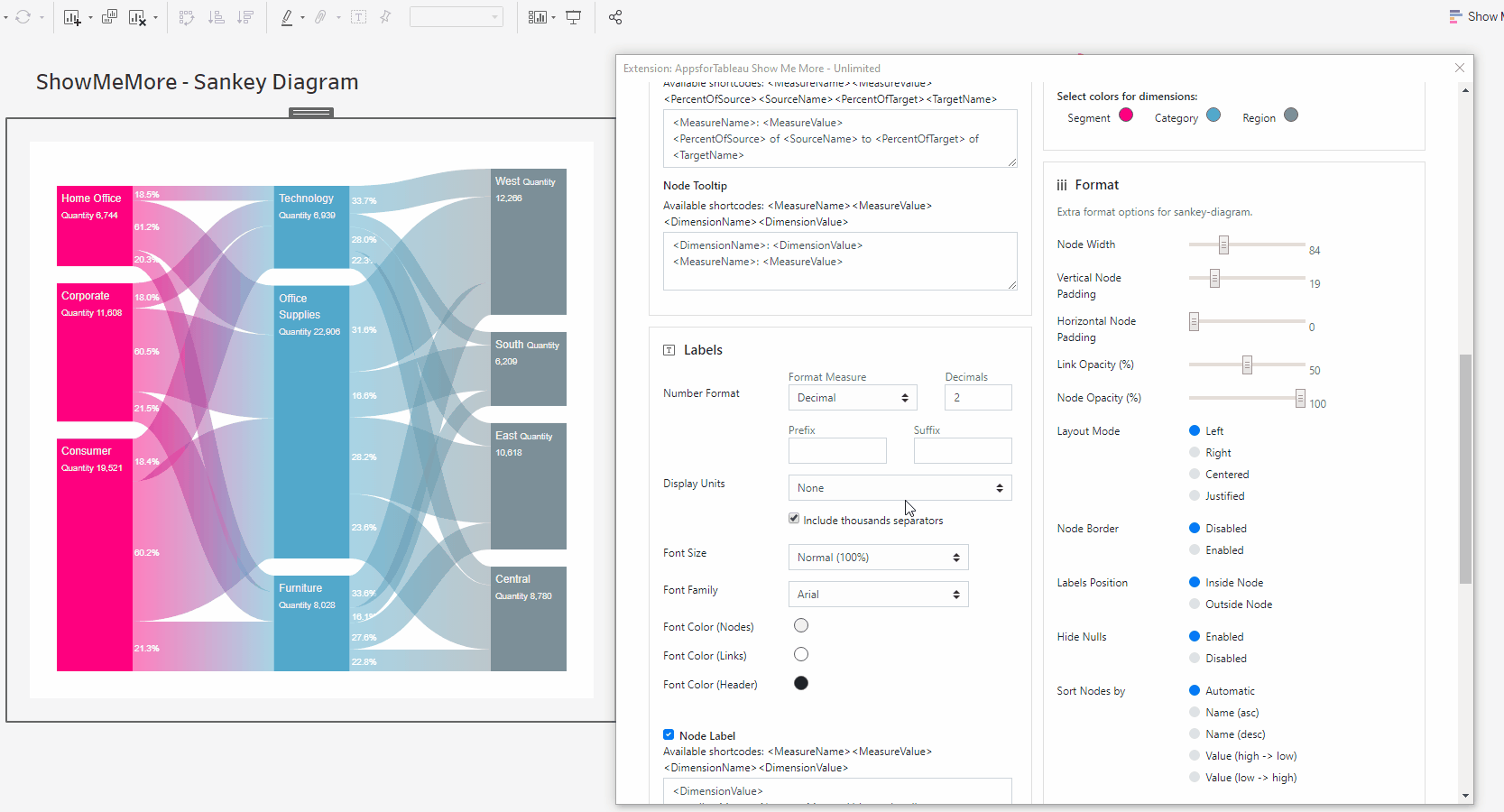
Link Opacity
Increase and decrease the link opacity (transparency) using the slider. 100 will give full opacity (zero transparency). Transparency is a great feature to visualize overlapping links. Intensity and color blending indicates the overlap of links so your flows remain visible and understandable for the end user.

Node Opacity
Increase and decrease the node opacity using the slider. 100 will give full opacity (zero transparency).
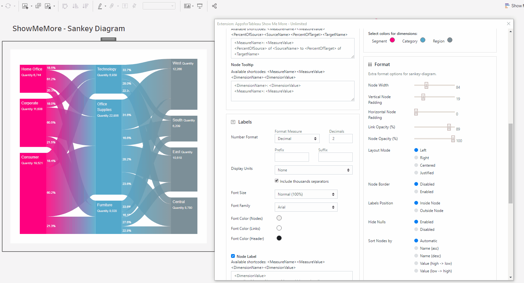
Layout Mode
Change the layout of your nodes by choosing one of the 4 layout options.
Node Border
Hit ‘Enabled’ to give all your nodes a border to make them more stand out with the background.

Labels position
Decide the position or your nodes label being inside or outside your node.
Hide Nulls
Have the ability to hide all nulls by hitting ‘disabled’. The image is showing how you can have flows from column 1 to column 4 with nulls in columns 2 & 3. Nodes can also start and end on different levels.
Sort Nodes by
Arrange the order of the nodes by name & value either ascending or descending. Name order can be very useful to have an easy to read Sankey Diagram, sorting by value may give you clearer insight to your measures. Automatic will use Sankey Diagrams internal algorithm which calculates the optimal order or nodes with the least link overlaps.

Sort Links by
Arrange the links by value. High to low or low to high. Ideal if you wish to show where most of your sales are going and to which category. Automatic will use Sankey Diagrams internal algorithm which calculates the optimal order or nodes with the least link overlaps.
Enable Header
Have the option show the names of the levels above the Sankey Diagram. See animated gif for an example of how it will look.
Scale
Use the scale scroll bar when you have larger and more complex tables. This will reduce sizing of all nodes to allow your complex Sankey Diagram to fit to your dashboard.
Highlight Mode
Limit the highlighting of sections of the Sankey Diagram to only occur on click, or allow highlighting to occur on both hover or click.
Label Alignment
Configure the location of labels within the nodes. Align them right/left, up/down or centered within the node. Note: certain html in the node label might interfere with the alignment.
Legend
To have a legend in your Sankey Diagram, tick the ‘Show legend’ button. When having a large selection of dimensions, it may be of benefit to use a color legend to display.

Legend Type
Choose between a Color legend to elaborate on the used colors or a Scale legend to visualize the size of nodes and links. Color legends will show the configured dimension alongside their color. The scale legend shows a reference bar with a specific value for referential purposes.
Legend Position
Choose where your legend will be. Left, Right, Top(color only) & Bottom (color only). Every Sankey Diagram could be different, change to give your dashboard the best look. This way you can match the Sankey diagram to the rest of your dashboard.
Legend order (Scale only)
Have the scale showing from High – Low or Low – high
Color (Scale only)
Use the circle to open the color pallet to change your scale color.
Number of columns
Decide how many columns the color legend should show in your view. This will help with the look of your Sankey Diagram.
Horizontal shift
Use the slider to adjust the position horizontally of your Legend. Use this to get your legend in the perfect position.
Vertical shift
Use the slider to adjust the position vertically. This could allow you to have more text shown in your view.
Other
Export your visualization as a SVG. This will open a prompt box explaining how to export.
Tutorial
Click on this link for a tutorial on how to use the Sankey Diagram
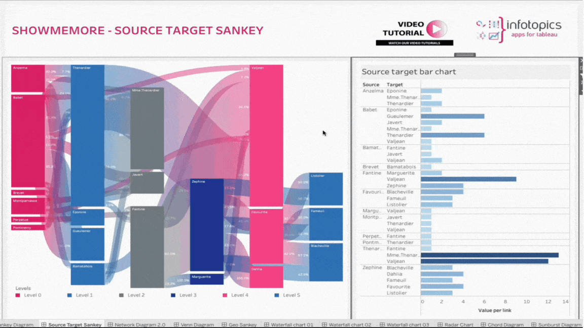
Source Target Sankey Diagram
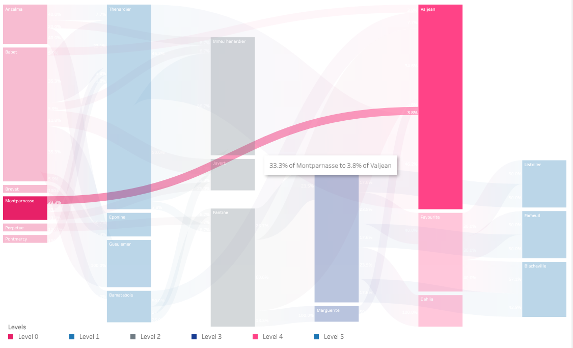
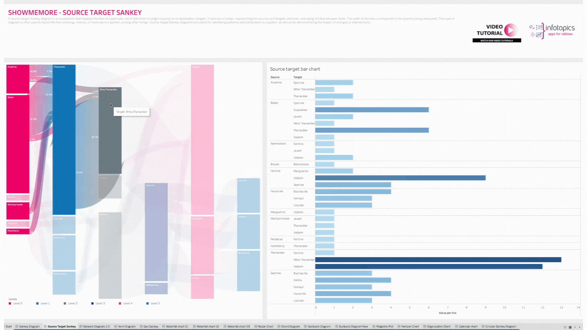
A source-target Sankey diagram is a visualization that displays the flow of a particular set of data from its origin (source) to its destination (target). It consists of nodes, representing the sources and targets, and links, indicating the flow between them. The width of the links corresponds to the quantity being measured. This type of diagram is often used to depict the flow of energy, money, or materials in a system, among other things. Source-target Sankey diagrams are useful for identifying patterns and bottlenecks in a system, as well as for demonstrating the impact of changes or interventions.
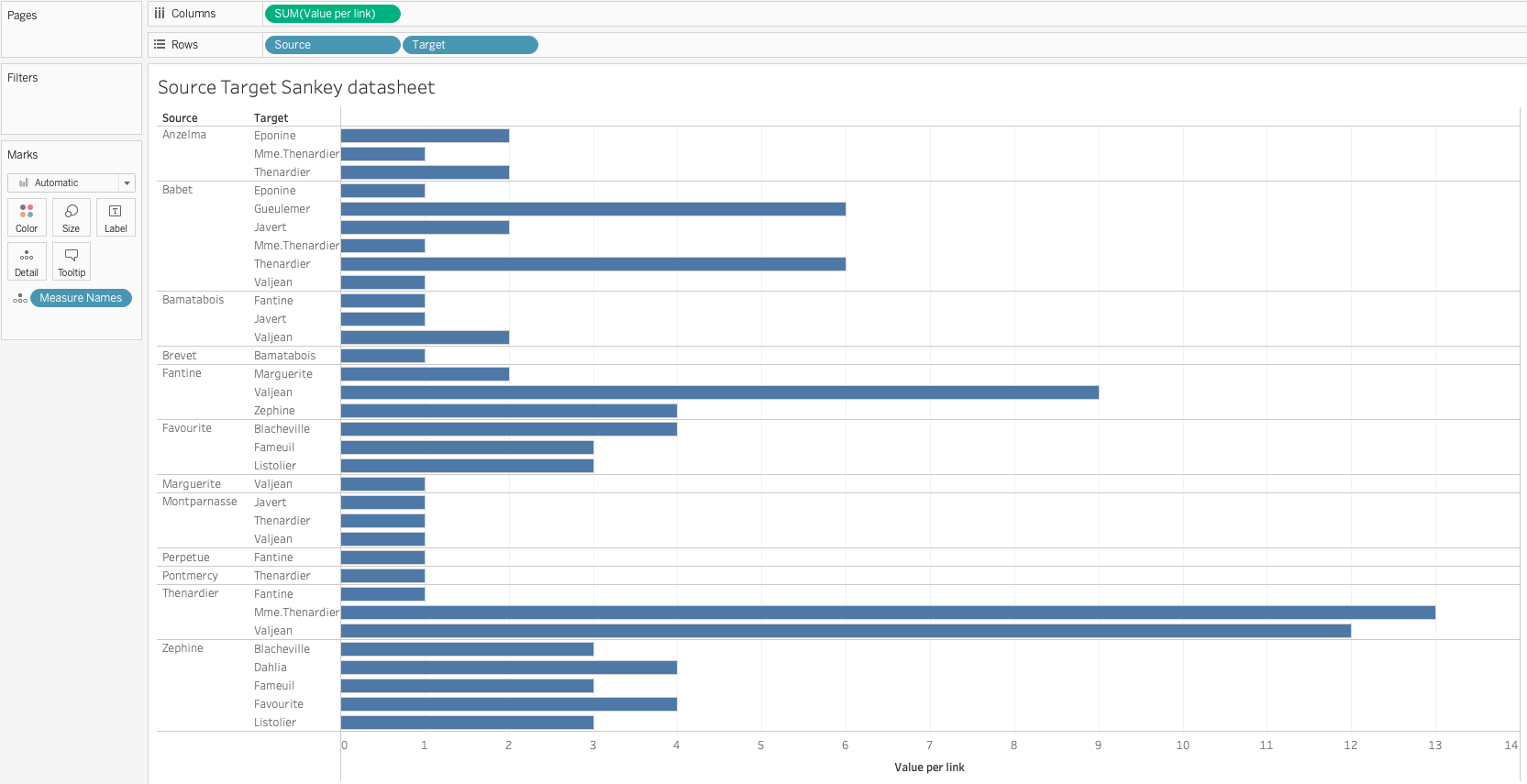
Setting up your datasheet
Best practice and performance wise however we recommend creating a dedicated datasheet for the Source Target Sankey diagram. Source Target Sankey diagram requires a particular data structure for the visualisation, a source, a target and the measure per link.
Add the datasheet to your dashboard since the ShowMeMore extension is a Dashboard Object that retrieves data from another sheet in the dashboard. Once you have added the datasheet to your dashboard you can hide it by making it a floating container and resizing the container to 1×1 pixel. The datasheet has to remain on the dashboard!
Configure Screen
Select Data Sheet
Once you start configuring ShowMeMore, the extension automatically scans the dashboard for available sheets. Make sure you’ve added your datasheet to the dashboard before opening the configuration screen. Select the worksheet you want to retrieve data from (preferably your separate datasheet). This worksheet will be the input for the visualization you pick in the next step.
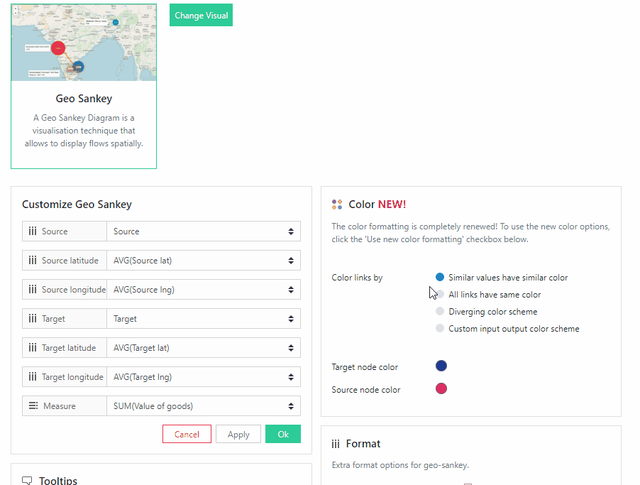
Customize Source Target Sankey Diagram
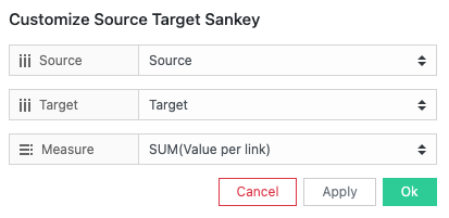
Choose the source, target and measure you wish to show in your Sankey Diagram. These will be visualized in the Sankey diagram from the left to the right.
Tooltips
Format your link and node tooltip. Use the short codes and/or free text. You will see the list of available short codes you can use. How they are displayed in the box will be how you will see them in your tooltip.
Labels
Number format
Format your measure to a decimal or a percentage using the dropdown menu. Enter the amount of decimal spaces shown under ‘decimals’. Add a ‘Prefix’ and/or a ‘Suffix’ in the text boxes. A prefix will go before the word and the suffix after. A prefix for example could add a currency ‘$’ and a Suffix could add a ‘%’.
Font Size
Use the dropdown menu to change the size of the font from 50% – 150%. Changing the font size will affect all fonts within your Source Target Sankey Diagram. Clicking the ‘Use Tableau font’ will match the font used on your Tableau font used on your dashboard.
Font Color (Header)
Clicking on the circle shapes will open the color palette. Nodes, Links and Headers can all be changed separately using their own palette.
Label Editing
Format what is shown on your nodes, to and from them. You may add free text as well as using short codes from your data (Example: ) For extra formatting try using HTML like H1, IMG tags or Bold. Bold a word and reduce text sizing is available Node Label
Within the text box, enter what you wish to be displayed within your node labels. Format to get the best look for your Sankey Diagram. See above for tips.
From Link Label
Next to each of your node labels, you will be able to display a label which can be entered within the text box. An example would to show the percentage of target. Example.
To Link Label
Have a label shown before your node labels. This could be useful to show a percent of your target. Use the text box to enter your information and see animated gif on how this will look when displayed.
Dashboard Actions
Dashboard actions are available within your Source Target Sankey Diagram! Use the ‘New Action’ to begin setting up the dashboard action.
Action type
Set up your dashboard action using a filter or a parameter from the dropdown menu. With the filter option you can trigger a dashboard action that filters on other sheets in your dashboard. A parameter action will change the value of a parameter to the node or link you selected in the Sankey. Very powerful features to control interactivity and usability!
Trigger On
Decide whether to trigger the dashboard action when you click on a node or a link from your Sankey Diagram.
Target Sheet
Here you can select the sheet(s) you want to be the target of your dashboard action. Beware that you do not set your datasheet as a target sheet for the actions otherwise it will be hard to reset your filters!
Deselecting will
This powerful feature will give you control of your configured dashboard action. Use the dropdown to decide what you wish to happen once you’ve deselected your mark(s) in the Sankey. You can choose to show all data again in the target sheet(s), show no data at all or leave the filter as it was.
Advanced Filtering
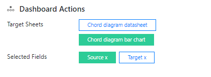
Using the Filter Type option in the configuration, it is possible to set the filter to apply to all nodes connected to a selected node. This filter can then be applied to the Sankey Diagram as well, allowing users to zoom into their selection on both connected sheets and the Sankey sheet with a single click! To set this up, follow these steps:
- Set the Filter Type to “All nodes connected to the selected node will be used as a filter”
- Create a dashboard action targeting a second data sheet in your dashboard (in the example below, the action targets the Bar Chart for filtering)
- Go to the second sheet and add 2 filters; the source and target dimensions
- Set the filters to “Use all”, then right click to apply the filters to selected worksheets and select the data source sheet for ShowMeMore
Color
Click the ‘Use new color formatting’ checkbox to use the new color options. This will allow you to color your levels, individually on a named basis. When not using the new color formatting option, the Mark Colors will be colored by sorting order. This will allow you to customize your dashboard greatly and improve your user experience!
Background color
Use the circle to open the color palette to change the background color of your Sankey Diagram. Extension objects can not be transparent in Tableau so to blend in your Sankey Diagram you are able to set your background color to match the design of your entire dashboard.
Color By
Same values have the same colors
Where your dataset shows the same value, your Sankey Diagram will display the same color. This can be helpful to show exact matches, within different categories. When choosing this you will be presented with all the dimension members available, click on each palette to edit.
All values have unique colors
Each value will have it’s own unique color. Ideal if you wish to differentiate all measures for example. When selecting you will be presented with the values that are available, click on each palette to edit.
Color by Levels
This will only be available when clicking on ’Color by levels’. All nodes and links will be colored by level. This would be ideal to show the flow from one level to the next. Below you can decide which color per level.
Color Links By
Here you can decide how you would like the links from your nodes to be colored by.
Input – Output (Gradient)
Links will show a gradient from input color (source node) to output color (target node).
Input
Links will be colored with the input nodes color.
Output
Links will be colored with the output nodes color.
No Color
No coloring on any link, links will be shown as grey.
Select colors for Levels:
Choose specific colors for each level of your Source Target Sankey, click on each color palette to choose your colors. Add and Remove levels that aren’t necessary.
Format
Node & Link Offset
If your Sankey Diagram has many nodes, there may not always be space for labels to be shown within each node/link. Change the offset to get the best look for your viz.
Node Width
Increase or decrease the width of your nodes using the slider. This will also change the size and shape of your links to fit the view. If you decided to show labels in your Sankey diagram this is the option to control the width to fit your content.
Vertical Node Padding
Increase and decrease the vertical padding (whitespace between the nodes) using the slider. This will give the same space between each node (vertically). You can design your Sankey with the optimal whitespace you want.
Horizontal Node Padding
Increase and decrease the horizontal padding (whitespace between the nodes and the links) using the slider. This will give the same space between each node and the link horizontally.
Link Opacity
Increase and decrease the link opacity (transparency) using the slider. 100 will give full opacity (zero transparency). Transparency is a great feature to visualize overlapping links. Intensity and color blending indicates the overlap of links so your flows remain visible and understandable for the end user.
Node Opacity
Increase and decrease the node opacity using the slider. 100 will give full opacity (zero transparency).
Layout Mode
Change the layout of your nodes by choosing one of the 4 layout options.
Node Border
Hit ‘Enabled’ to give all your nodes a border to make them more stand out with the background.
Labels position
Decide the position or your nodes label being inside or outside your node.
Hide Nulls
Have the ability to hide all nulls by hitting ‘disabled’. The image is showing how you can have flows from column 1 to column 4 with nulls in columns 2 & 3. Nodes can also start and end on different levels.
Sort Nodes by
Arrange the order of the nodes by name & value either ascending or descending. Name order can be very useful to have an easy to read Sankey Diagram, sorting by value may give you clearer insight to your measures. Automatic will use Sankey Diagrams internal algorithm which calculates the optimal order or nodes with the least link overlaps.
Sort Links by
Arrange the links by value. High to low or low to high. Ideal if you wish to show where most of your sales are going and to which category. Automatic will use Sankey Diagrams internal algorithm which calculates the optimal order or nodes with the least link overlaps.
Scale
Use the scale scroll bar when you have larger and more complex tables. This will reduce sizing of all nodes to allow your complex Sankey Diagram to fit to your dashboard.
Filter Type
When using Dashboard actions to filter, there is the option to filter based on just the selected node, or all connected nodes. Select the desired filter type and add a filter Dashboard action to apply the selected filter to your visualisations.
Legend
To have a legend in your Sankey Diagram, tick the ‘Show legend’ button. When having a large selection of dimensions, it may be of benefit to use a color legend to display.
Legend Position
Choose where your legend will be. Left, Right, Top(color only) & Bottom (color only). Every Sankey Diagram could be different, change to give your dashboard the best look. This way you can match the Sankey diagram to the rest of your dashboard.
Number of rows
Decide how many columns the color legend should show in your view. This will help with the look of your Sankey Diagram.
Horizontal shift
Use the slider to adjust the position horizontally of your Legend. Use this to get your legend in the perfect position.
Vertical shift
Use the slider to adjust the position vertically. This could allow you to have more text shown in your view.
Other
Export your visualization as a SVG. This will open a prompt box explaining how to export.
Waterfall Chart
Introduction
A waterfall chart is a form of data visualization that helps in understanding the cumulative effect of sequentially introduced positive or negative values. These intermediate values can either be time based or category based. The waterfall chart is also known as a flying bricks chart or Mario chart due to the apparent suspension of columns (bricks) in mid-air. Often in finance, it will be referred to as a bridge.
A waterfall chart can be used for analytical purposes, especially for understanding or explaining the gradual transition in the quantitative value of an entity that is subjected to increment or decrement. Often, a waterfall or cascade chart is used to show changes in revenue or profit between two time periods.
Possible Use Cases for Waterfall Chart
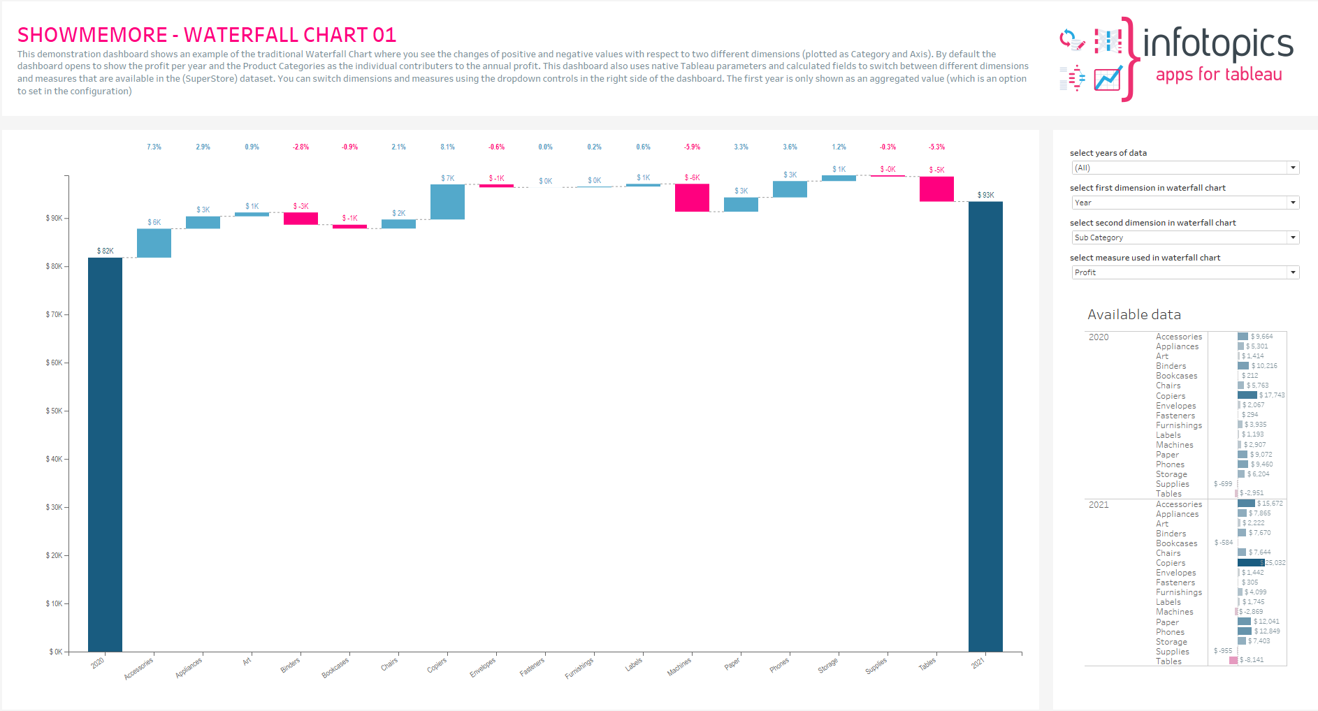
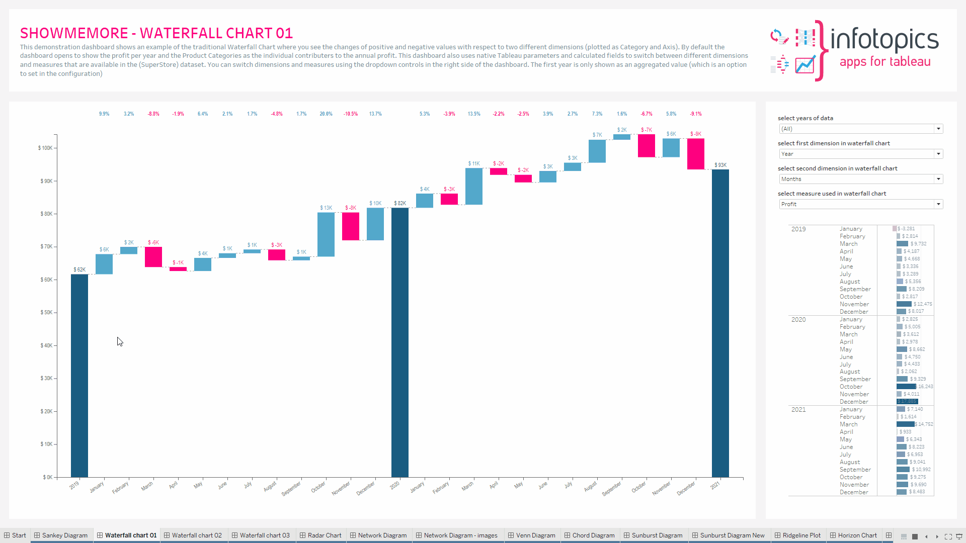
Aggregate First category
Compare the differences in sales, per dimension, to the previous year.
Our viz is comparing all product categories sales from one year to the previous year. The size of the bars within the Waterfall Chart represent the value difference from the previous year. We have colored the bars to show whether it is positive or negative with respect to the previous years sales. This will show which category has had the best growth as well as showing which categories contributed less to current year sales.
Comparison
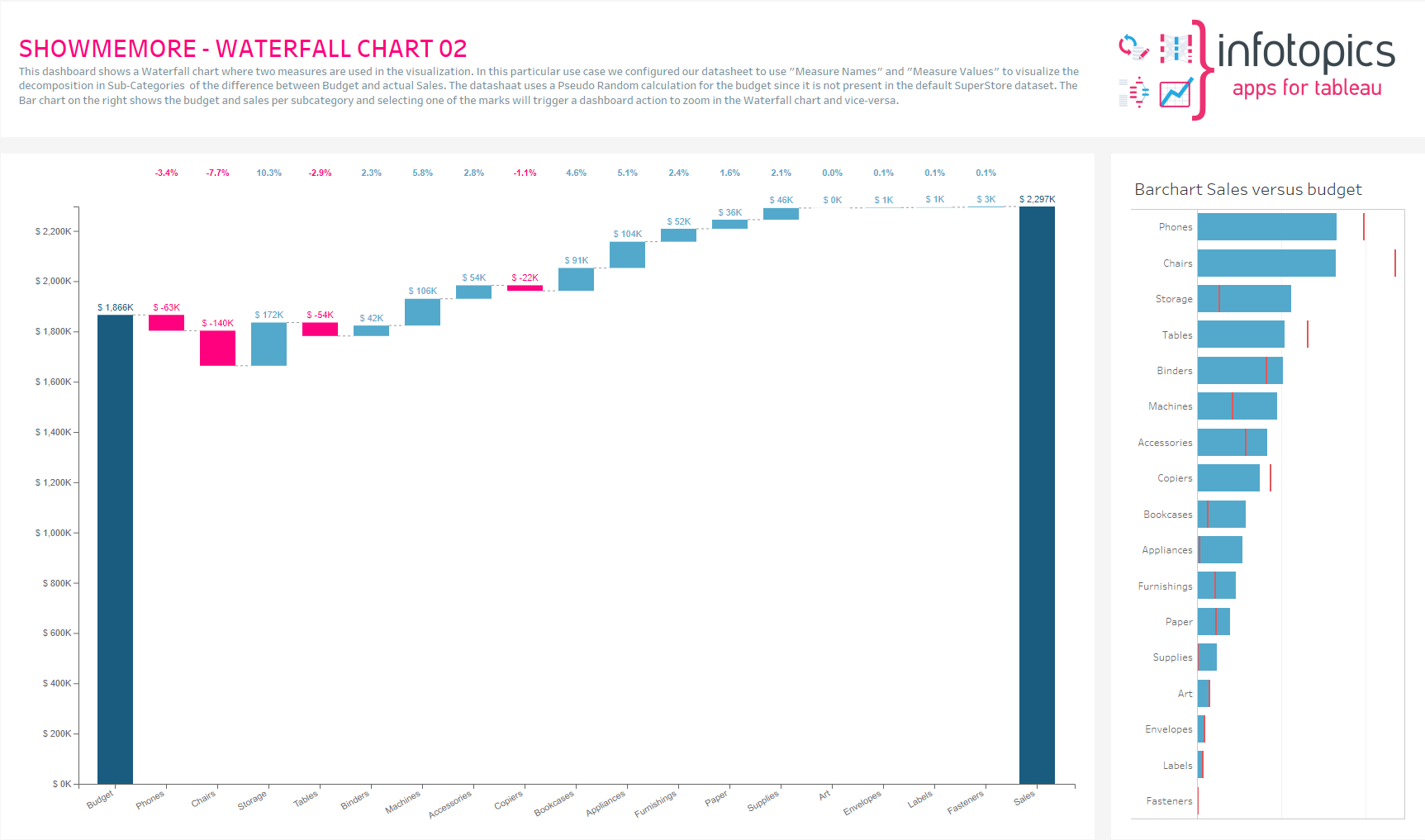
This dashboard shows a Waterfall chart where two measures are used in the visualization. In this particular use case, we configured our datasheet to use “Measure Names” and “Measure Values” to visualize the decomposition in product categories of the difference between Budget and actual Sales. The graph shows the contribution of each product category to the actual sales with respect to the budget (over budget is in blue, under budget is in pink)
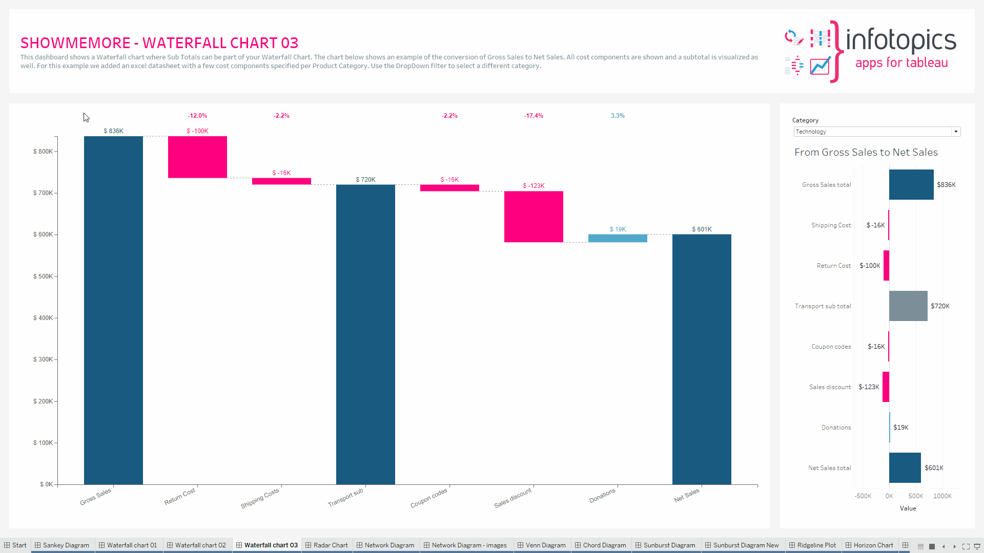
Subtotal
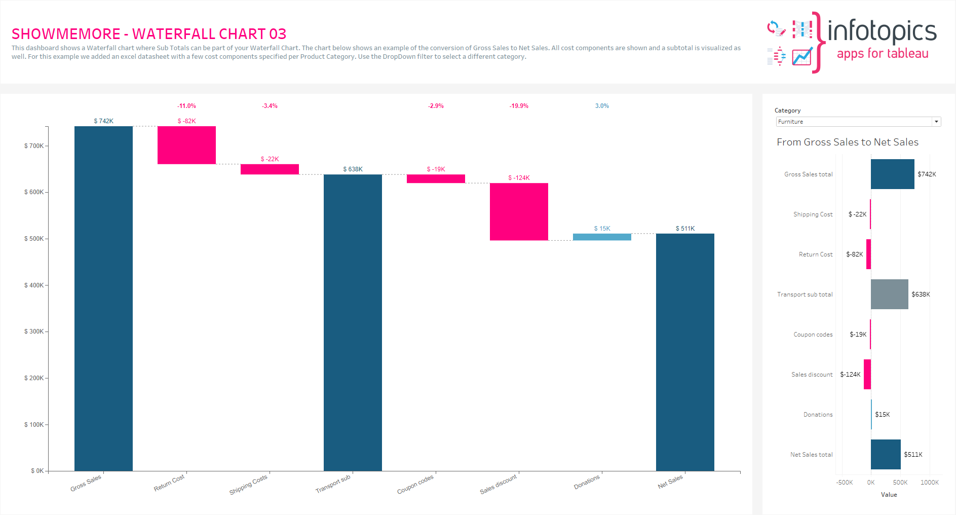
This dashboard shows a Waterfall chart where Sub Totals can be part of your Waterfall Chart. The chart below shows an example of the conversion of Gross Sales to Net Sales. All cost components are shown, and a subtotal of transport (shipping and return) costs is visualized as well.
Preparing your data
The ShowMeMore extension can connect to an existing visualization (or table) in your dashboard to retrieve the data. Best practice and performance wise however we recommend creating a dedicated datasheet for the Waterfall Chart. To create a dedicated datasheet we recommend dropping all dimensions and measures you want to use in your Waterfall Chart on the details of the marks pane in the datasheet. This will enable the best performance and allows dashboard actions to act on this dedicated Waterfall Chart, read more in our BLOG. Your marks pane should look similar to this.
You need to add the datasheet to your dashboard since the ShowMeMore extension is a Dashboard Object that retrieves data from a sheet that is present on your dashboard. Once you added the blue squared datasheet to your dashboard you can hide it by making it a floating container and resizing the container size to 1×1 pixel. The datasheet has to remain on the dashboard!
Setting up your Waterfall Chart
Once you have added your datasheet to your dashboard you drag the extensions object to the dashboard and locate your ShowMeMore ‘trex’ file, supplied by AppsforTableau. Using the extension dropdown open the configure screen. Select your datasheet and Waterfall chart from the ShowMeMore Gallery. Note: At least 1 Dimension & Measure is required.
Configure Screen
Choose the dimensions and measure you wish to be displayed in your Waterfall Chart. Be sure to add any missing dimension or measure to your data worksheet and reload the extension.
Category
The category will be the starting and ending point of the series. In our example this will show us which category produced the biggest sales in each particular year. Other categories could be revenue to net income , the waterfall chart will portray how your initial value is affected by a series of intermediate positive or negative values.
X Axis
The X Axis should be the series of dimensions that are being measured by your chosen measure. For example the profit and loss per department of your organisation, over a year. The series will show all departments and the effect they have on your companies revenue.
Measure
Use the Waterfall Chart to show the total sales through the year or just the profit to see which department or item is bringing in the best value. Add your measure here.
Tooltips
Format your link and node tooltip. Use the shortcodes and/or free text. You will see the list of available shortcodes you can use. How they are displayed in the box will be how you will see them in your tooltip.
Labels
Number format
Format your measure to a decimal or a percentage using the dropdown menu. Enter the amount of decimal spaces shown under ‘decimals’. Add a ‘Prefix’ and/or a ‘Suffix’ in the text boxes. A prefix will go before the word and the suffix after. A prefix for example could add a currency ‘$’ and a Suffix could add a ‘%’.
Display Units (Decimal only)
Within your data there could be large values. Here you can format using separators. Use the dropdown menu to display numerical units. Example: 6,744 – 6.74K. Use the tick box to include thousands separators. Example: 1234 – 1,234.
Font Size – Dimension
Use the dropdown menu to change the size of the font from 50% – 150%. Changing the font size will affect all fonts within your Waterfall Chart.
Font Family
Use the dropdown menu to change the font best to suit your dashboard.
Text Color & Header Color
Open the color palette to change the color of the text of the labels as well as all headers using the separate palette.
Node Label
Within the text box, enter what you wish to be displayed within your node labels. Format to get the best look for your Waterfall Chart. See above for tips.
Dashboard Actions
Dashboard actions are available within your Waterfall Chart! Choose one or multiple target sheets. Dashboard actions are supported to and from the extension.
Color
Click the ‘Use new color formatting’ checkbox to use the new color options. This will allow you to color by the values shown in your waterfall chart. Have the positive and negative stand out as well as coloring the totals.
Background color
Use the circle to open the color palette to change the background color of your Waterfall Chart. Use this to best match your dashboard color style.
Mark Colors
Use the circles to open the color palette to change the colors of the marks. The order they are in will be the order of your levels.
Format
Aggregate first category to a total
Total your first category by aggregating. This will give you your starting point to run through the series. This could be the total of the previous years sales to then compare to the current year. If you want to just see the progressive sales from the start, show all values with a separate total.
Show cumulative values
Here you have the options to show cumulative values of your dimension through your series of dimensions or to compare the values in the series to the previous category. You may need insight over one series of which products or departments are performing well or may need to see how those performed compared to the series before. Both possible here.
Options for totals
Show or hide totals within your Waterfall Chart. It may not be important to have a total in the view. A super cool feature is if any measure name or measure value is named ‘total’ they will be shown in the view.
Y-Axis Min (%)
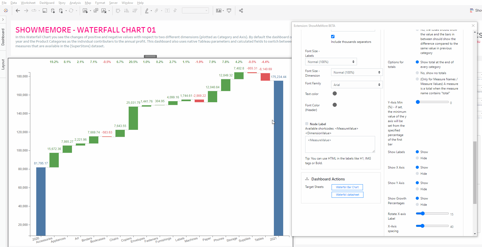
Show Labels/X Axis/Y Axis
Show or hide your measure labels in your viz. Turn off the X and Y axis too.
Show Growth Percentages
A very useful feature of the Waterfall Chart is the growth percentages shown at the top of each dimension. Each is This can be shown or hidden if you just want the bar charts to show you the differences.
Rotate X-axis Label
Use the scroll bar to rotate the labels of your dimensions. Get your waterfall chart looking just how you want it.
X-Axis & Y Axis spacing
Condense or spread out the waterfall chart for a clearer chart or to save that valuable dashboard space
Other
Export your visualization as a SVG. This will open a prompt box explaining how to export.
Geo-Sankey
Introduction
A Sankey Diagram visualizes the proportional flow between variables (or nodes) within a network. It is an excellent tool to get insights into the major transfers of flows within a system. However, what if we can add geographical attributes to the Sankey Diagram and visualize the flows on top of a map? It gives unprecedented insights into your data. This is the question triggered the development process of the Geo-Sankey. The new ShowMeMore Geo-Sankey can provide you with a birds-eye view for better insights into your data.
How does it work?
The Geo-Sankey requires 6 dimensions and a measure. The measure shows the flow (value in the links) and the dimensions include source, target names and the coordinates. The width of the links and the radius of the nodes can be configured to represent the value.
Example Use Case
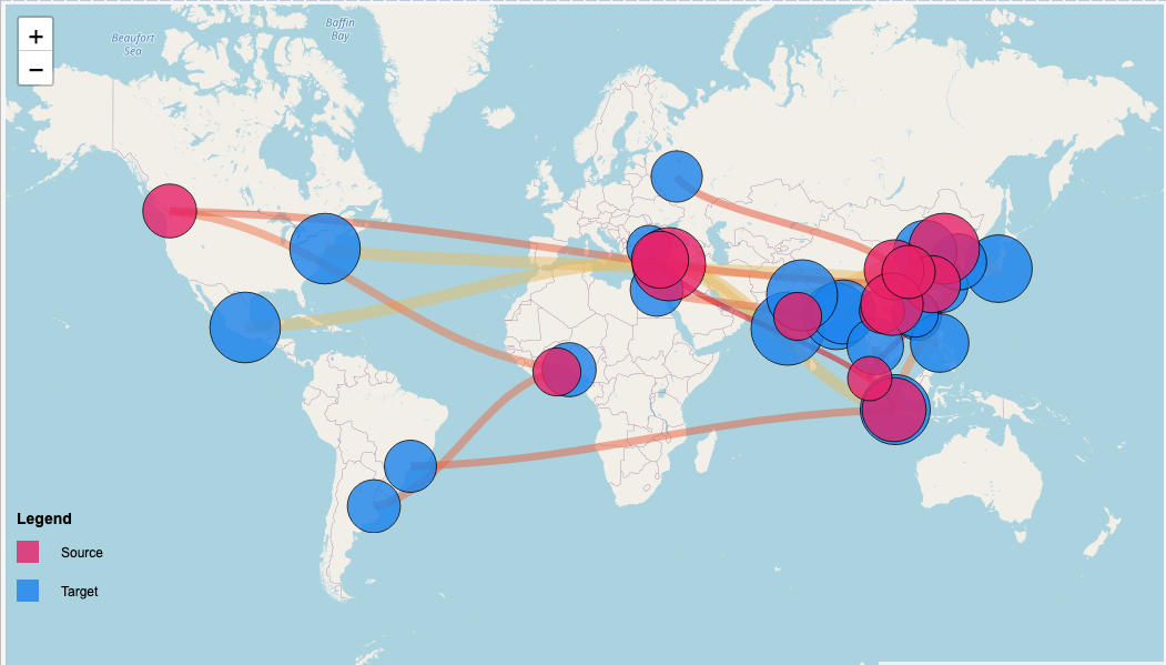
We have created an example use to demonstrate how you can use the Geo-Sankey. The large map on the left side of the screen is an instance of ShowMeMore with Geo-Sankey, on the right you have a bar chart with represents freight movement from different cities around the globe. The map above the bar chart shows country wise aggregated information of origin of freight movement.
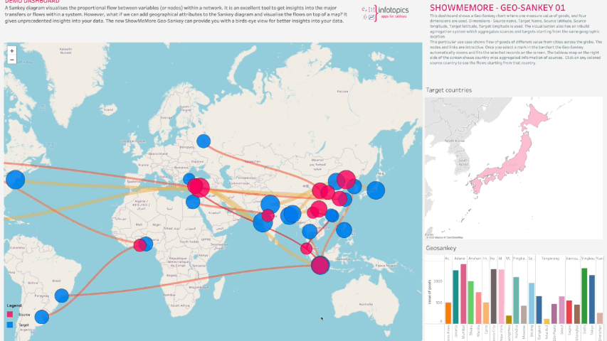
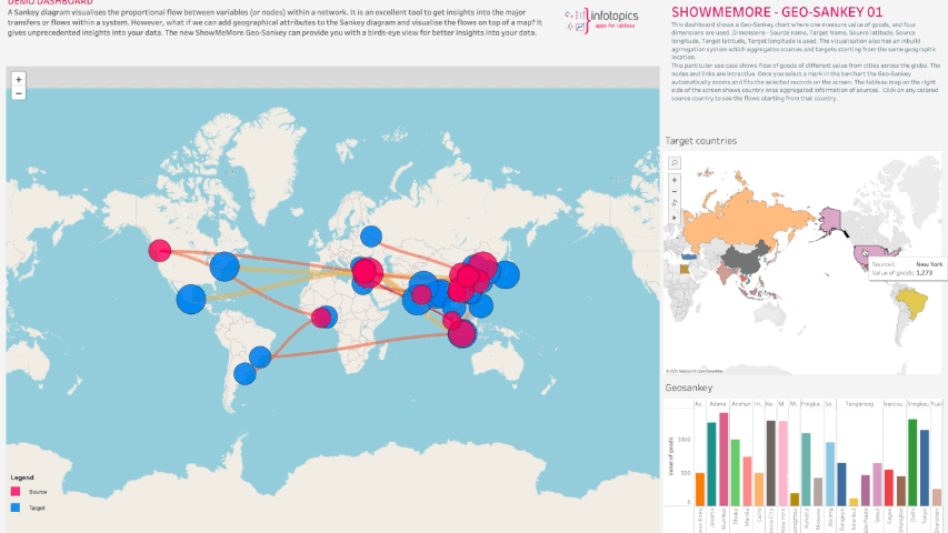
All the visualizations are interactive with the Geo-Sankey where you can click on a country to see the freight movements from that country to different destinations.
This way of data visualization, with Geo-Spatial attributes, helps you tell a story by curating data in an easy-to-understand way, by highlighting trends and outliers, thereby unlocking the hidden insights in the available data. The visual reports generated by Geo-Sankey can be extremely interactive and allow for easy investigation of stopgaps and concerns of the business.
Configure the extension
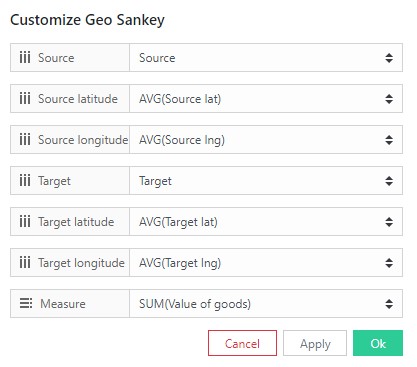
Customize Geo-Sankey
Here is where we will be choosing the dimensions and measure you wish to see visualized in your Geo-Sankey. The dimensions will be the Source and Target with their Longitude and Latitude coordinates. Add a measure you wish to see shown represented in the flow. See how we’ve set ours up. Naming your fields correctly will help when configuring your data.
Tooltips
Give your measure a suffix, for example adding a currency symbol. Add this here to see displayed in the tooltip.
Labels
Number format
Format your measure to a decimal or a percentage using the dropdown menu. Enter the amount of decimal spaces shown under ‘decimals’. Add a ‘Prefix’ and/or a ‘Suffix’ in the text boxes. A prefix will go before the word and the suffix after. A prefix for example could add a currency ‘$’ and a Suffix could add a ‘%’.
Display Units (Decimal only)
Within your data there could be large values. Here you can format using separators. Use the dropdown menu to display numerical units. Example: 6,744 – 6.74K. Use the tick box to include thousands separators. Example: 1234 – 1,234.
Font Size
Use the dropdown menu to change the size of the font from 50% – 150%
Font Family
Use the dropdown menu to change the font best to suit your dashboard.
Font Color
Clicking on the circle shapes will open the color palette. Customize your nodes, links and headers separately.
Node Labels
You can give your nodes a label to give users more insight, show the name of the dimension shown and the percentage of the source for example.
Dashboard Actions
Dashboard actions are available within your Geo-Sankey! Filter down on a dimension by clicking a node and see that interact instantly with your dashboard. It’s also possible to filter back from your tableau dashboard. Choose your target sheet(s) you wish to interact with.
Color
Here is where you colorize your Geo-Sankey. Set your Target and Source nodes using the color palette and decide how you will to color the links between them.
Format
Geo Sankey allows for many formatting options, here we will explain what each one offers.
Maximum link width
If you were to have many links within your viz it may be a good idea to reduce the maximum width of the links. Use the slider to choose your ideal maximum width.
Maximum Node Radius
Set the maximum size for your nodes. If there’s a condensed area of nodes, these may overlap and you’ll not be able to get clear insight from the view. Reduce the radius using the slider.
Horizontal node padding
Change the padding between nodes horizontally here. This will help with the spacing between nodes preventing as much overlapping as possible.
Link/Node Opacity
Change the link and node opacity separately using the sliders. The lower the number the more transparent they’ll be.
Node Border
Enable or disable a border on your nodes.
Zoom Level
Set the level you wished to be zoomed when the Geo-Sankey reloads. If your data is focused in a small area, increase the zoom level.
Show Paths
An important change will be whether to show the links from nodes at all time or just when you click on your desired node. A great formatting option use for different use cases.
Legend
Add a legend to your viz to show your users what the colors represent by using a legend. The clearer your viz, the better the user experience will be.
Other
Export your visualization as a SVG. This will open a prompt box explaining how to export.
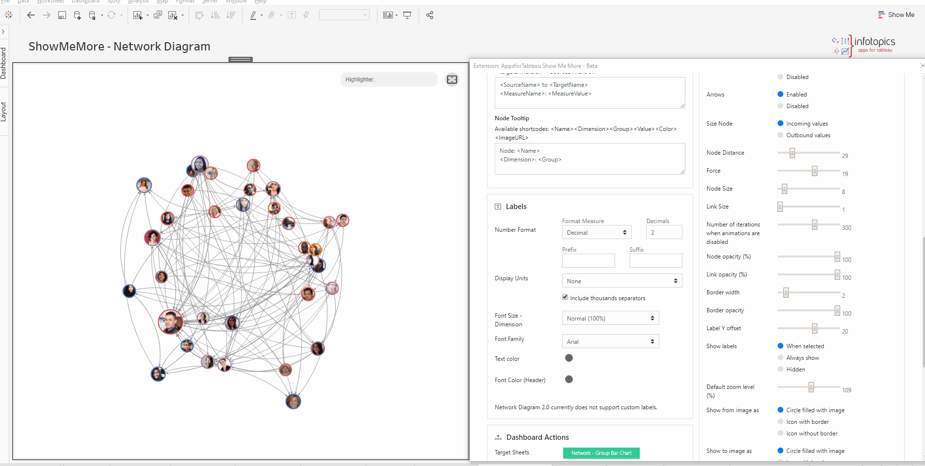
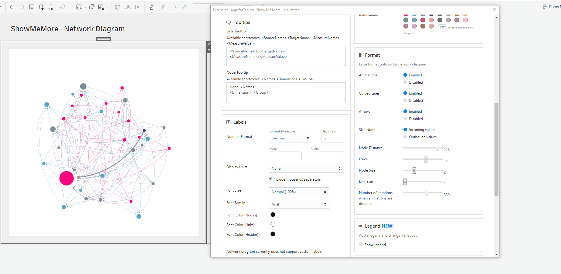
Network Diagram 2.0
In the past we have been looking into ways to improve ShowMeMore Network Diagram, we found many customers who are extremely happy with the existing diagrams, and we have been receiving so many new ideas and suggestions to make it more amazing. So instead of completely revamping the existing Network Diagram we decided to go with a new one with more custom features for the ones who need little more. Here is Network Diagram 2.0!

Setting up your worksheet
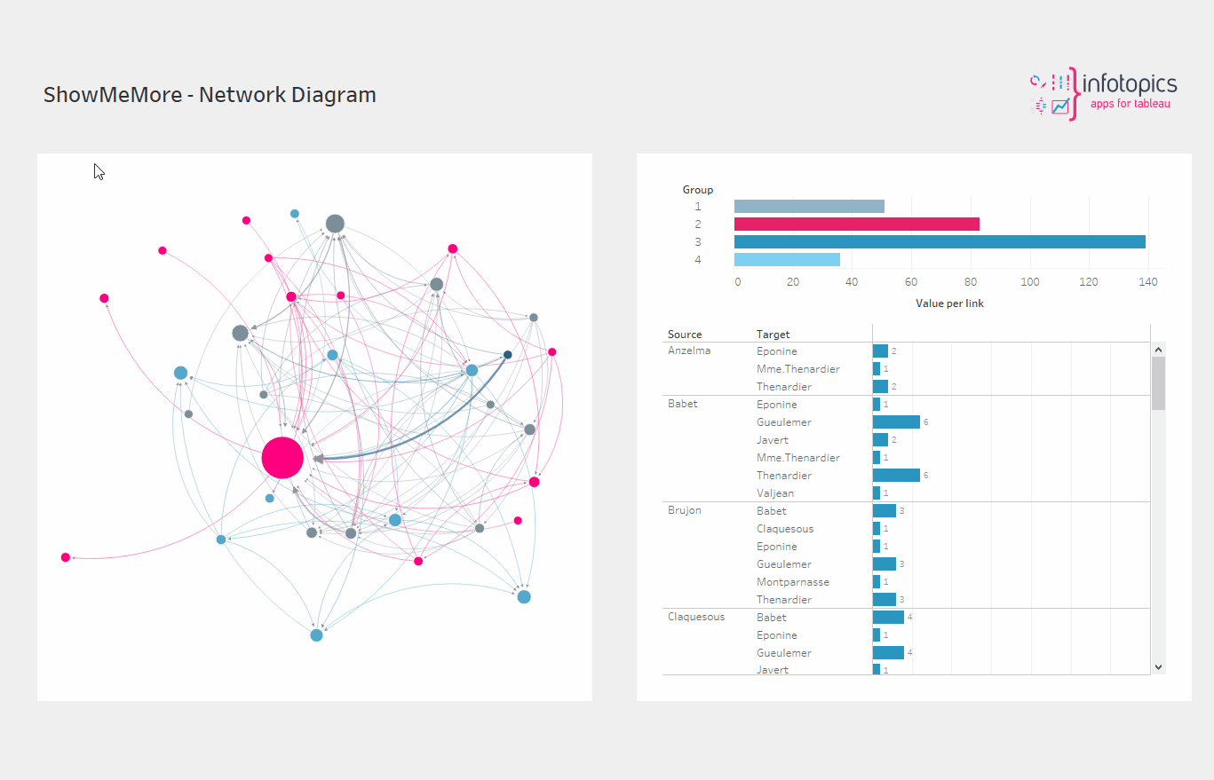
For the best practice we recommend dropping all dimensions and measures on to the marks card. This will enable the best performance. The main components of the dataset will be a ‘source’, ‘target’ and a measure. For example your source may be the managers in your organization, the target being the employees they manage and the measure being the total sales. Group your dimensions and set them as your color. This will allow you to have a clear understanding of your network. See screenshot showing how our demo workbook has been set up.
Configure Screen
Select Data Sheet
Select the worksheet you want to retrieve data from. This worksheet will be the input for the visualization you pick in the next step.

Customize Network Diagram
This is where we will be connecting to your datasheet.
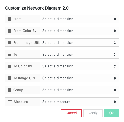
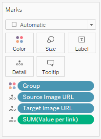
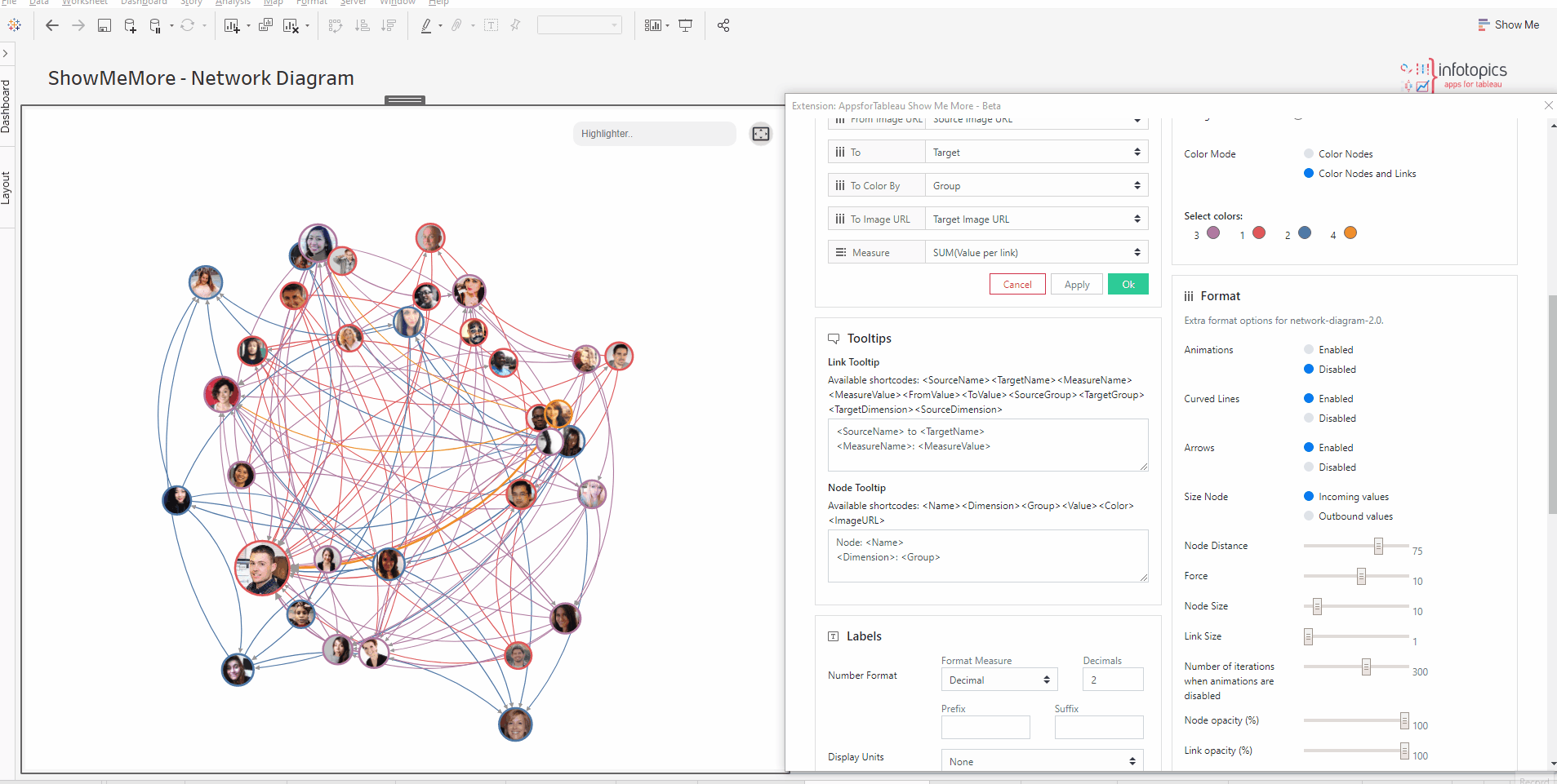
From Source
Choose your dimension from the dropdown menu to be your source. Within your network, these may be your managers for example who will then have links to their employees for example as their ‘target’. Fill ‘From Image URL’ with your source images.
To Target
Choose your dimension from the dropdown menu to be the target of your links with the source dimension. Fill ‘To Image URL’ with your Target images.
Color By
From the dropdown menu choose a dimension that will color the nodes in your Network diagram. You may, for example, have a certain group or department in your datasheet where certain employees are employed, these can be colored per group here. Colors can be chosen in the color segment of the configuration screen under ‘Mark Colors’ which will be discussed later on.
Group
This is an optional dimension. If you have a group attribute for your nodes you can use this dimensions field to assign it to the network diagram. The group information will be used to create the convex hull (bubble-like polygons around the nodes belonging to the same group).
Measure
Choose your measure from the dropdown. Here you may wish to show how many employees are under a manager’s name, the larger the value the larger the node will be in the view.
Analytics Options
Store Custom Views! Network Diagram allows dashboard creators to store their custom view in their workbook settings or within a Tableau parameter.
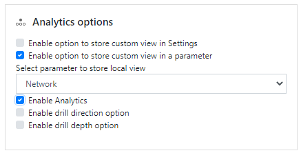
Custom View in settings
When activating storing custom view in settings, you will notice a save symbol appear on your viz. Save your diagram in your workbook settings once you’ve got it looking how you desired. Once saved this will be the default view every time you open your workbook, until you save again.
Custom View in a Parameter
When choosing this option make sure you have a dedicated parameter created! Create a parameter of type string and name it so it’s recognizable when configuring here! Connect to your parameter, now all changes will be stored without having to save.
When any changes to the viz are changed, they’ll be automatically saved to the parameter, if you wish to wipe the slate clean and start afresh you will see the unpin symbol, click here to reset your view.
Enable Analytics
Enable drill direction option
Here you can specify the drill direction. Drill direction determines the path the drill through action will take. The default is both ways. If you want to drill through the data in a different direction, you can change the drill direction here ( Available options are inward, outward and both ways)
Enable drill depth option
Here you can set the depth of your drill action, the depth determines how far your drill through action travels down the network diagram.
Dashboard Actions
Dashboard actions are available within your Network Diagram! Filter down on a dimension by clicking a node and seeing that interact instantly with your dashboard. It’s also possible to filter back from your tableau dashboard. You can do this as you would with your dashboard, by selecting ‘use as filter’ on your container.
Labels
Number format
Format your measure to a decimal or a percentage using the dropdown menu. Enter the number of decimal spaces shown under ‘decimals’. Add a ‘Prefix’ and/or a ‘Suffix’ in the text boxes. A prefix will go before the word and the suffix after. A prefix for example could add a currency ‘$’ and a Suffix could add a ‘%’.
Display Units (Decimal only)
Within your data, there could be large values. Here you can format using separators. Use the dropdown menu to display numerical units. Example: 6,744 – 6.74K. Use the tick box to include a thousand separator. Example: 1234 – 1,234
Font Size
Use the dropdown menu to change the size of the font from 50% – to 150%
Font Family
Use the dropdown menu to change the font best to suit your dashboard.
Font Color
Clicking on the circle shapes will open the colour palette. Nodes, Links and Headers can all be changed separately using their own palette.
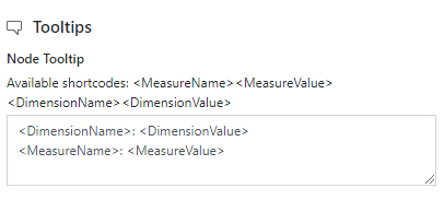
Tooltips

Format your link and node tooltip, separately. Use the shortcodes as well as free text. You will see the list of available shortcodes you can use. How they are displayed in the box will be how you will see them in your tooltip. You can also add HTML tags in between for more customization.
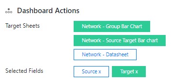
Target sheets
Decide which sheets you wish the extension to trigger, all sheets that are available on your dashboard will be shown here. Multiple sheets can be triggered with a dashboard action.
Selected fields
Which field would you like the extension to trigger on? This can be the dimension chosen as your source or the target dimension. Decide which is the field you wish to be the trigger of the extension.
Refresh
Warning! We are continuously looking to improve our solutions, clicking refresh will give you the latest release with all the new features. Your Network Diagram will reset including color palette, measures and columns.
Color
Click the ‘Use new color formatting’ checkbox to use the new color options.
Background color
Use the circle to open the color palette to change the background color of your Network Diagram. Use this to best match your dashboard color style.
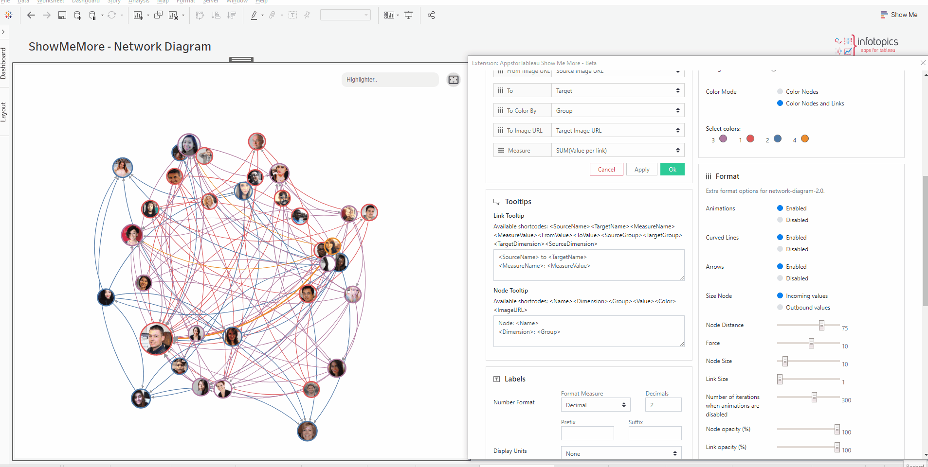
Color Mode
Choose between Color Nodes or Color Nodes and Links. Coloring just the nodes will leave the links grey.
Mark Colors
Use the circles to open the color palette to change the colors of the marks. The order they are in will be the order of your levels.
Select colors for dimensions: (New color formatting only)
Click on the color palette that’s alongside your chosen dimensions to choose their color. The new coloring format will improve your ease of use by seeing which dimension is represented by which color.
Format
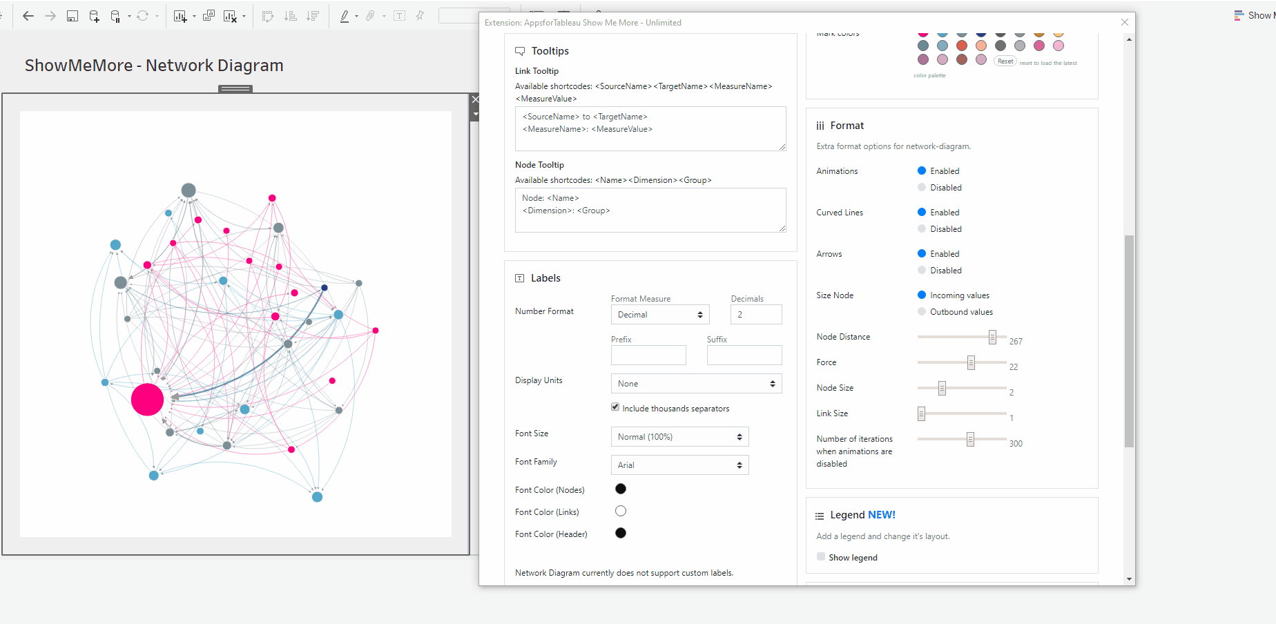
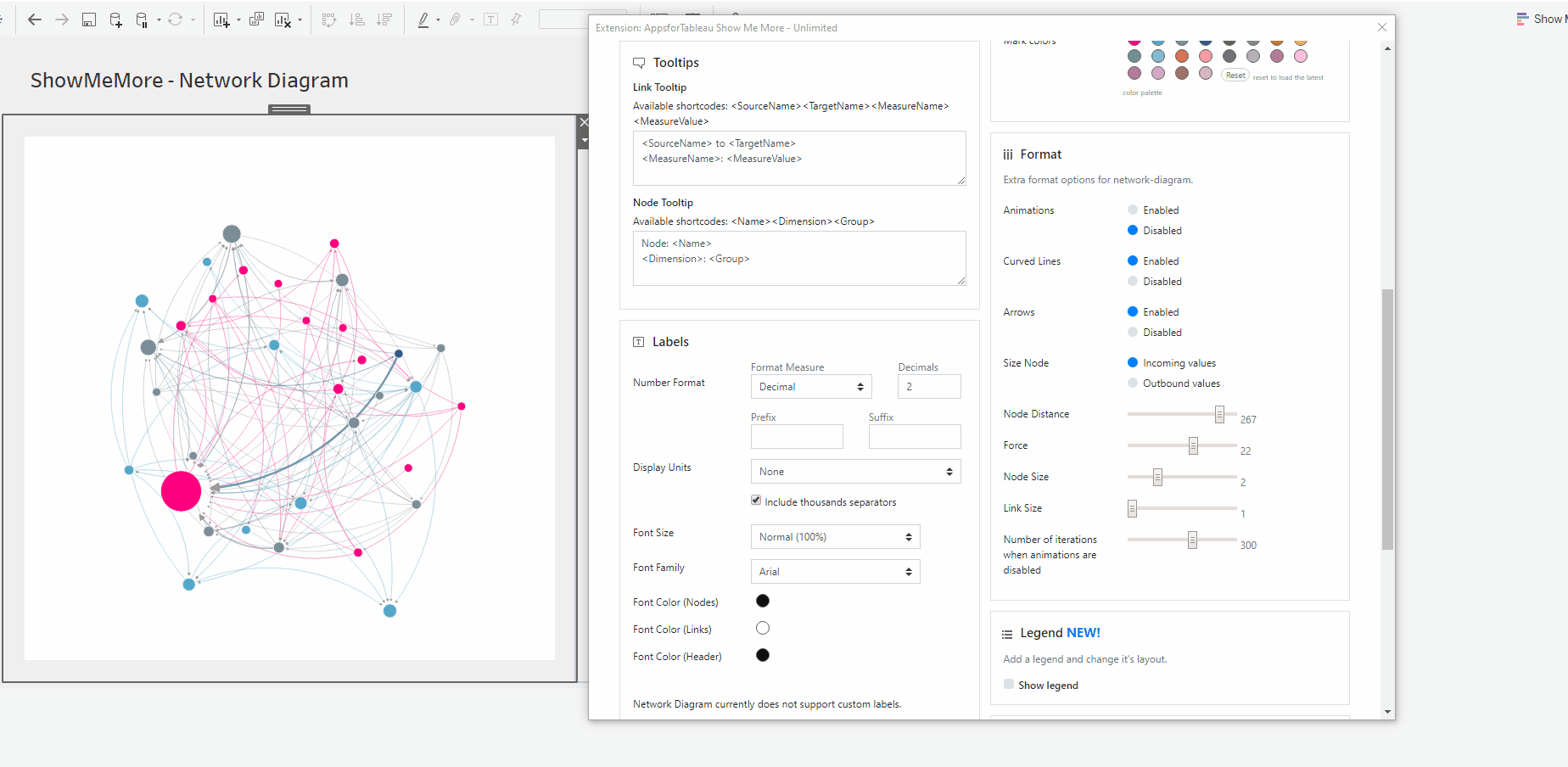
Animations
Enable or disable animations in your diagram. Liven up your dashboard with animations in your Network Diagram. Grab a node to move and see all the target nodes linked.
Curved Lines

Choose between curved and straight lines by enabling or disabling curved lines. Decide which looks better in your dashboard.


Arrows
Arrows will show the direction of source to target. Enable or disable here. This may help with the direction of the link between each of the nodes.
Size Node
Decide whether the incoming or outbound values will size your node. For example it may be important to see how many employees report to a manager, here you would choose incoming values.
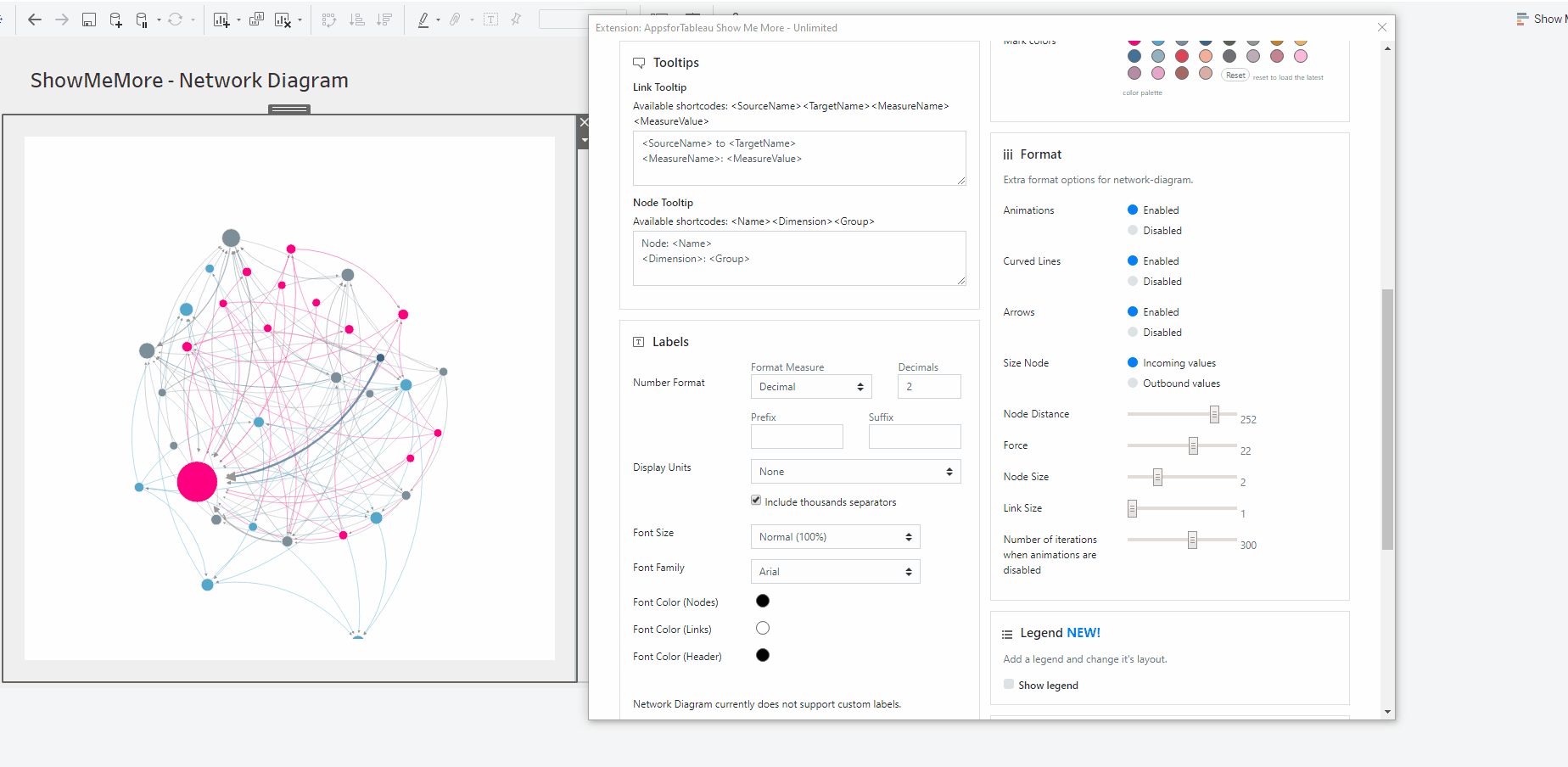
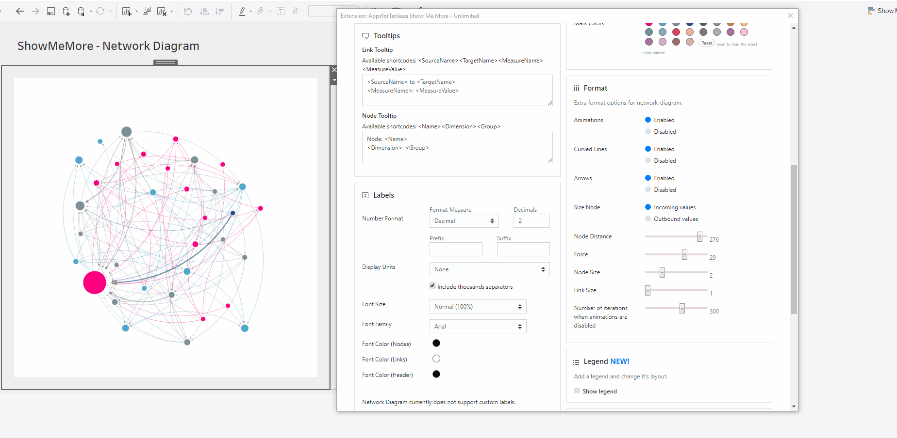
Node Distance
Change the distance from one node to another using the scroll bar. 300 being the biggest distance.

Node Size
Increase or decrease the size of your nodes, with 1 being the smallest & 5 the largest. All nodes will change in proportion. With less nodes available it may be beneficial to increase their size.
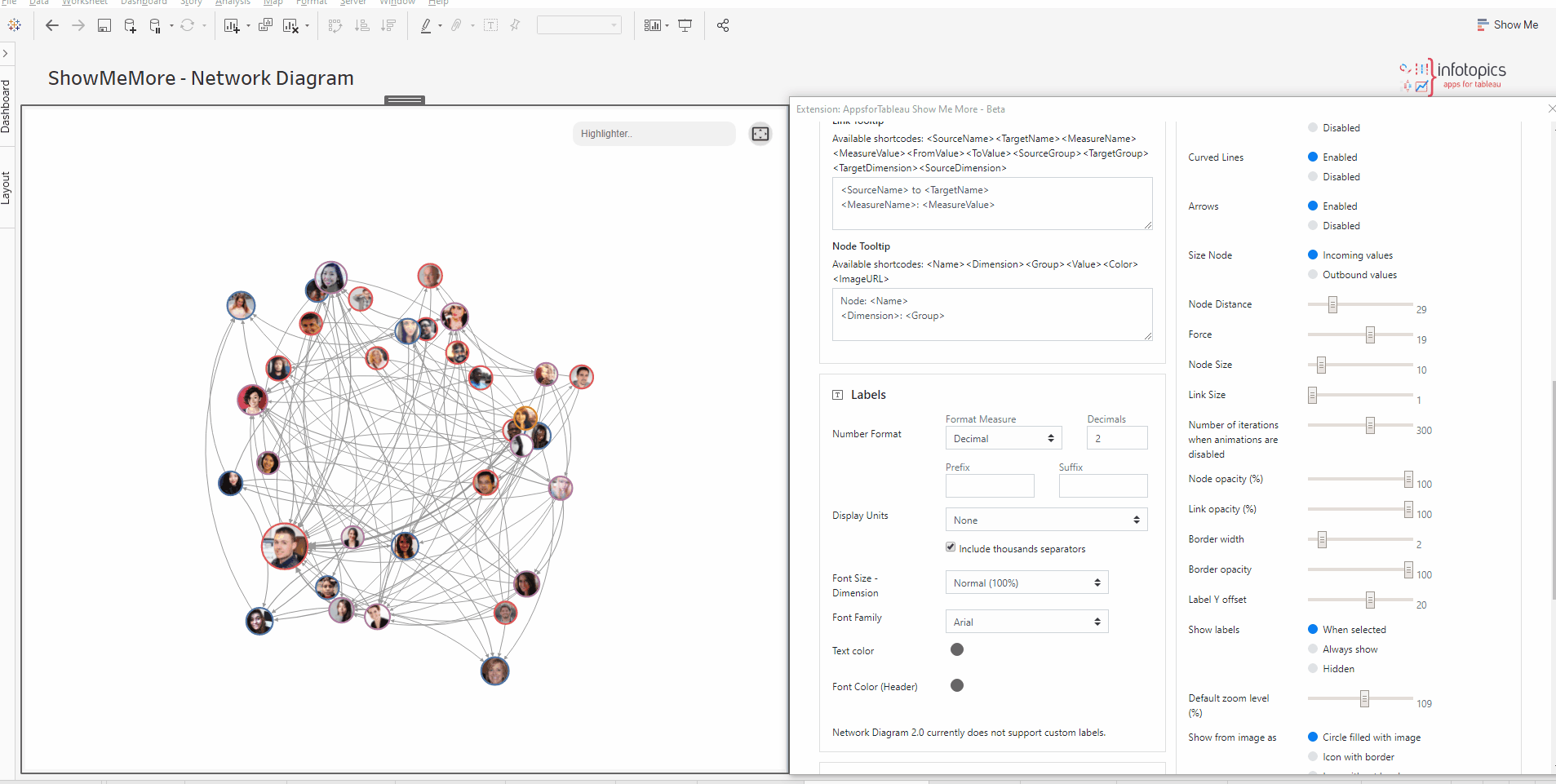
Link Size
Increase or decrease the width of your link, with 1 being the smallest & 5 the largest. Increase the stroke size to show clearer links.
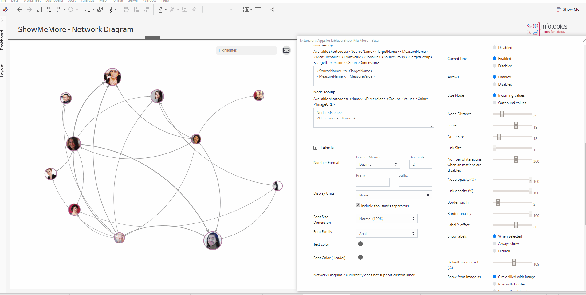
Number of iterations when animations are disabled
Decide on how many iterations there will be when disabled. The iterations will help with the look by avoiding overlaps for example. To improve the performance try reducing the iterations.
Node/Link Opacity
Use the sliders to change the opacity of the Nodes and Links separately. Having a more transparent link will give a clearer view from your source to your target.
Border Width & Opacity
Change the style of your borders here by changing the width and opacity of the border. Style your nodes exactly how you want them.

Show Labels
Have labels shown always in your view, only when selected or always hidden. Labels give users more insight to what they’re seeing but it may not always be of use to have them in the viz at all times. Use the ‘Label Y Offset’ to change the position of the label.

Default Zoom Level
Some Network Diagrams may contain a large number of members. Change the default zoom level to ensure no members get cut off.
Show Image As
Choose from the many options to decide how you wish to see your URL image in the Network Diagram. Follow our GIF to see how the options effect our Network Diagram.
New Shape
 Change the shape of your nodes in your Network Diagram. Choose from circles or squares with coloured borders or not. A new look to your dashboard is controlled by the dashboard creator. Plenty of options to format these nodes by adding a border or just changing the shape.

Position groups in quadrants

This option lets you choose different positioning types in your network diagram.
- Use Simulation will let the simulation mechanism choose the node size.
- Position on X-axis will expand the network diagram on the x-axis, and group attributes will be used to decide the order of nodes.
- Similarly, position on Y-axis will expand the network diagram on the y-axis


Analytics
The Network diagram 2.0 offers multiple features to analyse the network diagram like a highlighter and a drill through.
Highlighter
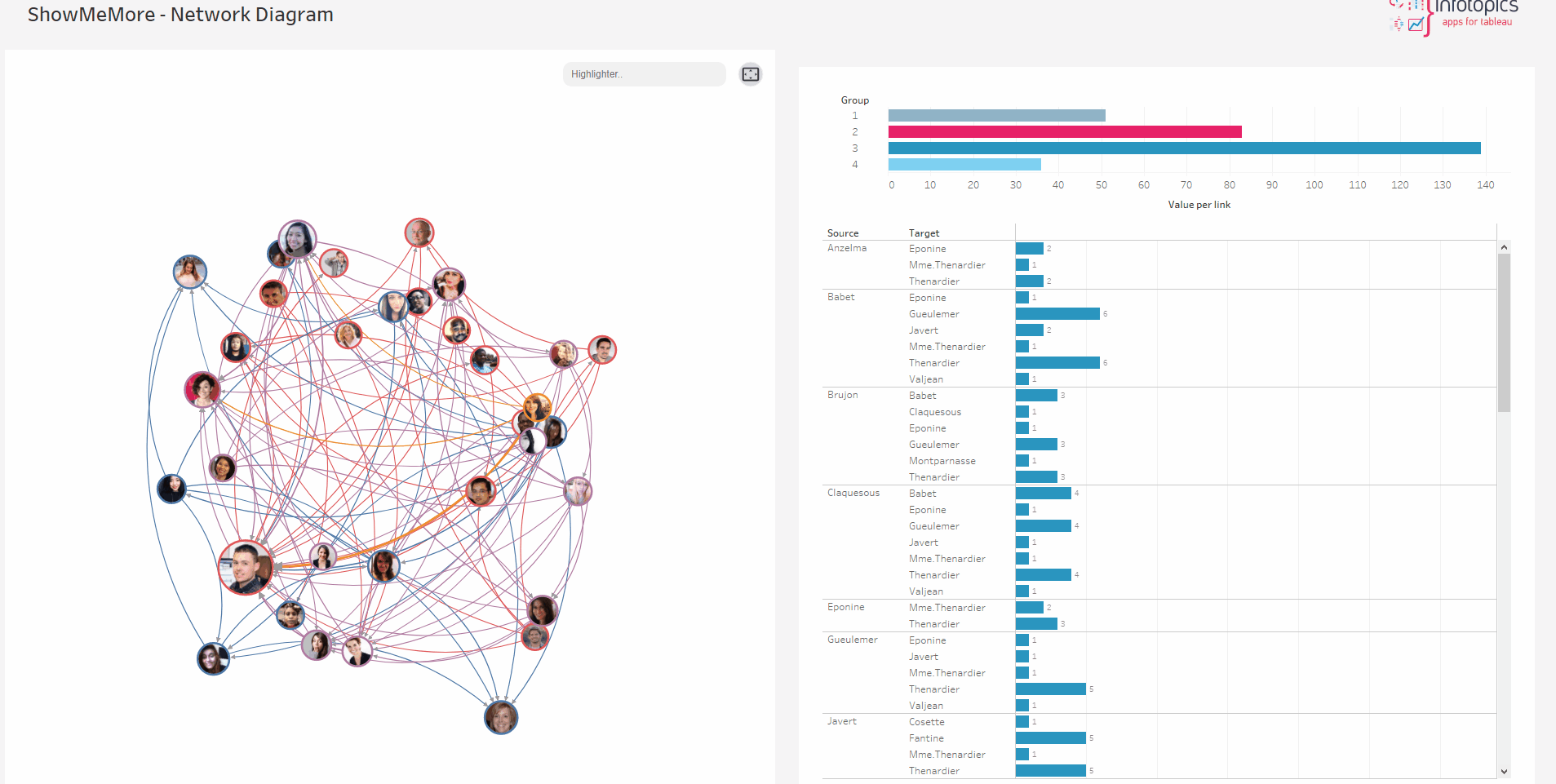
A fantastic new feature has dropped with our highlighter! In the top right corner, you can see the highlighter feature which you can use to highlight the nodes and links through a text search bar. Simply typing the name will highlight the node along with the connecting links. In a busy viz the highlighter will allow users to highlight their intended node whilst staying in the flow.
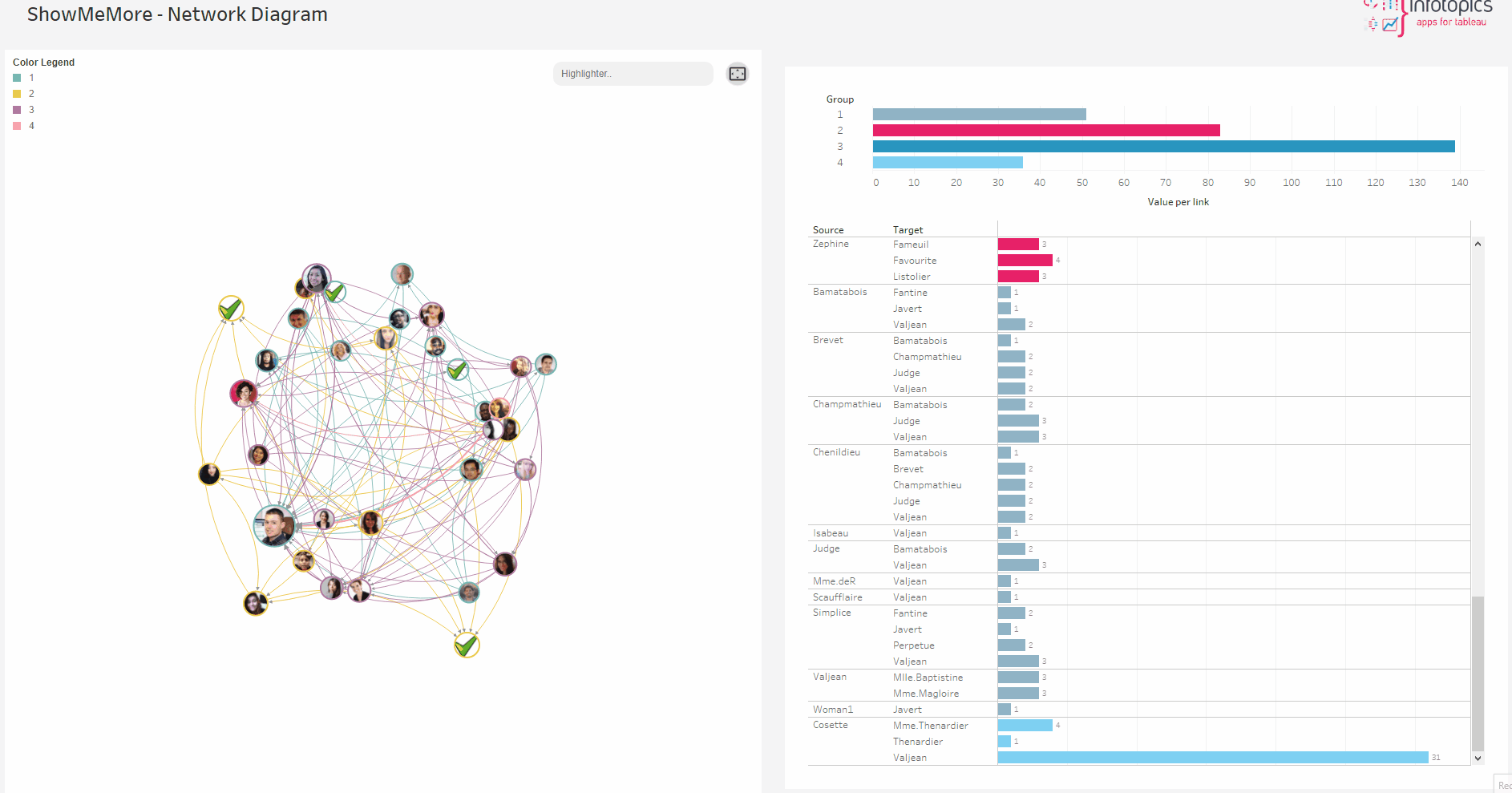
Drill-through
The Drill through feature allows you to navigate your data in an interactive way. The feature will enable you to visualize more detailed information within the network diagram. Drill through analysis is often confused with drill-down analysis as both practices are very similar. But, there is one main factor that makes them different. While drilling down provides granular information (https://appsfortableau.infotopics.com/drilldowntree/ ) within a specific chart or data set, however, drill throughs display another aspect of the data that might be relevant.
Network Diagram 2.0 offers two options to select the drill level and drill direction. The drill level defines how far your drill action propagates from the selected node. Drill direction defines in which direction you want the drill action to propagate; inward, outward, or both. For example, as the name suggests, the “inward” option highlights the nodes and paths which are coming to the selected node, and “outward” highlights the opposite.
Drill through analysis lets you see data from different points of view and navigate through data, and analyze it with different options. This greatly enhances the users’ understanding of the data and of the reasons behind the figures.
The drill through option can be used in two ways, one by setting a default configuration where the user will only be able to drill through a predefined direction and depth. Two, using the analytics pane where the user can change the drill direction and drill depth and explore the network.

Drill level lets you choose how far your drill action should propagate. level zero means it only highlights the nodes which are directly linked to the selected node. Level one means the action highlights the nodes that are connected to the nodes which are immediately connected to the selected nodes. An increase in level makes its action travel further from the selected node.
 There are three highlight options available.
- Highlight only inward links: Highlights the links which are coming towards the selected node (incoming).
- Highlight only outward links: Highlights the links which are going from the selected node (outgoing).
- Highlight both: Highlights both incoming and outgoing nodes.

This section will let you configure the analytics pane, for both drill depth and drill direction, the default option will be set from the value the user configures in the configuration pane.
Drill through actions


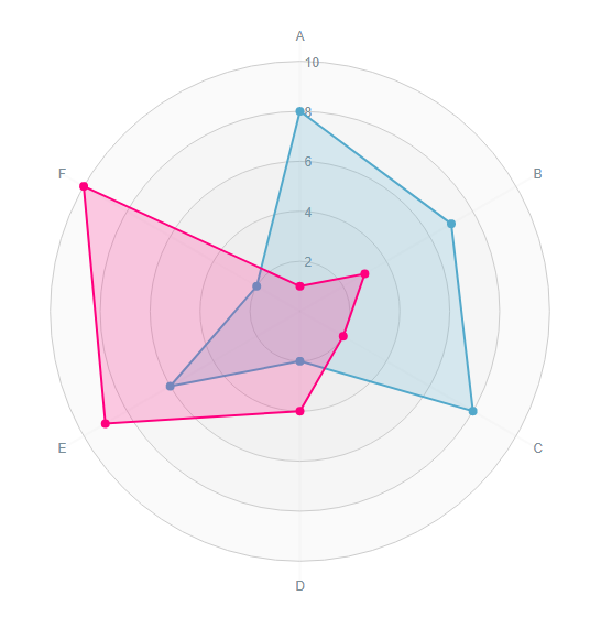
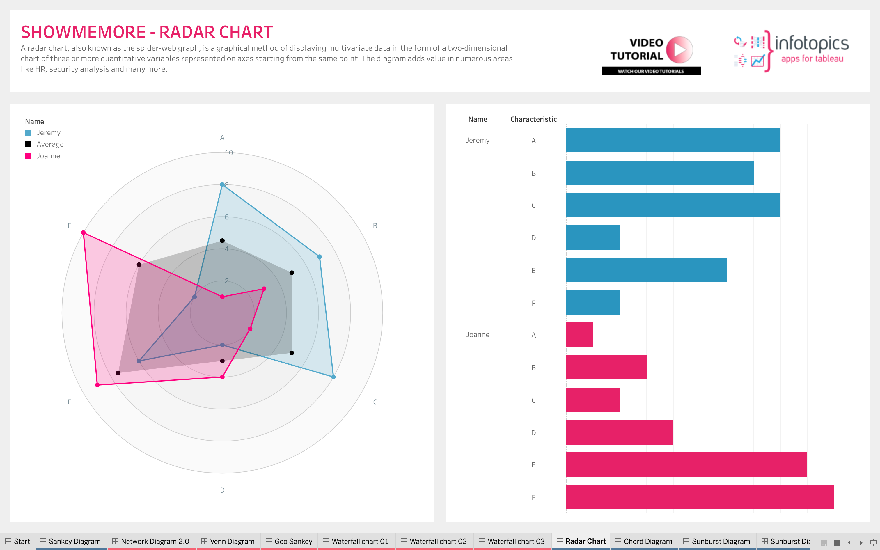
Radar Chart
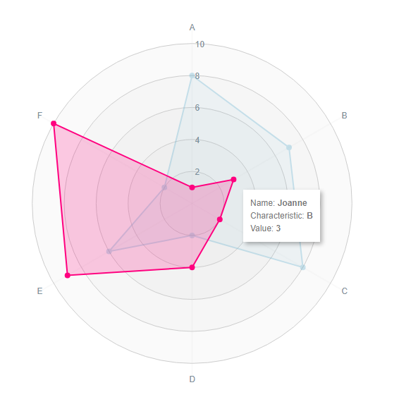
A radar chart is a graphical method of displaying multivariate data in the form of a two-dimensional chart of three or more quantitative variables represented on axes starting from the same point. Visualize a persons characteristics or plot your department security assessment results in the characteristic spider web plot.
Setting up your datasheet
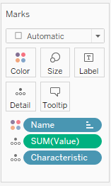
The ShowMeMore extension can connect to an existing visualization (or table) in your dashboard to retrieve the data. For best practice and performance however we recommend creating a dedicated datasheet for the ShowMeMore extension by dropping all dimensions and measures you want to use in your visualization on the details of the marks card. This will enable the best performance and allows dashboard actions to act on this dedicated datasheet. See screenshot showing how our demo workbook has been set up. For tips and advice check out our BLOG.
You do need to add the datasheet to your dashboard before ShowMeMore can use it, since the ShowMeMore extension is a Dashboard Object that retrieves data from another sheet in the dashboard. Once you added the blue squared datasheet to your dashboard you can hide it by making its container a floating container and resizing that container to 1×1 pixel. The datasheet has to remain on the dashboard!
Configure Screen
Select Data Sheet
Once you start configuring ShowMeMore, the extension automatically scans the dashboard for available sheets. Make sure you added your datasheet to the dashboard before opening the configuration screen. Don’t panic If you forgot to add the datasheet to the dashboard. Just close the configuration, add the datasheet to your dashboard and start the configuration again. Select the worksheet you want to retrieve data from (preferably your blue squared datasheet). This worksheet will be the input for the visualization you pick in the next step.
Customize Radar Chart
Dimension
Choose a dimension from the dropdown menu. This will show all the dimensions from your linked worksheet you’ve made available. We suggest no more than 3.
Axis
Choose a dimension from the dropdown menu which will act as your Radar Charts Axis. The dimension label will be on the outside of the circle. We suggest no more than 10 factors on you axis.
Color By
Choose a dimension from the dropdown menu that will color your Radar Chart. Choose the colors from the color menu within your configure pane. Using the correct color will help you differentiate one from the other.
Measure
Choose a measure you wish to use in your Radar Chart. The measure will show you how a dimension is doing in what areas allowing you to compare easily.

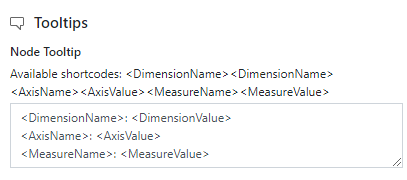
Tooltips
Format your link and node tooltip. Use the short codes as well as free text. You will see the list of available short codes you can use. How they are displayed in the box will be how you will see them in your tooltip.
Labels
Number format
Format your measure to a decimal or a percentage using the dropdown menu. Enter the amount of decimal spaces shown under ‘decimals’. Add a ‘Prefix’ and/or a ‘Suffix’ in the text boxes. A prefix will go before the word and the suffix after. A prefix for example could add a currency ‘$’ and a Suffix could add a ‘%’.
Display Units (Decimal only)
Within your data there could be large values. Here you can format using separators. Use the dropdown menu to display numerical units. Example: 6,744 – 6.74K. Use the tick box to include thousands separators. Example: 1234 – 1,234
Font Size Axis
Change the size of the font within the axis of your Radar Chart. When you have multiple dimensions within your axis it may be useful to reduce the font size.
Font Size Dimension
Make your Dimension stand out around your Radar Chart by increasing the size of the font.
Font Family
Use the dropdown menu to change the font best to suit your dashboard.
Font Color
Clicking on the circles alongside the labels will open the color palette. Here you can separately change the font colors of your Axis, Dimension and Header!
Dashboard Actions
Dashboard actions are available within your Radar Chart! Filter down on a dimension by clicking a node and see that interact instantly with your dashboard. Click the centre of your Radar chart to filter all nodes or click on nodes individually to filter. It’s also possible to filter back from your tableau dashboard.

Refresh
Warning! We are continuously looking to improve our solutions, clicking refresh will give you the latest release with all the new features. Your Radar Chart will reset including color palette, measures and columns.
Color
Click the ‘Use new color formatting’ checkbox to use the new color options. This will allow you to color your dimensions, individually. When not using the new color formatting option, the Mark Colors will be colored by sorting order. This will allow you to customize your dashboard greatly!
Background color
Use the circle to open the color palette to change the background color of your Radar Chart. Use this to best match your dashboard color style.
Mark Colors
Use the circles to open the color palette to change the colors of the marks. The order they are in will be the order of your levels.
Select colors for dimensions: (New color formatting only)
Click on the color palette that’s alongside your chosen dimensions to choose their color. The new coloring format will improve your ease of use by seeing which dimension is represented by which color.
Format
Axis Labels
Enable the axis label to be shown in the view. It may be beneficial to have these turned off in the view for a larger chart in your dashboard.
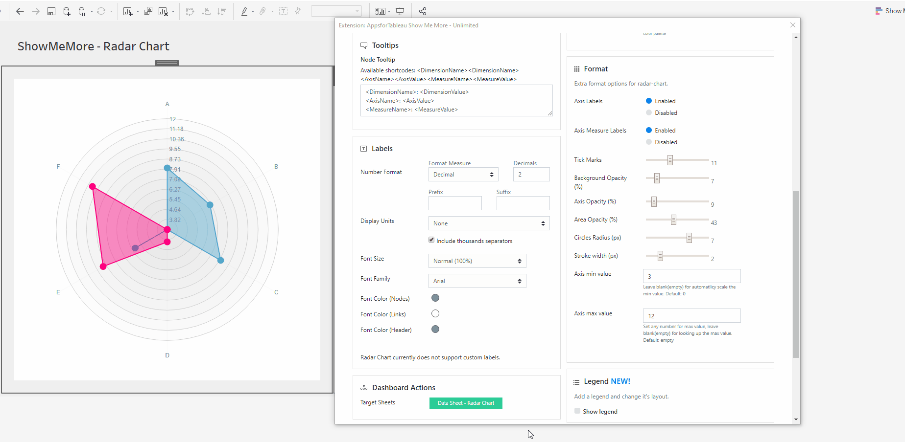
Axis Measure Labels
Enable or disable your axis measure labels. Take these away will leave a clean chart where you may be able to compares your dimensions as an overview.
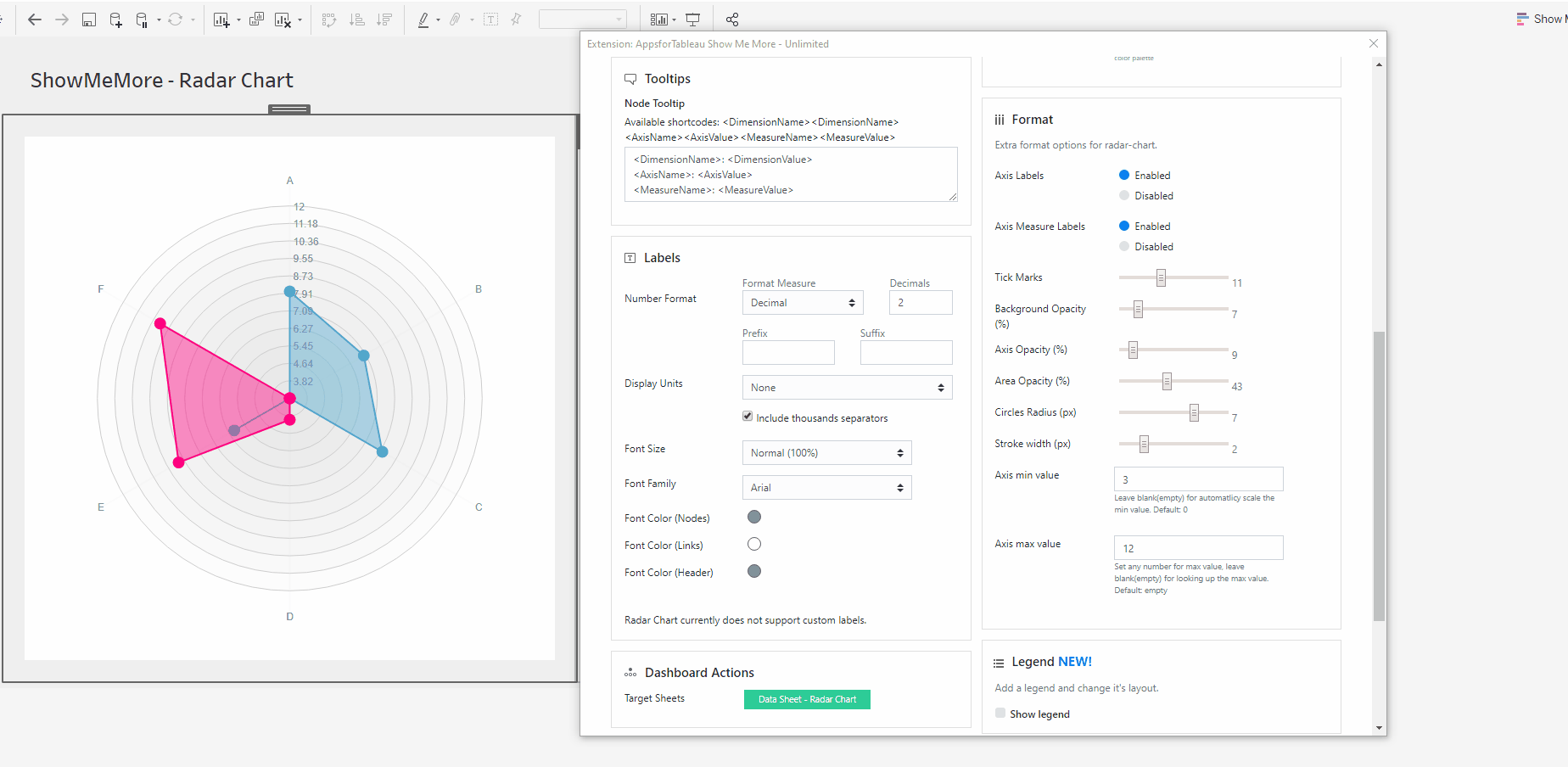
Tick Marks
Want a more detailed view of where you’re measures are in your Radar Chart? Add more tick marks by using the slider.
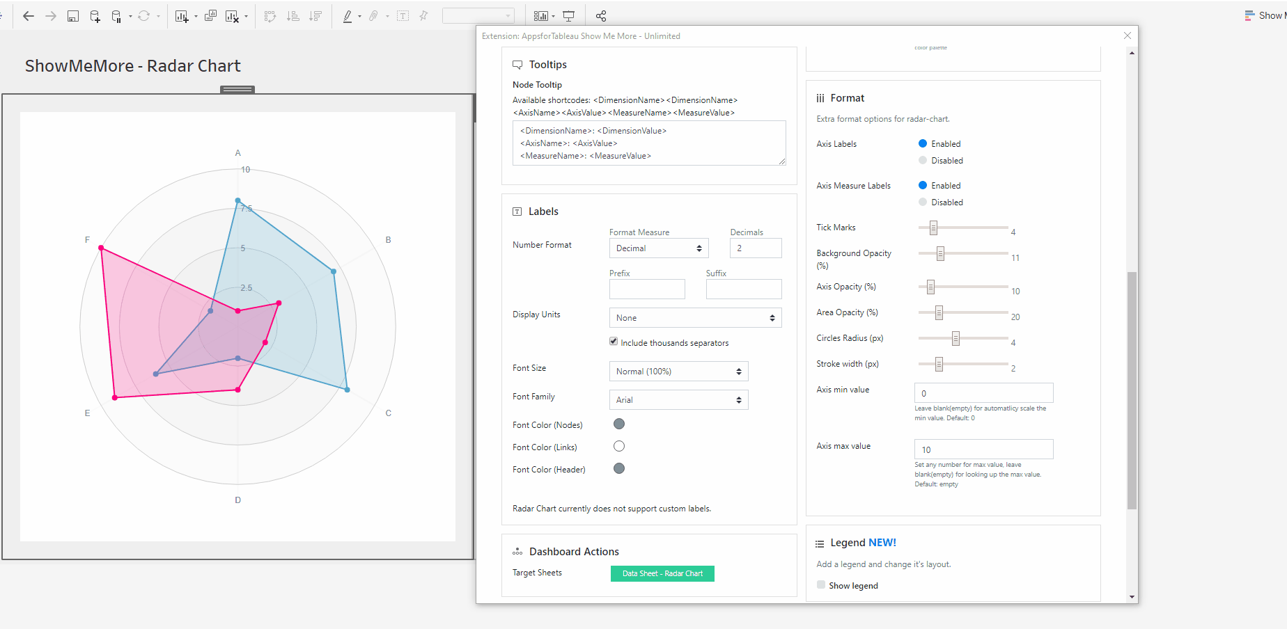
Background Opacity
Change the opacity of the gradient in your Radar Charts background. Allow your dimensions to stand out more.
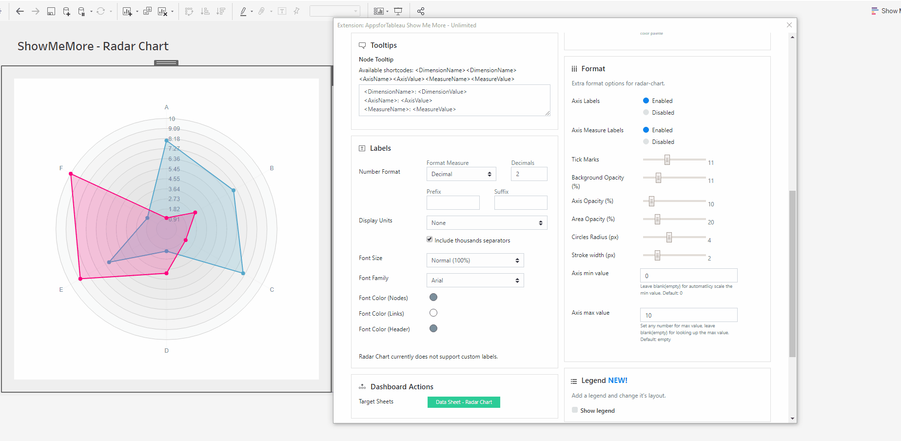
Axis Opacity
Have the axis lines run clear through your chart, this may assist you in understanding your results better.

Area Opacity
Allow the measure labels to be shown through your axis by changing the opacity of the area for example.
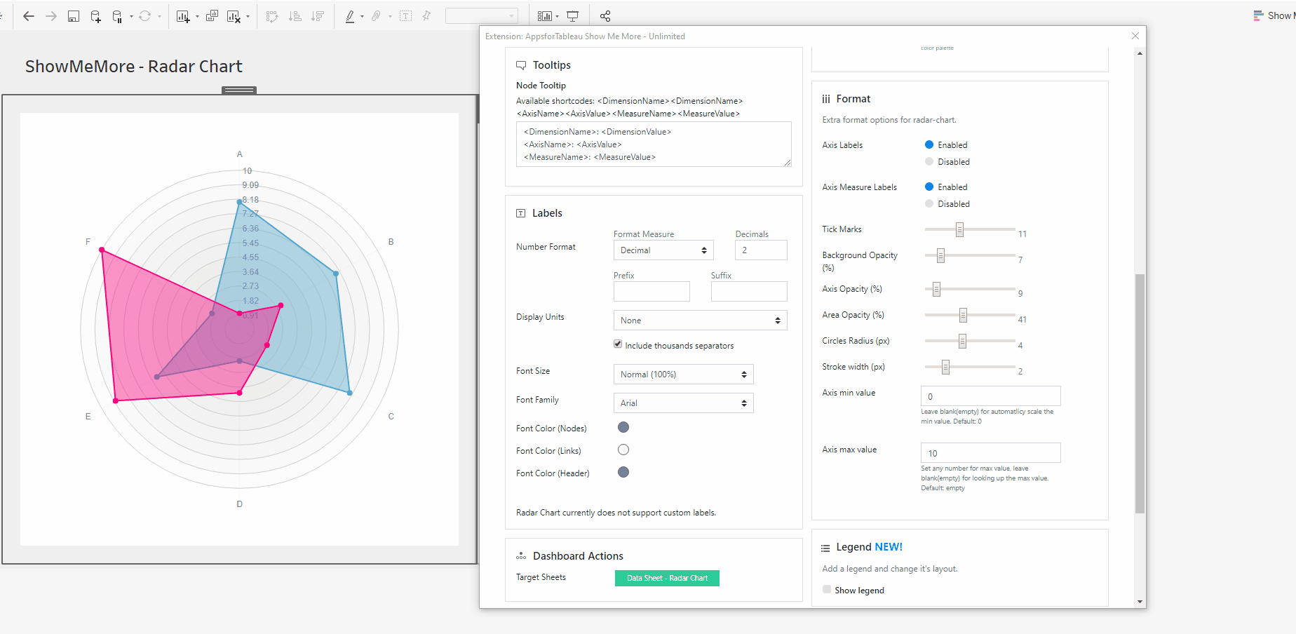
Circles Radius
Change the size of the circle points. With many points it may benefit you to have smaller circles in your view.

Stroke Width
Do you want thick or thin lines connecting your points? Change this here.
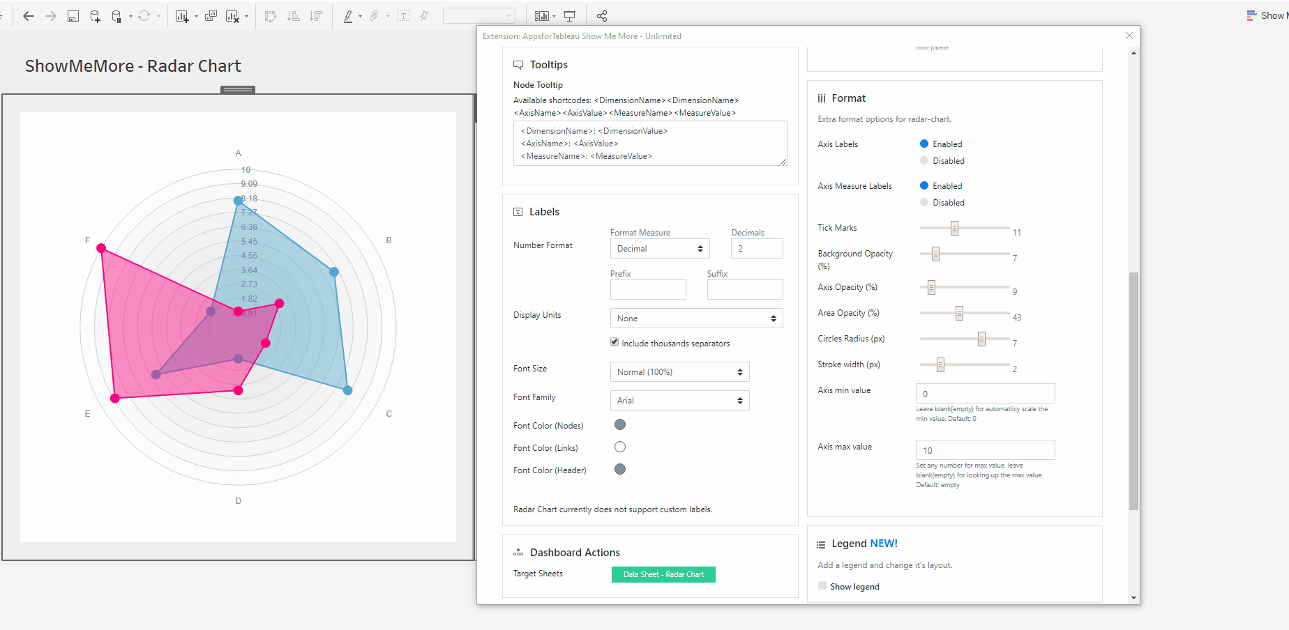
Axis Min Value
Set the minimum value to be shown in your view. It may be important to only show values at a certain level to get real value in your Radar Chart.
Axis Max Value
Set the maximum value to be shown in your view. You may want to compare over a range, you can easily do this here.
Reverse Axis
By default the values of the axis will start at 0 (zero) and show the numbers increasing to each axis, this can now be reversed to show the 0 (zero) value outside with the values increasing towards the centre.
Show Average
An average can be shown in your viz, this will show the average of all of the values present in your viz to give you more insight to your viz. The average color can be changed to make it stand out.
Legend
To have a legend in your Radar Chart, tick the ‘Show legend’ button. When having a large selection of dimensions, it may be of benefit to use a color legend to display.
Legend Position
Choose where your legend will be. Left, Right, Top & Bottom. Every Radar Chart could be different, change to give your dashboard the best look.
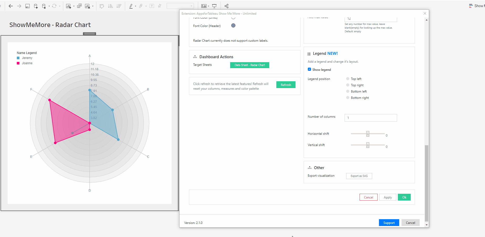
Number of columns
Decide how many columns the color legend should show in your view. This will help with the look of your Radar Chart.
Horizontal shift
Use the slider to adjust the position horizontally of your Legend. Use this to get it in the perfect position.
Vertical shift
Use the slider to adjust the position vertically. This could allow you to have more text shown in your view.
Other
Export your visualization as a SVG. This will open a prompt box explaining how to export.
Tutorial
Click on this link for a tutorial on how to use the Radar Chart
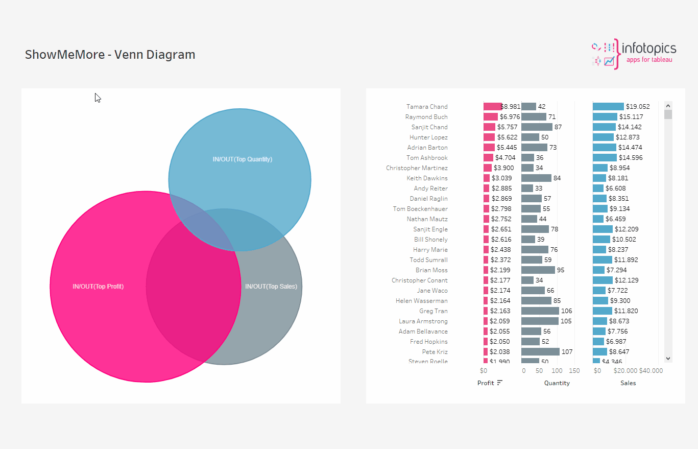
Venn Diagram
A Venn Diagram is a diagram that visually displays all the possible logical relationships between a collection of sets. Each set is typically represented with a circle. Contained within each set is a collection of objects or entities that all have something in common. When sets overlap, it’s known as the intersection area. This is where entities that have all the qualities of the overlapping sets.
Setting up your datasheet
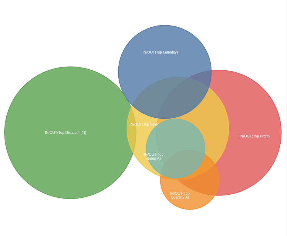
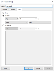
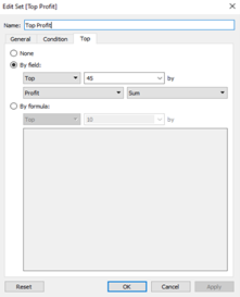
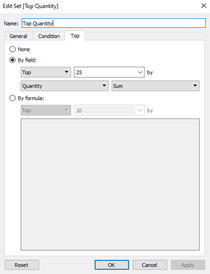
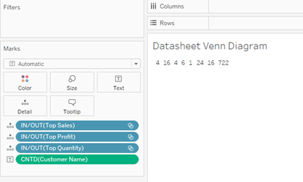
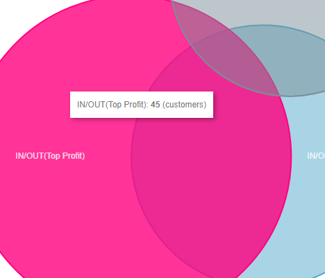
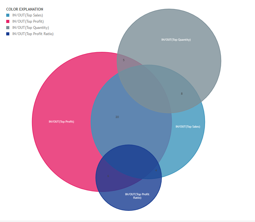
The Venn Diagram uses Tableau Sets to visualize overlap between sets. For tips and advice check out our BLOG. To get started you need to create two or more sets. In the example dashboard we used the Tableau Superstore demo dataset to create three sets:
- My Top 30 customers based on Sales
- My Top 45 customers based on Profit
- My Top 25 customer based on Quantity
In Tableau these sets are created based on Customer ID like shown below
Drag these sets to the detail of your Marks pane and also add the countD of your Customer name or Customer ID as a measure. You will end up with a datasheet that looks like this
Configure Screen
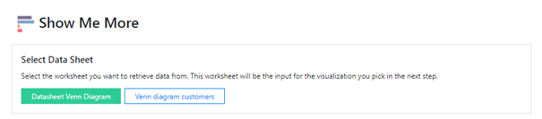
Select Data Sheet
Select the worksheet you want to use as datasheet for your Venn diagram. This worksheet will be the input for the visualization (Venn Diagram) you pick in the next step.
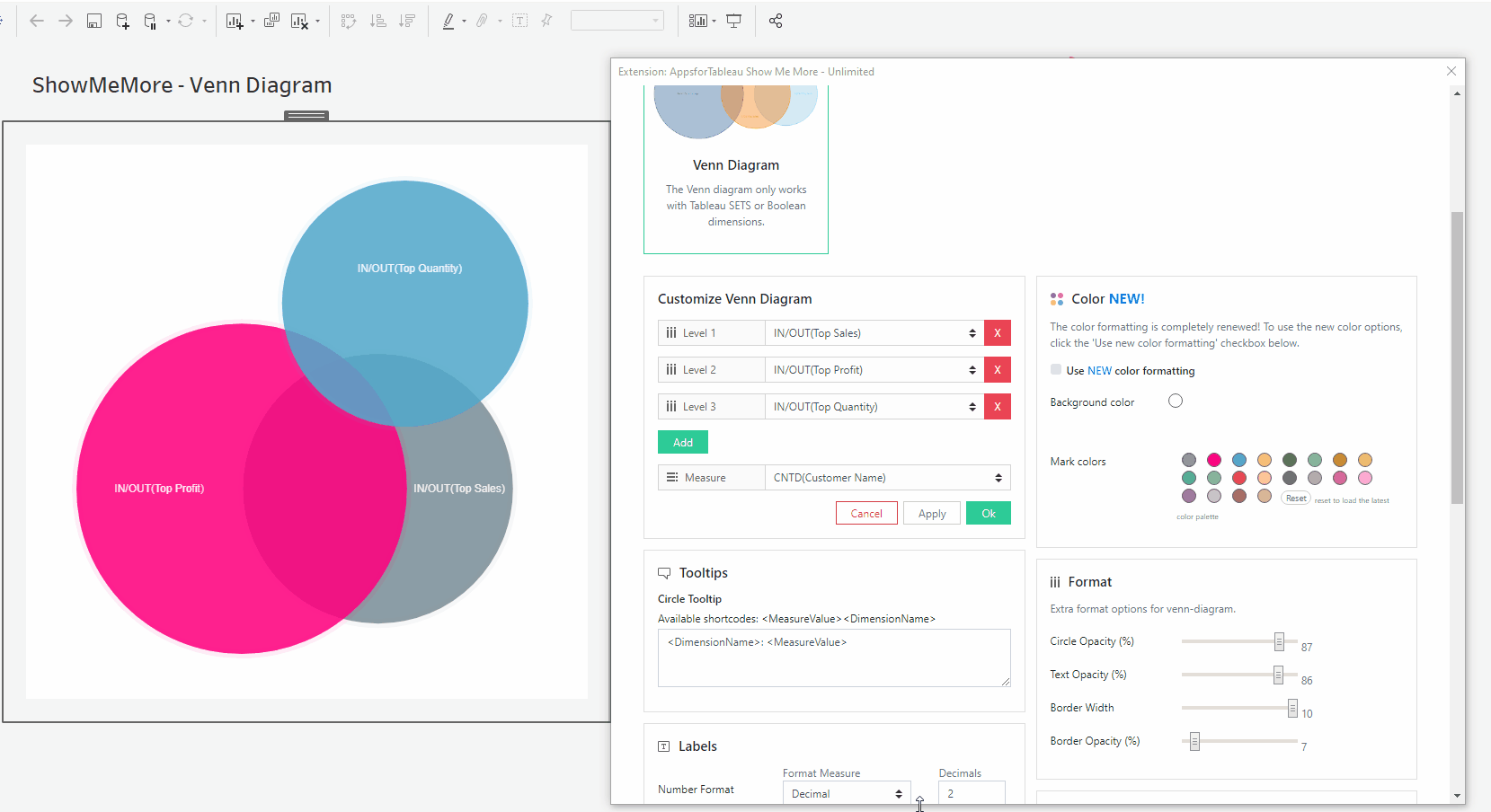
Customize Venn Diagram
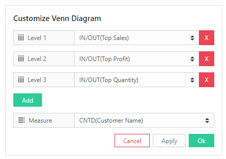
Choose the levels to be view in your Venn Diagram. Here you select the sets you want to be part of your Venn diagram (Top customers Sales, Top customers Profit and Top customers Quantity). The dimensions chosen will be visualized by overlapping spheres where its size is according by the measure chosen (number of unique customers). Use the dropdown menus to choose the specific sets and measure. Use the green ‘Add’ button if you want to add an extra set in your Venn Diagram.
Tooltips
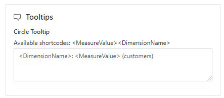
Format your link and node tooltip. Use the short codes as well as free text. You will see the list of available short codes you can use. How they are displayed in the box will be how you will see them in your tooltip.
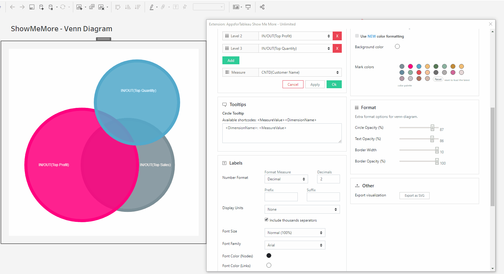
Labels
Number format
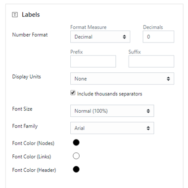
Format your measure to a decimal or a percentage using the dropdown menu. Enter the amount of decimal spaces shown under ‘decimals’. Add a ‘Prefix’ and/or a ‘Suffix’ in the text boxes. A prefix will go before the word and the suffix after. A prefix for example could add a currency ‘$’ and a Suffix could add a ‘%’.
Display Units (Decimal only)
Within your data there could be large values. Here you can format using separators. Use the dropdown menu to display numerical units. Example: 6,744 – 6.74K. Use the tick box to include thousands separators. Example: 1234 – 1,234.
Font Size
Use the dropdown menu to change the size of the font from 50% – 150%. Changing the font size will affect all fonts within your Venn Diagram.
Font Family
Use the dropdown menu to change the font best to suit your dashboard.
Font Color
Clicking on the circle shapes will open the color palette. Customise your nodes, links and headers separately.
Example configuration for Labels:
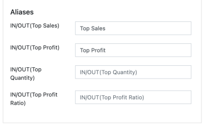
Aliases
Using aliases, it is possible to rename nodes to clearly communicate their definition without having to edit the name of the measure. Leaving a row empty will default to the measure name taken from de datasource.
Dashboard Actions
Dashboard actions are available within your Venn Diagram! Filter down on a dimension by clicking a node and see that interact instantly with your dashboard. It’s also possible to filter back from your tableau dashboard.
In the example dashboard I configured the Dashboard action like shown below:
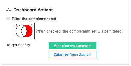
This will trigger selection of a sphere or overlapping segment of the VENN diagram and act as a filter on the Target sheet (the Bar Chart with all customers).
Let’s say there is a dataset of customers who bought a car, a motorbike or a bicycle, and some of them bought more than 1 vehicle. When the checkbox is selected, clicking the outside part of the “car” dataset will select only the customers that bought a car, and no other vehicles. When the checkbox is not selected, clicking the “car” dataset will select all customers who bought a car, even those who also bought a motorbike and/or bicycle.
In the example below you can see that selecting a sphere or an overlapping segment of spheres will filter my customers to the ones that are part of the sets involved in my selection.
Refresh
Warning! We are continuously looking to improve our solutions, clicking refresh will give you the latest release with all the new features. Your Venn Diagram will entirely reset including color palette, measures and columns.
Color
Click the ‘Use new color formatting’ checkbox to use the new color options. This will allow you to color your dimensions, individually. When not using the new color formatting option, the Mark Colors will be colored by sorting order. This will allow you to customize your dashboard greatly!
Background color
Use the circle to open the color palette to change the background color of your Venn Diagram to blend it in perfectly with the rest of your dashboard.
Mark Colors
Use the circles to open the color palette to change the colors of the marks. The order they are in will be the order of your levels.
Select colors for dimensions: (New color formatting only)
Click on the color palette that’s alongside your chosen dimensions to choose their color. This will ensure that the set/dimension you choose always has the same coloring in the dashboard
Format
Circle Opacity
Set up the opacity to see all the overlaying circles clearly. Use the slider to change the opacity of the circles. 100 being full opacity 0 being no opacity.

Text Opacity
The text may stand out too much, here you can blend in to your diagram. Use the slider to change the opacity of the text. 100 being full opacity 0 being no opacity.

Border Width
Having a wider border may help to show each level clearer. Change the width of your boarder. 0 being the smallest, 10 being the biggest.
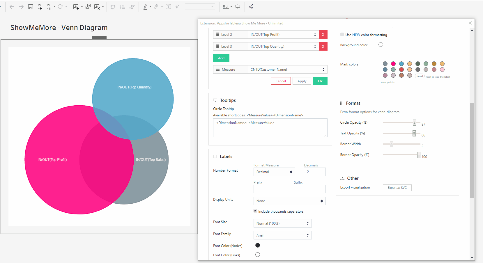
Border Opacity
Use the slider to change the opacity of the border. 100 being full opacity 0 being no opacity.
Legend
Add a legend to your viz to give some meaning to the colors displayed. Here you can change the layout, title and position of the legend to best suit your viz.
Other
Export your visualization as a SVG. This will open a prompt box explaining how to export.
Tutorial
Click on this link for a tutorial on how to use the Venn Diagram
Network Diagram
This type of visualisation shows how things are interconnected through the use of nodes / vertices and link lines to represent their connections and help illuminate the type of relationships between a group of entities. Start connecting the dots in your customer base or visualize team relationships with this viz type.
Setting up your worksheet
For the best practice we recommend dropping all dimensions and measures on to the marks card. This will enable the best performance. The main components of the dataset will be a ‘source’, ‘target’ and a measure. For example your source may be the managers in your organisation, the target being the employees they manage and the measure being the total sales. Group your dimensions and set them as your color. This will allow you to have a clear understanding of your network. See screenshot showing how our demo workbook has been set up. For tips and advice check out our BLOG.

Configure Screen
Select Data Sheet
Select the worksheet you want to retrieve data from. This worksheet will be the input for the visualization you pick in the next step.
Customize Network Diagram
Source
Choose your dimension from the dropdown menu to be your source. Within your network these maybe your managers for example who will then have links to their employees for example as their ‘target’.
Target
Choose your dimension from the dropdown menu to be your target of your links with the source dimension.
Color By
From the dropdown menu choose a dimension that will color the nodes in your Network diagram. You may for example have certain group or department in your datasheet where certain employees are employed, these can be colored per group here. Colors can be chosen in the color segment of the configuration screen under ‘Mark Colors’ which will be discussed later on.
Measure
Choose your measure from the dropdown. Here you may wish to show how many employees are under a managers name, the larger the value the larger the node will be in the view.
Tooltips
Format your link and node tooltip. Use the shortcodes as well as free text. You will see the list of available shortcodes you can use. How they are displayed in the box will be how you will see them in your tooltip.
Labels
Number format
Format your measure to a decimal or a percentage using the dropdown menu. Enter the amount of decimal spaces shown under ‘decimals’. Add a ‘Prefix’ and/or a ‘Suffix’ in the text boxes. A prefix will go before the word and the suffix after. A prefix for example could add a currency ‘$’ and a Suffix could add a ‘%’.
Display Units (Decimal only)
Within your data there could be large values. Here you can format using separators. Use the dropdown menu to display numerical units. Example: 6,744 – 6.74K. Use the tick box to include thousands separators. Example: 1234 – 1,234
Font Size
Use the dropdown menu to change the size of the font from 50% – 150%
Font Family
Use the dropdown menu to change the font best to suit your dashboard.
Font Color
Clicking on the circle shapes will open the color palette. Nodes, Links and Headers can all be changed separately using their own palette.
Dashboard Actions
Dashboard actions are available within your Network Diagram! Filter down on a dimension by clicking a node and see that interact instantly with your dashboard. It’s also possible to filter back from your tableau dashboard. You can do this as you would with your dashboard, by selecting ‘use as filter’ on your container.
Target sheets
Decide which sheets you wish the extension to trigger, all sheets that are available on your dashboard will be shown here. Multiple sheets can be triggered with a dashboard action.
Selected fields
Which field would you like the extension to trigger on? This can be the dimension chosen as your source or the target dimension. Decide which is the field you wish to be the trigger of the extension.
Refresh
Warning! We are continuously looking to improve our solutions, clicking refresh will give you the latest release with all the new features. Your Network Diagram will reset including color palette, measures and columns.
Color
Click the ‘Use new color formatting’ checkbox to use the new color options.
Background color
Use the circle to open the color palette to change the background colour of your Network Diagram. Use this to best match your dashboard color style.
Color Mode
Choose between Color Nodes or Color Nodes and Links. Coloring just the nodes will leave the links grey.
Mark Colors
Use the circles to open the color palette to change the colors of the marks. The order they are in will be the order of your levels.
Select colors for dimensions: (New color formatting only)
Click on the color palette that’s alongside your chosen dimensions to choose their color. The new coloring format will improve your ease of use by seeing which dimension is represented by which color.
Format
Animations
Enable or disable animations in your diagram. Liven up your dashboard with animations in your Network Diagram. Grab a node to move and see all the target nodes linked.
Curved Lines
Choose between curved and straight lines by enabling or disabling curved lines. Decide which looks better in your dashboard.

Arrows
Arrows will show the direction of source to target. Enable or disable here. This may help with the direction of the link between each of the nodes.
Size Node
Decide whether the incoming or outbound values will size your node. For example it may be important to see how many employees report to a manager, here you would choose incoming values.
Node Distance
Change the distance from one node to another using the scroll bar. 300 being the biggest distance.
Force
The force pushes the nodes from its closest node away. The larger the node, the stronger the push it will have. Adjust the slider to increase the force!
Node Size
Increase or decrease the size of your nodes, with 1 being the smallest & 5 the largest. All nodes will change in proportion. With less nodes available it may be beneficial to increase their size.
Link Size
Increase or decrease the width of your link, with 1 being the smallest & 5 the largest. Increase the stroke size to show clearer links.

Number of iterations when animations are disabled
Decide on how many iterations there will be when disabled. The iterations will help with the look by avoiding overlaps for example. To improve the performance try reducing the iterations.
Legend
To have a legend in your Network Diagram, tick the ‘Show legend’ button. When having a large selection of dimensions, it may be of benefit to use a color legend to display.
Legend Position
Choose where your legend will be. Left, Right, Top(color only) & Bottom (color only)
Number of columns
Add more columns in the text box to get the best look for your Network Diagram.
Horizontal shift
Use the slider to adjust the position or your legend horizontally
Vertical shift
Use the slider to adjust the position of your legend vertically
Sunburst Diagram NEW
This type of visualization shows hierarchy through a series of rings, that are sliced for each category node. Each ring corresponds to a level in the hierarchy, with the central circle representing the root node and the hierarchy moving outwards from it. Rings are sliced up and divided based on their hierarchical relationship to the parent slice. The angle of each slice is either divided equally under its parent node or can be made proportional to a value.
Setting up your worksheet
For the best practice we recommend dropping all dimensions and your measure on to the marks card. This will enable the best performance. Your data should be organized with your hierarchical data. See screenshot showing how our demo workbook has been set up. For tips and advice check out our BLOG.
Configure Screen
Select Data Sheet
Select the worksheet you want to retrieve data from. This worksheet will be the input for the visualization you pick in the next step.
Customize Sunburst Diagram
Choose the dimensions you wish to show in your Sunburst Diagram. Use the dropdown menu to select your dimension. The first chosen dimension will fill out the inner part of your Sunburst Diagram. Assign your chosen measure by clicking on the measure dropdown menu. Example: A book store would use a Sunburst Diagram to see sales per genre. The hierarchy could be ‘Genre’, ‘Sub-Genre’, ‘Topic’ etc. This is an ideal way of showing which genres have the best sales.
Tooltips
Format your link and node tooltip. Use the short codes as well as free text. You will see the list of available short codes you can use. How they are displayed in the box will be how you will see them in your tooltip.
Labels
Number format
Format your measure to a decimal or a percentage using the dropdown menu. Enter the amount of decimal spaces shown under ‘decimals’. Add a ‘Prefix’ and/or a ‘Suffix’ in the text boxes. A prefix will go before the word and the suffix after. A prefix for example could add a currency ‘$’ and a Suffix could add a ‘%’.
Display Units (Decimal only)
Within your data there could be large values. Here you can format using separators. Use the dropdown menu to display numerical units. Example: 6,744 – 6.74K. Use the tick box to include thousands separators. Example: 1234 – 1,234.
Font Size
Use the dropdown menu to change the size of the font from 50% – 150%. Changing the font size will affect all fonts within your Sunburst Diagram.
Font Family
Use the dropdown menu to change the font best to suit your dashboard.
Font Color
Clicking on the circle shapes will open the color palette. Nodes, Links and Headers can all be changed separately using their own palette.
Dashboard Actions
Dashboard actions are available within your Sunburst Diagram! Filter down on a dimension by clicking a node and see that interact instantly with your dashboard. It’s also possible to filter back from your tableau dashboard.
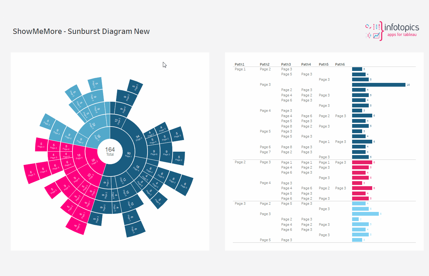
Target Sheet
Decide which sheets are triggered when using the extension. Multiple sheets may be chosen. It be important to target just a single sheet on the dashboard so this will offer huge value.
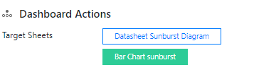
Refresh
Warning! We are continuously looking to improve our solutions, clicking refresh will give you the latest release with all the new features. Your Sunburst Diagram will reset including color palette, measures and columns.
Color
Click the ‘Use new color formatting’ checkbox to use the new color options. This will allow you to color your dimensions, individually. When not using the new color formatting option, the Mark Colors will be colored by sorting order. This will allow you to customize your dashboard greatly!
Background color
Use the circle to open the color palette to change the background color of your Chord Diagram.
Color By
Choose either having all values the same color or all to be colored by the ‘level 1’ values
Mark Colors
Use the circles to open the color palette to change the colors of the marks. The order they are in will be the order of your levels.
Select colors for dimensions: (New color formatting only)
Click on the color palette that’s alongside your chosen dimensions to choose their color. The new coloring format will improve your ease of use by seeing which dimension is represented by which color.
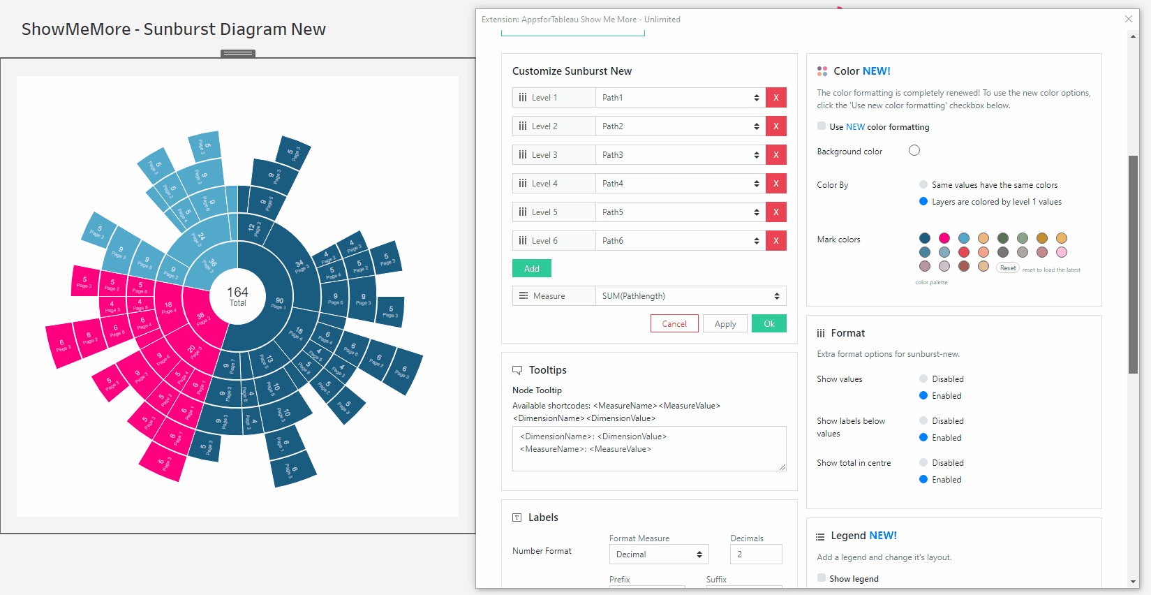
Format
Show Values
Have the values shown on your Sunburst Diagram. Some occasions it may be useful to only show certain labels in your view, disabling will allow you to hide the value.
Show labels below values
Format the labels by having them below the values. This may be useful if the values are the most important component of your diagram.
Show total in centre
Have a grand total shown in the centre of your Sunburst! A fantastic feature to see the total values within your Sunburst Diagram
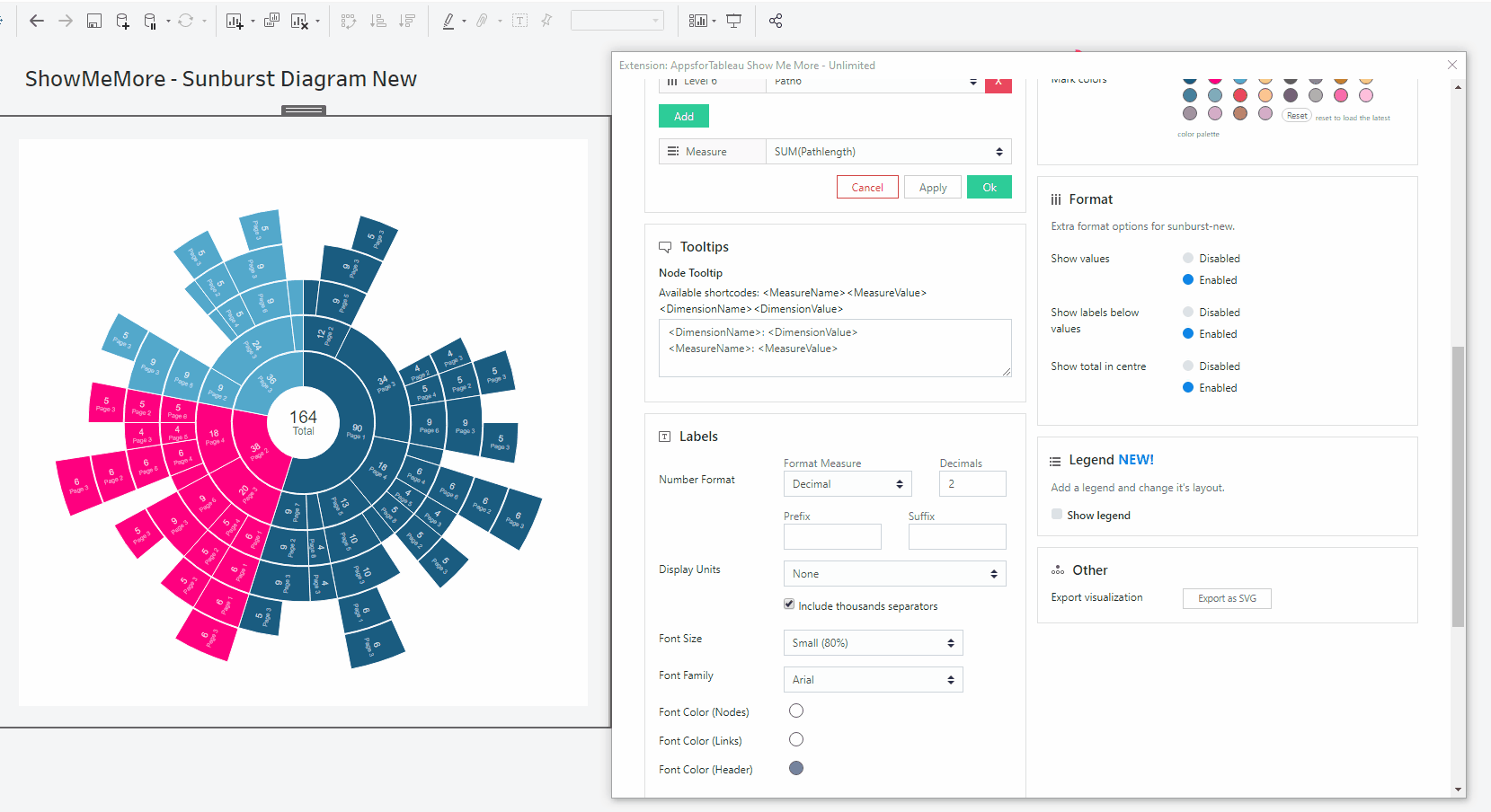
Legend
To have a legend in your Sunburst Diagram, tick the ‘Show legend’ button. When having a large selection of dimensions, it may be of benefit to use a color legend to display.
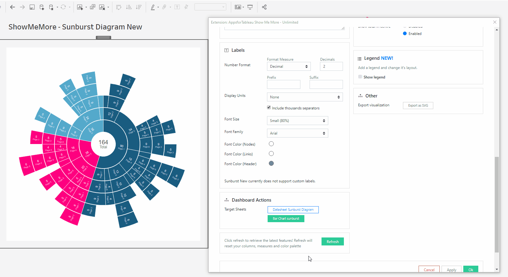
Legend Position
Choose where your legend will be from the 6 options! Your Sunburst Diagram will autosize to fit the legend in the view.
Number of columns
Add more columns in the text box to get the best look for your Sunburst Diagram. You may prefer to have them in a row or on top of each other.
Horizontal shift
Use the slider to adjust the position horizontally of your Legend. Use this to get your legend in the perfect position.
Vertical shift
Use the slider to adjust the position vertically. This could allow you to have more text shown in your view.
Other
Export your visualization as a SVG. This will open a prompt box explaining how to export.
Tutorial
Click on this link for a tutorial on how to use the Sunburst Diagram
Chord Diagram
This type of diagram visualizes the inter-relationships between entities. The connections between entities are used to display that they share something in common. This makes Chord Diagrams ideal for comparing the similarities within a dataset or between different groups of data.
Setting up your worksheet
For the best practice we recommend dropping all dimensions and measures on to the marks card. This will enable the best performance. For tips and advice check out our BLOG. This visualization requires matrix data to work. For example A -> B, B ->A, A->A & B->B. See screenshot showing how our demo workbook has been set up.
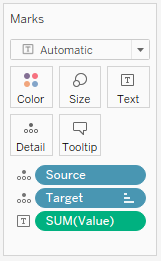
Configure Screen
Select Data Sheet
Select the worksheet you want to retrieve data from. This worksheet will be the input for the visualization you pick in the next step.
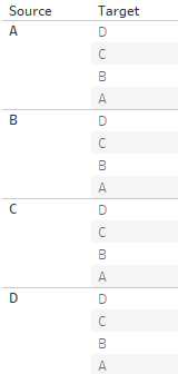
Customize Chord Diagram
Source
Choose your dimension from the dropdown menu to be your source. The source will link to your target dimension around the axis.
Target
Choose your dimension from the dropdown menu to be your target of your source dimension.
Measure
Choose your measure from the dropdown menu. Have a selection of measures loaded, once changed you will see an instant change to the Chord Diagram.
Tooltips
Format your link and node tooltip. Use the short codes as well as free text. You will see the list of available short codes you can use. How they are displayed in the box will be how you will see them in your tooltip.
Labels
Number format
Format your measure to a decimal or a percentage using the dropdown menu. Enter the amount of decimal spaces shown under ‘decimals’. Add a ‘Prefix’ and/or a ‘Suffix’ in the text boxes. A prefix will go before the word and the suffix after. A prefix for example could add a currency ‘$’ and a Suffix could add a ‘%’.
Display Units (Decimal only)
Within your data there could be large values. Here you can format using separators. Use the dropdown menu to display numerical units. Example: 6,744 – 6.74K. Use the tick box to include thousands separators. Example: 1234 – 1,234.
Font Size
Use the dropdown menu to change the size of the font from 50% – 150%. Changing the font size will affect all fonts within your Chord Diagram.
Font Family
Use the dropdown menu to change the font best to suit your dashboard.
Font Color
Clicking on the circle shapes will open the color palette. Nodes, Links and Headers can all be changed separately using their own palette.
Dashboard Actions
Dashboard actions are available within your Chord Diagram! Filter down on a dimension by clicking a node and see that interact instantly with your dashboard. It’s also possible to filter back from your tableau dashboard.
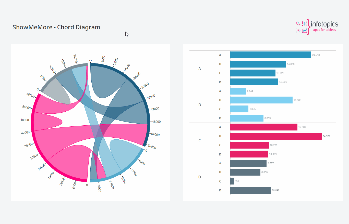
Refresh
Warning! We are continuously looking to improve our solutions, clicking refresh will give you the latest release with all the new features. Your Chord Diagram will reset including color palette, measures and columns.
Color
Click the ‘Use new color formatting’ checkbox to use the new color options. This will allow you to color your dimensions, individually. When not using the new color formatting option, the Mark Colors will be colored by sorting order. This will allow you to customize your dashboard greatly!
Background color
Use the circle to open the color palette to change the background color of your Chord Diagram.
Color By
Choose between having one color throughout your diagram or to colorize using the color palette.
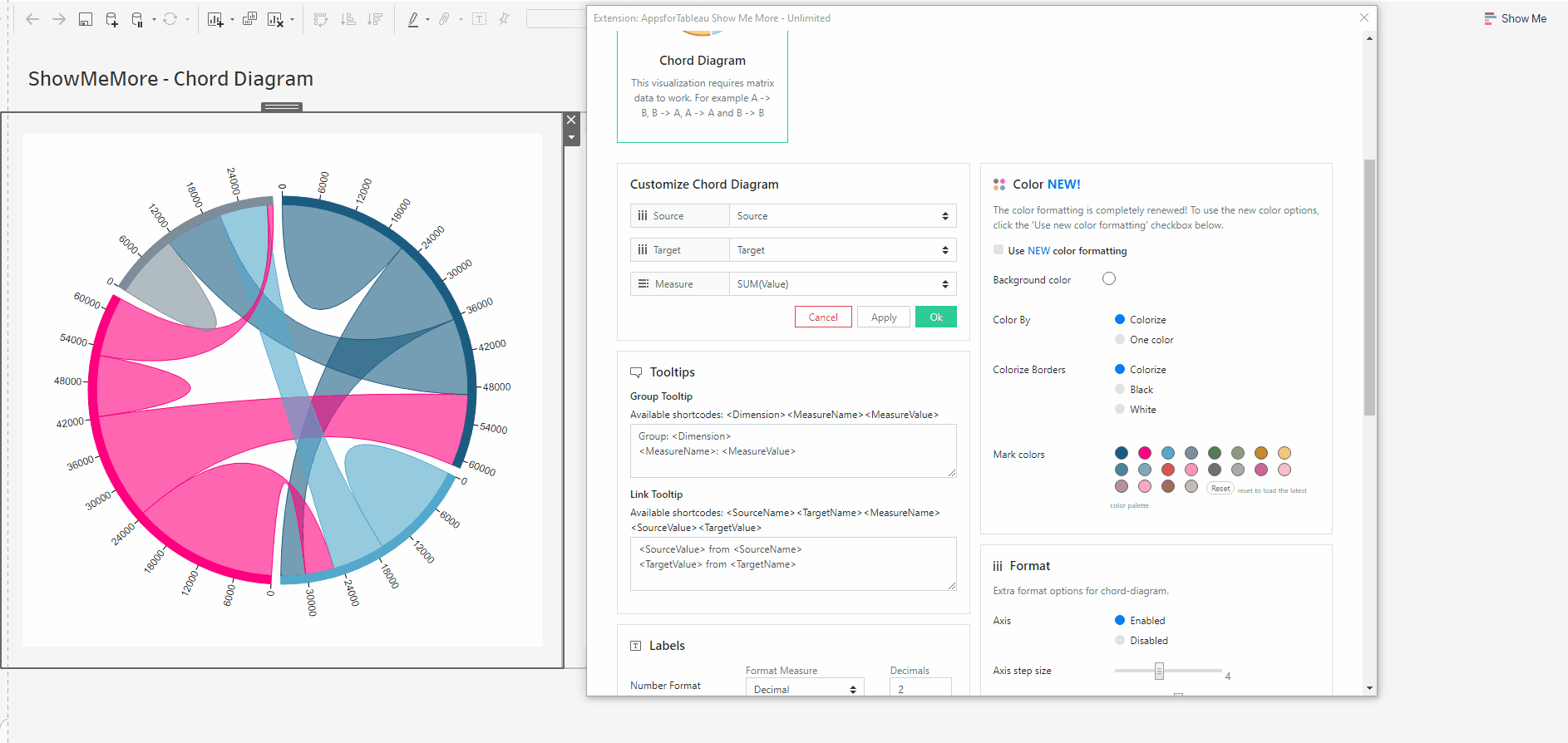
Colorize Borders
Edit the border in your Chord Diagram. Change the color of your borders by colorizing them using the color palette or making them black or white.
Mark Colors
Use the circles to open the color palette to change the colors of the marks. The order they are in will be the order of your levels.
Select colors for dimensions: (New color formatting only)
Click on the color palette that’s alongside your chosen dimensions to choose their color. This will ensure that the set/dimension you choose always has the same coloring in the dashboard
Format
Axis
Have an axis shown around your Chord Diagram. Format the labels of your axis below.
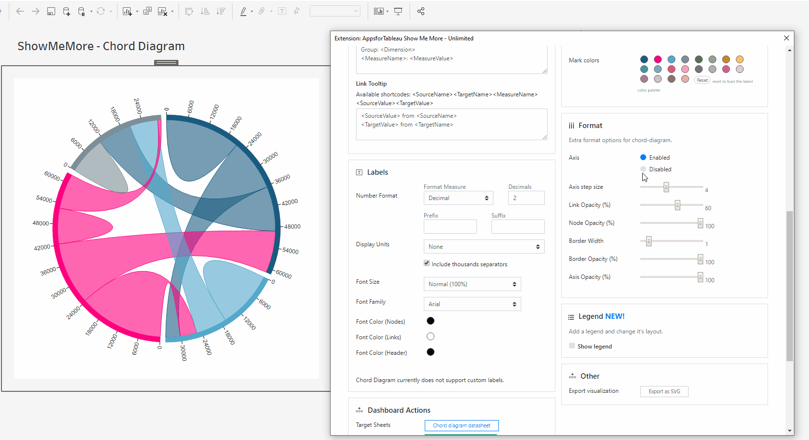
Axis Step Size
Decide how many steps of the axis you wish to be shown in your view. 0 will show no labels with 10 showing the most possible. No labels will overlap.
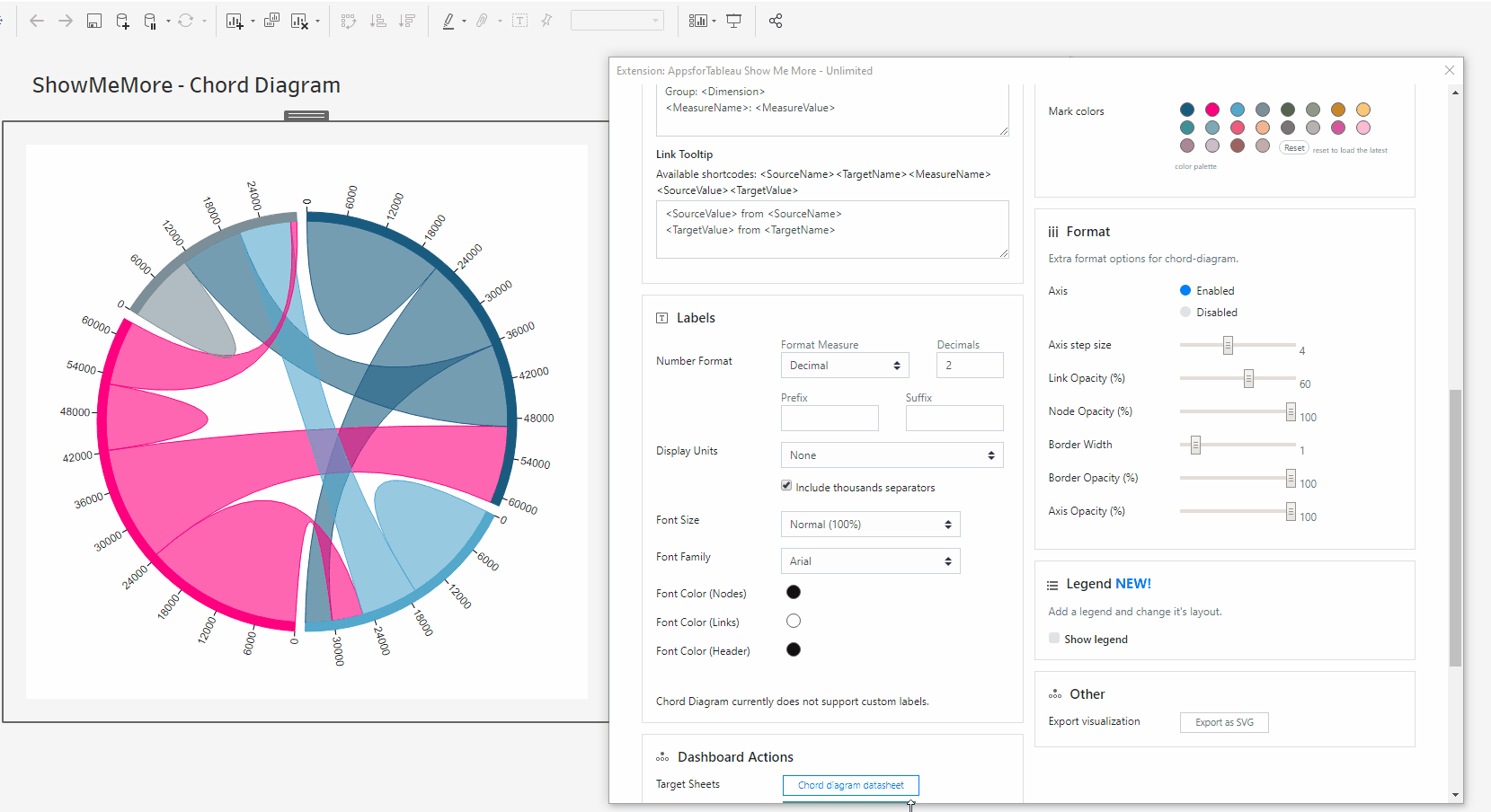
Link Opacity
Change the opacity of your links. 100 being full opacity, 0 being no opacity.
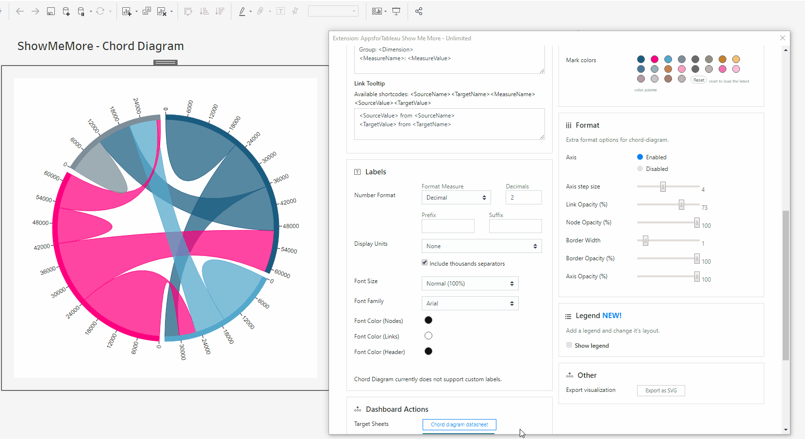
Node Opacity
Change the opacity of your nodes. 100 being full opacity, 0 being no opacity.

Border Width
Change the width of your border. 10 being the widest, 0 will show no border.

Border Opacity
Change the opacity of your border. 100 being full opacity, 0 being no opacity.
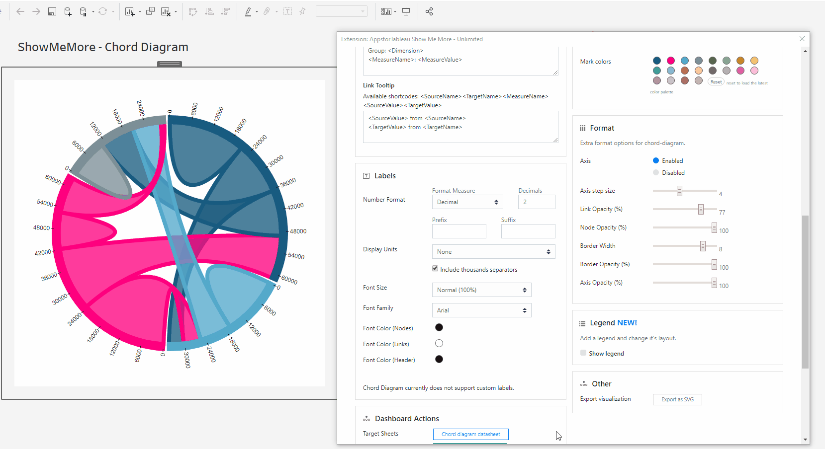
Axis Opacity
Change the opacity of your axis. 100 being full opacity, 0 being no opacity.
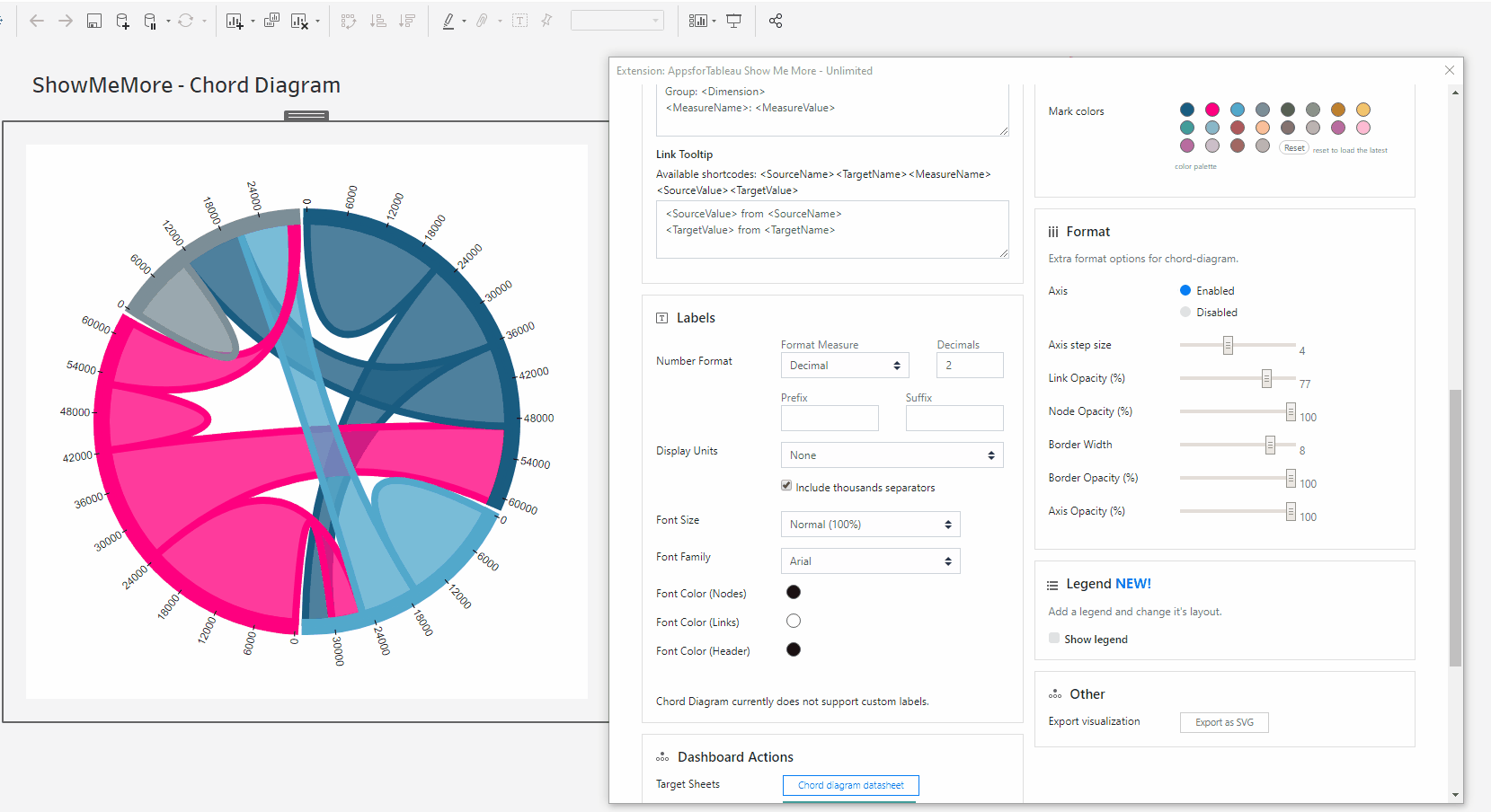
Arc Distance
Increase or decrease the space between all members on the outer circle.
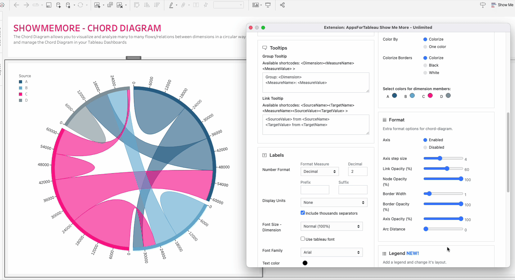
Legend
To have a legend in your Chord Diagram, tick the ‘Show legend’ button. When having a large selection of dimensions, it may be of benefit to use a color legend to display.
Legend Position
Choose where your legend will be. Top Left, Top Right, Bottom Left & Bottom Right. Every Chord Diagram could be different, change to give your dashboard the best look.
Number of columns
Add more columns in the text box to get the best look for your Chord Diagram.
Horizontal shift
Use the slider to adjust the position of your legend horizontally.
Vertical shift
Use the slider to adjust the position vertically
Other
Export your visualization as a SVG. This will open a prompt box explaining how to export.
Tutorial
Click on this link for a tutorial on how to use the Chord Diagram
Ridgeline Plot
A Ridgeline plot (sometimes called Joyplot) shows the distribution of a numeric value for several groups. Distribution can be represented using histograms or density plots, all aligned to the same horizontal scale and presented with a slight overlap.
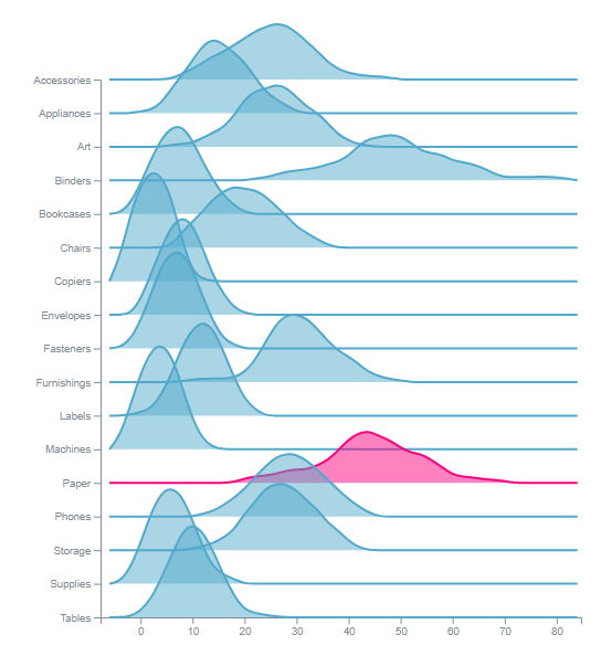
Setting up your worksheet
For the best practice we recommend dropping all dimensions and measures on to the marks card. This will enable the best performance. See screenshot showing how our demo workbook has been set up. For tips and advice check out our BLOG.
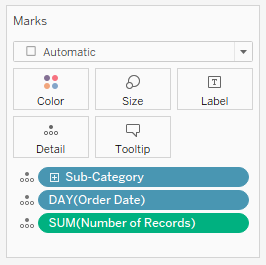
Configure Screen
Select Data Sheet
Select the worksheet you want to retrieve data from. This worksheet will be the input for the visualization you pick in the next step. See setting up your worksheet to see the necessary components needed.
Customize Ridgeline Plot
Series
Choose the date series such as days or weeks that will be used in your view.
Category
Which category will be shown in the view? Use the dropdown to choose your dimension. These will be shown as rows displayed in your viz.
Measure
Use the dropdown to choose your measure. Example: SUM(Number of records)
Tooltips
Format your link and node tooltip. Use the short codes as well as free text. You will see the list of available short codes you can use. How they are displayed in the box will be how you will see them in your tooltip.
Labels
Number format
Format your measure to a decimal or a percentage using the dropdown menu. Enter the amount of decimal spaces shown under ‘decimals’. Add a ‘Prefix’ and/or a ‘Suffix’ in the text boxes. A prefix will go before the word and the suffix after. A prefix for example could add a currency ‘$’ and a Suffix could add a ‘%’.
Display Units (Decimal only)
Within your data there could be large values. Here you can format using separators. Use the dropdown menu to display numerical units. Example: 6,744 – 6.74K. Use the tick box to include thousands separators. Example: 1234 – 1,234.
Font Size
Use the dropdown menu to change the size of the font from 50% – 150%. Changing the font size will affect all fonts within your Ridgeline Plot.
Font Family
Use the dropdown menu to change the font best to suit your dashboard.
Font Color
Clicking on the circle shapes will open the color palette. Nodes, Links and Headers can all be changed separately using their own palette.
Dashboard Actions
Dashboard actions are available within your Ridgeline Plot! Filter down on a dimension by clicking a node and see that interact instantly with your dashboard. It’s also possible to filter back from your tableau dashboard.
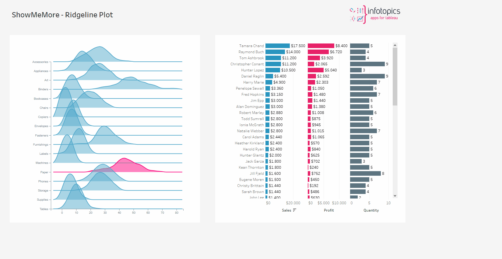
Refresh
Warning! We are continuously looking to improve our solutions, clicking refresh will give you the latest release with all the new features. Your Ridgeline Plot will reset including color palette, measures and columns.
Color
Click the ‘Use new color formatting’ checkbox to use the new color options. This will allow you to color your dimensions, individually. When not using the new color formatting option, the Mark Colors will be colored by sorting order. This will allow you to customize your dashboard greatly!
Background color
Use the circle to open the color palette to change the background color of your Ridgeline Plot.
Color By
Colorize Borders
Change the color of the borders using color, black or white.
Select colors for dimensions: (New color formatting only)
Click on the color palette that’s alongside your chosen dimensions to choose their color. This will ensure that the set/dimension you choose always has the same coloring in the dashboard
Format
Kernel bandwidth
Use the slider to change the Kernel bandwidth. Changing the bandwidth changes the shape of the kernel: a lower bandwidth means only points very close to the current position are given any weight, which leads to the estimate looking squiggly; a higher bandwidth means a shallow kernel where distant points can contribute.
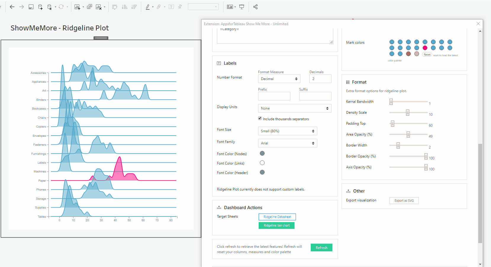
Density Scale
Decide how sense you would like your scale to be by moving the slider. The peaks may not be seen as clear with low density, increasing the scale may help you.
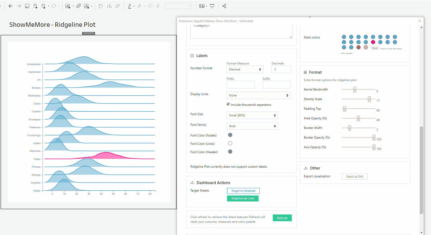
Padding Top
The spikes in your Ridgeline Plot may be too large and will disappear off the top of your view. Change the padding using the slider to get the best fit.

Area Opacity
Use the slider to change the opacity. It’s likely many rows will overlap so get the best look using the slider to change the opacity. It’s possible to have full or no opacity.

Border Width
Change the width of your borders using the slider. You may use this to have no border in your plot.
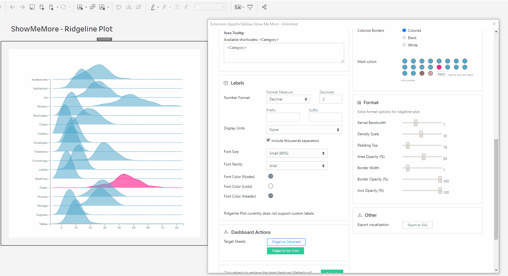
Border Opacity
You may wish to have a strong border around your axis, change the opacity here using the slider.
Axis Opacity
The dimensions shown on your axis can have their opacity changed here by using the slider.
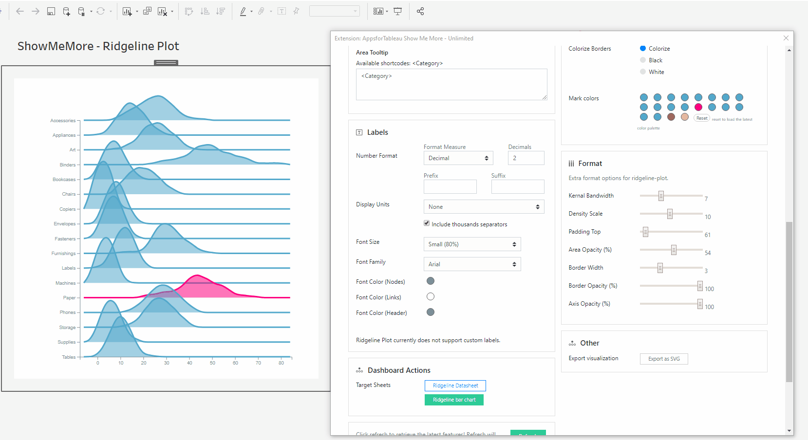
Other
Export your visualization as a SVG. This will open a prompt box explaining how to export.
Tutorial
Click on this link for a tutorial on how to use the Ridgeline Plot
Horizon Chart
Horizon charts are an alternative to ridgeline plots and small-multiple area charts that allow greater precision for a given vertical space by using colored bands. These charts can also be used with diverging color scales to differentiate positive and negative values.
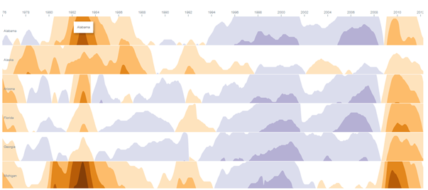
Data should also include the metric that you are monitoring.
Setting up your worksheet
For the best practice we recommend dropping all dimensions and measures on to the marks card. This will enable the best performance. A horizon chart relies on a date field, a dimension and a measure. See screenshot showing how our demo workbook has been set up. For tips and advice check out our BLOG.
Configure Screen
Select Data Sheet
Select the worksheet you want to retrieve data from. This worksheet will be the input for the visualization you pick in the next step.
Customize Horizon Plot
DAY(Date)
Choose the dimension which holds the date field. Example: Years, Months.
Category
Use the dropdown to choose your category. Example: State.
Measure
Use the dropdown to choose your measure. Example: (Sum)Difference from average.
Labels
Number format
Format your measure to a decimal or a percentage using the dropdown menu. Enter the amount of decimal spaces shown under ‘decimals’. Add a ‘Prefix’ and/or a ‘Suffix’ in the text boxes. A prefix will go before the word and the suffix after. A prefix for example could add a currency ‘$’ and a Suffix could add a ‘%’.
Display Units (Decimal only)
Within your data there could be large values. Here you can format using separators. Use the dropdown menu to display numerical units. Example: 6,744 – 6.74K. Use the tick box to include thousands separators. Example: 1234 – 1,234.
Font Size
Use the dropdown menu to change the size of the font from 50% – 150%. Changing the font size will affect all fonts within your Horizon Chart.
Font Family
Use the dropdown menu to change the font best to suit your dashboard.
Font Color
Clicking on the circle shapes will open the color palette. Nodes, Links and Headers can all be changed separately using their own palette.
Refresh
Warning! We are continuously looking to improve our solutions, clicking refresh will give you the latest release with all the new features. Your Horizon Chart will reset including color palette, measures and columns.
Color
Click the ‘Use new color formatting’ checkbox to use the new color options.
Background color
Use the circle to open the color palette to change the background colour of your Horizon Chart.
Select diverging color scheme: (New color formatting only)
Click on one of the schemes to color format your Horizon Chart. These are stored within your Horizon chart for you to choose.
Format
The amount of overlapping layers
Limit the number of overlapping layers across your Horizon Chart (maximum 5)
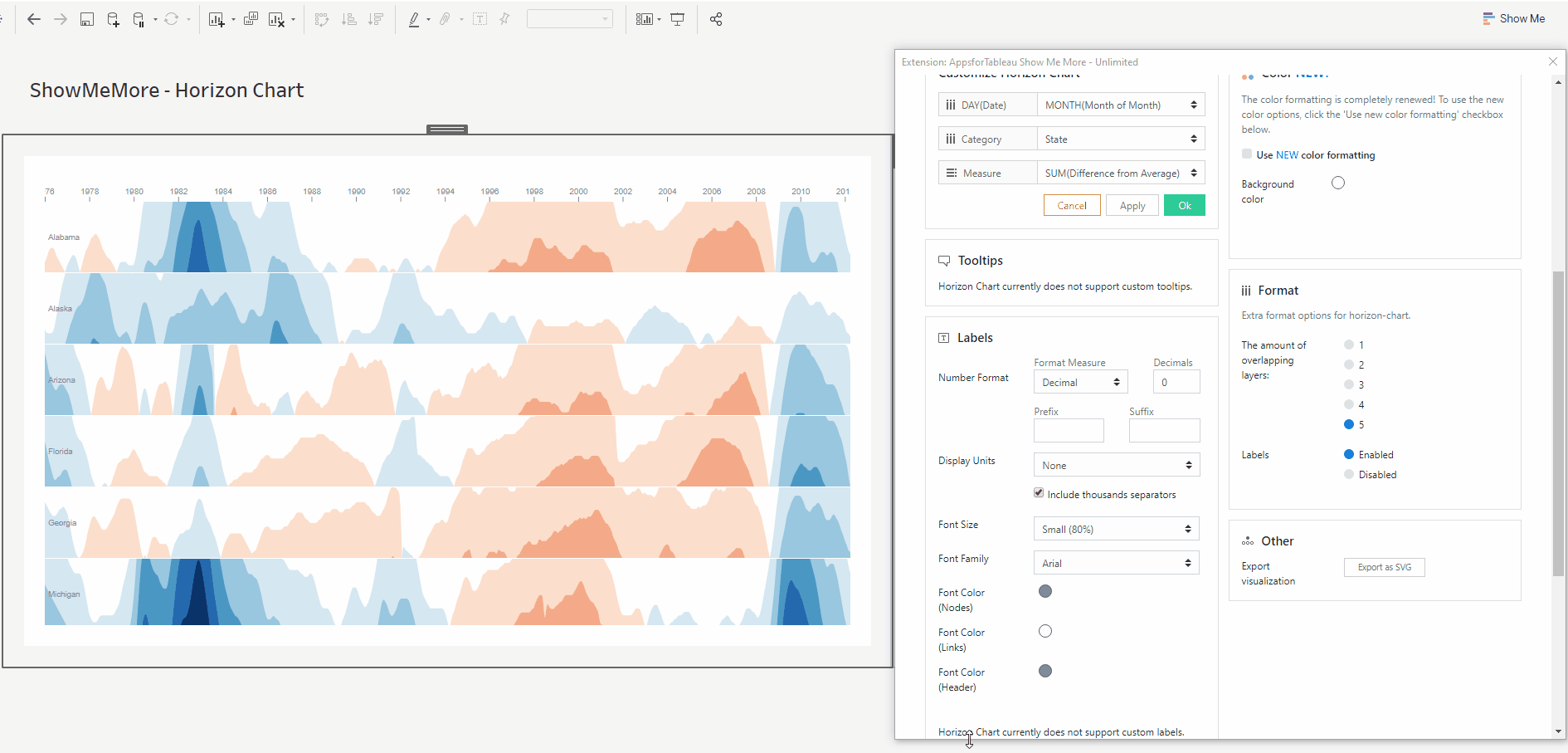
Labels
Choose to enable or disable the labels to be shown in view. The labels shown will be your chosen category in the view. These will be shown at the start of your chart rows.
Other
Export your visualization as a SVG. This will open a prompt box explaining how to export.
Tutorial
Click on this link for a tutorial on how to use the Horizon Chart
Circular Sankey
The Circular Sankey Diagram visualizes the flow of a measure over multiple dimensions with internal loops. Sankey diagrams are a type of flow diagram in which the width/height of the arrows is proportional to the flow rate.
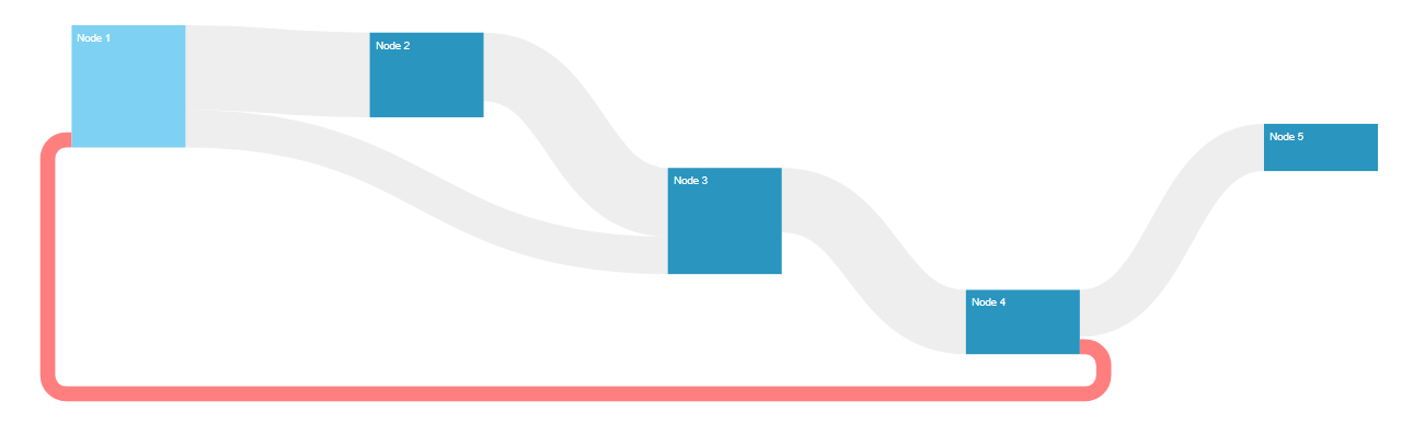
Setting up your worksheet
For the best practice we recommend dropping all dimensions and measures on to the marks card. This will enable the best performance. Your data should have a two dimensions (your source and target of the source) and a measure. Your See screenshot showing how our demo workbook has been set up. For tips and advice check out our BLOG.
Configure Screen
Select Data Sheet
Select the worksheet you want to retrieve data from. This worksheet will be the input for the visualization you pick in the next step.
Customize Circular Sankey Diagram
Choose the dimensions you wish to show in your Sankey Diagram. Use the dropdown menu to select your dimension. The levels will be the order, from left to right, shown in your Sankey Diagram. Use the ‘Add’ button to add more levels. Assign your chosen measure by clicking on the measure dropdown menu.
Tooltips
Format your link and node tooltip. Use the short codes as well as free text. You will see the list of available short codes you can use. How they are displayed in the box will be how you will see them in your tooltip.
Labels
Number format
Format your measure to a decimal or a percentage using the dropdown menu. Enter the amount of decimal spaces shown under ‘decimals’. Add a ‘Prefix’ and/or a ‘Suffix’ in the text boxes. A prefix will go before the word and the suffix after. A prefix for example could add a currency ‘$’ and a Suffix could add a ‘%’.
Display Units (Decimal only)
Within your data there could be large values. Here you can format using separators. Use the dropdown menu to display numerical units. Example: 6,744 – 6.74K. Use the tick box to include thousands separators. Example: 1234 – 1,234.
Font Size
Use the dropdown menu to change the size of the font from 50% – 150%. Changing the font size will affect all fonts within your Circular Sankey Diagram.
Font Family
Use the dropdown menu to change the font best to suit your dashboard.
Font Color
Clicking on the circle shapes will open the color palette. Nodes, Links and Headers can all be changed separately using their own palette.
Label Editing
Format what is shown on your nodes, to and from them. You may add free text as well as using short codes from your data (Example: ) For extra formatting try using HTML like H1, IMG tags or Bold. Bold a word and reduce text sizing is available.
Node Label
Within the text box, enter what you wish to be displayed within your node labels. Format to get the best look for your Circular Sankey Diagram. See above for tips.
From Link Label
Next to each of your node labels, you will be able to display a label which can be entered within the text box. An example would to show the percentage of target. Example .
To Link Label
Have a label shown before your node labels. This could be useful to show a percent of your target. Use the text box to enter your information and see animated gif on how this will look when displayed.
Dashboard Actions
Dashboard actions are available within your Circular Sankey Diagram! Filter down on a dimension by clicking a node and see that interact instantly with your dashboard. It’s also possible to filter back from your tableau dashboard.
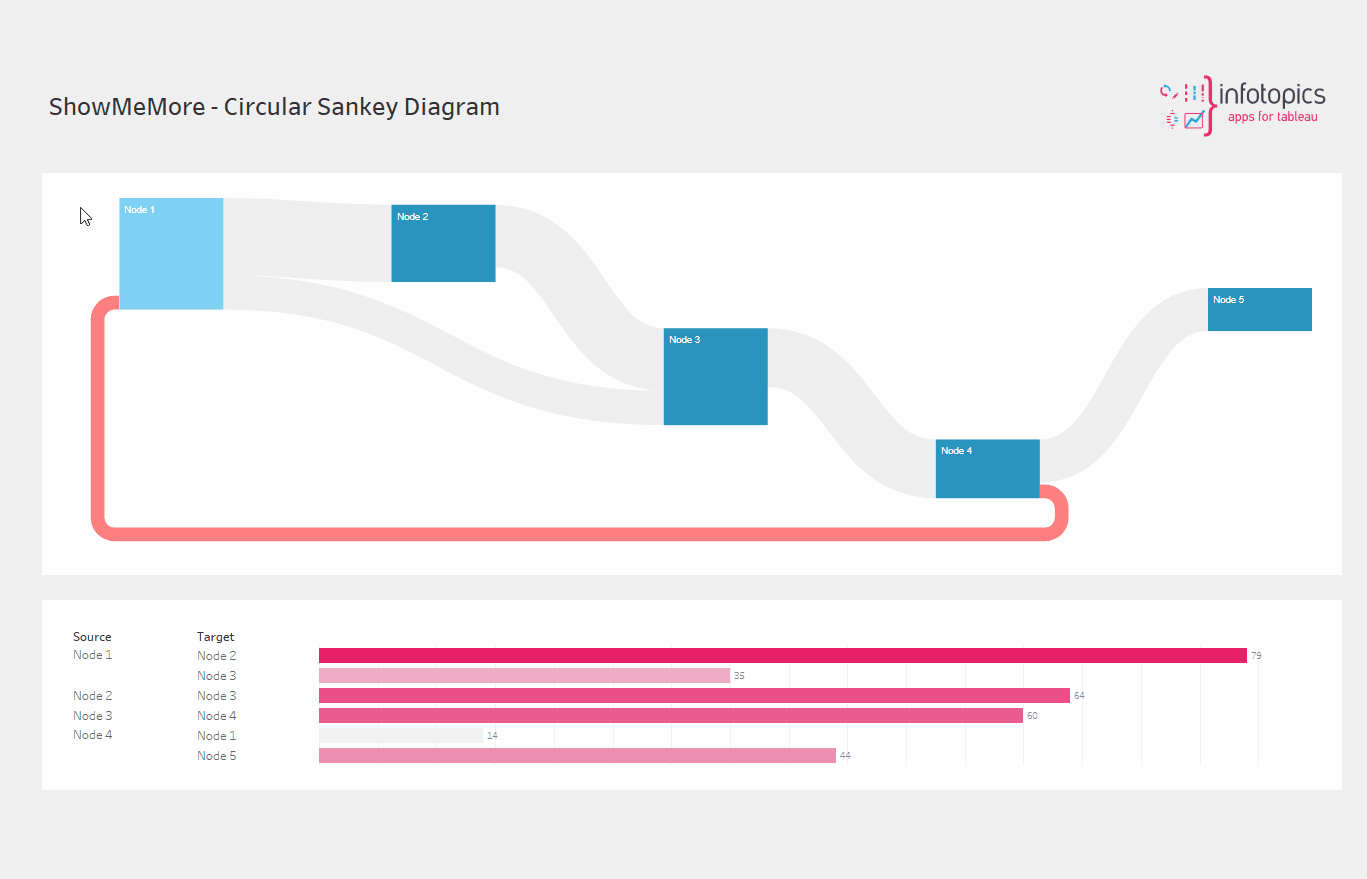
Refresh
Warning! We are continuously looking to improve our solutions, clicking refresh will give you the latest release with all the new features. Your Sankey Diagram will reset including color palette, measures and columns.
Color
Click the ‘Use new color formatting’ checkbox to use the new color options. This will allow you to color your dimensions, individually. When not using the new color formatting option, the Mark Colors will be colored by sorting order. This will allow you to customize your dashboard greatly!
Background color
Use the circle to open the color palette to change the background color of your Sankey Diagram.
Color By
Same values have the same colors
Where your dataset shows the same value, your Circular Sankey Diagram will display the same color. This can be helpful to show exact matches, within different categories. When choosing this you will be presented with all the dimension members available, click on each palette to edit.
One color
Have a single color running through your diagram instead of multiple. The first color on your ‘Mark colors’ will be the color shown.
Color Links By
Here you can decide how you would like the links from your nodes to be colored by.
Circular – None Circular
The links will be greyed out
Input – Output (Gradient)
Links will show a gradient from input color to output.
Input
Links will be colored with the input nodes color.
Output
Links will be colored with the output nodes color.
Mark colors
The mark colors can be changed individually by clicking on each one to open the color palette. The order of the mark colors will be the order of the color of the nodes.
Select colors for dimensions: (New color formatting only)
Click on the color palette that’s alongside your chosen dimensions to choose their color. (This will only work when having ‘Same values have the same colors’ option selected.
Format
Node Width
Increase and decrease the width of your nodes using the slider. This will also change the size and shape of your links to in the view.

Vertical Node Padding
Increase and decrease the vertical padding using the slider. This will give the same space between each node (vertically)
Horizontal Node Padding
Increase and decrease the horizontal padding using the slider. This will give the same space between each node and the link.
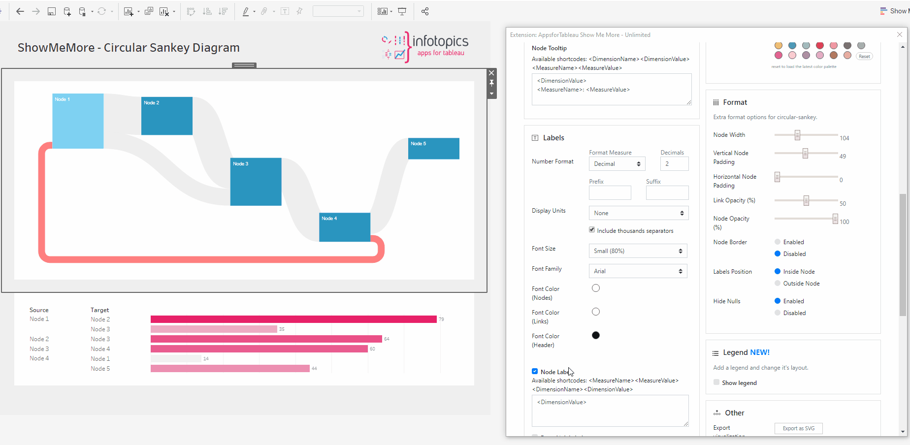
Link Opacity
Increase and decrease the link opacity using the slider. 100 will give no opacity, 0 will give the most opacity.

Node Opacity
Increase and decrease the node opacity using the slider. 100 will give no opacity, 0 will give the most opacity.

Node Border
Hit ‘Enabled’ to give all your nodes a border.

Labels position
Decide the position of your nodes label being inside or outside your node.

Hide Nulls
Have the ability to hide all nulls by hitting ‘disabled’. The image is showing how you can have flows from column 1 to column 4 with nulls in columns 2 & 3. Nodes can also start and end on different levels.
Legend
To have a legend in your Sankey Diagram, tick the ‘Show legend’ button. When having a large selection of dimensions, it may be of benefit to use a color legend to display.
Legend Type
Choose between Color or Scale. Color will show the dimension alongside their color. The legend shows a reference bar with a specific value for referential purposes.
Legend Position
Choose where your legend will be. Left, Right, Top(color only) & Bottom (color only). Every Circular Sankey Diagram could be different, change to give your dashboard the best look.
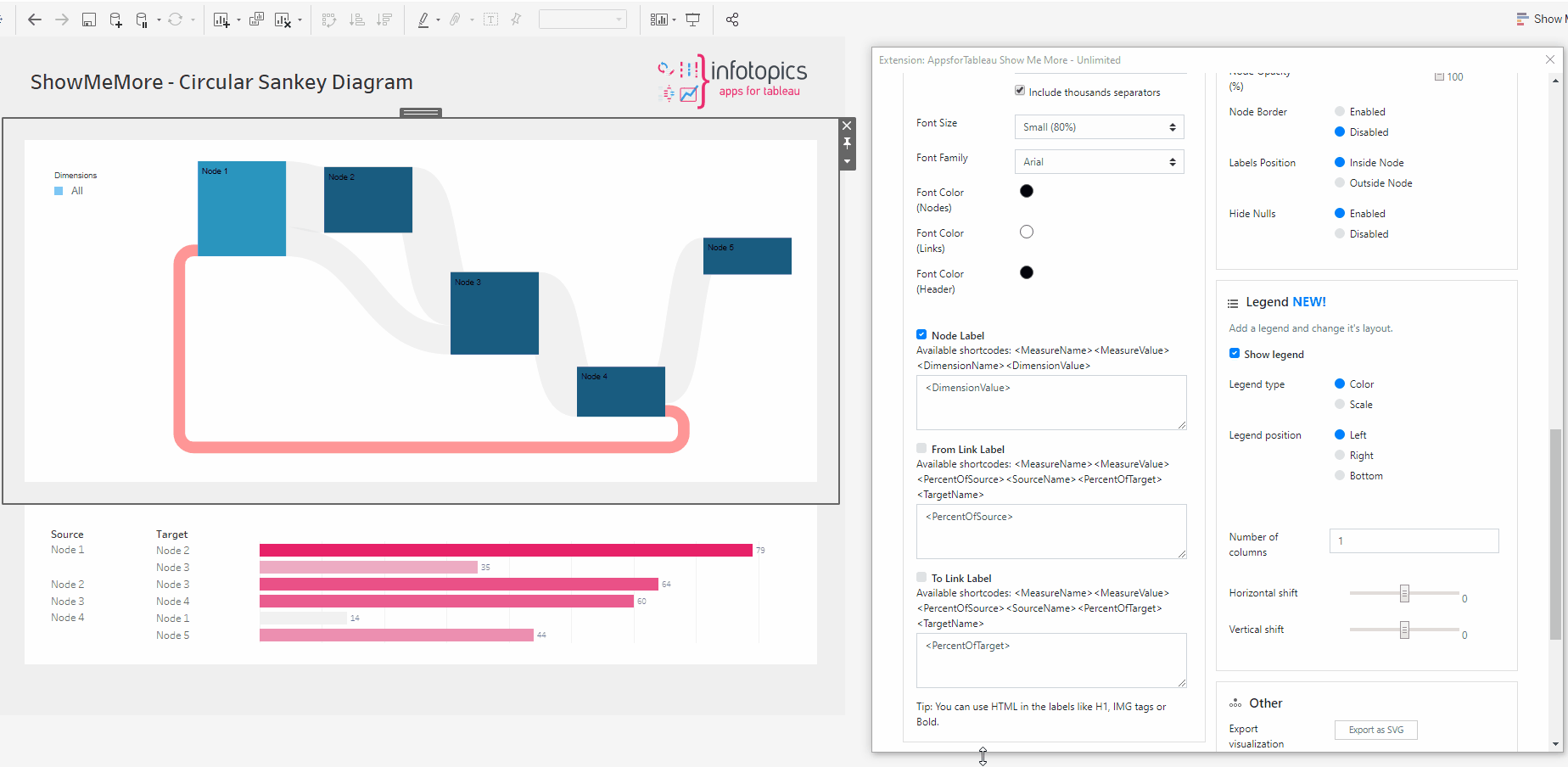
Legend order (Scale only)
Have the scale showing from High – Low or Low – high
Color (Scale only)
Use the circle to open the color pallet to change your scale color.
Number of columns
Decide how many columns the color legend should show in your view. This will help with the look of your Sankey Diagram.
Horizontal shift
Use the slider to adjust the position horizontally of your Legend. Use this to get it in the perfect position.
Vertical shift
Use the slider to adjust the position vertically. This could allow you to have more text shown in your view.
Other
Export your visualization as a SVG. This will open a prompt box explaining how to export.
Tutorial
Click on this link for a tutorial on how to use the Circular Sankey
Organization Chart
The organization chart is a diagram showing graphically the relation of one official to another, or others, of a company. It is also used to show the relation of one department to another, or others, or of one function of an organization to another, or others. This chart is valuable in that it enables one to visualize a complete organization, by means of the picture it presents.
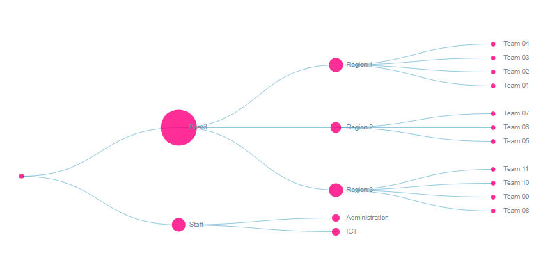
Setting up your worksheet
For the best practice we recommend dropping all dimensions and measures on to the marks card. This will enable the best performance. See screenshot showing how our demo workbook has been set up. For tips and advice check out our BLOG.
Configure Screen
Select Data Sheet
Select the worksheet you want to retrieve data from. This worksheet will be the input for the visualization you pick in the next step.
Customize Organization Chart
Choose the dimensions you wish to show in your Organization Chart. Use the dropdown menu to select your dimension. Add more dimensions to show more levels of your organization. Choose a measure to show within your chart.
Tooltips
Format your link tooltip & your node tooltip. Use the short codes as well as free text. Example: of to of
Labels
Number format
Format your measure to a decimal or a percentage using the dropdown menu. Enter the amount of decimal spaces shown under ‘decimals’. Add a ‘Prefix’ and/or a ‘Suffix’ in the text boxes.
Display Units (Decimal only)
Use the dropdown menu to display numerical units. Example: 6,744 – 6.74K
Use the tick box to include thousands separators. Example: 1234 – 1,234
Font Size
Use the dropdown menu to change the size of the font from 50% – 150%
Font Family
Use the dropdown menu to change the font best to suit your dashboard.
Font Color
Clicking on the circle shapes will open the color palette. Customize your nodes, links and headers separately.
Dashboard Actions
Choose which sheet(s) will be triggered when interacting with your Organization chart.
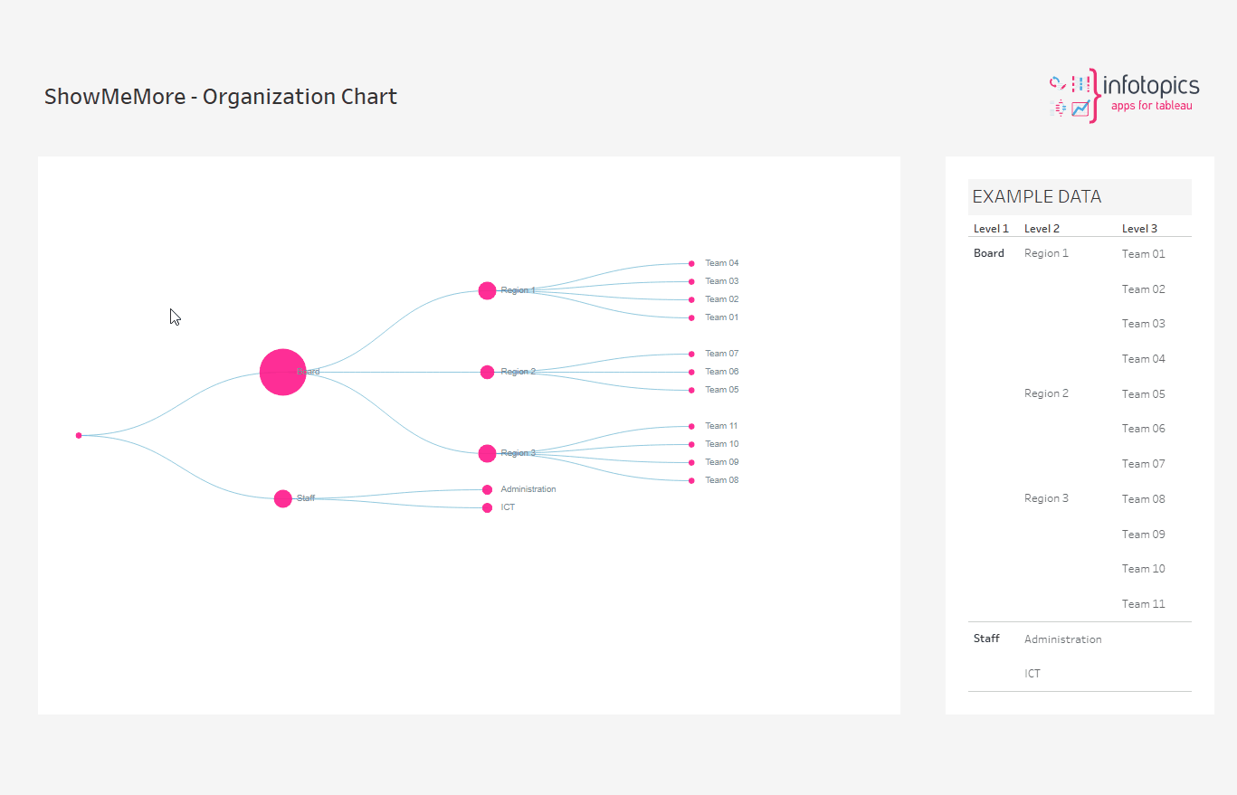
Refresh
Click refresh to retrieve the latest features! Refresh will reset your columns, measures and color palette
Color
Click the ‘Use new color formatting’ checkbox to use the new color options.
Background color
Use the circle to open the color palette to change the background color of your Organization Chart.
Color Mode
Color just your nodes or your links and nodes.
Mark Colors
Use the circles to open the color palette to change the colors of the marks. The order they are in will be the order of your levels.
Select colors for dimensions: (New color formatting only)
Click on the color palette that’s alongside your chosen dimensions to choose their color. This will ensure that the dimension you choose always has the same coloring in the dashboard.
Format
Layout
Decide between having a horizontal layout or a vertical.
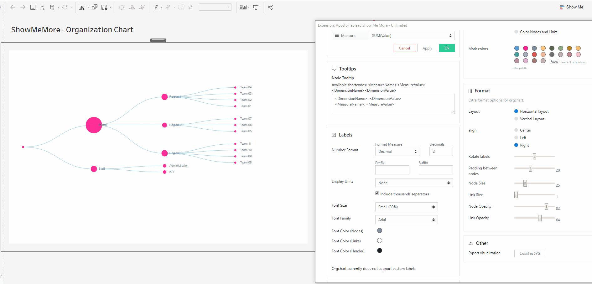
Align
Change the alignment of the nodes! Centre, Left or right
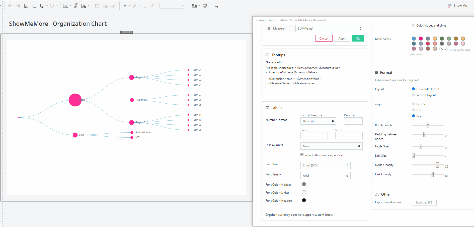
Rotate labels
Starting at 0 use the slider to rotate your labels. Your label will turn clockwise 0 through 360.

Padding between nodes
Space out those nodes by using the slider 1-50. 1 being the closest and 50 being the farthest.

Node Size
Change the size of the node from 1-100. 1 being the smallest and 50 being the largest.
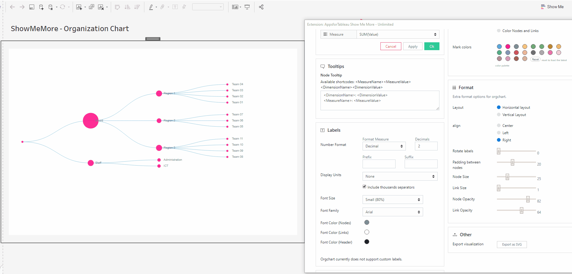
Link Size
Change the size of the node from 1-5. 1 being the smallest and 5 being the largest.
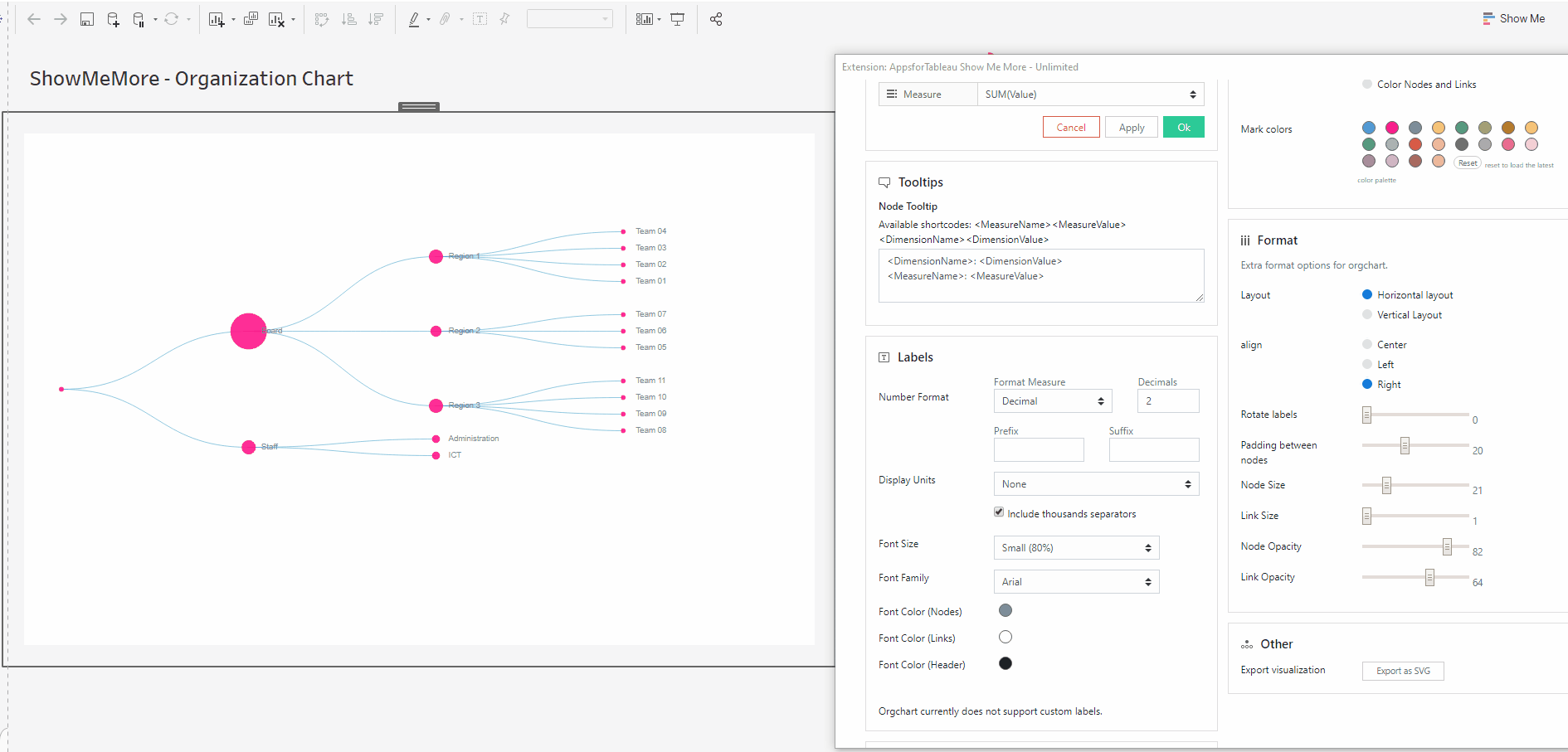
Node Opacity
Change the opacity of the node from 1-100. 1 having the most opacity and 100 having the least.
Link Opacity
Change the opacity of the link from 1-100. 1 having the most opacity and 100 having the least.
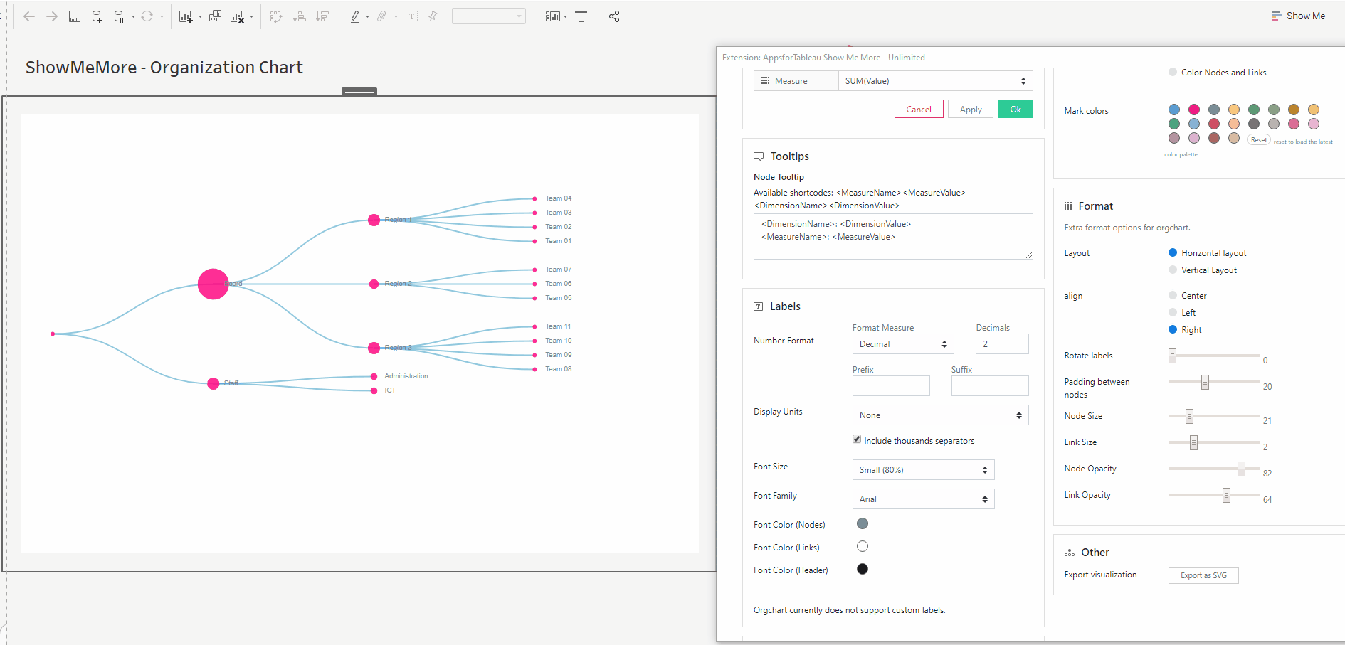
Zoom & Drag
Organizations can be large, with many hierarchies and even more personnel. Use the scroll wheel on your mouse to zoom in and out. There’s no issue in getting your whole organization in your visualization with easy zoom. Click anywhere away from the nodes and have free movement, to reset click the icon in the top right of your viz.
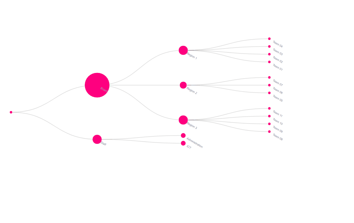
Other
Export your visualization as a SVG. This will open a prompt box explaining how to export.
Tutorial
Click on this link for a tutorial on how to use the Organization Chart
Calendar Chart
Calendars as a visual tool are used to display periods of time and to display the organization of events. Periods of time are often displayed and divided into units such as days, weeks, months and years. A date is the designation of a single, specific day within such a system.
Setting up your worksheet
For the best practice we recommend dropping all measures on to the marks card. This will enable the best performance. It’s necessary to have a date field, add other measures which you can decide to show on your Calendar chart. See screenshot showing how our demo workbook has been set up. For tips and advice check out our BLOG.
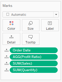
Configure Screen
Select Data Sheet
Select the worksheet you want to retrieve data from. This worksheet will be the input for the visualization you pick in the next step.
Customize Calendar Chart
DAY(Date)
Choose the measure that holds the dates from the dropdown list.
Measure
Decide the measure to be shown in your calendar. Change the measure to see the changes in your calendar instantly.
Tooltips
Format your link and node tooltip. Use the short codes as well as free text. You will see the list of available short codes you can use. How they are displayed in the box will be how you will see them in your tooltip.
Labels
Number format
Format your measure to a decimal or a percentage using the dropdown menu. Enter the amount of decimal spaces shown under ‘decimals’. Add a ‘Prefix’ and/or a ‘Suffix’ in the text boxes. A prefix will go before the word and the suffix after. A prefix for example could add a currency ‘$’ and a Suffix could add a ‘%’.
Display Units (Decimal only)
Within your data there could be large values. Here you can format using separators. Use the dropdown menu to display numerical units. Example: 6,744 – 6.74K. Use the tick box to include thousands separators. Example: 1234 – 1,234.
Font Size
Use the dropdown menu to change the size of the font from 50% – 150%
Font Family
Use the dropdown menu to change the font best to suit your dashboard.
Font Color
Clicking on the circle shapes will open the color palette. Customize your nodes, links and headers separately.
Dashboard Actions
Dashboard actions are available within your Calendar Chart! Filter down on a dimension by clicking a node and see that interact instantly with your dashboard. It’s also possible to filter back from your tableau dashboard.
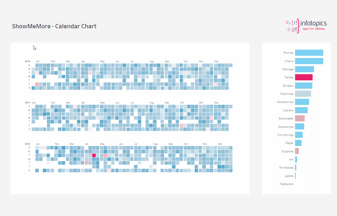
Refresh
Warning! We are continuously looking to improve our solutions, clicking refresh will give you the latest release with all the new features. Your Calendar Chart will reset including color palette, measures and columns.
Color
Click the ‘Use new color formatting’ checkbox to use the new color options.
Background color
Use the circle to open the color palette to change the background color of your Calendar Chart.
Color Mode
Color just your nodes or your links and nodes.
Mark Colors
Use the circles to open the color palette to change the colors of the marks. The order they are in will be the order of your levels.
Select colors for dimensions: (New color formatting only)
Click on the color palette that’s alongside your chosen dimensions to choose their color. In ‘Format’ when selecting ‘Diverging palette’ here you can decide the colors that will diverge.
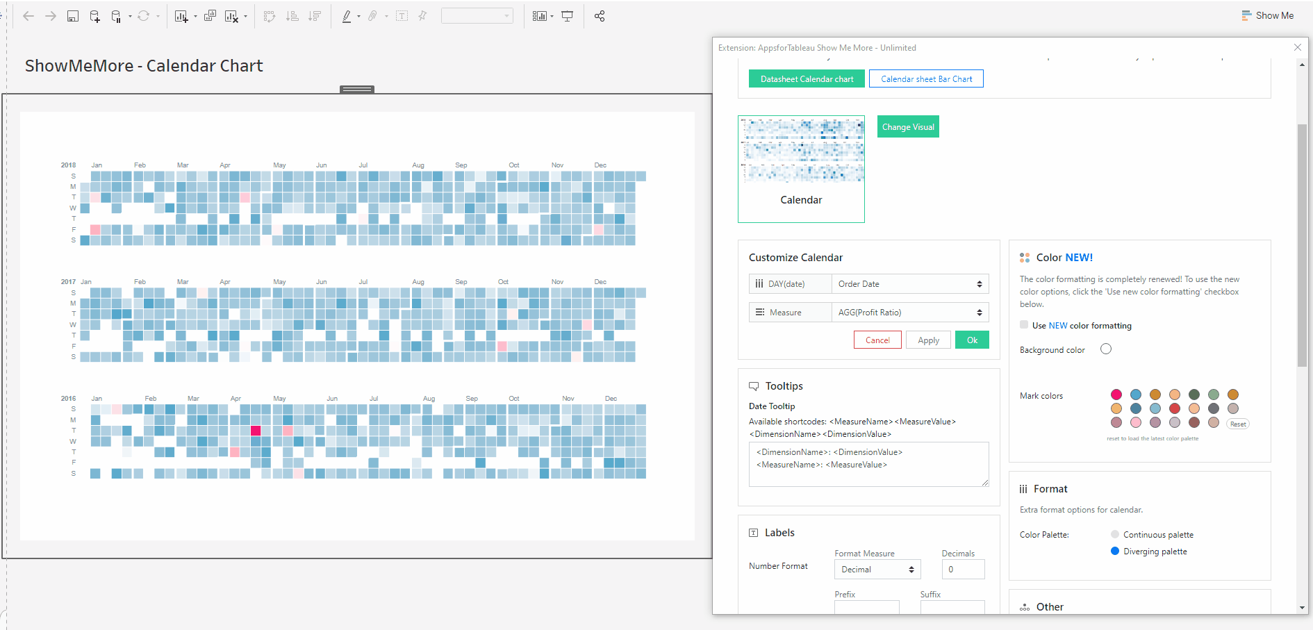
Format
Color Palette
Change the palette style between continuous and diverging.
Other
Export your visualization as a SVG. This will open a prompt box explaining how to export.
Tutorial
Click on this link for a tutorial on how to use the Calendar Chart
We love to make solutions and help Tableau users to do things more efficiently. If you have feedback, ideas, questions or need support, please make sure to share it with us! Also, don’t forget to follow us on social media for our latest news and updates.