
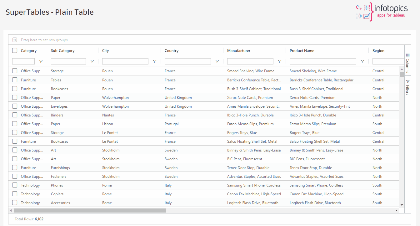
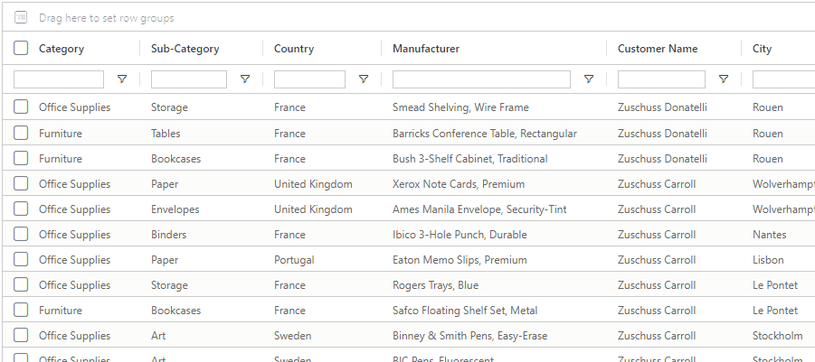
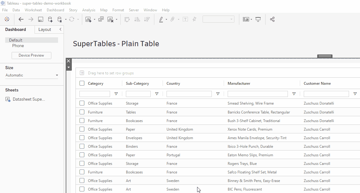
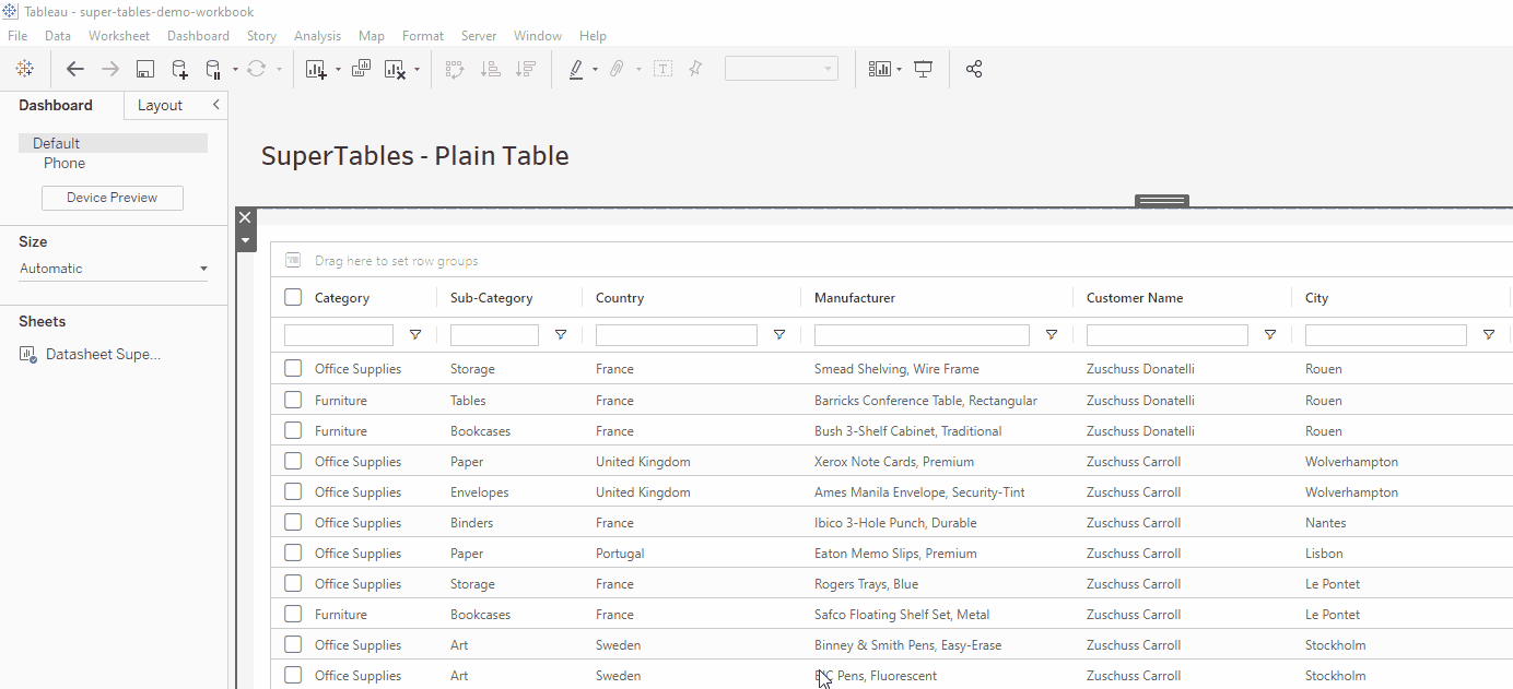
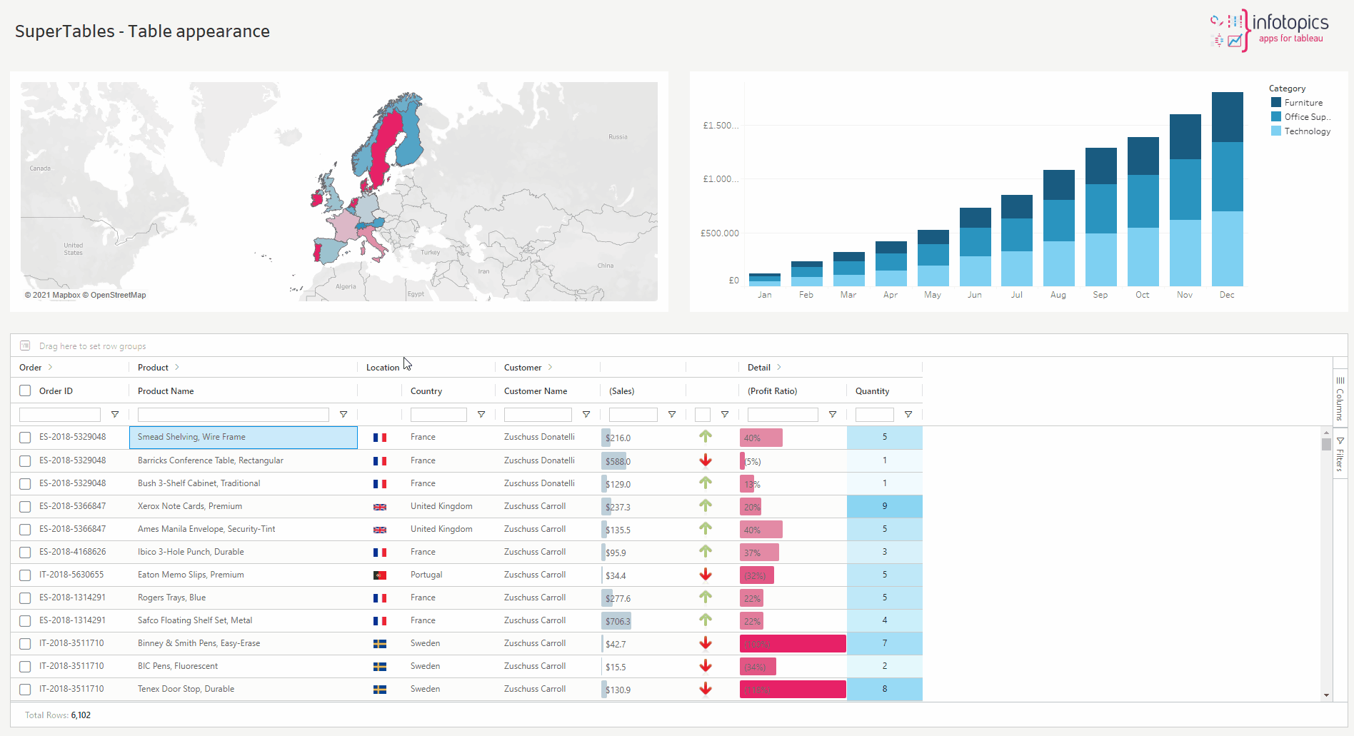
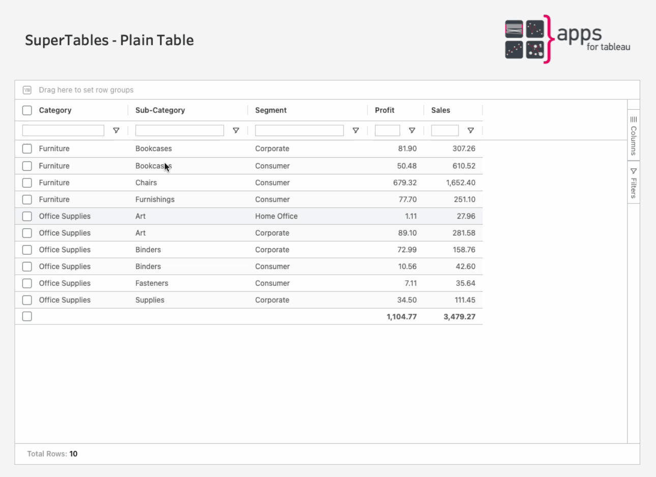
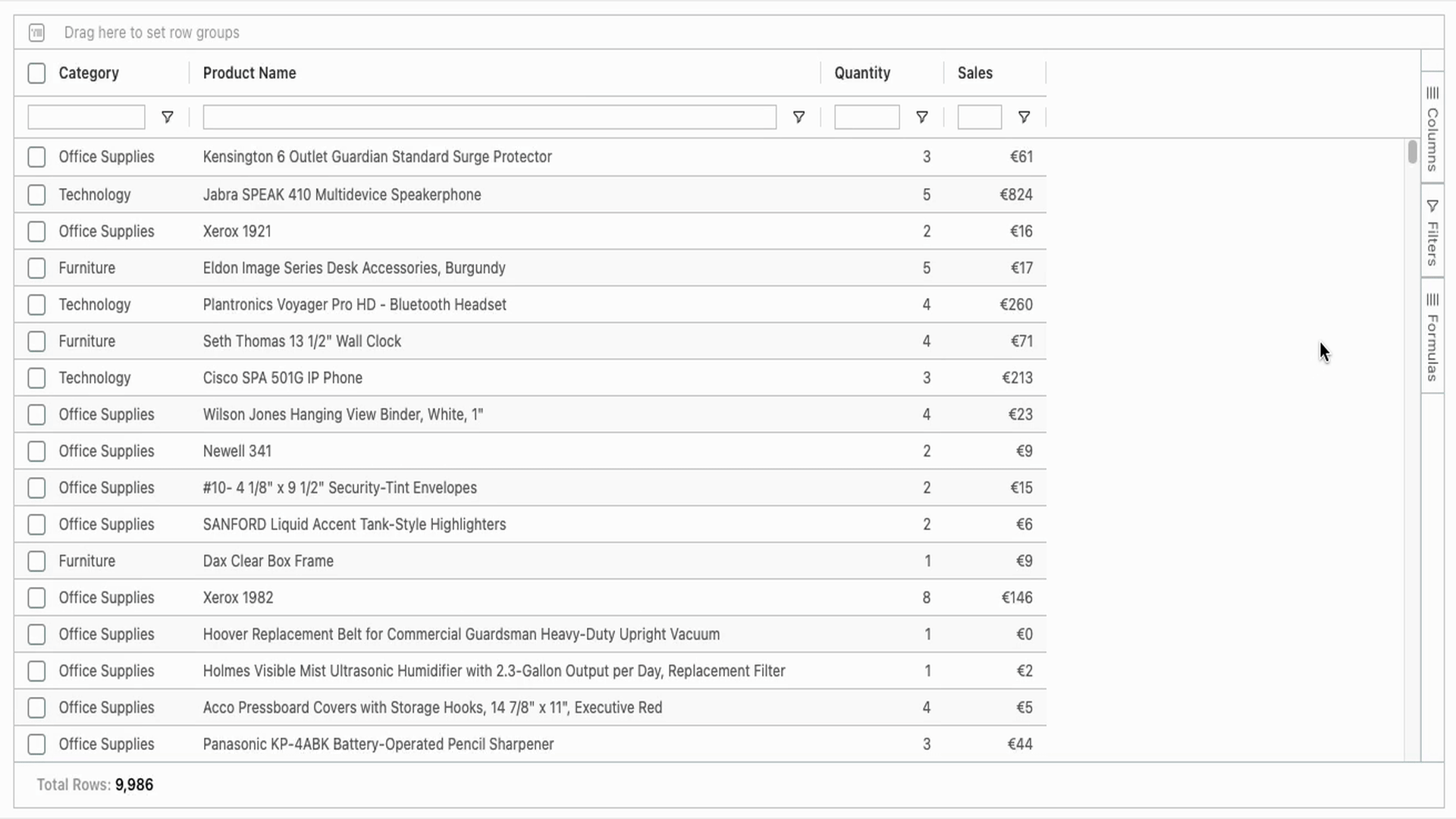
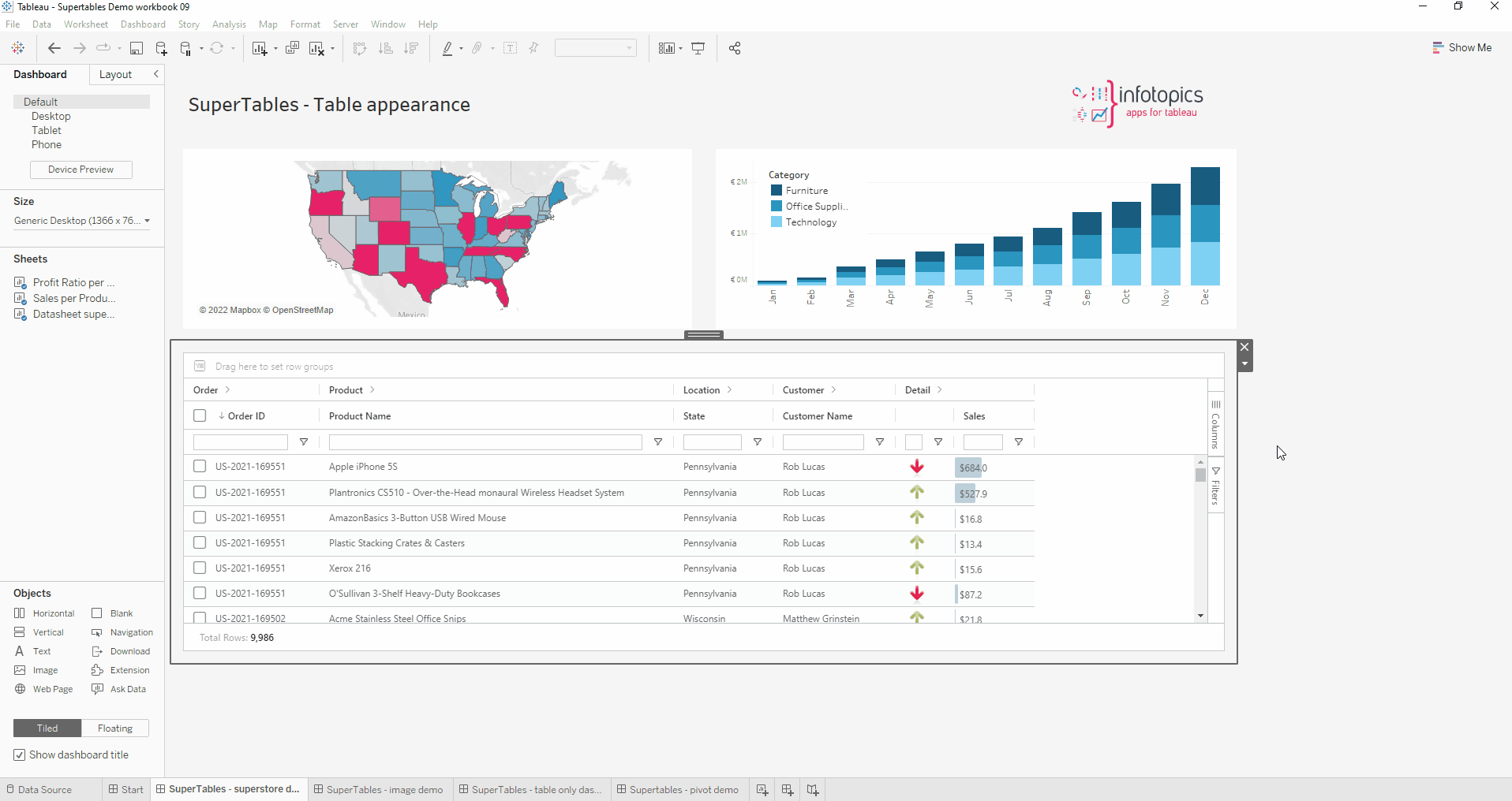
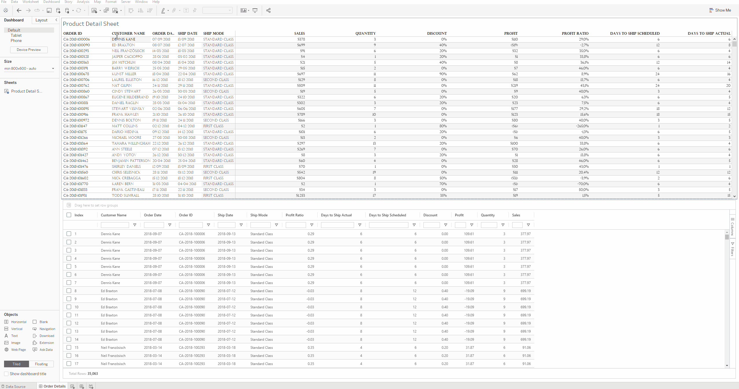
Supertables offer more flexibility to your dashboard users in handling tables in Tableau. Using a table in your dashboard comes in handy if you want to provide dashboard users with extra context on their visualisation and also let them customize their view with their own groupings, filtering and cross-sections. SuperTables provides your dashboard users with a table that supports inline filtering, pivoting, grouping and many more features of which they can create their own personalized views on Tableau Server / Tableau Online. Drag the extension to the dashboard, configure the data(sheet) to feed the table and you’re ready to offer your Dashboard users Excel-like functions without leaving your Tableau Dashboards! You’ve never seen a more powerful table! Stay in the Flow!
SuperTables Features
This section describes the flexible ‘Excel like’ features SuperTables has to offer for your Dashboard users.
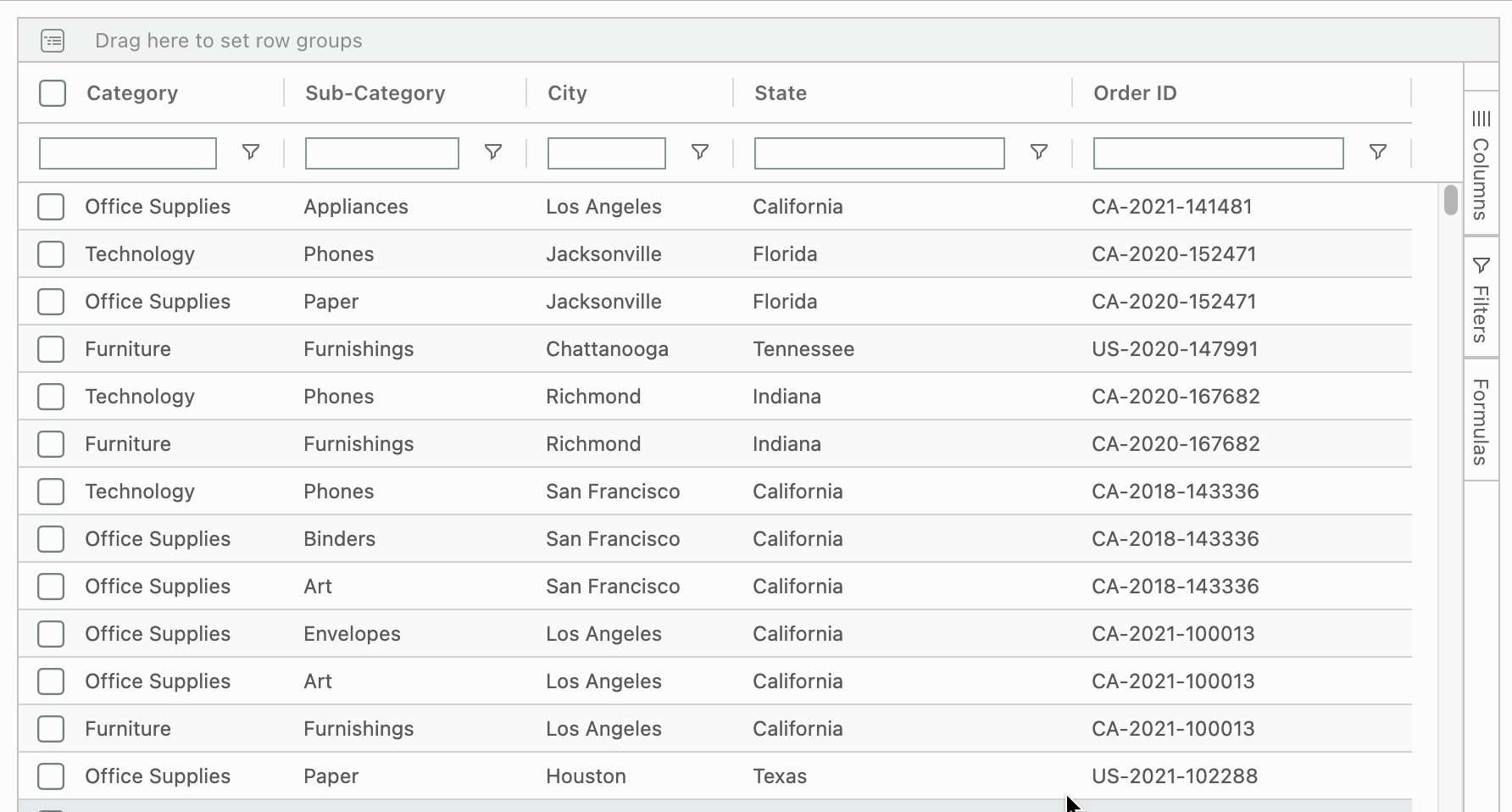
Enter text into the search box underneath the column header you wish to filter. This will instantly filter inline and can be done on multiple columns simultaneously and offer your dashboard users the most flexible way of filtering their rows based on column values. To enable Inline Filtering, open the configure screen within the extension. Under the Data tab click on the dimension(s) you wish to have an inline filter. Halfway down you will see ‘filter style’, click on ‘Wildcard Match’ to have the inline filter activated on your table. Alternatively, within the configure screen under the Appearance tab under the Layout Options header, you can tick the ‘Enable quick filters’ which will give every column an inline filter.
Click, drag and drop any header along the columns to change the order. It’s as simple as that!

Click, drag and drop any column header outside the container to remove that column from the view. The column can be made visible again via the columns option in the sidebar of SuperTables.
Click on a header to sort the rows in an ascending order. Click again for a descending order, a further click will bring you back to the original sorting order. You can also select a secondary sorting column, just hold the Shift key while clicking the second column header. For example, your first sorting is on “Product Category” and the second sorting is on “Customer Segment”. When using multiple columns for sorting, you will see a small integer appear in the column header to indicate the first, second, third etc. columns you sorted the data on.
Set a default sort order for dimensions, or set a custom sort order, overwriting the default alphabetical order:
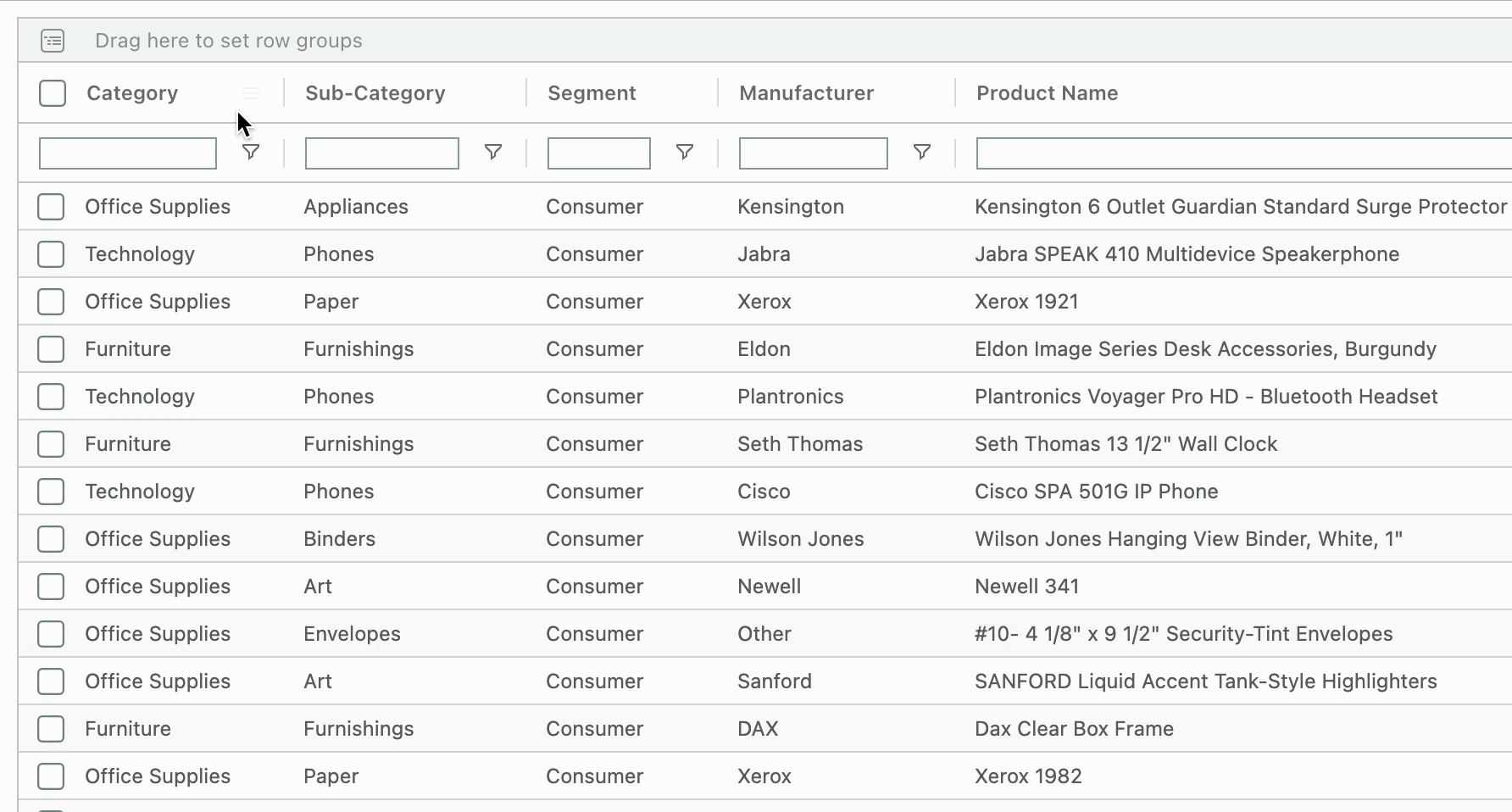
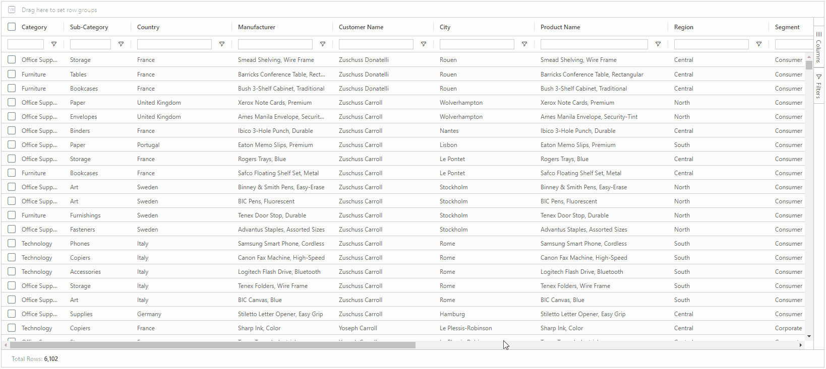
On the right of the table (or left if you enabled RTL in Appearance) you see a side pane we call the Sidebar. By default you will see a “Column” tab as well as a “Filter” tab. In the column tab you can check and un-check tick boxes to show/hide columns you would like to see in your SuperTable.
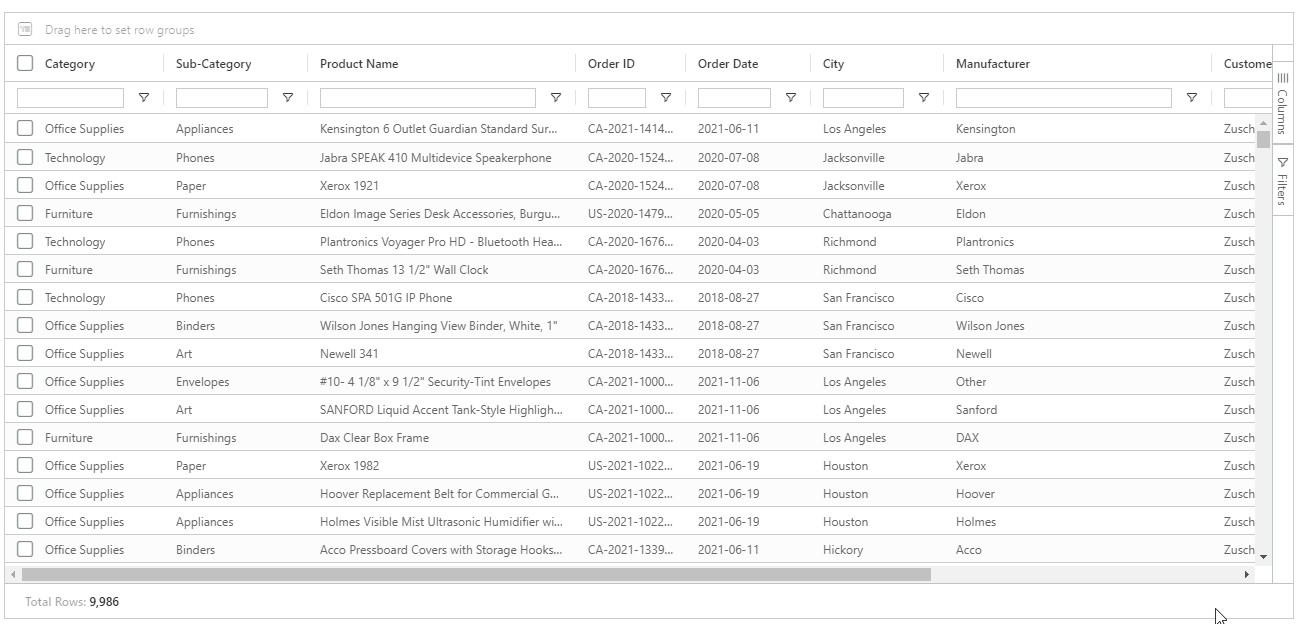
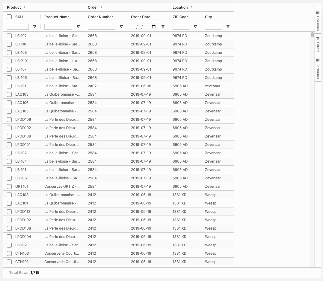
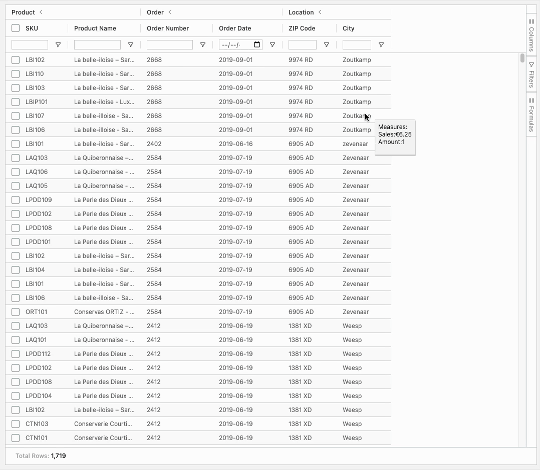
In the Sidebar on the right side of your SuperTable you also see a “Filters” tab. When you open this tab, you can click on any column header and filter though the filter pane. Use the dropdown to choose which filter you wish to use and use the text box that will show up to dynamically filter your chosen column. You are able to do multiple filters at once.
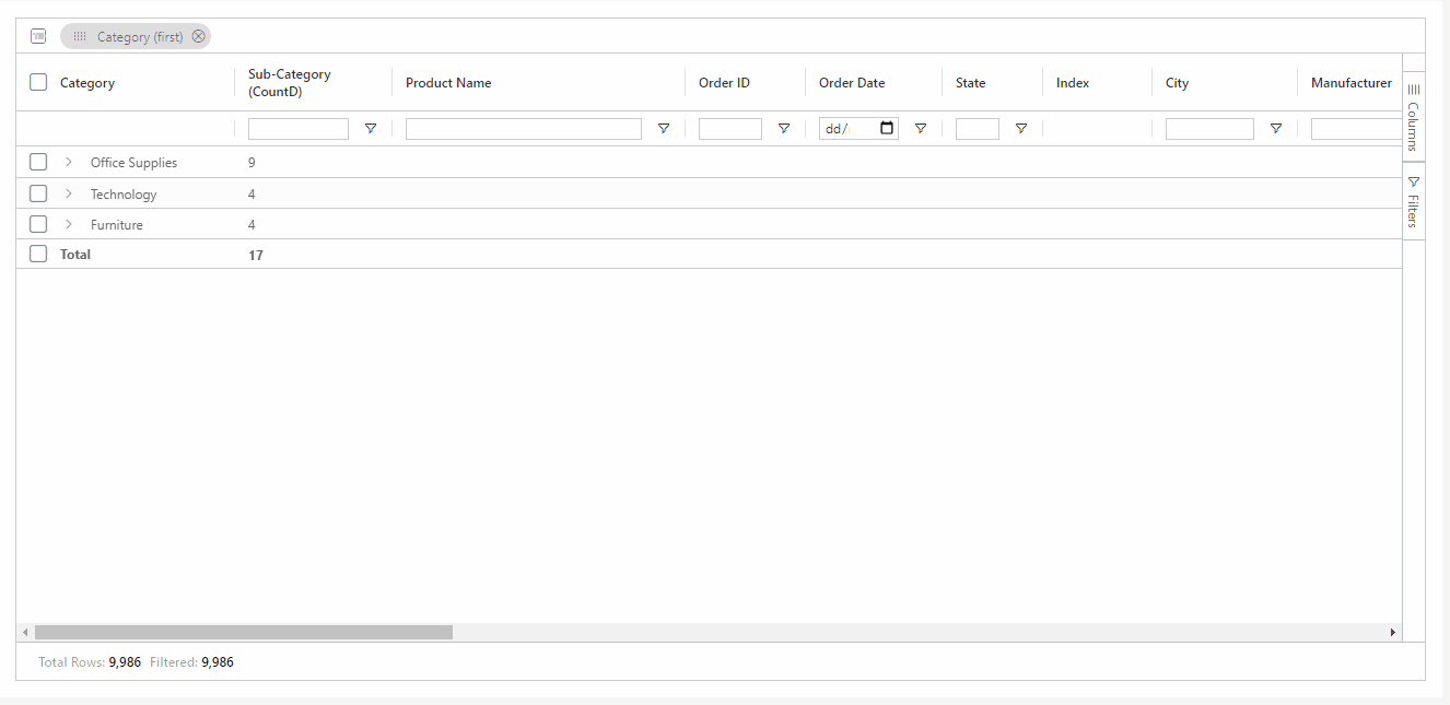
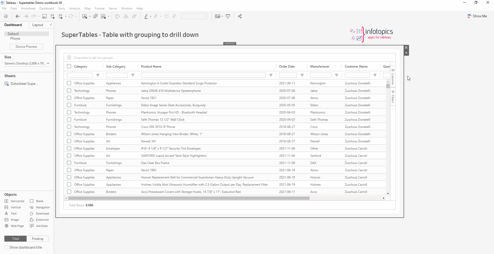
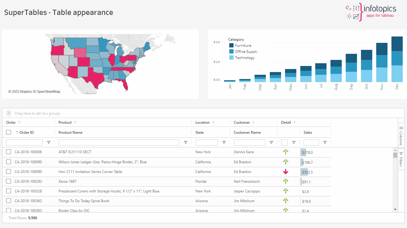
An amazing feature of SuperTables is that it allows your dashboard users to create their own grouping hierarchy. This can be done without the need of a Tableau fixed Hierarchy and in any order your dashboard user would like. To use this feature just drag a column to the grouping bar and drop it in the grouping bar. The rows will now be aggregated based on the grouping which you can select yourself. You can use multiple levels of grouping to create your own hierarchies just by adding columns to the grouping bar.
Just like in Excel, you can double click on the separator between column headers. This will automatically auto size the width of the column. You can also click on the hamburger menu alongside the column header, where you can auto size the selected column, auto size all columns, or dynamically size columns based on the window size, just with one click! 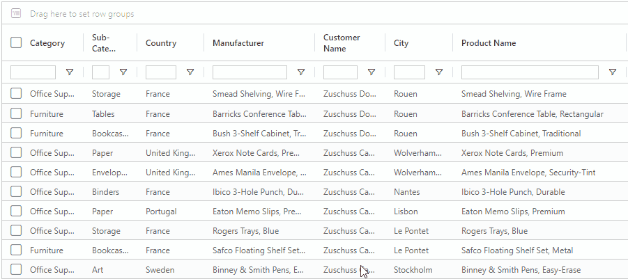

Right click on a cell anywhere in your SuperTable. Under the Export tab you can export all the data to a CSV file, .xlsx or.xml. This will export all the data you are showing in your current SuperTable view. The details of the export can be configured in the “Export” tab of the configuration pane. Export will respect the data type of the field.
NOTE: This feature is not available on iOS devices due to technical limitations.
Now export directly to PDF! This can include images too (for enterprise users). This will create a multi page PDF showing all the data in your view when exported. You can use export tab in the configuration screen to format your view. TIP: When renaming the filename be sure to add ‘.pdf’ to the end.
Empower your advanced dashboard users! Let them make columns out of values by pivoting on the data right in your table, similar to Pivot Tables in Excel. Open the Sidebar of your SuperTables and enable “Pivot mode” in the “Columns” tab. You can now configure row headers and columns based on groups or dimension values you like. You can, for example, replace the the column header “Category” with its values (for example “Office Supplies, Furniture and Technology” and have the rows show the “Regions” and “Ship Mode” like the example below. 
Clear all active filters in one foul swoop by right clicking anywhere on your SuperTables and then going to ‘Clear all filter(s). See it below in action.
We combine the power of Tableau Parameters and visible columns in SuperTables. By doing this we will automatically remove / add detail from the datasheet which results in a different level of aggregation. With this incredible feature you only query the data you are looking at, and Table Calculations / LOD calculations will also keep working like you expect! On top of that you benefit from a performance boost!
Set up Dynamic Aggregation
Enter the configuration screen of SuperTables and head to the Appearance tab. Under Layout Options tick ‘Enable auto aggregation based on the visible columns in the table’
Our example:
1. Create a string parameter with the exact same name as your column. For example: ‘Category’
2. Create a calculated field with the same name as the parameter in step 1.
3. Use this calculation: IIF([parameter_name] = ‘true’, [name_of_the_dimension], ‘_’)
4. Check if the parameter updates when you show/hide the column. In this example the column ‘Category’.
Next create a parameter of type ‘string’ with the current value ‘true’ as next we will be creating a calculated field. Follow our GIF to set up the calculated field.
Parameter:
Calculated Field:
All done, reload the extension to implement the dynamic aggregation to your SuperTable!
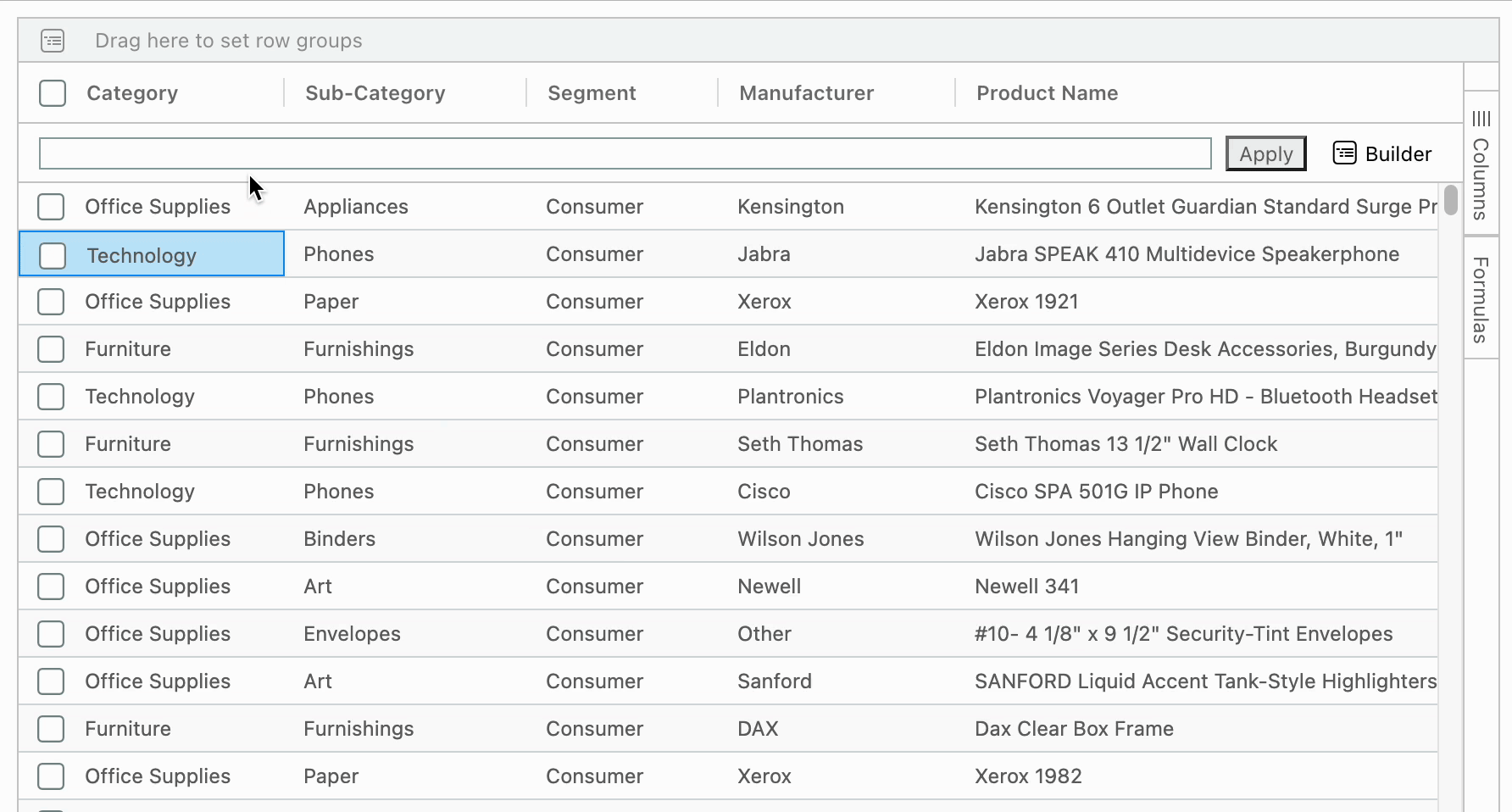
The advance filter feature consists of one long bar which can combine multiple filters into one expression. In addition to typing the filters by yourself, you can also use the builder tool to visually create complex filters to fit your use-case. Optionally enable the use of hidden columns in the advanced filter.
Formulas
This section describes the formulas available to users for on-the-fly data analysis. The formula editor allows end users to add formula-based columns to their SuperTables view using the measures and dimensions available to them.
Formatting options
Formulas can be formatted as a decimal number, currency or percentage. The amount of decimals can be edited, as well as the pre-and-suffix appended to the calculated measure.
IF/ELSE configuration
Using the If-Else Formula Editor, advanced formulas can be created using conditions for both strings and values. Set the “if” statement, calculations for when the condition is and isn’t met, and potential other “if” statements using additional “else-if” blocks. Advanced conditions using AND/OR clauses can also be set in these formulas.
Configuration Screen
This section describes the configuration of your Dimensions, Measures and Calculated fields in SuperTables.
Note: You’re able to use SuperTables whilst the configuration screen is open!
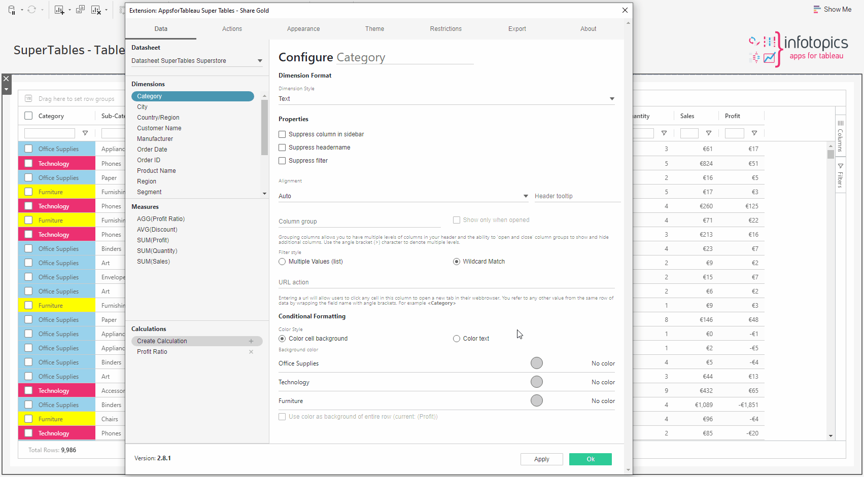
All columns can be aliased. By default, the name of the column will be presented in the column headers of SuperTables. Using the first option that says “Configure” on the Data pane of Configuration allows you to create an alias that will be shown in your column headers.

This image shows how to alias the “City” field in my dataset with the word “Town” in my SuperTables presentation.
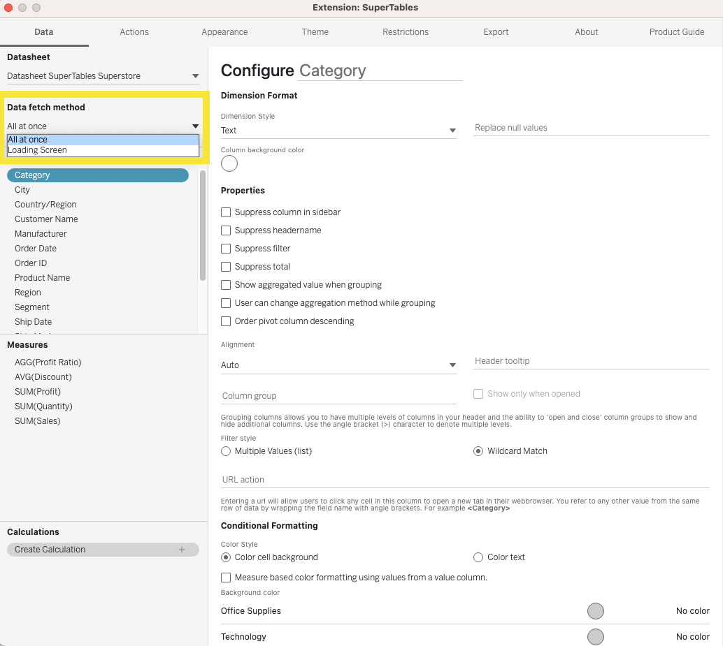
Data Fetch Method
SuperTables offers two ways to fetch your data to the extension, a bulk load all at once or paged loading. The Paged loading option “Loading Screen” requires Tableau version 2022.4 or higher.
All at once
This is recommended for smaller data sets and the quickest way to see your data. The data will be sent all at one time.
Loading Screen
Recommended for larger data sets, the data will be sent via paged loading where you will see a loading screen. This will prevent any timeouts but may take longer than the “All at once” option.
Dimension Data Pane
In this section, we will take you through the dimension data pane and explain the options in the dimension configuration screen. Format each dimension field individually to suit your dashboard needs.
Dimension Format
Here, you can choose the style of your dimension. Plenty of options such as a Text field, a URL that can be rendered into an image, HTML, Markdown or even an emoji!
The text field will view similar to what you’d see in a Tableau table.

If your dimension holds data of an image URL, have that shown in your SuperTable. Add the width and height in px into the text boxes to set the proportions of the image. A good tip is to enable ‘auto row height based on cell content’ under the Appearance tab to enable larger images in the grid and have the row height automatically calculated. We suggest setting at least one of the dimensions of the image size for better layout control. Leave the width and/or height empty for auto-detection and show the full image (max sizes).

Would you like videos shown within your Supertable? If your data holds embedded HTML, choose HTML as your dimension Type.

Use the markdown language on your dimension. Such as header styles, # and more. Use this website to see the markdown language that can be used in SuperTables.
Using the emoji codes in your dataset, show emojis in your SuperTable. Find the emoji codes here
If your dimension is a date type, you can format the date in the view. For example “YYYY-MM” to 2021-05 for May 2021.

Filter date
Filter now on a date part including exact date or even a range of dates. Want to show data over a specific time, easily filter your date to show in your viz.
Formatted date fields in SuperTables can now be used for aggregation. So if you have an exact date field in your dataset, and format the column to show only Year and Month you can aggregate that column (using the grouping bar) on Year-Month and the exact dates are aggregated based on your date formatting.
Column Background Color
Set a fixed color to your column. If you have a sales and profit column for example and they’re the most important columns in your data set, grab your users attention by colorizing each column so users see the information that’s most important in your visualization. Set the color by clicking on the color palette on any measure or dimension in the data pane.
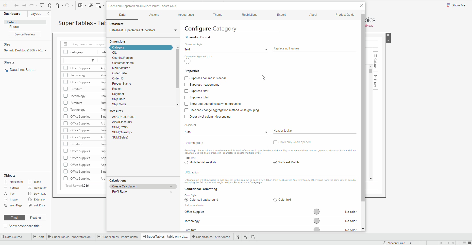
Properties
In this section you will find options to customize your table.
Set the colors for the background and header of a column, as well as the font color of the header.
Sometimes you want to use columns in a calculation but not show them in the SuperTable. Choose this option if you wish to hide the column from the sidebar so users cannot enable this column.

Ticking this will remove the column header from the SuperTable view.

Suppress the filter from a specific dimension. You see in our example it’s not possible to filter on Category but possible on Sub-Category.
Suppress the column from showing total value. For instance you want to show the Sales total but not the quantity total in the total row of a grouped SuperTable, suppress the total from your quantity column.
When grouping a dimension show the aggregated value of the members in the group. Decide what the default aggregation should be which includes Count and now CountD!
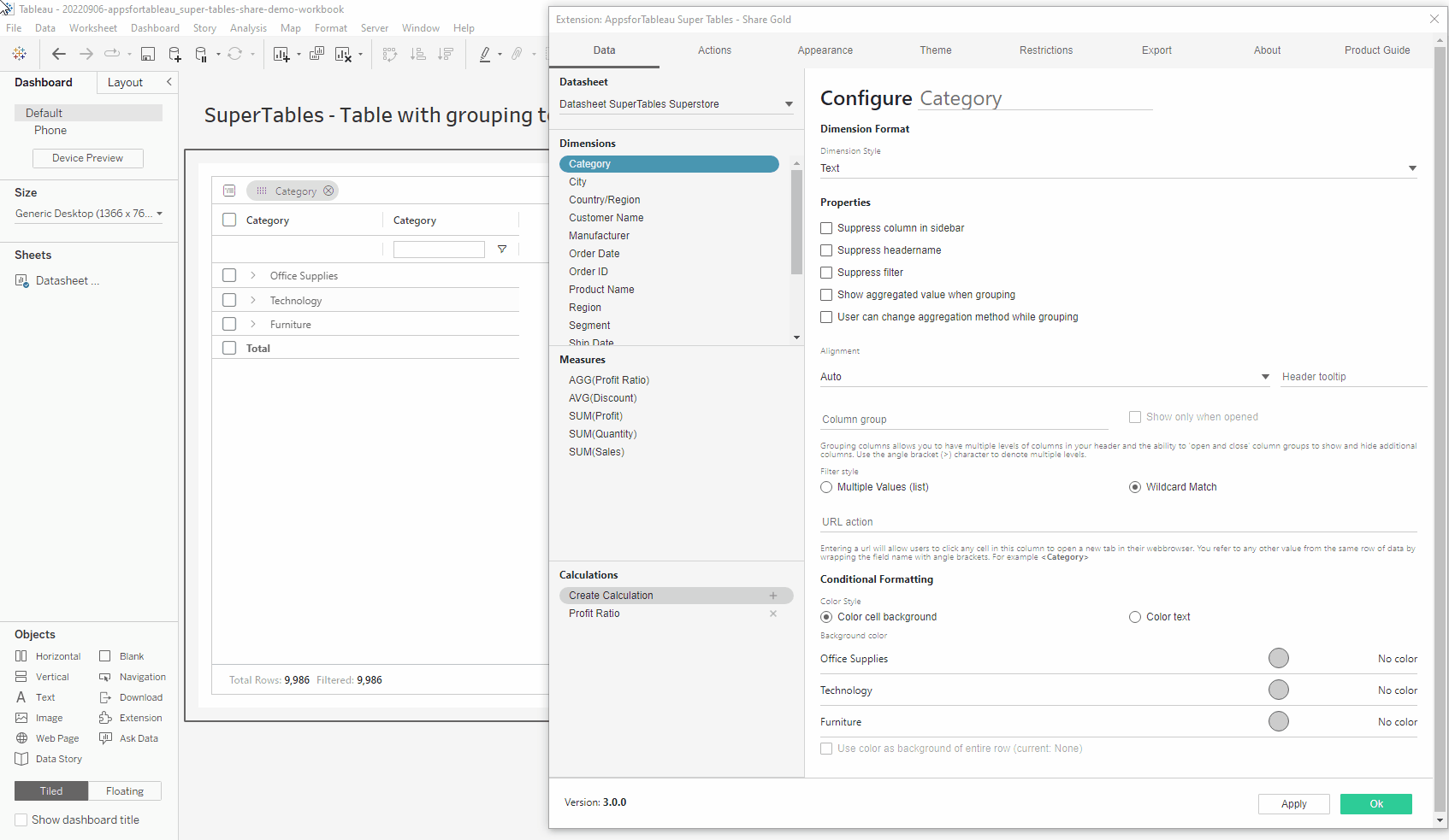
Dashboard creators can allow users to change the aggregation method on the chosen dimension.
Choose the alignment of the text within your SuperTables view, as well as the header of the specific column.
Change the tooltip of your selected dimension. By default, it will show the dimension name. This tooltip is for the column header only
Multiple Values (list) – A dropdown to be able to show or hide values. The dropdown will contain all the values of the dimension.
Wildcard Match – The column will show a search bar for this column to be used as an inline filter.
Entering a URL will allow users to click any cell in this column to open a new tab in their web browser. You can refer to any other value from the same row of data by wrapping the field name with angle brackets. You can of course also use a dynamically calculated field that contains a dynamic URL based on the content of that specific row of data. With this, you can set URL parameters to open a dashboard that has already been filtered on specific column values in your selection.
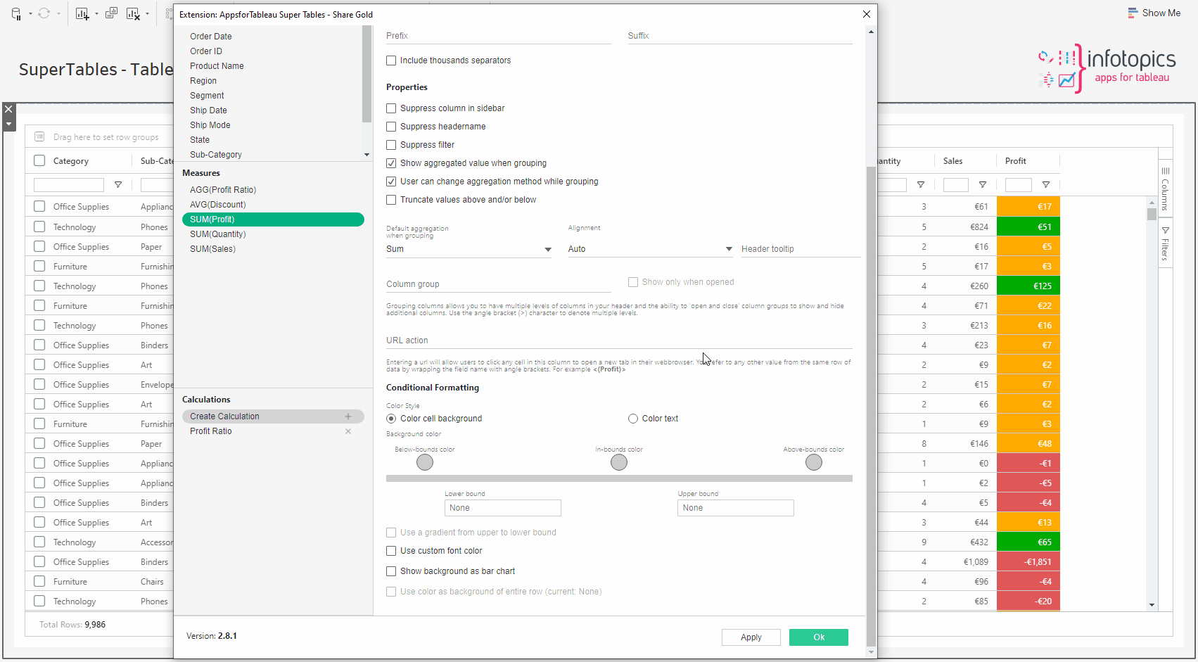
With this option, you can set conditional formatting. There are three options for conditional formatting:
- Change the font color of the cell
- Change the background color of the cell
- Change the background color of the entire row
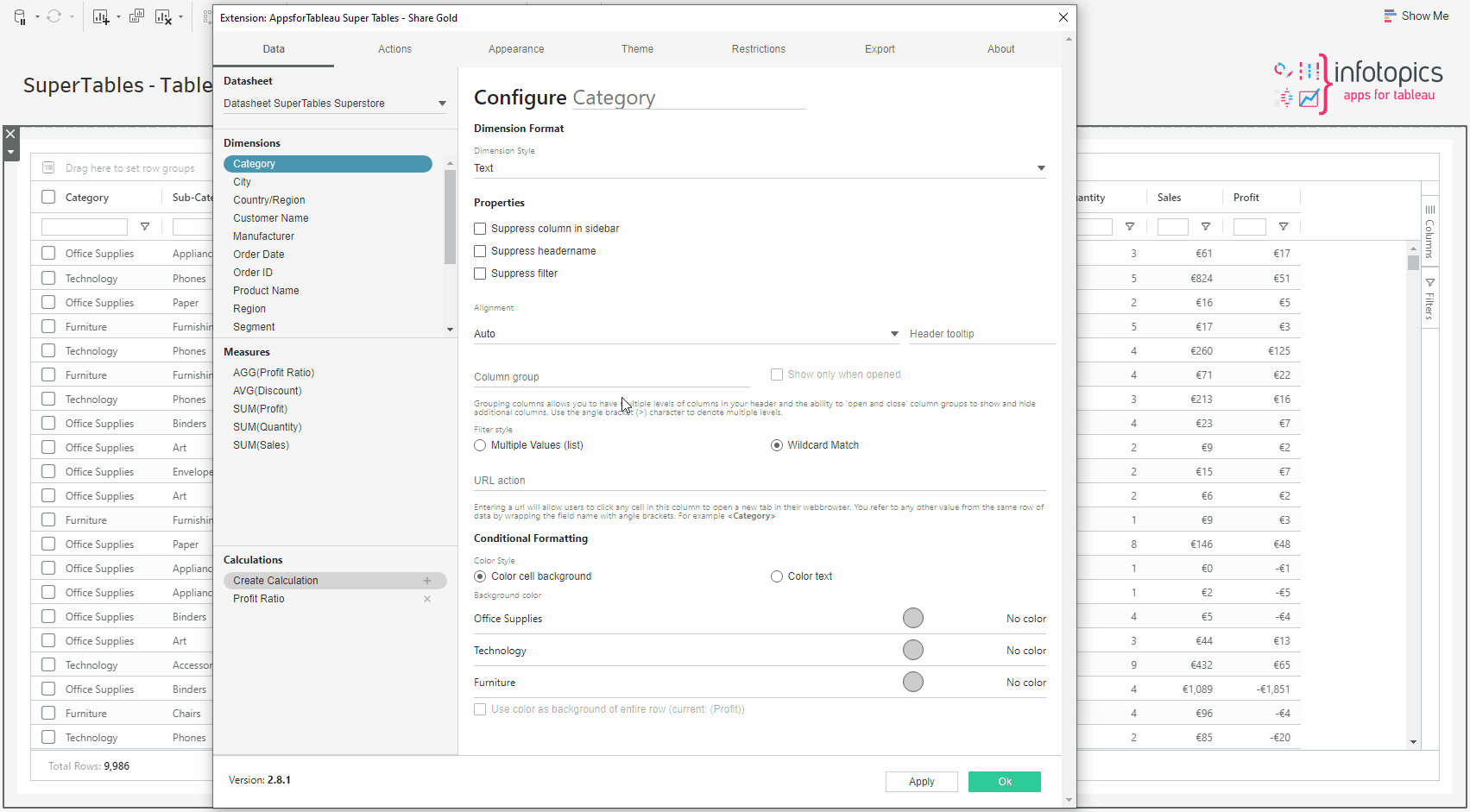
Click on the circle to open the color palette and choose the color you wish to use. Please note that you cannot configure colors for a dimension with more than 50 members.
Check the tick box to use the chosen colors to color the background entire rows.
Measure Data Pane
In this section, the configuration options you can set with Measures are described. Here you will be able to format the style of your measure to from a number to a percentage for example, if that’s the value your measure holds. Define the aggregation of your measure as well as conditional format the color of your cells. We will describe each option available.
For measures you can select one of the following number formats:
- Decimal
- Currency
- Percentage
- Time
Format how you wish your positive and negative values are displayed in your SuperTable. See options below.

With decimal numbers, you can set a prefix and/or a suffix to be used in the presentation in the cells of your SuperTables. The numbers will remain intact so it’s only to add extra information to the cells in SuperTables. You can also configure how negative values should be represented in your SuperTables and you can choose to enable or disable thousands separator in the display of the numbers in your cells. For instance, if your cell contains a numeric year (like 2021) it can be shown as 2,021 if you allow a thousand separator or 2021 if you disable the thousand separator.
The currency number formatting allows the same options as the number format, plus the option to top the currency shown in your SuperTable.
With currency, you can use a 3 letter suffix to change the currency. The default currency is USD, but you can also use for example GBP or EUR.
This number formatting behaves the same as the decimal format. Your cell value will be multiplied by 100 and besides that, it adds the percentage sign to your cell formatting in SuperTables.
When you choose this option, you can indicate what hierarchy of time must be used for your cell representation. To use this option your values must be in milliseconds (ms) and they will be automatically presented in the entire or part of the range you selected:
- Seconds
- Minutes
- Hours
- Days
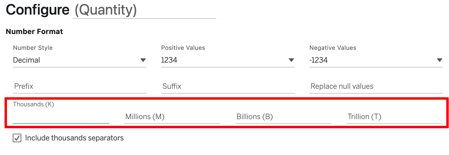
Configure the display units for when measures reach thousands, millions, billions or trillions.
Properties
Set the colors for the background and header of a column, as well as the font color of the header.
Choose this option if you wish to hide the column from the sidebar. This comes in handy when you have columns in your data that you need for SuperTables calculations but don’t want to show in your SuperTable. Using this option never allows your dashboard users to add the column to SuperTables using the Sidebar.
Ticking this will remove the header from the SuperTable view. For example, when using images, this might come in handy.
Check this to remove/disable the ability to inline filter this column.
Turn off aggregated values (SUM, AVG, MAX etc.) if you do not wish to see it in your view.
Dashboard creators are able to restrict users to only aggregating to their chosen aggregation method.
Using the hamburger menu alongside a column allows you to change the column aggregation (change from SUM to AVG for instance).
Truncate the measure to show a range by deciding on a minimum and maximum value.
Use the dropdown to choose which aggregation will be used on your measure when grouping / aggregating your measure in SuperTables. Many options available now including the much requested CountD. This incredible new feature lets you calculate the unique amount of members in a dimension and show this in your SuperTables. You can use this in calculations to add even more value to your table.
Choose the alignment of the text within your SuperTables view, as well as the header of the specific column.
Change the tooltip of the header of your selected measure. By default, it will show the measure name.
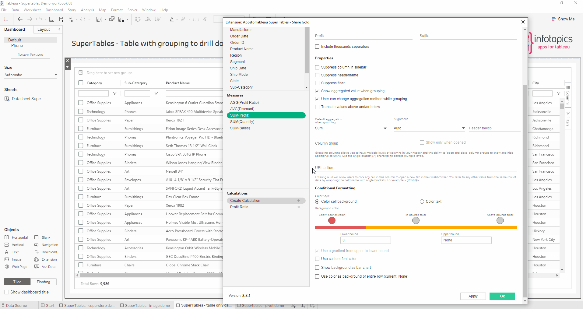
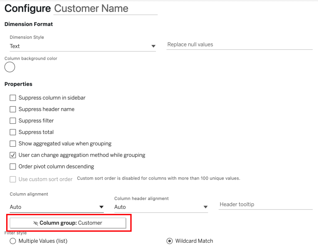
Add an extra header and add all dimensions, measures and calculated fields of your choice to this extra header group. Create a unique group within your SuperTable. You can indicate if a column must only be visible when the column group is expanded or also when the column group is not expanded. This way, you can create a group with extra detail but not show all detail on the initial opening of the dashboard.
Entering a URL will allow users to click any cell in this column to open a new tab in their web browser. You refer to any other value from the same row of data by wrapping the field name with angle brackets. For example, you can use a dynamically calculated field that contains a dynamic URL based on the content of that specific row of data. With this, you can set URL parameters for instance to open a dashboard that has already been filtered on specific column values in your selection.
With this option, you can set conditional formatting. There are three options for conditional formatting:
– Change the font colour of the cell;
– Change the background colour of the cell;
– Change the background colour of the entire row.
Click on the circle to open the color palette and choose the color you wish to use. Please note that you cannot configure colors for a dimension with more than 50 members.
Instead of having set colors for below bound, in bound and above bound, it will gradient from below to above. Use the lower & upper bound to decide on the scope.
Change your cell into a bar chart, setting the minimum and maximum bounds.

Fill entire rows in your SuperTable by using the conditionally formatted colours of your upper and lower bounds.
Calculations
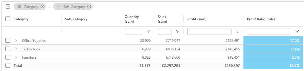
SuperTables offers the possibility to create (SuperTable only) calculated fields. The extensions API transfers summary data only, so ratios and percentages are transferred as numbers instead of calculations. There is nothing wrong with that when you are presenting your data on a row level, but when you use the custom grouping options of SuperTables you will be presented aggregated values of the percentages and ratios that will not match the correct values.
This is where the SuperTables Calculated Fields come in handy. With this simple Calculation editor you can easily perform simple mathematical calculations which use operands like Add, Subtract, Divide and Multiply. So for instance, if you have Profit and Sales columns in your dataset you can create a calculated field like SUM(Profit)/SUM(Sales) to calculate the Profit Ratio which will also aggregate properly when using custom groups.
Calculations also have access to the same If-Else Formula Editor as the Formulas tab, allowing for further customisation of your SuperTables measures.

Column Groups
Add column groups to your SuperTables for a more organized, streamlined, and visually customizable approach to presenting and managing your data. Create your column groups in the data configuration tab and personalize them with enhanced customisation options, including the ability to independently style the background and font colors of each header cell.

If a dimension or measure is part of a column group, this will be displayed in the configuration tab of these values, as seen below:
Appearance
Use parameter to change and store multiple layouts of SuperTables
Allow your users to select from multiple table layouts options. For example, some may want to go to a pre-set pivot table, some may want to only show certain columns in a certain order in another layout. This prevents users from having to develop multiple custom tabs.
Configuration
Firstly you will need to create two parameters of type string in your worksheet. One for storing the view and one for the layout change. Leave the value empty.
Create a parameter
Firstly you will need to create two parameters of type string in your worksheet. One for storing the view and one for the layout change. Leave the value empty.
Configure parameter in supertables
Open the configuration screen of SuperTables and head to the appearance tab. Choose the parameter you created to store your layout in.

Configure second parameter you created
In the same appearance tab, scroll further down where we will be using your second parameter. Click on the ‘Use a parameter to switch between layouts’ then below choose your layout parameter.
Setup your dashboard
Place both Parameter filers on your dashboard. All changes made in your SuperTables will be saved in your stored parameter. When you’ve got your SuperTable view exactly how you want it, copy the text shown in your stored parameter.
Layout parameters
Edit the layout parameter by clicking on the dropdown on the parameter. This is where we will be creating our custom layouts.

Paste your layout as a value in the list and name your custom view.

Repeat this process for each new custom view you wish to have on your dashboard. Once you have all the custom views you want, remove the stored layout from your dashboard. You can now click on each view and see an instant change in your SuperTable!
Store table layout in
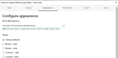
All changes you make to the SuperTables layout can either be stored in the workbook settings (no personal views possible) or in a special dedicated parameter for storing the SaveState of your SuperTable. When using a Parameter to store the Layout Settings you enable your dashboard users to create personal/private views on your published dashboards (Tableau Server / Tableau Online). Please make sure you use a dedicated parameter per SuperTables instance in your workbook, since parameters are global within a workbook. Using the same parameter twice in one workbook might lead to unexpected results! The parameter to store your SuperTables settings can be created by:
- Creating a new parameter
- Using a logical name like “PM Savestate Salesdashboard”
- Setting the “Data type” to: String
- Empty the “Current value”
- Setting the option “All” for the “Allowable values”

- Save/Store your parameter
- Head to the Appearance tab of your SuperTables configuration pane and select the new parameter from the dropdown
Custom Views
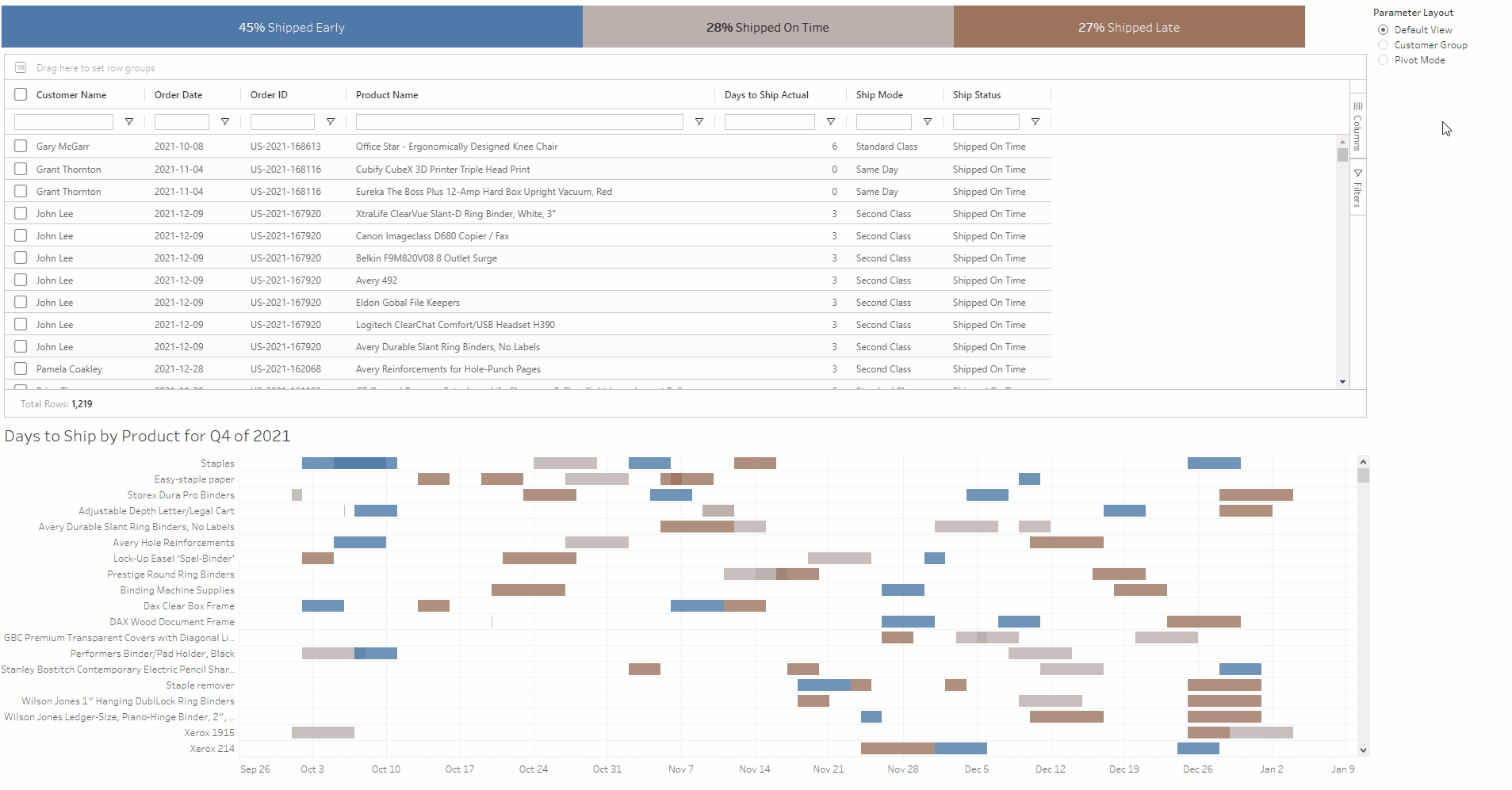
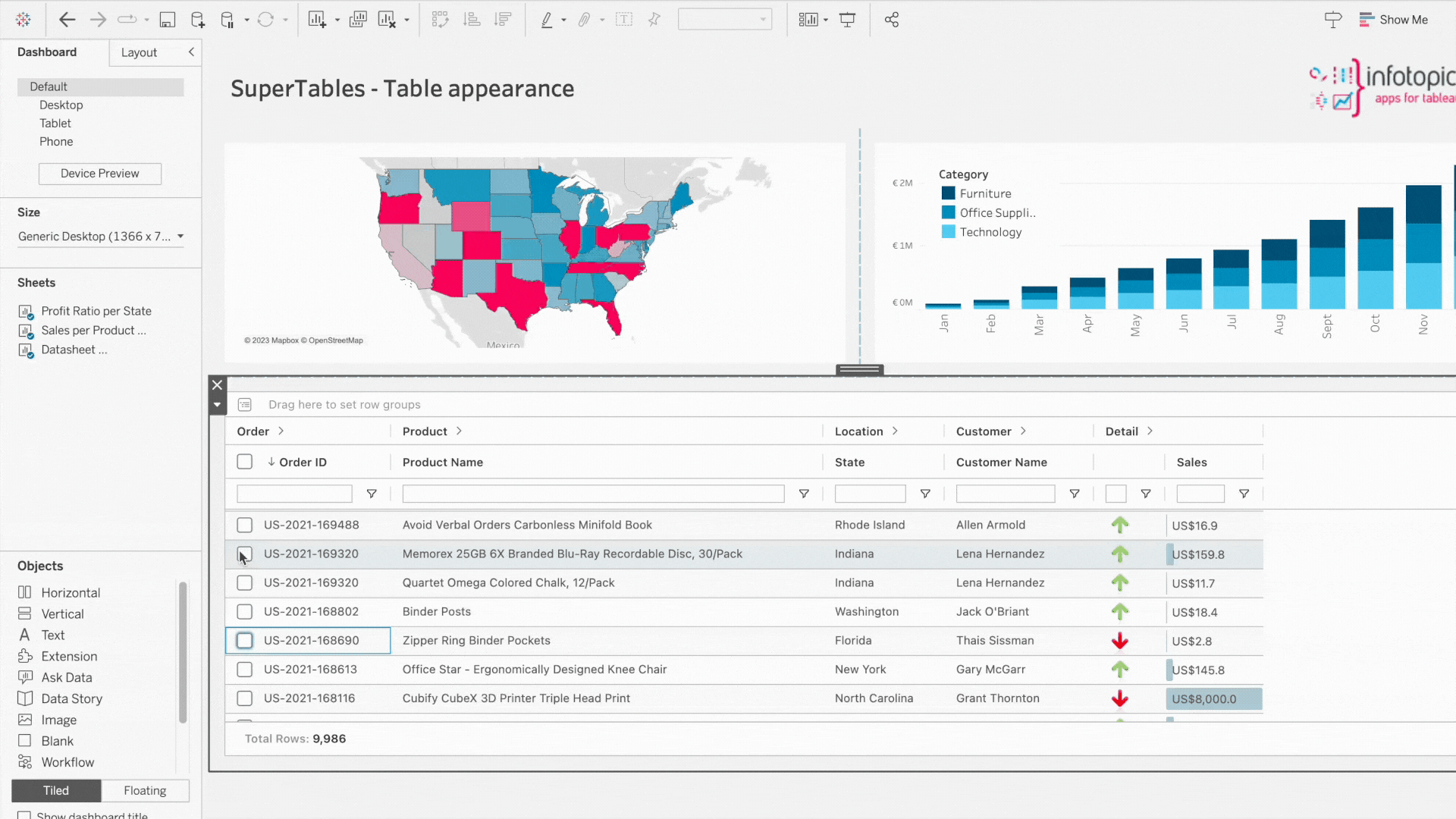
Create your own custom views of SuperTables! Each user can create their own unique view of their dashboard containing SuperTables. Wish to just see a compact view, sales view or a customer only view? Save as many views as you wish to be easily accessible every time you log in. You can make any view your default as well as making them available for your team!
Charting
Create a pop-up chart of your selection. Within your SuperTable, select some dimensions and measures, right-click and choose ‘Chart Range’. Here, you will be presented with a selection of charts. Click on your desired choice and you will be presented with a pop-up chart within your dashboard. This is read-only and will not be stored in your SuperTables configuration and settings. It is designed to help your Dashboard users with some extra self-service analytics on the SuperTables data.
Layout Options
Enable auto row height based on the contents of the cells
The height of Each cell will change automatically based on the contents of the cell to show all content in the view. The row height will be calculated on the cell containing the most content (either image, text or numbers).
Selection options
Select the row with just one click.
Multiple Row Selection
When using devices where Ctrl and Shift is not an option, turn on this feature where each click of a row will keep all rows selected. Clicking on a selected cell will deselect the row.
Enable to allow multiple rows to be selected
When selected users can highlight multiple rows, when disabled only a single row can be selected. Each selection of a new row will de-select the previous selection.
Enable compact mode
Make supertables compact for a clean and concise look, a very useful feature for clean-looking dashboards
Enable/disable sidebar
Enable the option to show or hide the sidebar in the SuperTables extension for Dashboard users. You can also individually set this option for only the
- Columns panel
- Filter panel
- Formulas panel
Enable/disable quick filters
This option lets you toggle the visibility of quick filters in the column headers of your SuperTable.
Enable filter menu when hovering column in header
When hovering over any column a hamburger menu will appear allowing users to pin columns, auto size and much more. Dashboard creators now have the option to disable. This can give a more focused SuperTable for your users.
Enable/disable status bar
This option lets you toggle the visibility of the status bar in your SuperTable. The status bar is shown in SuperTables at the bottom and holds information on the total number of rows and filtered rows.
Rearrange supertables from right to left
RTL stands for ‘Right To Left’. This gives the SuperTable users the option to rearrange their SuperTable for it to read from the right to the left of the screen.
Always show sorting icon in header
Keep the ‘sorting’ icon in the header at all times when enabling this. This will show less experienced users how easy it can be to sort on each header.
Enable/disable pagination
Show pagination at the footer of your SuperTable. You can click through each page or use it to go to the last.
Show SuperTables in a popup on mark selection
Important: Reload the extension after changing the popup settings. Choose which worksheet to trigger the pop-up. This will turn the SuperTable into a dashboard button to save that vital dashboard space and will be triggered on mark selection. Allow the popup up only when the datasheet has data (has a negative performance impact).
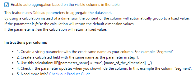
This feature uses Tableau parameters to aggregate the datasheet.
By using a calculation instead of a dimension the content of the column will automatically group to a fixed value.
If the parameter is false the calculation will return the default dimension values.
If the parameter is true the calculation will return a fixed value.
Instructions per column:
- 1. Create a string parameter with the same name as your column. For example ‘Segment’
- 2. Create a calculated field with the same name as the parameter in step 1.
- 3. Use this calculation: IIF([parameter_name] = ‘true’, [name_of_the_dimension], ‘_’)
- 4. Check if the parameter updates when you show/hide the column. In this example the column ‘Segment’

Hide/Show the Index column
Enable to hide the index column in the SuperTables instance. This will prevent it from showing up in the “columns” tab of your end-users.
Grouping Options
Enable Group bar
Show or hide the grouping bar in SuperTables. This enables or disables your dashboard users to do custom groupings on the dataset you offer in your SuperTable instance.
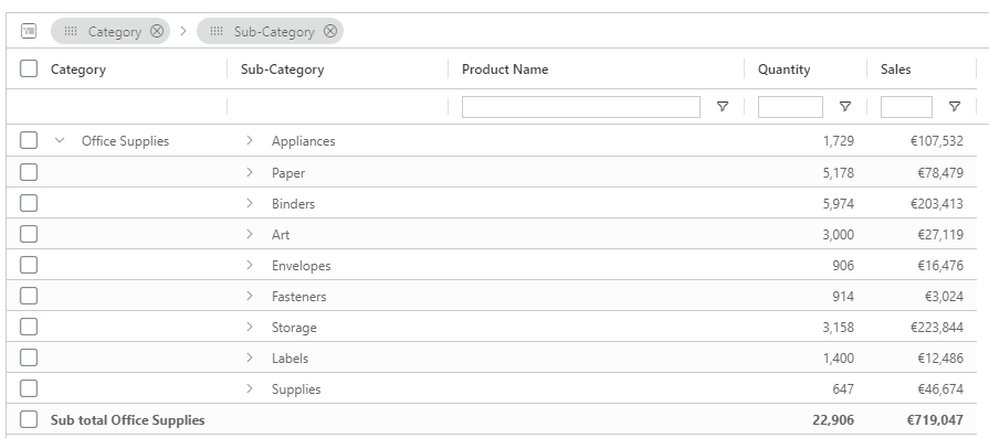
Enable group totals within each group level
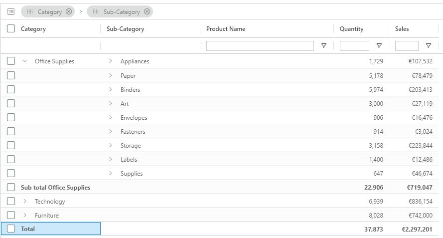
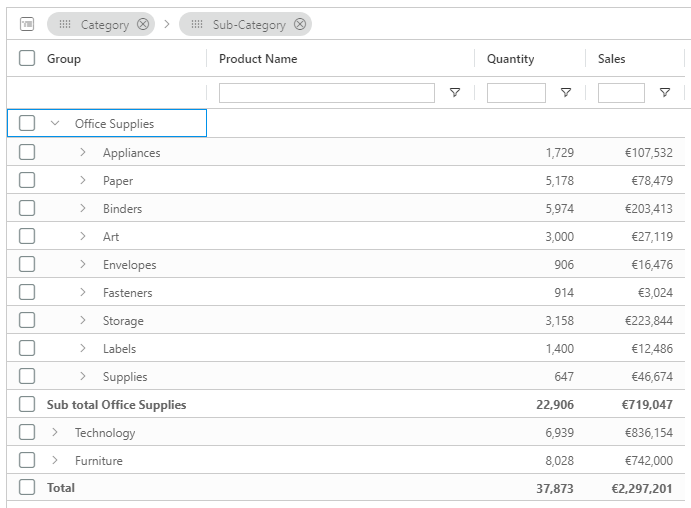
Each level will show a total of the group. Below, an example of the group total for “Office Supplies”:
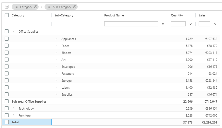
Enable a ‘grand’ total across all groups
Show a grand total of all groups in your SuperTable view.
View grand total at the top of the table
Show the grand total (pinned) at the top of your SuperTable view.
When Group is expanded, hide the parent row
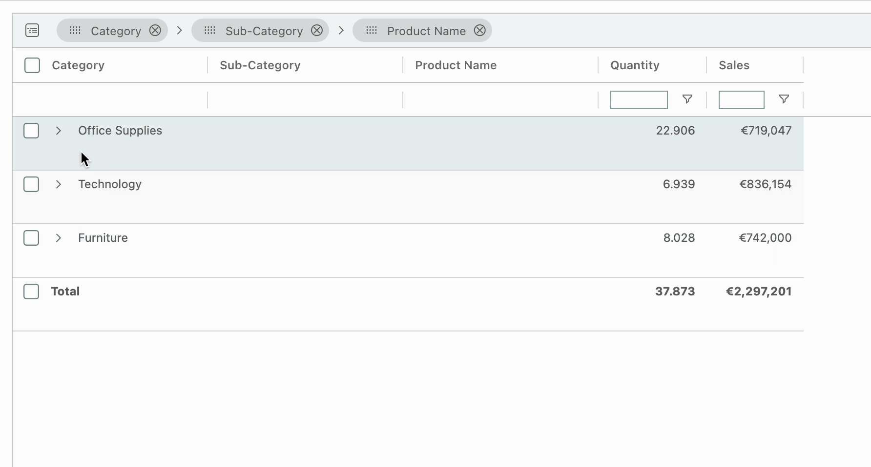
SuperTables allows you to hide the parent row while drilling down in your table. Below, an example with the parent row enabled:
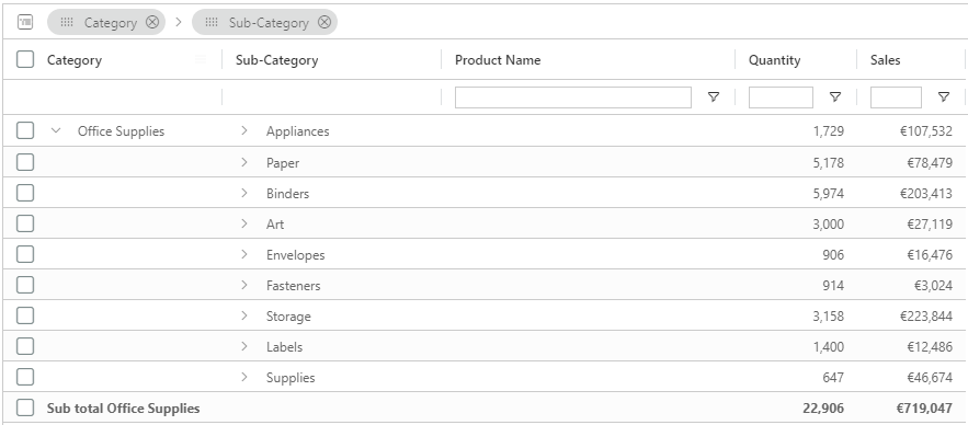
Also an example with this option set to hide the parent row:
Enable sticky row groups
This option will make the group rows stick to the top of the table when scrolling down, meaning that the parent row of a group will remain visible while scrolling through the underlaying rows.
Hide the number of rows counter behind a group row
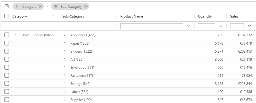
Normally, SuperTables shows the number of rows contained in a group or aggregation. With this switch you can turn off this row counter. By default, SuperTables shows a row counter when grouping:
You can switch this off and then the SuperTable groupings look like this:
Use multiple columns for grouping
When you use the grouping bar, SuperTables uses one column for the group by default. With this option, you can force SuperTables to use a dedicated column for each member of the grouping hierarchy. Example: Below you see a custom group of “Category” and “Sub category” where there is also a separate column for “Sub category”:

Default SuperTables combines the grouped dimensions into one column called “Group”:
Show opened group names on the rows below
This is useful when the user scrolls down through the children of the group, and the row showing what group was opened is scrolled out of view.
Show aggregation function in header
When using Measures in your SuperTable, the aggregation of the column can be shown in the SuperTable column header using this switch:
Automatically expand grouped rows
If your SuperTables has multiple groups, you can set it to open on a specified level by default. If you have, for instance, 3 group levels, you can choose to expand it by default on the first level by setting this value to 2.
Group value empty or null
Replace the empty group or null with a message of your choice, leave empty for default.
Enable URL actions for grouped values
If you are using dynamic values in the URL it will use the first row found in the grouped data to generate the URL. Deselecting will deactivate the URL action on the grouped level.
Unbalanced Groups
If there are rows containing null or undefined values for the column that is being grouped then these rows will not be grouped. This is called unbalanced grouping. If the null values should be in a column that’s current in your dataset you can set a replacement column using the dropdown. Wherever there are nulls or undefigned values, this column will be used for all.
Event listeners
Here, you can choose on what events the SuperTable should be updated from the dashboard
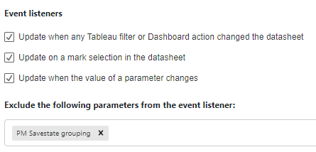
Update when any Tableau filter or Dashboard action changed the datasheet
Your SuperTable will be updated (reloaded) when any filter or dashboard action changed the datasheet.
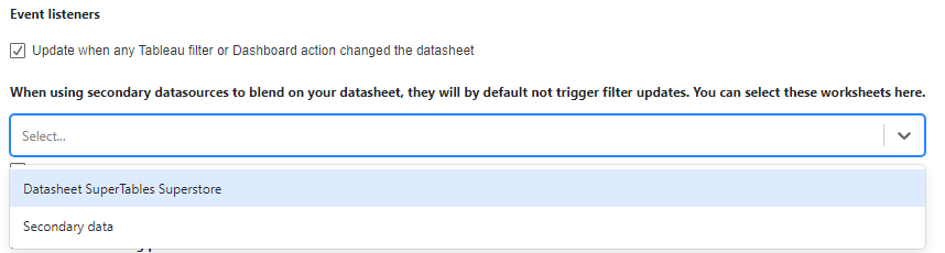
When using secondary datasources to blend on your datasheet, they will by default not trigger filter updates. You can select these worksheets here.
Use the dropdown to choose the secondary datasource. This worksheet will need to be present on your dashboard.
Update on a mark selection in the datasheet
Your SuperTable will be updated on a mark selection in the datasheet that feeds the extension.
Update when the value of a parameter changes
Your SuperTable will be updated when the value of a parameter changes.
Exclude the following parameters from the event listener
In some use cases you might want your SuperTables extension to respond to parameter changes, but not to all parameter. For instance, when you have two SuperTables instances on the same dashboard that have their settings stored in a parameter, you might want your SuperTable to exclude to respond on that settings parameter changes.
Pivoting options
Enable Pivot Header
Show or hide column headers when in Pivot mode.
Enable row total columns for each value at end of pivot table
Enable or disable row total columns for each value at the end of the pivot table.
Pivot column is date
If a column header in your pivot table is a date, you can format it’s appearance here.
Custom notification options
A message will be shown within your SuperTables if there’s an empty datasheet. Dashboard designers can determine what message will be shown. This can be a clear message to explain how to connect data or even if you wish to have a message shown in a different language.
Accessibility
Enhanced accessibility mode
With enhanced accessibility mode all rows and columns will be rendered in the HTML for screen readers even the rows and columns which are not visible on the screen. Animations will be disabled when using enhanced mode. NOTE: Accessibility mode will have a negative impact on performance. To improve performance we recommend using the pagination option, you can follow our GIF to activate this.
Theming for SuperTables!
Your dashboards are about to look even better! Our most recent upgrade of SuperTables allows creators to match their SuperTables extension to their dashboards branding. Color your headers, text, borders and background to the theme you and your users recognize! All settings can be saved in the general workbook settings or in a parameter (this can be chosen in the appearance tab of the configuration screen).

Packaged themes
A brand new tab is available for all your theming needs. Open the configuration screen of SuperTables and head to the Theme tab. By default SuperTables will have a Tableau look, you can change the whole style by using our pre-made themes such as Modern and Compact modes in both Light and Dark. Compact mode, as you can imagine, will compact your view, ideal to get all your columns and rows as visible as possible. Why not use one of the set themes as a starting point to then tweak to your liking?

Compact Mode
Enabling compact mode will reduce line, height and cell spacing, a good way to save that valuable space. Compact mode will work when auto cell height is enabled too!
Tableau Fonts
Inherit fonts from Tableau workbook setting. This will use the font configured for worksheets in workbook formatting. This works from Tableau 2021.4 and higher)
Colorize your SuperTable
The new theming tab allows you to individually color segments of your SuperTable, from all the borders, headers and backgrounds to just the text color. Use the color palette alongside each option to choose your color from the palette or use HEX codes and RGB color values. See our GIF to show how easy it to transform the look!

Items available for theming include border colors for major UI elements, rows and:
| Text Color | Background Color |
|
Icon |
Header Panels Inline filter Odd/Selected rows Grand/Subtotals |
Restrictions
Use the this tab to decide what the users will be able to do once you publish your dashboard to Tableau Server or Online. By default, there are no restrictions set in SuperTables. If you decide it is better for your use case to restrict people from some of the SuperTables functions, you can set it up in this configuration. screen.
User can adjust column width
When creating a pixel perfect dashboard, you might want to fix the column widths in your SuperTable. This option prevents your dashboard users from changing the column width.
User can sort columns
Some use cases require a strict sorting of the columns in your SuperTable. This option helps you maintain that sorting by preventing the dashboard users to change the column sorting in your SuperTable.
User can order columns
Some use cases require a strict order of the columns in your SuperTable. This option helps you maintain that order by preventing the dashboard users to change the column order in your SuperTable.
User can anonymize data
You can either allow or deny your Dashboard users to use the Anonymize function of SuperTables.
User can Copy data
The great thing of SuperTables is that you diminish the demand for working with Excel. However, SuperTables allows users to copy selections of rows/cells to the clipboard by default. This option can prevent your users to copy the data of SuperTables to the clipboard.
User can export data
SuperTables allows Dashboard Users to export the (filtered) data to Excel or CSV files by default. If your use case needs to restrict this export you can use this option to restrict the Dashboard users from exporting the data.
Tooltip
The Advanced Tooltip Function is a powerful and versatile feature designed to augment your SuperTables dashboards. This function enriches your data exploration experience by providing interactive and customisable tooltips that can follow the mouse cursor or remain fixed. With a wide range of options for customisation, it allows you to tailor the tooltips according to your specific needs and preferences.
Tooltip Positioning and display options
Choose whether the tooltip should follow the mouse cursor or remain static for a seamless user experience. Adjust the delay for showing and hiding tooltips, enabling you to strike the perfect balance between responsiveness and avoiding accidental pop-ups.
Styling and Color of the tooltip
Easily adjust padding, border width, and border radius to create tooltips that fit harmoniously with your overall design aesthetics. Tailer the background color, default font color, and border color to align with your brand and visualisation themes.
Column-Specific or Generic Tooltips
Personalise tooltips to suit each column’s unique data by creating column-specific tooltips, or use a generic tooltip to highlight consistent information across all columns.
Image Display Options
Take advantage of the image display feature, which allows you to set fixed images for each column, dynamically based on data, or a combination of both. This empowers you to enrich your data presentation with relevant visuals.
Text Customisation
Enjoy the freedom to customize the tooltip text extensively, giving you the flexibility to provide detailed insights, summaries, or any other information that complements your data.
Row-based Tooltips
The first type of tooltip is the Row-based tooltip, able to display information based on the row currently hovered. It can display either the values from the currently hovered column or a pre-specified one.
Column-based Tooltips
In addition to the Row-based tooltips, specific tooltips for each column can be used to append or replace a row-based tooltip.
Adding Images to Tooltips
Images can be added to a tooltip either from a static image URL, displaying the same image in each tooltip, or by using a image URL column to dynamically display an image for each row.
Export
Here you can decide what will be exported and how it will be formatted when exporting your SuperTable.
Floating export buttons
Add buttons to the bottom section of SuperTables that allow for easy exporting of the current view to Excel, CSV or PDF.
Differentiate between even and odd rows
Use the row banding when you do an export to Excel.
The first line are column header names
Export the column header names as a first row in the export.
Include header column grouping
If you use grouping, you can choose to include the header of the column grouping in your export.
Include group rows
When using the grouping option, you can decide if you want to include grouped rows as well in your export.
Export visible columns only
In SuperTables you can show/hide columns, this option allows you to export visible columns only or use all available columns.
Export all rows except last level
If you want your users to prevent to export the lowest member of your groupings, you can use this option. The row level data will not be exported because the export only contains the aggregated data of your grouping structure.
Format exported values
In the DATA tab of configuration you can set the formatting of your measures. This option allows you to include this formatting in your export, or use the raw data without the formatting on the Configuration | DATA pane. SuperTables will not export the formatting of the table in your dashboard because this is only about the formatted values in the export.
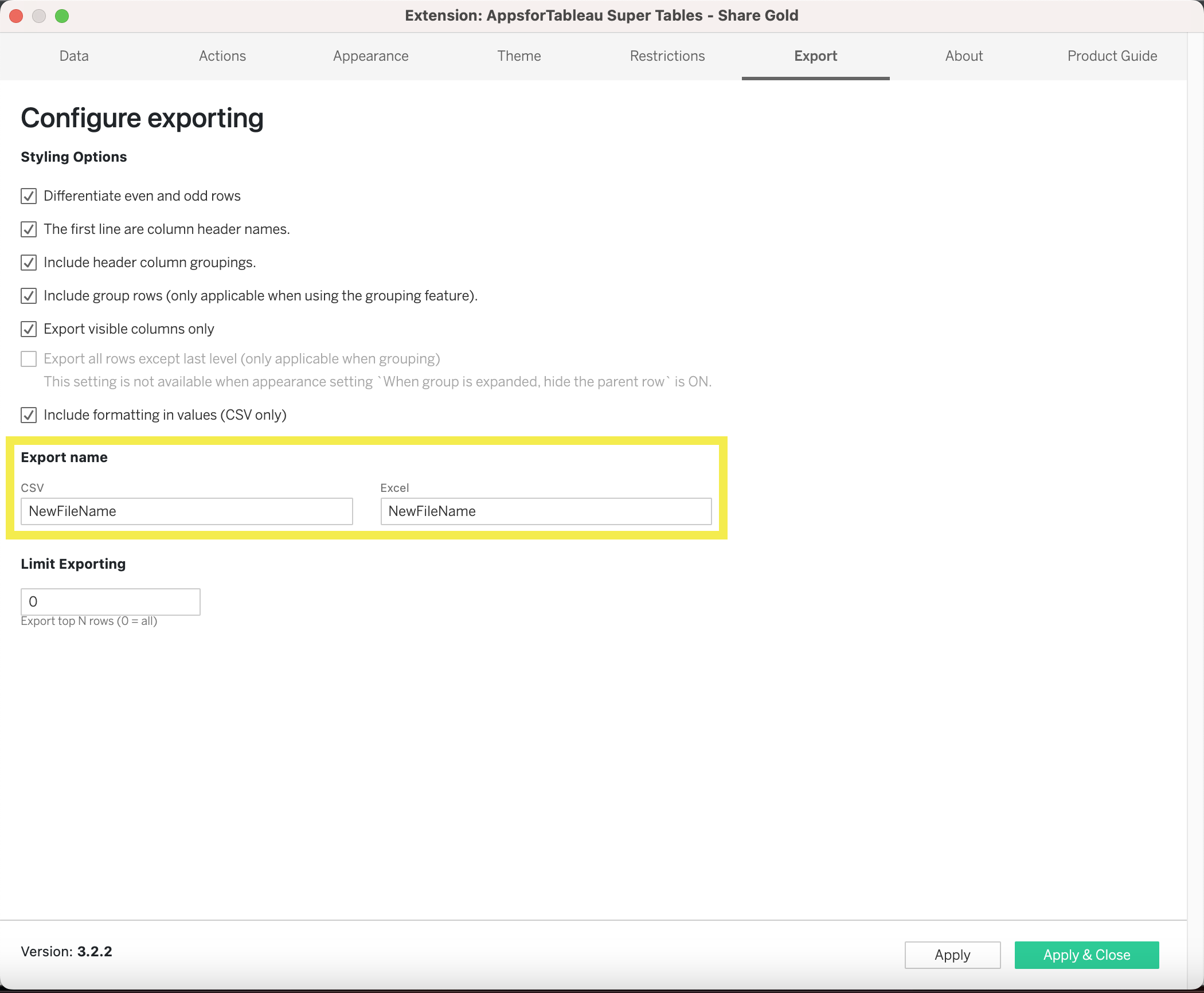
Export Name
Change the default file name when exporting to CSV or Excel. By default (no changes) the extension will fall back on “export.xlsx” for excel and “export.csv” for CSV exports. You can change the default filename as well as the file extension name. Newfilename – Newfilename.txt.
Limit Exporting
Limit the amount of rows allowed exporting. This will export only the top amount of rows you decide on.
Logging Options
Audit export and copy actions in SuperTables in a log file on the server where SuperTables is hosted. The log file will be found in the folder where the SuperTables binary is running. Log rows exist out of: Who, When, What (Number of Rows, Number of Columns), Type (Export, Copy), Dashboard, Workbook.
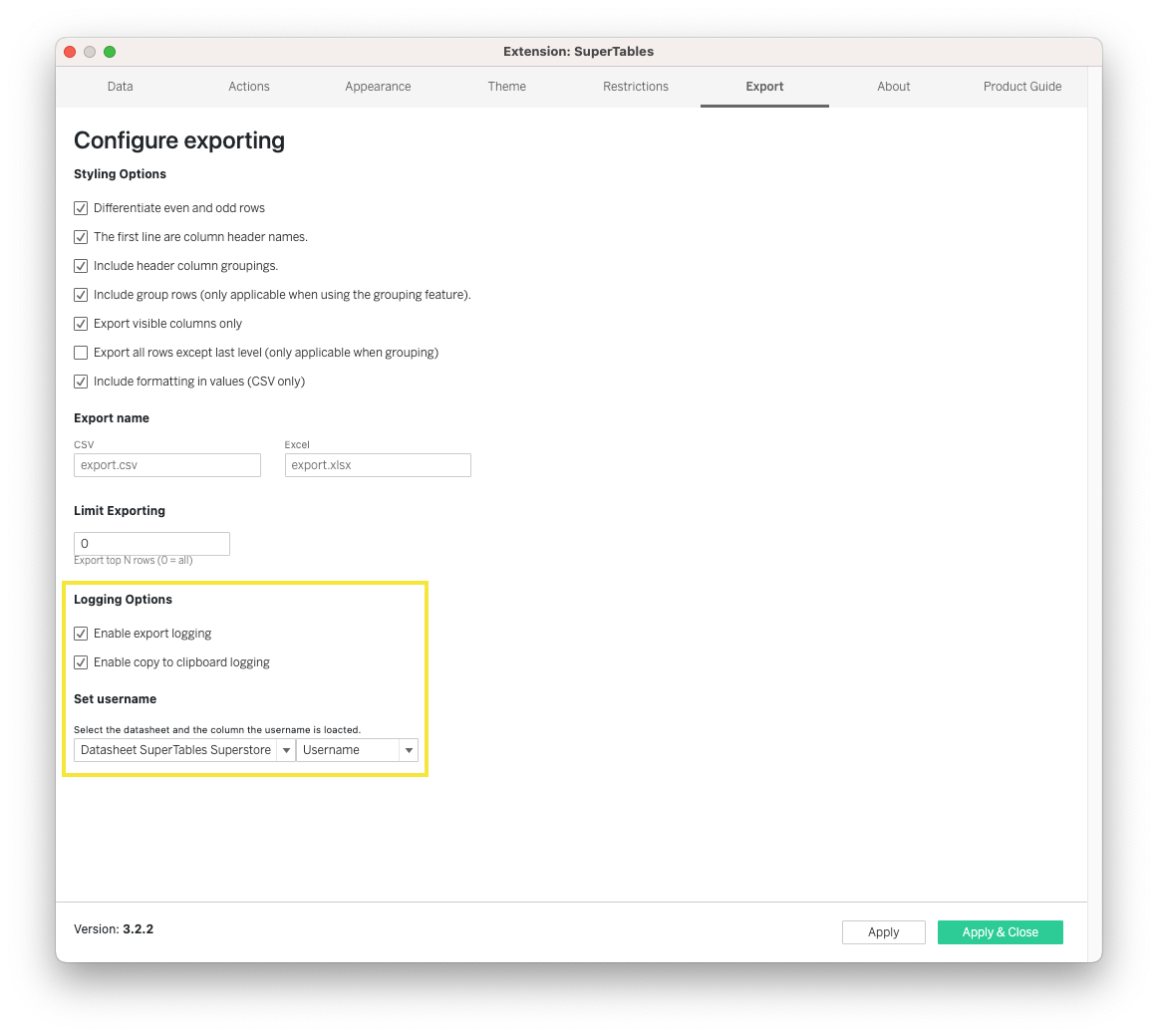
Set usernames
Select a worksheet and column containing the username(). enable/disable audit on export and audit on copy. To create the user name you can create a calculated field and name it ‘Username’ with the calculation ‘USERNAME()’ Drag this to the marks pane of your datasheet.
About
Here, you will find which version of SuperTables you are using along with the changelog of all the updates from previous versions. Support email and the Infotopics | Apps for Tableau website link are also available in here.
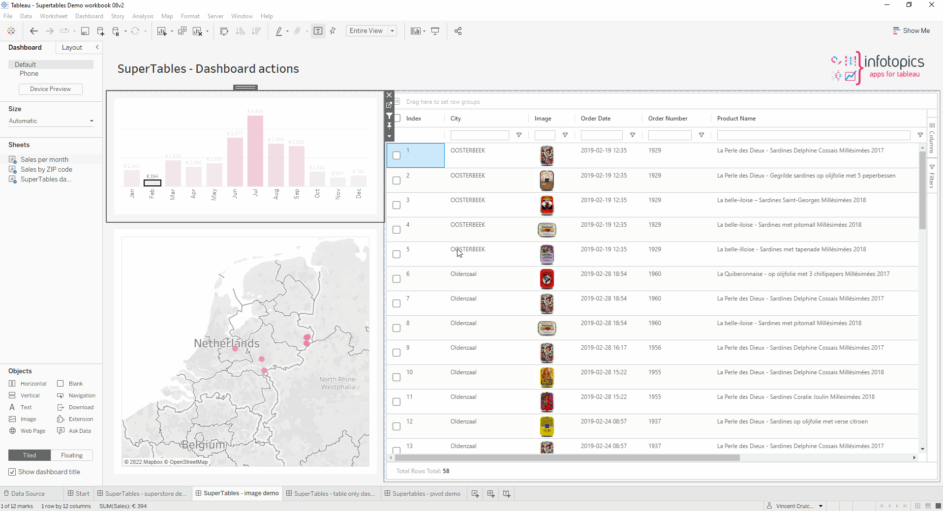
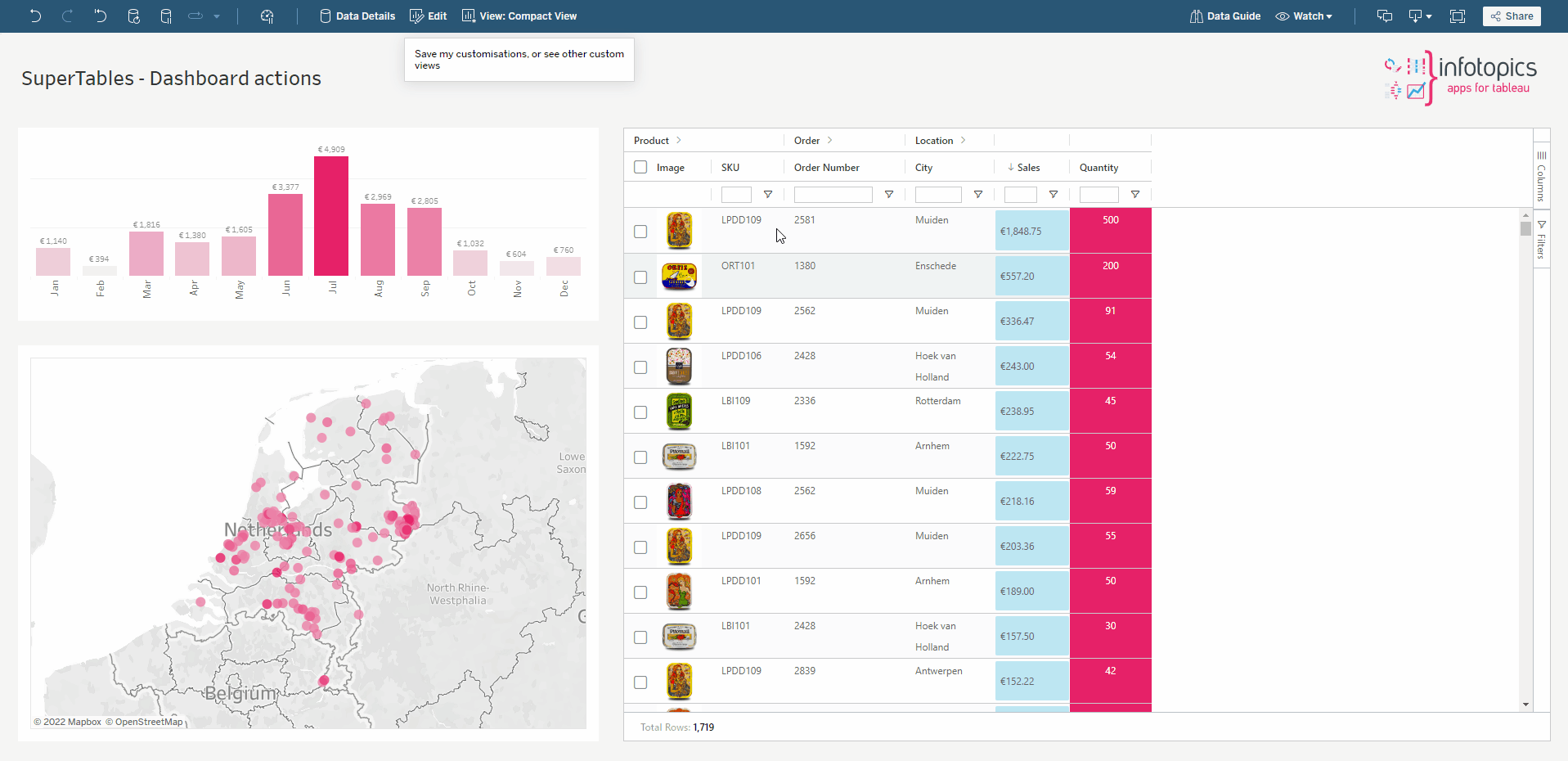
Dashboard Actions
Interaction between visualizations and sheets in your dashboard is an important aspect of Tableau. SuperTables supports a high degree of interactivity by using a “Dashboard actions” like mechanism. Actions in SuperTables are based on row selection. You can either select one or multiple rows which will trigger your Dashboard Action. To start configuring the Dashboard Actions by SuperTables, click the “Actions” tab in the configure screen. In this screen you can either edit an existing action (by default, no actions are present) or create a new action. To create a new action click the green “Add action” button. You will be presented a modal popup where you can configure your action.
Select action type
SuperTables supports three types of action:
- Filter action: This allows you to use one column value of the selected row to filter upon another sheet of your dashboard.
- Parameter action: This will allow you to fill a parameter with the value of a column of one (or more) selected rows.
- Highlight Action: This action allows you to highlight the value of a column of your selected row(s) in another sheet of your dashboard.
- Hide/Show elements action: This action allows you to hide/show a floating container when selecting/deselecting a row in SuperTables. Combine it with a Filter / Parameter action to show a filtered graph when clicking on a row in SuperTables.
Select a column
Choose which column will be used to execute the action. This is not the column that will trigger the execution of the action but this is the value that will be used as a filter, parameter value or highlight value in this specific action.
Select a worksheet
Choose the target worksheet you wish your action to trigger, SuperTables actions can be applied to one single target sheet only.
Clearing the selection will
Select how you want your action to behave when the (row) selection is undone. You can choose to leave the filter, show all values again or exclude all values.
Data format
If you use a date field as a column value to be used in your action, you can set what format you want to use as a filter value.
Custom Themes (Enterprise Only)
Customize the layout of SuperTables
With SuperTables enterprise you have the full freedom to customize the layout of SuperTables. You can do this by editing the custom.css file which is part of the installation files. With custom css you can do almost anything from:
- Company fonts and colors
- Custom icons
- Coloring
- Edit spacing, margins and more
- Hide parts of SuperTables like borders, elements and more.
- And many more CSS tricks you can think of.
An example of a custom table:


Custom events (Enterprise Only)
In SuperTables 2.3.0 we have added the possibility to add custom content above and below the SuperTable. You can use this feature to add custom titles, buttons and more.

Toggle columns and/or groups
We have also added a custom event you can use to hide/show (toggle) columns with a button. This feature enables you to show/hide groups of columns with a single click. There is example code available in custom.js and custom.css for the button layout.

Localization (Enterprise Only)
With SuperTables enterprise you have the full flexibility to change the language of your SuperTables installation to your own likings. You can find the localization file in the Enterprise Installation files. Update any of the values and the SuperTable will be updated automatically.

FAQ related to the accessibility in Supertables
Using enhanced accessibility mode, all rows and columns will be rendered in DOM, even the rows and columns which are not visible on the screen. Following are the questions you might get if you use tools like axe dev tools to assess the accessibility of Supertables.
Why does my page not have a level one heading?
ARIA Rule : Page must contain a level-one heading
Generally, it is a best practice to ensure that the beginning of a page’s main content starts with an h1 element, and to ensure that the page contains only one h1 element. However, ARIA Standards also mention that in the case of iframes, the heading can be an <h2> or <h3> so we have added an invisible heading, which tells the screen readers that it is the SuperTables container.
Why certain elements do not have an ARIA parent role?
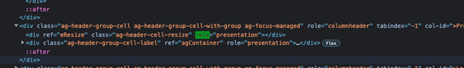
ARIA Rule: For every column header ARIA parent role must be added.
By default, SuperTables has a column header’s role described as role=”columnheader” - element containing a column header. For all the member cells there is an ARIA-Describe By tag which explains where it belongs.
However, even though all aria tags have been applied to the necessary elements, some screen readers have trouble navigating the tags when the grid structure gets more complex (eg. grouped columns). This is the reason why there are some limitations in announcing the correct column names.
I cannot find the landmarks for some elements?
Aria Rule: landmarks to element
Navigating a web page is far simpler for screen reader users if the content splits between multiple high-level sections. Content outside of sections is difficult to find and the content’s purpose may be unclear. However, in this case, SuperTables stand as one single element instead of website where contents are spread of multiple sections.
All elements in SuperTables have a role attribute which describes what it is, see the image below.
Does the SuperTables element in the screen have an identifier?
ARIA Rule: A Main landmark should be available in the SuperTables structure
Screen reader users can use keyboard shortcuts to navigate directly to the first h1, which, in principle, should allow them to jump directly to the main content of the web page. If there is no h1 or if the h1 appears somewhere other than at the start of the main content, screen reader users must listen to more of the web page to understand its structure, wasting valuable time. To tackle this issue we have added an invisible heading which will help the screen reader to easily recognize the SuperTables container.
How do I optimize SuperTables for accessibility?
ARIA Rule: configuration option to enable/disable Accessibility optimization for the grid
You can use the “Enhanced accessibility option” if you wish to optimize SuperTables for accessibility. It in general disables the column and row virtualization. This as result generates all cells in the DOM thereby you will see a considerable reduction in performance.
There may be 2 scenarios when you may wish to disable column virtualization (if you prefer).
1) Auto-sizing of all columns. This will ensure that all columns, and not just the columns which are rendered on the screen, will be resized.
2) Support for a11y. This is to prevent any potential issues with keyboard navigation and screen readers (https://www.a11yproject.com/).
Accessibility audit shows missing ‘Main roles’ which helps users to skip sections.
Aria Rule: Bypass repeated blocks by setting the role to “Main”
Since websites often display secondary, repeated content on multiple pages (such as navigation links, heading graphics, and advertising frames), keyboard-only users benefit from faster, more direct access to the primary content on a page. This reduces keystrokes and minimizes associated physical pain. Since SuperTables is just one page and there are navigation shortcuts to move around. This does not affect the accessibility of SuperTables.
Are there other general limitations to accessibility in SuperTables?
Known limitations
Navigation to pinned rows/columns
Screen readers assume that the visual and DOM element order are identical. Specifically, when you pin a row/column, it causes elements to be rendered in different containers. This is why you cannot use screen readers to navigate into pinned row/column cells, as in fact, this means they’re rendered in a different element from the rest of the columns/rows which are scrollable.
Limitations announcing the correct column name in grouped columns
Even though all aria tags have been applied to the necessary elements, some screen readers have trouble navigating the tags when the grid structure gets more complex (eg. grouped columns). This is the reason why there are some limitations in announcing the correct column names.
No announcements of state change of a grid cell or grid header
Some screen readers will not recognize changes that happen to an element that is currently focused (including children of this element). So in order to detect changes (eg. sorted state, updated labels, etc…), you will need to move focus to another element and back.
We love to make solutions and help Tableau users to do things more efficiently. If you have feedback, ideas, questions or need support, please make sure to share it with us! Also, don’t forget to follow us on social media for our latest news and updates.