Visualize Success: How Different Sankey Diagrams Propel Business Insights
In today’s data-driven world, businesses are constantly on the lookout for innovative tools that unlock valuable insights from their data. One such tool that can revolutionize data visualization is the Sankey diagram. In this blog, join us as we explore the practical advantages of Basic, Geo, and Circular Sankey diagrams. Discover real-world examples that demonstrate how ShowMeMore enhances data visualization, taking it to a new level of effectiveness and clarity.
Unleashing the Power of ShowMeMore:
ShowMeMore adds 10+ visualization types to your Tableau toolkit that are not present in the “Show Me” function of Native Tableau. In this blog, we focus on three of them that unlock the full potential of Sankey diagrams for businesses, offering capabilities beyond those found in Tableau’s basic Sankey diagram. While Tableau‘s native feature is a great addition, our extension brings added value that makes it the go-to choice for businesses in need of advanced data visualization capabilities.
Let’s explore the unique advantages of each Sankey diagram type and how ShowMeMore takes them to new heights.
Standard Sankey Diagrams:
Let’s dive into the fascinating world of Sankey diagrams!
By mapping the flow of data or resources through interconnected nodes and directed links, a Sankey diagram paints a vivid picture of complex relationships and patterns. It’s like unravelling a captivating story, where you can identify the proportions, pathways, and transitions of different elements within your system. See the flow of information come to life before your eyes! Uncover bottlenecks, spot inefficiencies, and witness the impact of changes or interventions in a visually intuitive way.
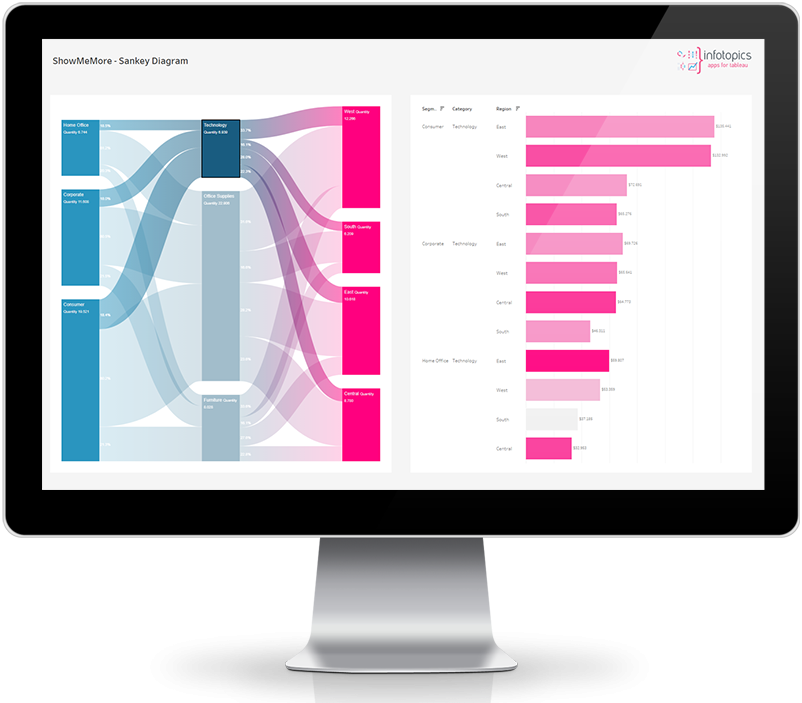
The standard Sankey diagram is a game-changer if you’re working in finance, healthcare, or any other industry that craves valuable insights. Let’s take a closer look at how financial institutions can take it even further. Just imagine being able to see how money flows within various investment portfolios—like stocks, bonds, and commodities. It’s like peeking into the very core of diversification strategies, pinpointing risks, and discovering amazing opportunities. Portfolio managers can optimize their allocations, rebalance portfolios, and confidently explain investment strategies to clients. ShowMeMore’s Sankey diagram brings data visualization and decision-making to a whole new level of brilliance!
Circular Sankey Diagrams:
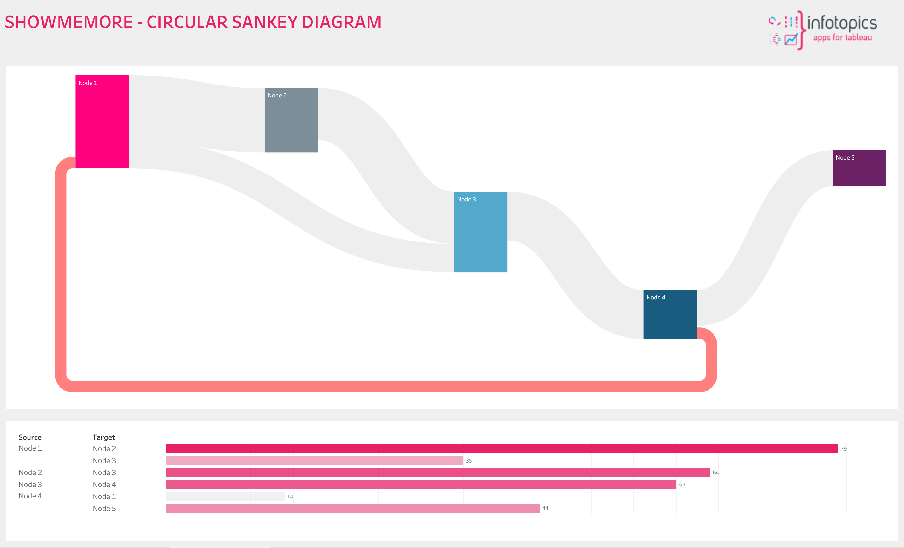
Circular Sankey diagrams provide an exciting way to explore data, bringing to light the fascinating world of cyclical processes, feedback loops, or interconnected relationships. With ShowMeMore, businesses can make Circular Sankey diagrams with just a few clicks. This powerful tool simplifies the process, allowing users to reveal hidden patterns and gain a holistic view of their data with ease.
Imagine a manufacturing company using a Circular Sankey diagram to visualize the flow of their supply chain. It becomes a powerful tool for identifying feedback loops, comprehending the intricate connections between suppliers and customers, and ultimately optimizing their operations for maximum efficiency.
It’s like having a secret decoder to unlock the secrets hidden within their data.
Source-Target Sankey Diagrams:
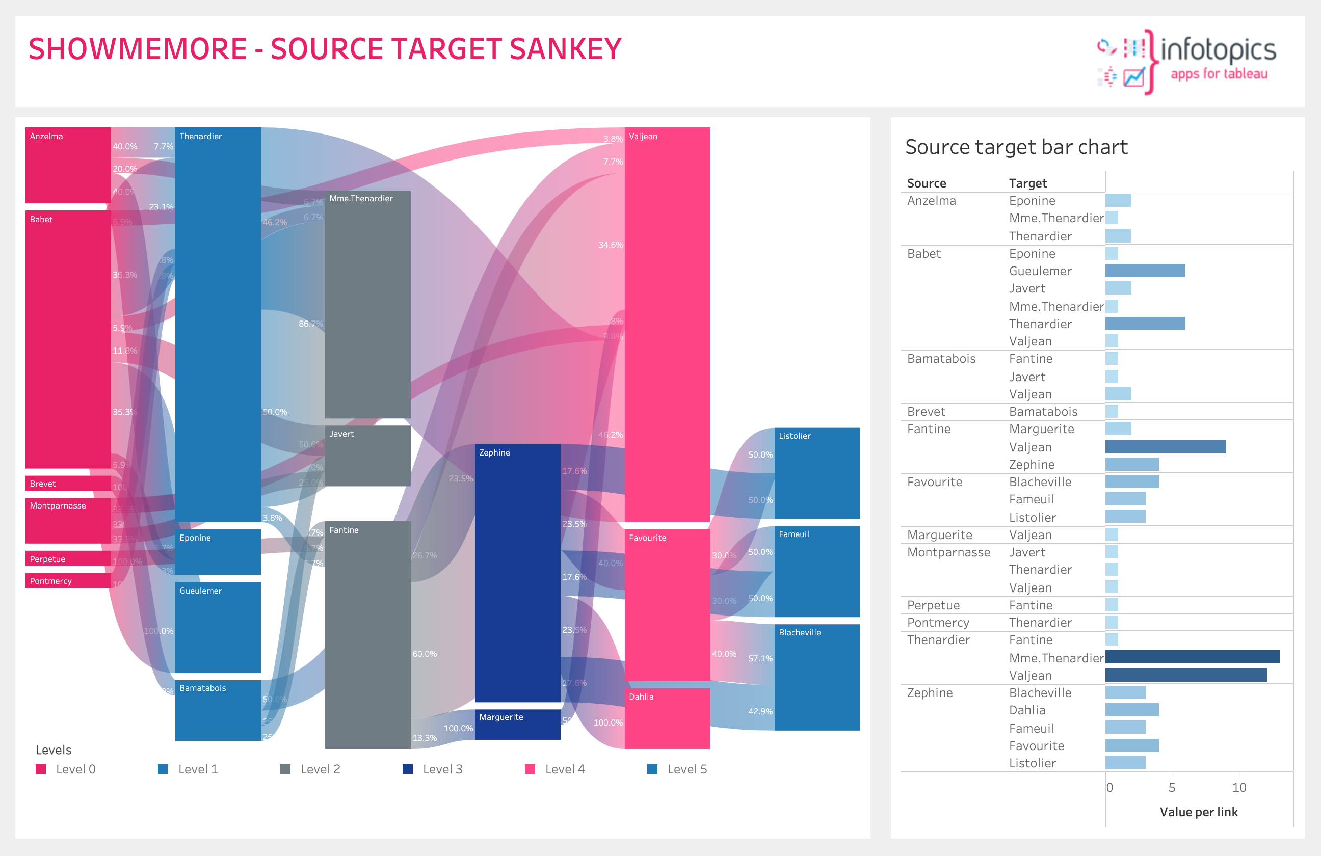
Source-target Sankey diagrams present a crystal-clear view of how data moves from its starting point to its final destination. These diagrams are like a treasure map, helping us uncover patterns, pinpoint bottlenecks, and understand the ripple effect of any changes in a system. With ShowMeMore, creating Source-target Sankey diagrams is effortless, empowering businesses with customization options to optimize processes and enhance efficiency. Our extension even lets you precisely control the widths of the connections, ensuring that quantities are accurately represented.
Imagine a transportation company harnessing the power of ShowMeMore’s Source-target Sankey diagram to analyze the flow of goods from diverse origins to various destinations. It’s like having a GPS for their logistics network, allowing them to identify roadblocks, optimize routes, and make real-time adjustments to maximize their operations. With this tool in their arsenal, they have the ability to navigate through challenges and steer their business toward success.
Geo Sankey Diagrams:
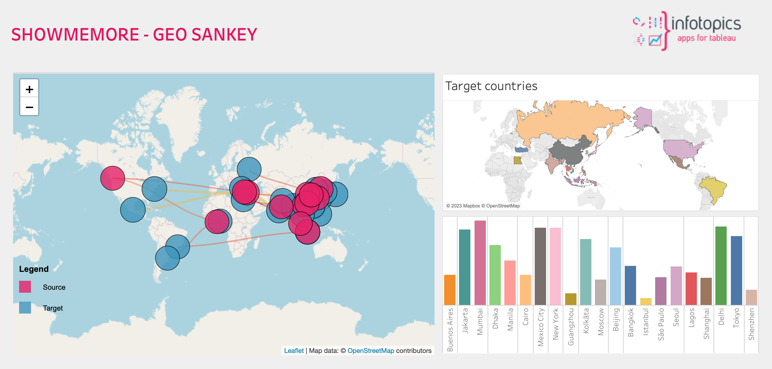
Geo Sankey diagrams add a geographical dimension to data flows, providing unprecedented insights into the major transfers within a system. With ShowMeMore, businesses can overlay data on maps, enabling them to identify geographic patterns and make informed decisions. Geo Sankey’s capabilities offer advanced features such as zooming, custom aggregation systems, and the ability to visualize flows on top of interactive maps.
Imagine examining the flow of goods of varying values from cities worldwide. ShowMeMore’s interactive Geo-Sankey chart, combined with aggregated source information on the Tableau map, paints a comprehensive picture of global trade. With a simple click, zoom into specific records and uncover flows originating from selected countries, and gain a bird’s-eye view of your data.
Real World Examples:
Whether you’re a retail company, a tourism agency, or an e-commerce giant, ShowMeMore’s Geo Sankey diagram is a versatile tool that connects businesses across industries.
A retail company operating globally can leverage ShowMeMore’s Geo Sankey diagram to visualize sales flow across different countries. They can identify regions with high sales volumes, analyze the transfer of goods between countries, and make informed decisions on market expansion and resource allocation.
A tourism agency can utilize ShowMeMore’s interactive Geo-Sankey chart to visualize the travel patterns of its customers. They can overlay data on maps to identify popular tourist destinations, understand the flow of tourists between countries or cities, and tailor their marketing strategies to attract more visitors.
An e-commerce company can employ ShowMeMore’s interactive Geo-Sankey chart to track the movement of products from warehouses to customers in different regions. They can zoom in on specific regions to understand the distribution patterns, identify popular product destinations, and optimize their inventory management and delivery processes accordingly.
No matter your industry, ShowMeMore’s Sankey diagrams connect you to the pulse of your data, enabling you to make informed decisions, optimize processes, and uncover valuable insights.
In the dynamic realm of data visualization, mastering the best visualization is crucial for businesses seeking valuable insights. While Tableau now includes a basic Sankey diagram feature, our ShowMeMore extension offers remarkable flexibility and advanced features that enhance the analysis process. With capabilities such as zooming, HTML tooltips, and the ability to effortlessly create stunning visualizations, businesses can easily make confident, data-driven decisions. Elevate your data visualization game and unlock a competitive edge with ShowMeMore.