Five Must-Try Viz Extensions to Solve Business Challenges
Explore five incredible ways to utilize Viz Extensions and transform your data visualizations.
1. Viz Extensions | SuperTables
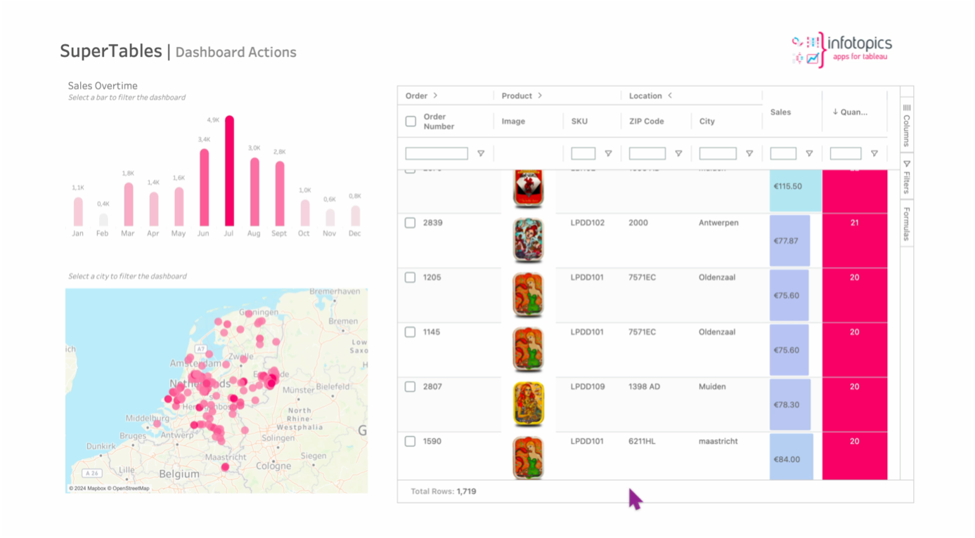
Leverage the powerful potential of SuperTables directly in your sheets with Viz Extensions! SuperTables enable you to work with Excel like tables allowing you to decide how to organise your data.
You can eliminate the use of excel, enable self service analytics and reduce dashboard development time. Features include front end formulas, aggregate calculations, IF ELSE formula builder, inline filters, easy grouping, export to excel & CSV, conditional cell formatting, design themes, customised views, user restrictions and more!
In the dashboard below, store product images from the data set are easily shown, with an inbuilt bar chart to show the sales and conditional formatting applied to the quantity field. The monthly bar chart can filter the table, and selecting on rows of the table filters the rest of the dashboard. We can locate a particular order by using the search function for all fields, group and reorder fields, and use the configuration settings to further control the contents, appearance and usability of the SuperTables.
2. Viz Extensions | DrillDownTree
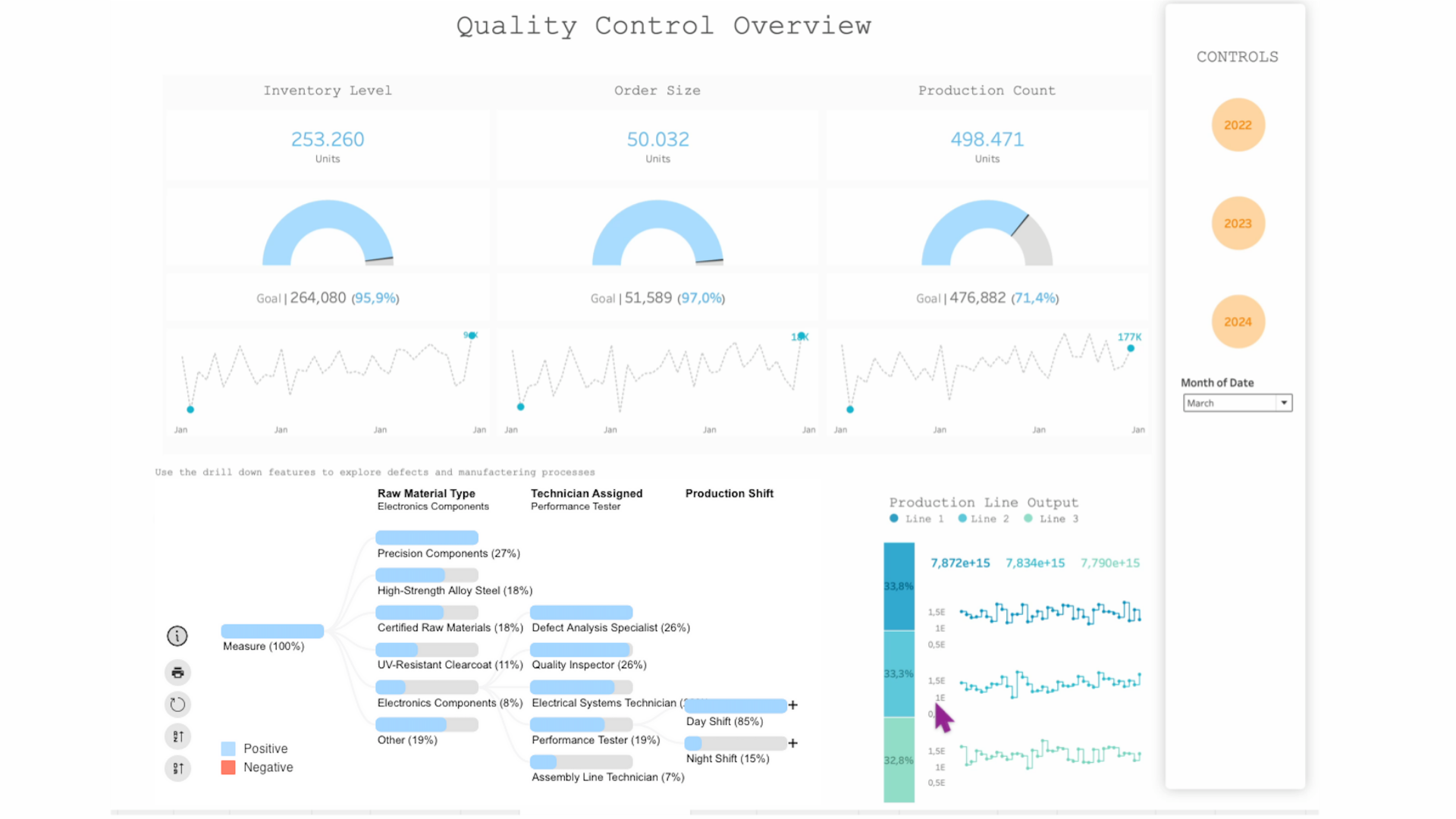
DrillDownTree can be used to gain better insights into your data. The ability to easily visualise, analyse and aggregate enables users to explore specific information and scenarios such as root-cause analysis. Users are free to choose what fields they would like to drill down into, creating a completely customisable analytical journey.
The DrillDownTree is used in the Quality control dashboard below to show proportions and connections between defect types, defect categories, machine status, product shift information, raw material type, region and the supplier. The fields can be expanded and ordered in a flexible way allowing insights into the quality control process. Configuration options are plentiful and include filter actions, animation style, appearance and dashboard actions.
3. Viz Extensions | ProcessMining
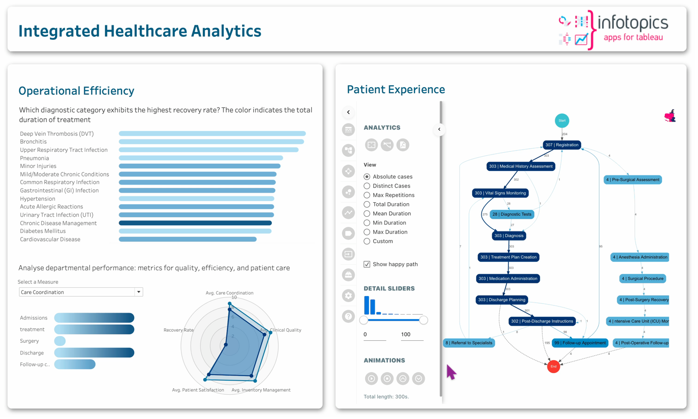
ProcessMining shows the complexity of operations, allowing informed decision making and optimization of efficiency. It can be used for auditing, detecting bottle necks, root-cause analysis, patient journey analysis and much more.
With Viz Extensions, you can now add and configure ProcessMining charts in your Tableau sheets with just a few clicks.
In the Healthcare analytics dashboard below, the ProcessMining chart shows detailed patient journeys from start to end, this can be filtered using any of the other charts on the dashboard, allowing you to focus on specific areas. This extension has many configuration options from activities and path formatting to dashboard actions. The radar chart from ShowMeMore viz extension range can also added to your sheet using Viz extensions.
4. Viz Extensions | Sunburst Chart
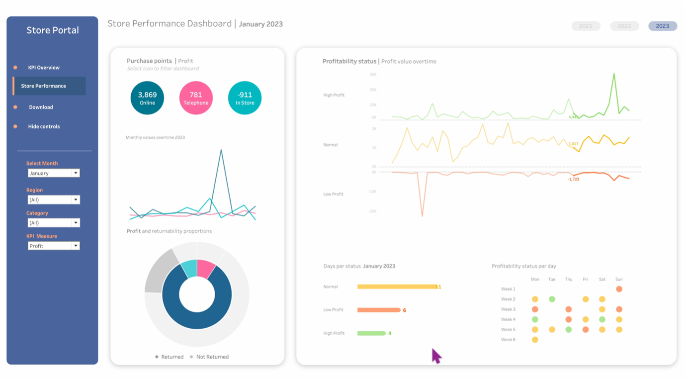
Sunburst charts are one of the many unique charts from ShowMeMore extension that we can bring into Tableau by using Viz Extensions. The chart allows us to segment multilevel data whilst being filterable, enabling a seamless and interactive experience.
The first level of the sunburst chart in the Retail Store Performance dashboard below shows the proportion of sales for each purchase point, or the chosen measure selected from the parameter. The second level shows the proportion of orders that were returned or not for each purchase point. This chart responds to filters and parameters and can also be used to filter other sheets in the dashboard such as profitability status.
5. Viz Extensions | Sankey Diagram
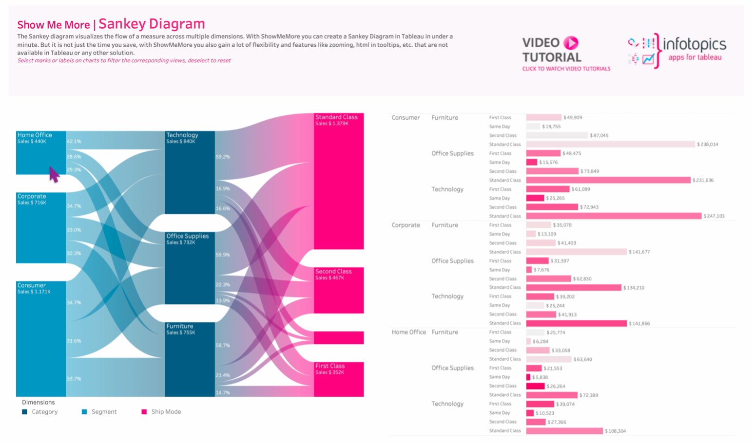
The Sankey diagram from ShowMeMore range can also be added into the sheet using Viz Extensions. This chart shows the flow of a measure over multiple dimensions. With the easy configuration steps, you can also create amazing colour gradients.
ShowMeMore demo workbook shows the flow of sales across the segment, category and shipping mode. Each dimension can be used to filter the dashboard and the bar chart can also be used to filter the Sankey.
Transform Your Data Journey
Are you ready to make your analytics journey smoother and more impactful than ever? As Tableau opens new doors for creativity and progress, we’re thrilled to present extensions that have become the number one choice for companies globally.