STEP 3: Connect Template With Your Data
Template B+C
When creating SuperKPIs from Scratch
The following steps are relevant, when you want to start with a fresh workbook and create a new KPI dashboard within. (In case you want to add a KPI dashboard to an existing workbook using existing data sources, follow the steps in the other tab).
After you’ve chosen the right template according to your data structure, delete all other dashboards and sheets from the workbook. Unhide all sheets of the remaining dashboard (on dashboard and sheet level). Close all data sources related to the dashboards you’ve just deleted.
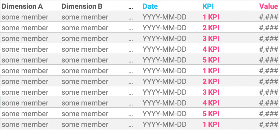
Use the following steps if your data is structured like this:
Add a new connection and bring your table to the canvas.
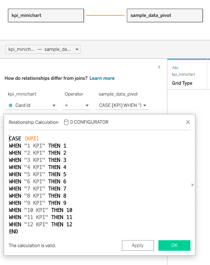
When working with pivoted data structures, the mapping of your KPIs to the KPI cards happens in the connection step.
Select Card Id on the left side, and then create CASE-Statements or IF-Statements to map your data to the respective Card Ids.
When working with pivoted data sources, each KPI can only be mapped to one Card Id. For example, if you want to show Sales on Card 01, and Profit on Card 02, you’d have to duplicate both Sales and Profit in your table and map it to Card 03, to calculate a Profit Ratio as sum(Profit)/sum(Sales) on Card 03.
Connect multiple tables
We recommend querying your KPI raw data from one single data source. Most of the time it’s worth the effort to create that single table instead of creating workarounds in Tableau.
If you have to bring together data from multiple sources than consider the following approaches:
- Union your data tables: In case there are mismatched fields, make sure to merge the date dimension and all other dimensions used in the view (e. g. as a filter).
- Create separate data sources: In case a union won’t work (e. g. when having data from different connections), combine each of your data tables with our layout data in separate data sources. Recreate the KPI sheets for each data source (like described here) and bring all sheets together on a dashboard.
Connect published data sources
Building relationships won’t work with published data sources. If you want to use published data sources, you have to edit that data source and add a connection to the layout data. You can then replace the existing data source of the template you want to use and use that edited published data source instead (the procedure to replace data sources is also described here).
When you want to add SuperKPIs to an existing workbook, or you have a large extract within a workbook and don’t want to recreate that extract, follow these steps.
Edit relevant data sources
Go to the relevant data source and add a connection to our PostgreSQL layout database on AWS using your credentials.
Depending on which template you want to use, add the following tables to the canvas:
- BANs: kpi_ban
- LINES: kpi_minichart
- BAR & AREA: kpi_minichart + densification (relationship on 1=1)
- PROGRESS: kpi_progress + densification (relationship on 1=1)
Depending on the data structure of your data, define the relationship for unpivoted data with KPIs in columns like described here (Template A) and for pivoted data use the procedure described in the other tab (Create from scratch Templates B&C).
Copy template to workbook
Next step is to copy the selected SuperKPIs template and paste it into the workbook. If you want to keep the same font, change the workbook font to Roboto (Format -> Workbook…) before copying over the dashboard.
Replace data sources
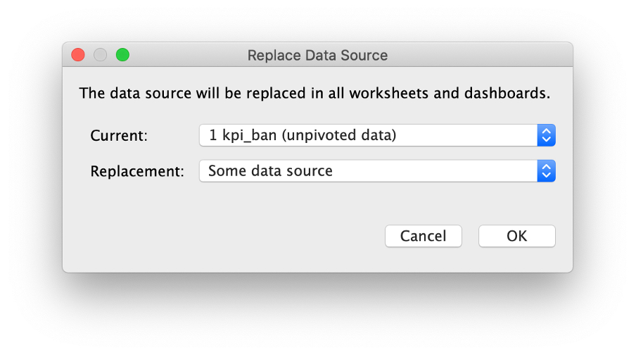
Then go to Data -> Replace Data Source… and replace the current data source (here: “1 kpi_ban (unpivoted data)”) with the one you’ve edited in the first step (“Some data source”).
Close the original data source (“1 kpi_ban (unpivoted data)”), we don’t need it anymore.
Fields might break (not necessarily) because of different field names. If that happens, search for data source fields (not calculated fields) with a red exclamation mark and replace references from the broken to the correct fields.
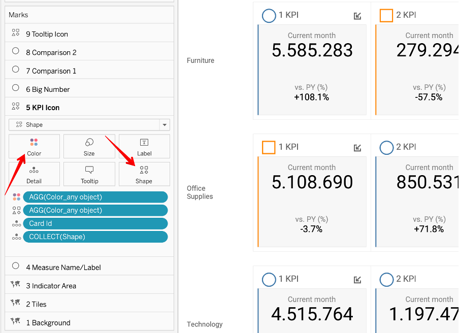
After replacing the data sources, custom color choices and shapes will turn back to default. Go for example to the KPI Icon layer and change back shapes and colors to your preference.


We love to make solutions and help Tableau users to do things more efficiently. If you have feedback, ideas, questions or need support, please share them with us! Also, don’t forget to follow us on social media for our latest news and updates.