Global Productivity, Well-Being, and Employment Benchmarking
The Global Productivity, Well-Being, and Employment Benchmarking dashboard provides an overview and comparison of key metrics related to quality of life, labor force and productivity across multiple countries and the Netherlands. Here you can also see how Tableau Extensions can enhance your analysis and provide valuable insight. Please refer to the bottom of this page for the data source.
Use case & Value
• Select countries in the map for trend comparison of quality of life based on income, employed labour force and productivity across countries in Europe and the Netherlands.
• Compare productivity levels effectively with the use of a Radar Chart.
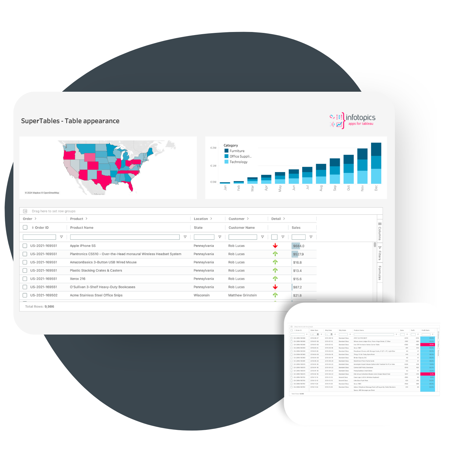
• Use the pop out SuperTables Extension to view and compare details of metrics used.
Insights from the Dashboard
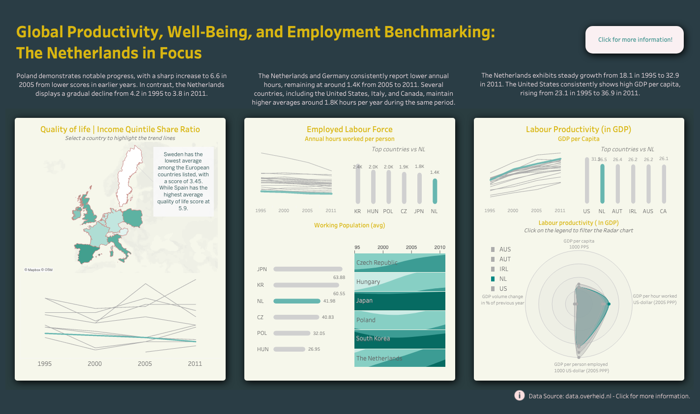
• Poland demonstrates notable progress, with a sharp increase to 6.6 in 2005 from lower scores in earlier years. In contrast, the Netherlands displays a gradual decline from 4.2 in 1995 to 3.8 in 2011.
• The Netherlands and Germany consistently report lower annual hours, remaining at around 1.4K from 2005 to 2011. Several countries, including the United States, Italy, and Canada, maintain higher averages around 1.8K hours per year during the same period.
• The United States consistently shows high GDP per capita, rising from 23.1 in 1995 to 36.9 in 2011. The Netherlands exhibits steady growth from 18.1 in 1995 to 32.9 in 2011.
Extensions Used in Dashboard:
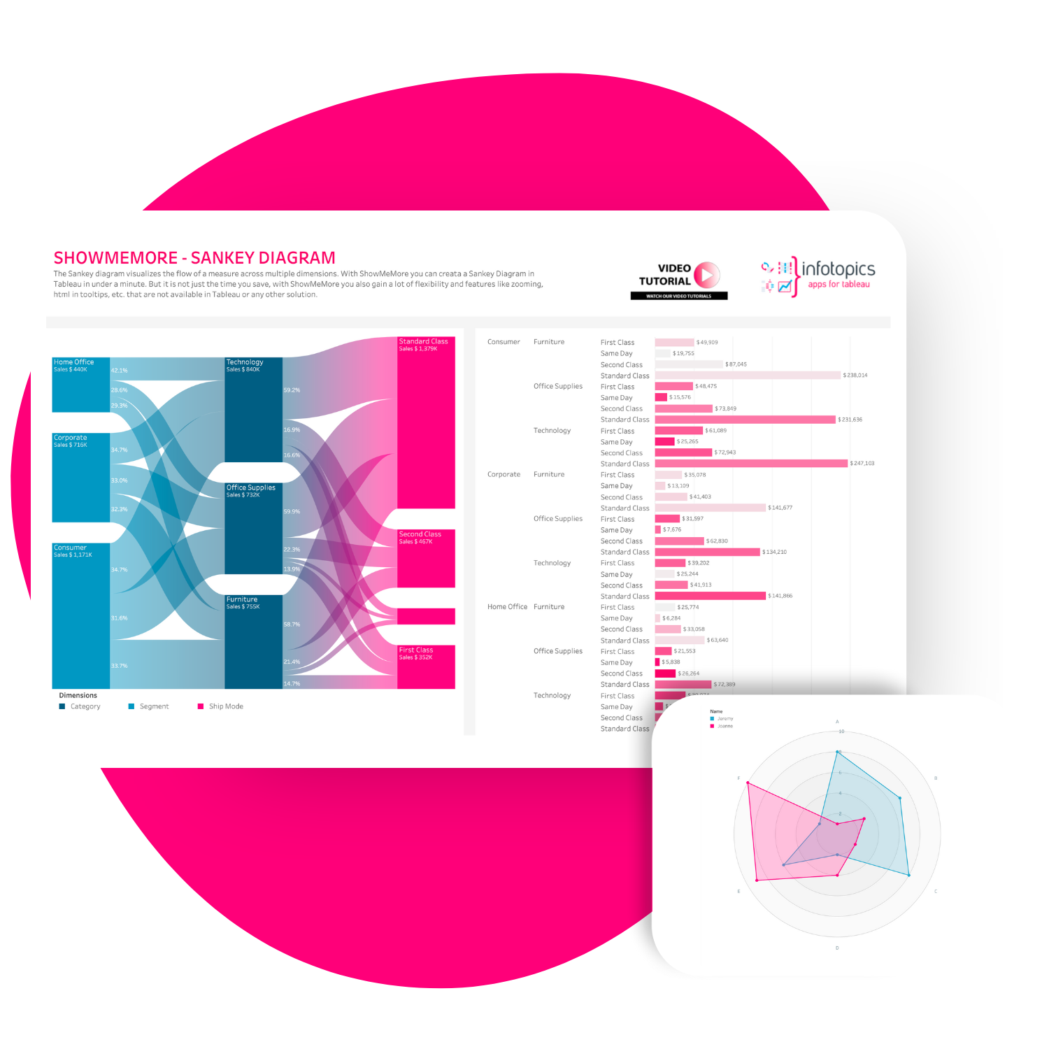
ShowMeMore – Compare multiple variables using a Radar Chart
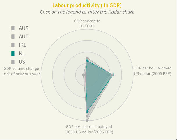
The Radar Chart allows you to combine multiple metrics in one visualization and compare across multiple measures in one area, it shows different metrics related to labour productivity & GDP. For example, the Netherlands exhibits steady growth, with GDP per capita rising from 18.1 in 1995 to 32.9 in 2011, showcasing its economic productivity.
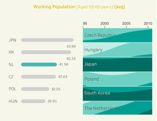
ShowMeMore – Compare values overtime using a Horizon Chart
This chart helps us see trends over time and compare them across different countries, highlighting where the Netherlands stands in comparison to others. The darker area indicates a higher bin value of the measure.
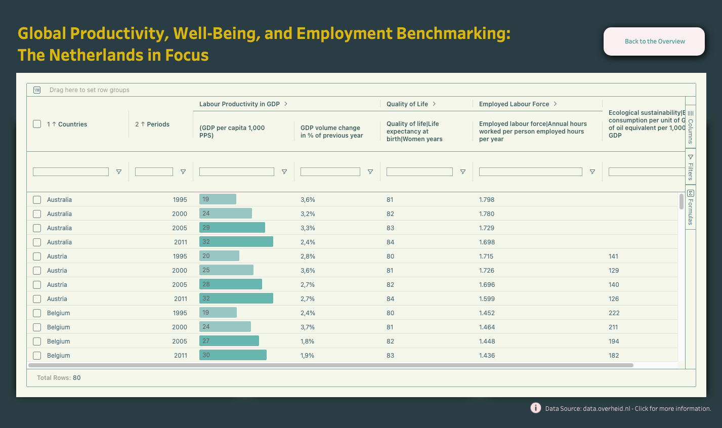
SuperTables – Pop out Crosstab Analysis
The interactive pop out SuperTables Extension table allows us to filter and analyze various metrics such as labour productivity, quality of life, and ecological sustainability across different periods and countries, we can also use it to compare measures across different countries as shown.
Data Credit
Data Source: Data.overheid.nl
“Investment Climate: Dutch Economy International Comparison (1960-2012).”
Accessed on June 2024, from
https://data.overheid.nl/en/dataset/4558-investment-climate–dutch-economy-international-comparison–1960-2012
. Licensed under CC BY 3.0 NL
