3 simple steps to a flawless Dashboard
Within each business, numerous opportunities are available, and your decisions can change your future. Making decisions based on data can help ensure sustained success and growth. But data isn’t always easy to understand, especially when dealing with large data sets. That’s where data visualizations come in. Data visualizations are an impressive tool for understanding and communicating complex data sets. They help you see trends, patterns, and relationships that you might not be able to see otherwise.
With the power of a well-designed dashboard, you can make sense of complex data sets, communicate your findings to others more effectively, and make smarter decisions. But what makes a dashboard a great dashboard? A great-designed dashboard should enable your users to see the insights and make unbiased decisions for the business without additional complexity. Any element in the visualization should serve this purpose.
We focus on three primary factors in this article to help your dashboard stand out:
1. Make it easy to understand at a glance.
Simplify.
Any graph in the dashboard should be clear enough, so it doesn’t raise additional questions. When designing your visualization, consider providing enough context to understand the data without being overwhelming.
Get rid of grid lines, extra labels, or any other visual noise that makes your dashboard hard to scan and understand. Another point is that improper scaling can lead to misleading and invalid interpretations even when all the information in a chart is accurate.
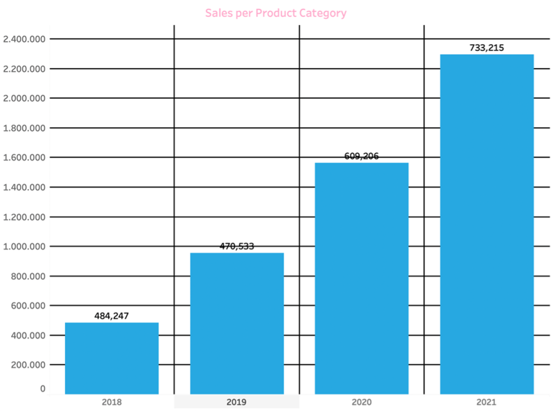
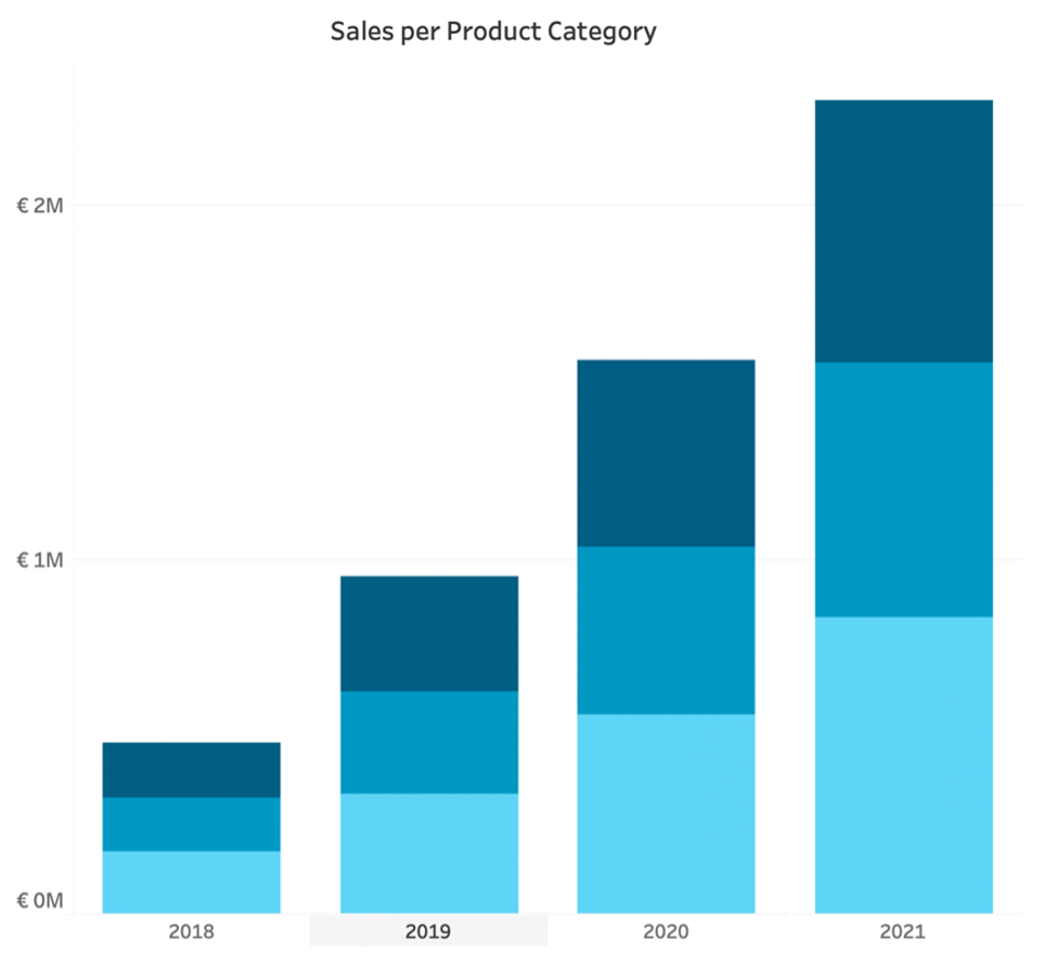
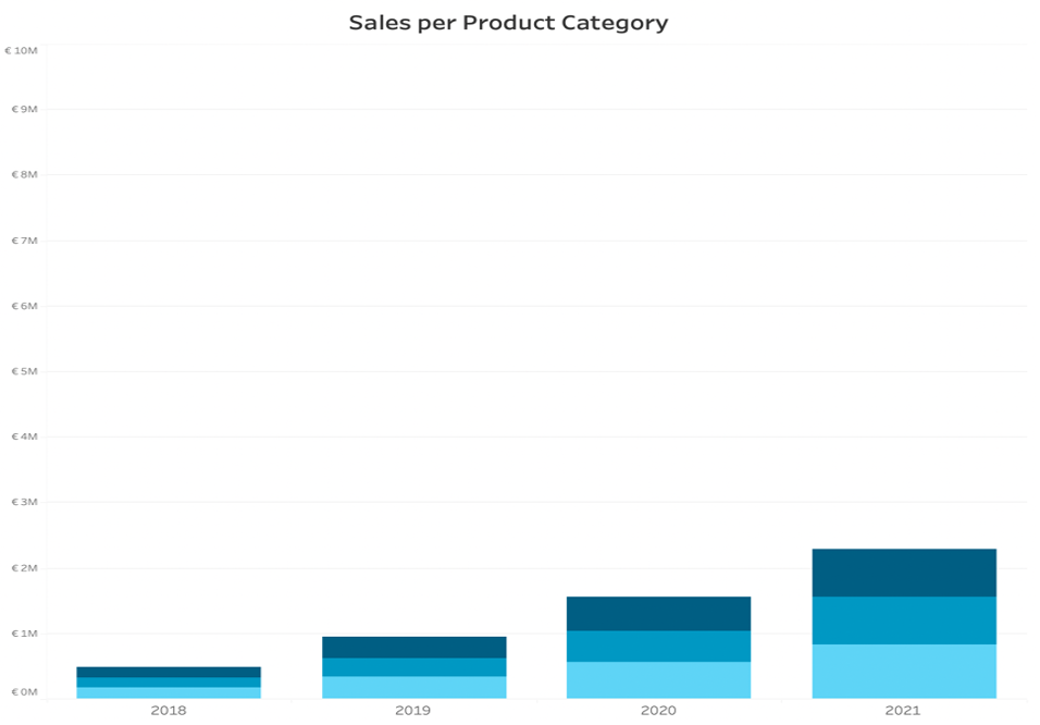
Design the mood of your viz.
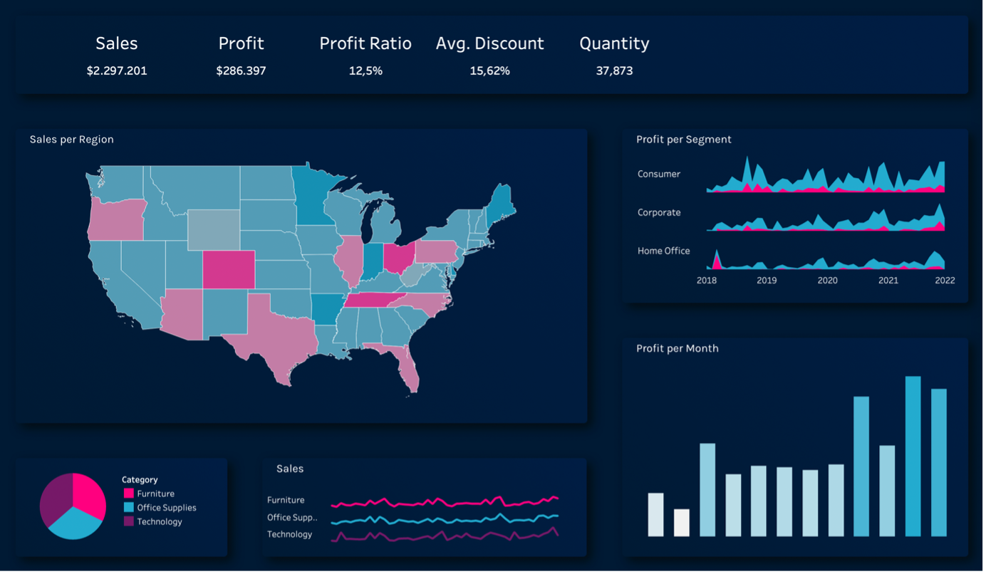
Make your visualizations simple, and be aware of the psychology of colors and your design’s effect on the audience.
In general, the less color you use, the better, unless you want to emphasize on a variable. You make each graph stand out with fewer colors and proper contrast. And when it comes to different colors in a chart, shades are better than extra colors.
You should also note that, in most cases, the color schema is influenced by the company’s color pallet or corporate identity, and you should keep the consistency between all the visualizations to avoid confusion.
An easy way to design your dashboard and adapt the customized template for your visualization is to use an extension like Easydesigns which offers the freedom to design a dashboard as you wish, in a few seconds.
Choose the proper chart.
You should know your audience’s perception of each chart; for example, our brain is way better at comparing linear areas than spatial areas, and you might want to show a different chart each time, depending on your goal and data.
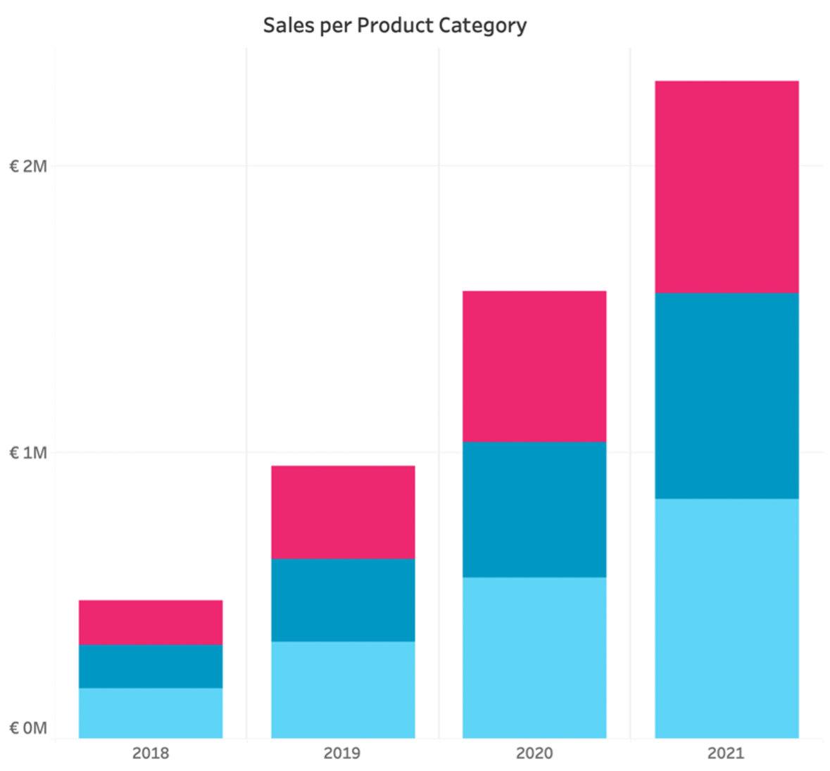

If you are interested in what alternatives you have for a pie chart, you can check the article (Alternatives for pie charts) from Tableau.
If you’d like to dive deeper and bring your viz to the next level, you can check the ShowMeMore extension, which gives you many options for amazing charts and help your vizzes to stand out and make an impact.
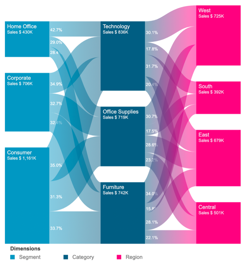
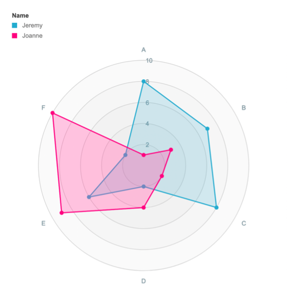
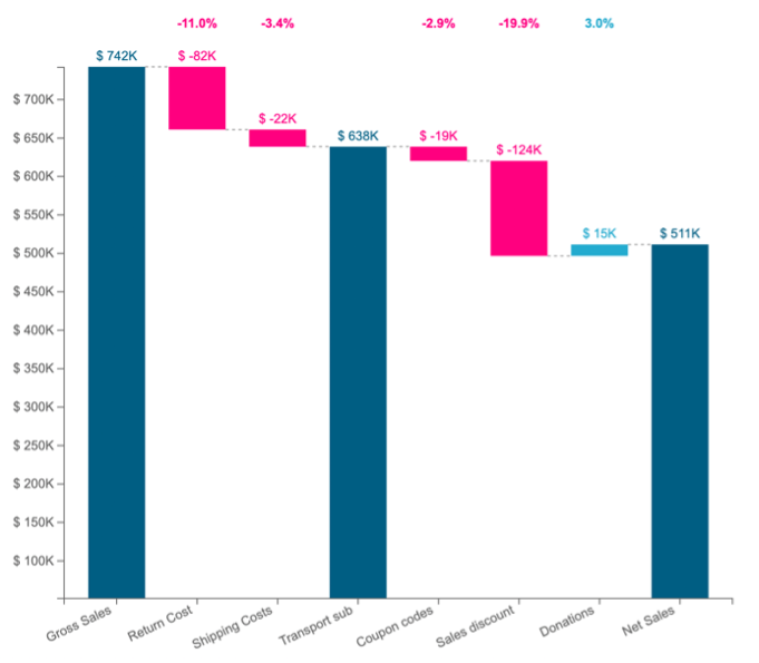
Now that you have the perfect graphs and designs in your dashboard, let’s look at the goal of visualization one more time. We want to understand the data and use it to help us strategize our decisions more efficiently and determine whether they need to be modified or changed.
With multiple graphs, you can show the most critical takeaways from the data and see how they are connected, yet these graphs are a small portion of your data and only give you a brief overview.
On the other hand, a big table of content in excel doesn’t say much about the patterns of the critical factors that play a role. For deeper analysis, you will need both and, ideally, combine them in a dashboard.
Both the table functionality and the graphs vision can make your dashboard powerful enough to deliver the message at a glance and still contain enough information for further investigation. Thus, you have a dashboard that is easy to grasp and, at the same time, accessible for detailed drill-down and improved analytics.
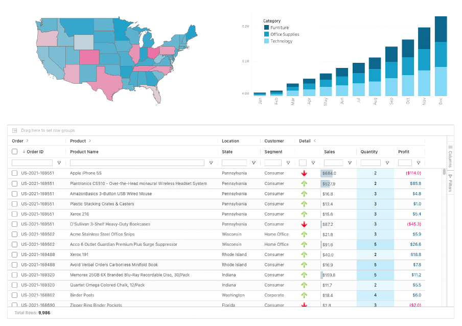
The question is, how? SuperTables is a great example of an extension that enables you to have all of these, with only a few clicks.
2. Let the user interact with it.
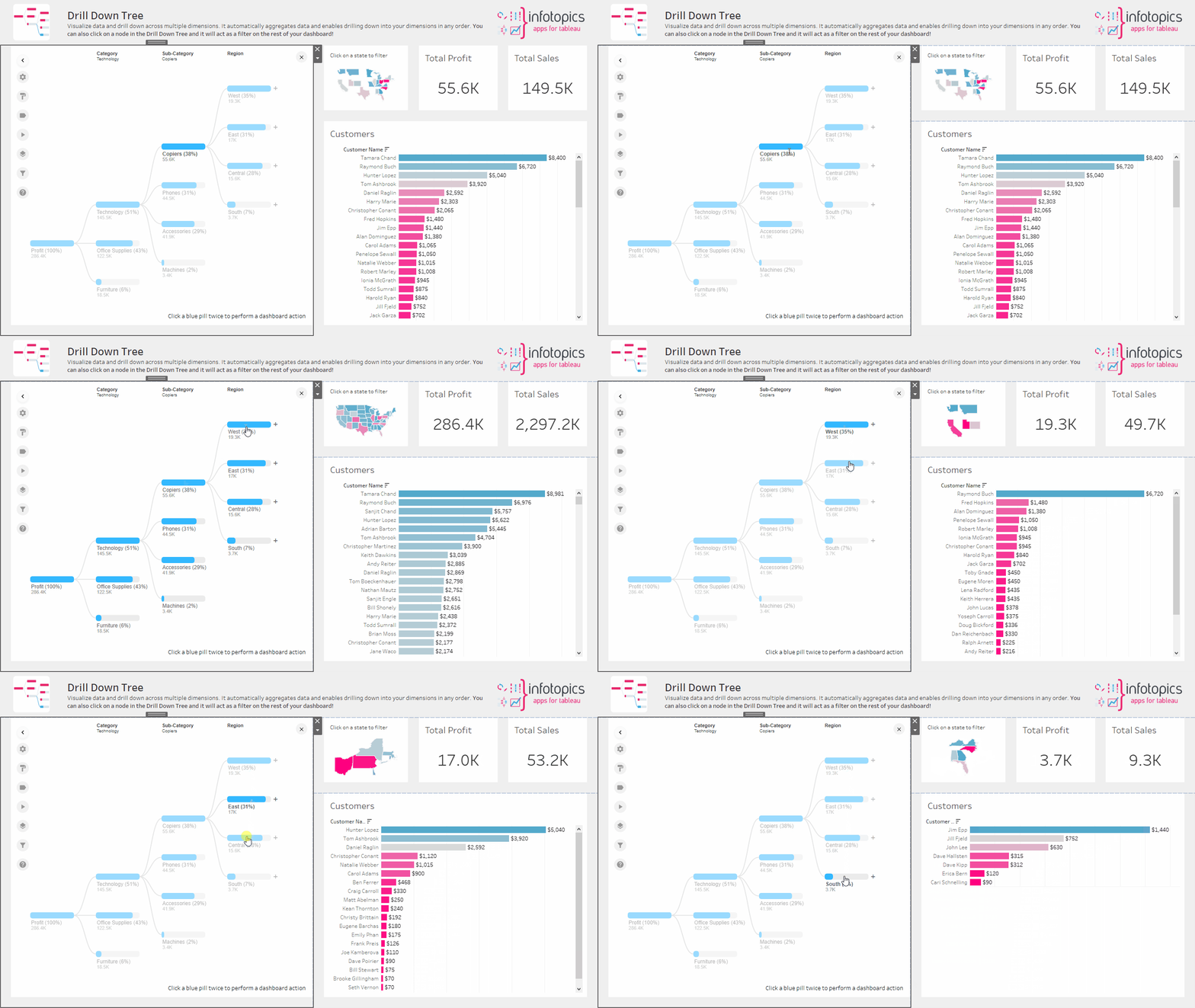
Make your dashboard interactive. Your users should be able to slice and dice your data in a visualization; Filters are one way to add this functionality. The filter gives the user the ability to customize a dashboard.
Within each filter, you better understand your data, and you have the opportunity to study different factors that might have a role. You can add more layers of knowledge with filters or a couple of workbooks connected.
The true power of visualization is that you can see the data from different aspects and perspectives and guide your users toward the desired insights. This way, you reduce the number of needed dashboards and the number of reports you want to manage later.
3. Don’t simply show your data; tell a story with it.
Now that you have everything you need, it’s time to tell your story. People love stories, and you can humanize your information with them. A compelling narrative helps you to be more effective, and you can convince more people of the insights you’ve found.
If you want to explore more about having a professional story of your data, check our ScrollyTelling extension and read next-level storytelling with Tableau.
We love to make solutions and help Tableau users to do things more efficiently. If you have feedback, ideas, questions or need support, please share them with us! Also, don’t forget to follow us on social media for our latest news and updates.