Sankey Diagram
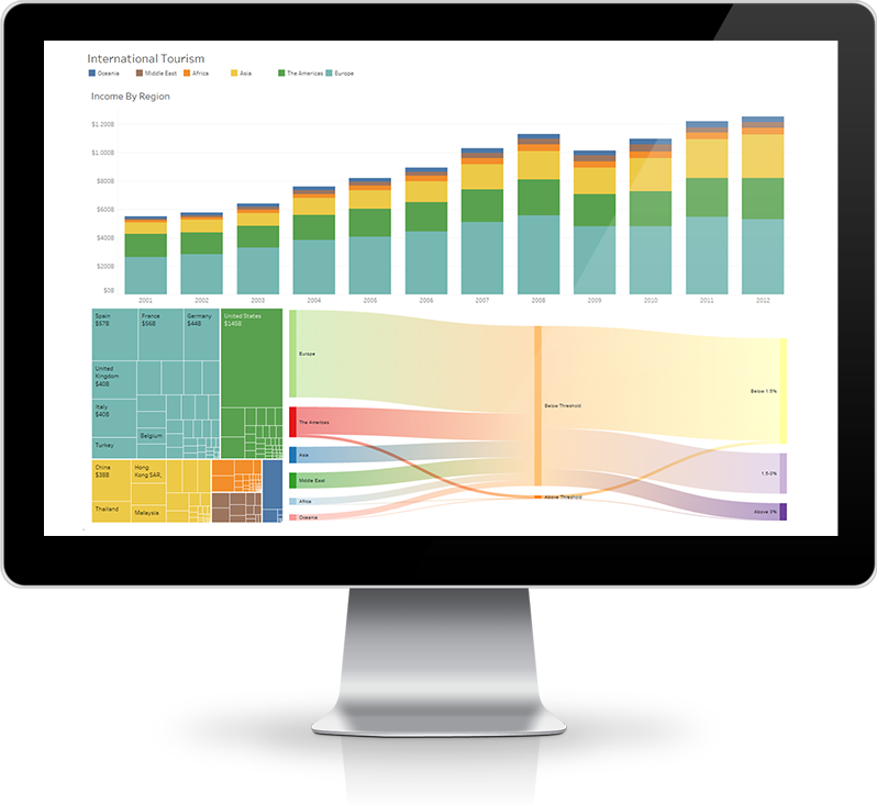
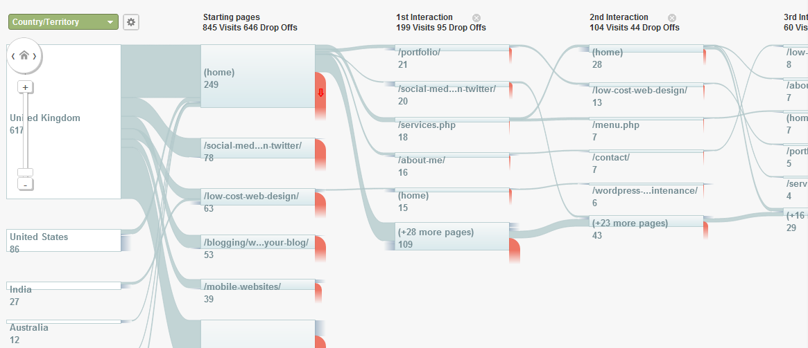
Sankey Diagrams are used to visualize the flow of one measure over multiple dimensions. The best practise use for Sankeys are many-to-many relations which are usually hard to visualize in the traditional way. You need at least two dimensions in a Sankey Diagram, for example schools and bachelor programs. A use case of Sankey Diagrams with multiple dimensions is the flow of users browsing your website, also visualized in Google Analytics.

Sankey use cases
The first known Sankey Diagram dates from 1898. Irish Captain Sankey described the energy flow in a steam engine. Nowadays, we have several new scenario’s that are very suitable to be visualized in a Sankey Diagram. Some familiar examples are:
- The behavior of website visitors;
- Financial flows withing organizations;
- The call history in call cebtres;
- Traffic patterns is cities;
- Energy use and yields in factories.
The understanding of individual nodes in the entire information flow is of great importance, especially the dominant contributions. How to visualize this properly?

Sankey Diagram in Tableau
Unfortunately, it is very hard to use this widely used visualization type in Tableau. There is definitely no drag-and-drop or “Show me” way to add Sankeys to your dashboards. To create a Sankey in Tableau:
- Manipulate data, resulting in a dataset that is specifically designed for this visualization type. This results in almost double the number of records in the dataset;
- Dozens of calculations, several parameters and a bunch of extra sheets are needed to finalize the visualizations.
A harsh and difficult process that discourages enthousiastic Tableau users to embed Sankey Diagrams in dashboards. Normally, speed and ease of use are key elements in working with Tableau. In this case creating a Sankey is a non-flexible, hard to understand solution which lacks transparency. You need a lot of experience, knowledge and resources to do the job properly on every single Sankey visualization.
As of Tableau version 2018.2 this changes dramatically by allowing Dashboard Extensions to use the Tableau Extensions API. Dashboard Extensions are objects that allow new functionality in dashboards through the integration of external apps form the Tableau-interface.
ShowMeMore in Tableau
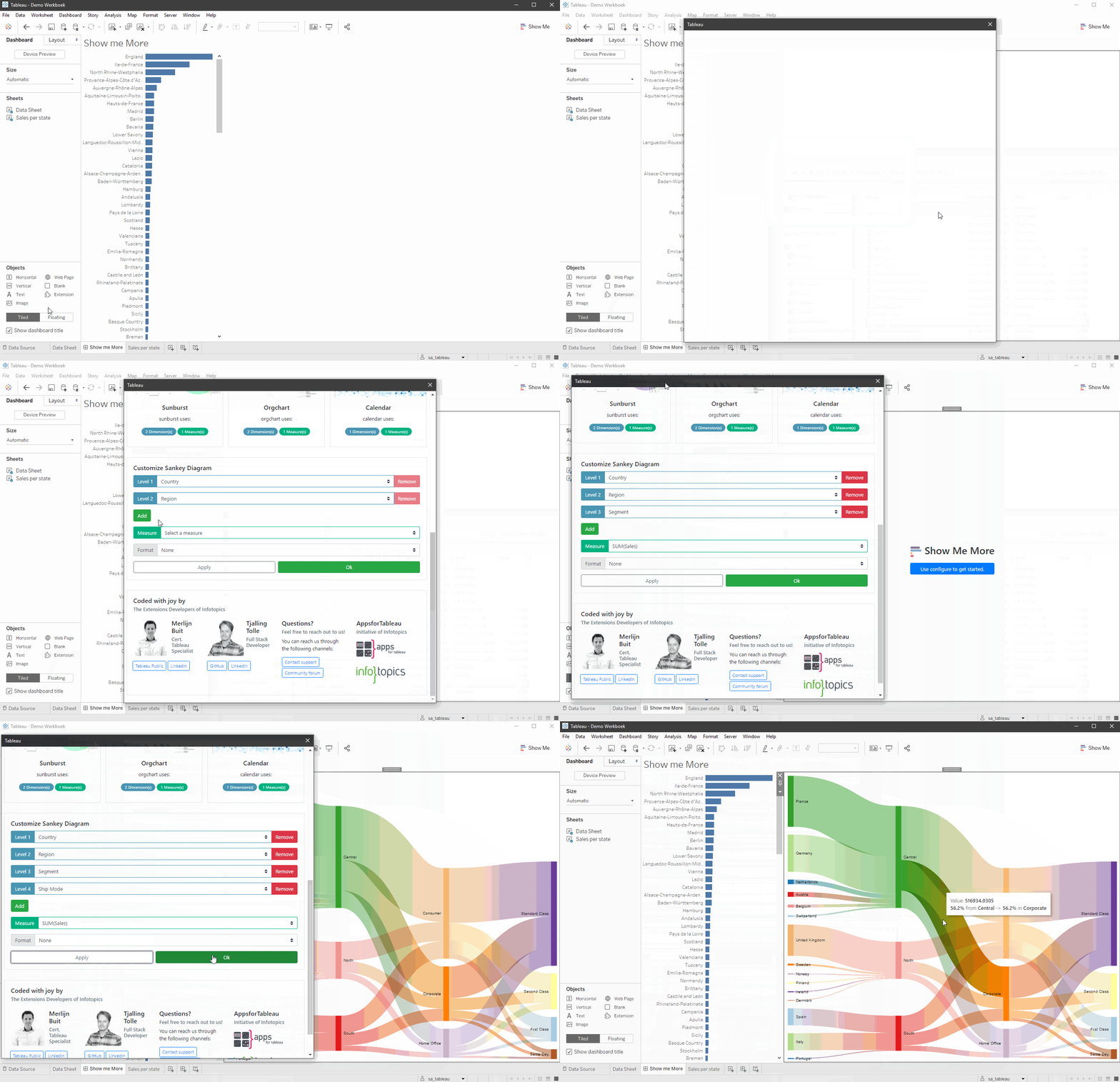
Every Tableau user is familiar with the “Show me” button. As stated before, the Sankey Diagram is not incorporated as a visualization type under “Show me”. The use of Tableau Extensions enabled us to create a “Show me More” extension that incorporates new visualization types in Tableau that are not present in the standard “Show me” palet.
With this ShowMeMore extension in Tableau you only need a few clicks to embed a Sankey Diagram in your Tableau Dashboard. It’s almost like cheating….
It really is that easy. Interested in this solution or have some great ideas of your own? Contact us!

We love to make solutions and help Tableau users to do things more efficiently. If you have feedback, ideas, questions or need support, please share them with us! Also, don’t forget to follow us on social media for our latest news and updates.