Pro Juventute’s Success in Visualizing User Behaviour and Donations through ShowMeMore
Pro Juventute, a renowned Swiss non-profit organization dedicated to supporting children and young adults in need, were looking for a more streamlined and efficient approach to visualizing their data, particularly in relation to web flow and donation campaigns. During this search they found the powerful Apps for Tableau Extensions which revolutionized their data visualization process.
About Pro Juventute
The programs and services of Pro Juventute pursue three objectives. They aim to promote identity, community, and opportunities for children and young people. Pro Juventute supports children, young people, and their environment in these areas through diverse programs and offerings such as counselling services, supervised holiday programs, parent letters, media and financial literacy programs, and initiatives to prevent youth unemployment.
It simply worked.
Pro Juventute was searching for a solution that would simplify the data visualization process and reduce the effort involved. With the free trial of Apps for Tableau Extensions, they explored the features and functionality first hand. Implementing ShowMeMore into their Tableau Desktop environment was easy, thanks to the user-friendly integration process. In a matter of minutes, Pro Juventute was able to configure and visualize the data, achieving the desired Sankey Diagram.
One of their concerns was the compatibility of ShowMeMore with Tableau Online, as previous experiences gave challenges. However, the Apps for Tableau Extensions seamlessly integrated with their Tableau Online environment, offering a smooth experience. The ease of use and straightforward implementation of the Apps for Tableau Extensions impressed them. It simply worked, without any unnecessary steps.

“I installed ShowMeMore in Tableau Desktop, imported the data I wanted to visualize and then I clicked a little bit around. Just like that, I created a Sankey Diagram! It only took about a minute, and the best part was that it effortlessly worked. It was really drag and drop on the dashboard and it works, which was the highlight of the experience.”
– Martin Seifert, CRM & Data Analytics
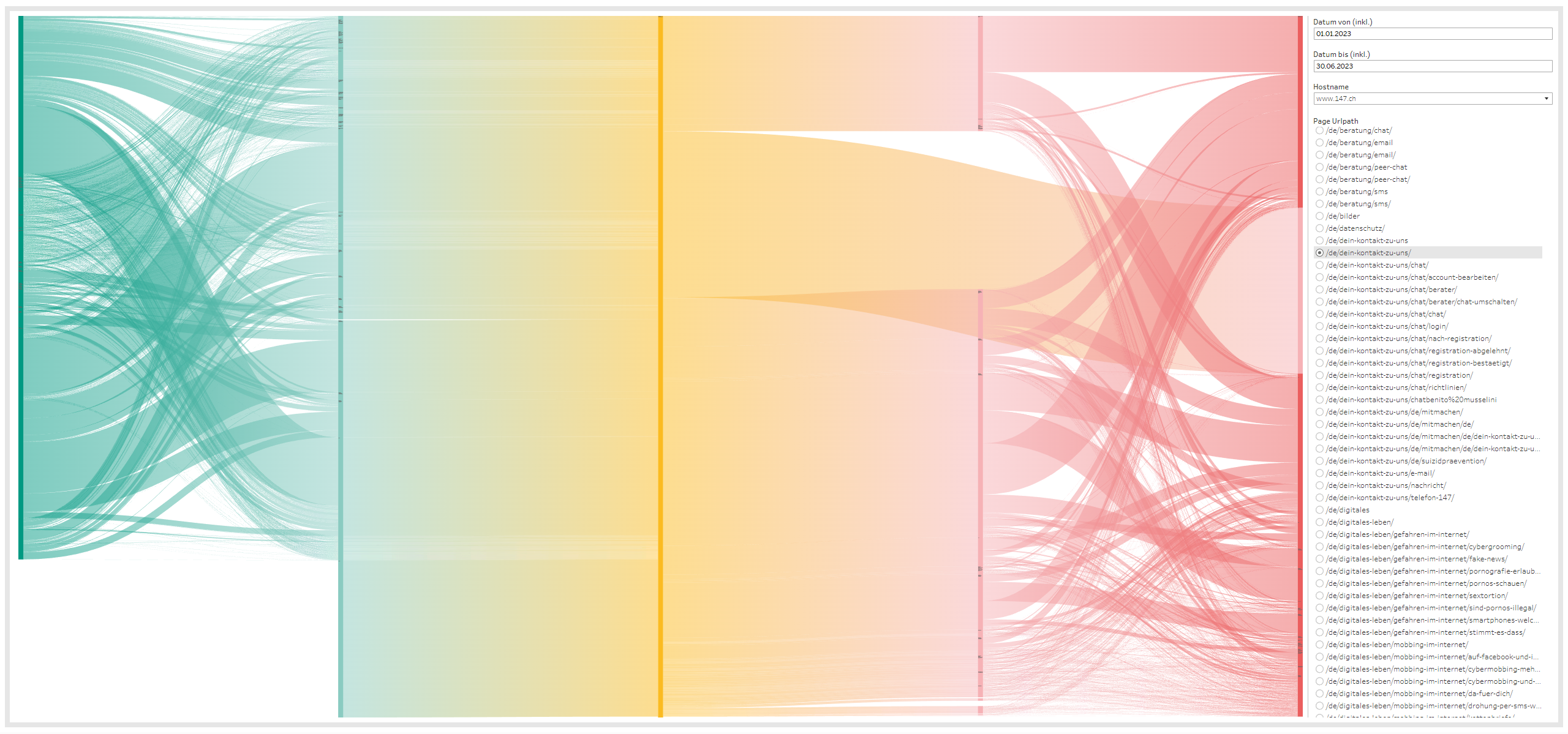
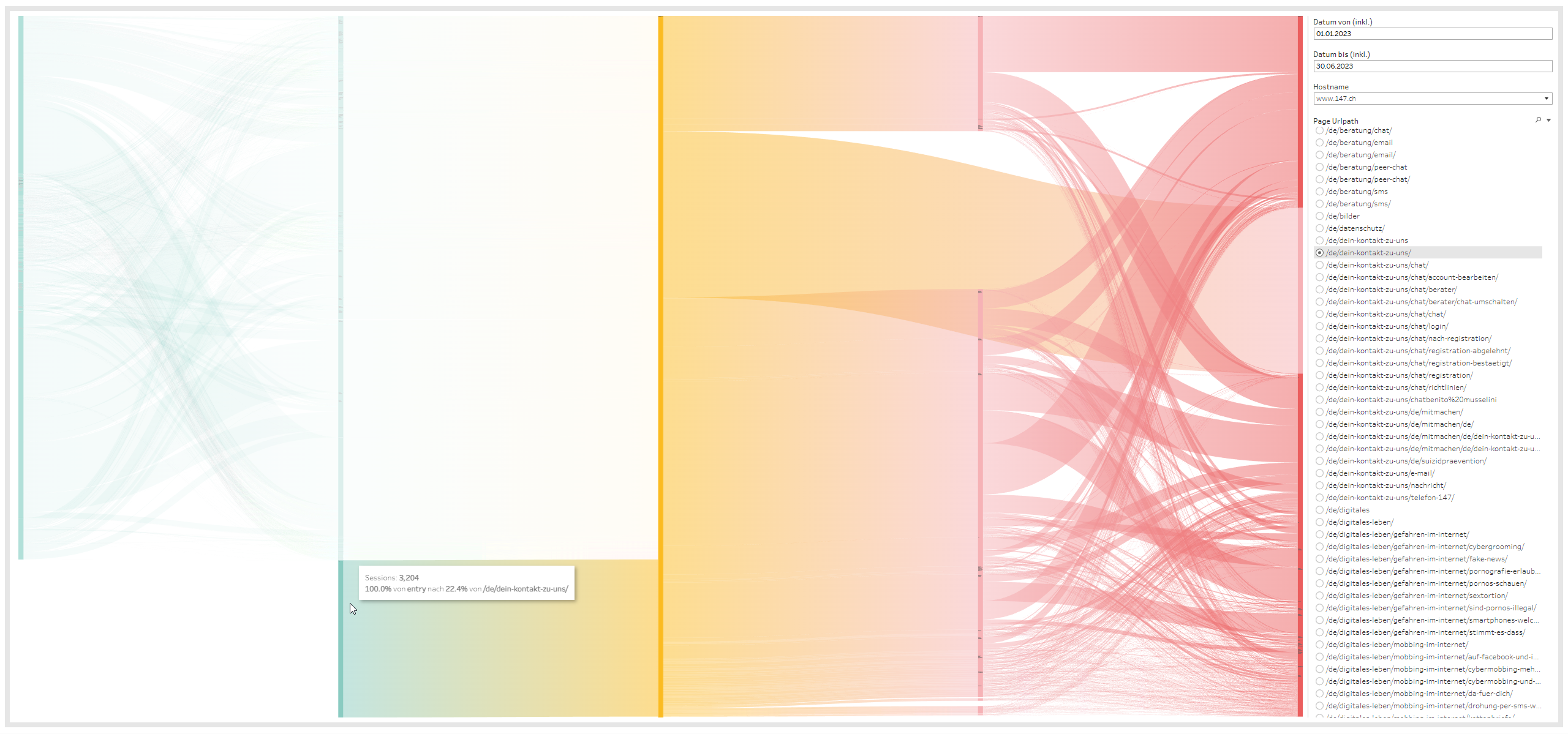
Visualizing User Behaviour on the website.
Turning to their specific use case, one of their objectives was to analyze the user behaviour on their website. One of the programs that they’re doing is the national helpline for children and young adults in Switzerland. Whenever there is any issue and they have nobody to talk to, Pro Juventute is there to listen. That process must be as easy as possible.
The data offered insights into user activity on their websites, particularly page views. By visualizing the flow of visitors across different pages, they aimed to optimize the accessibility and effectiveness of critical pages such as their contact and donation pages.
Monitoring Success with the Sankey Diagram.
The data offered insights into user activity on their websites, particularly page views. By visualizing the flow of visitors across different pages, they aimed to optimize the accessibility and effectiveness of critical pages such as their contact and donation pages.
The Sankey Diagram visual provided by the ShowMeMore Extension, was a perfect fit for this goal. They were able to clearly observe the paths visitors took from entry points to specific pages, such as the contact page or the donation page. The Sankey Diagram empowered them to monitor the success of driving users to these pages and identify areas for improvement.
The seamless integration of ShowMeMore with Tableau enabled them to create visually appealing and informative dashboards that facilitated data-driven decision-making.
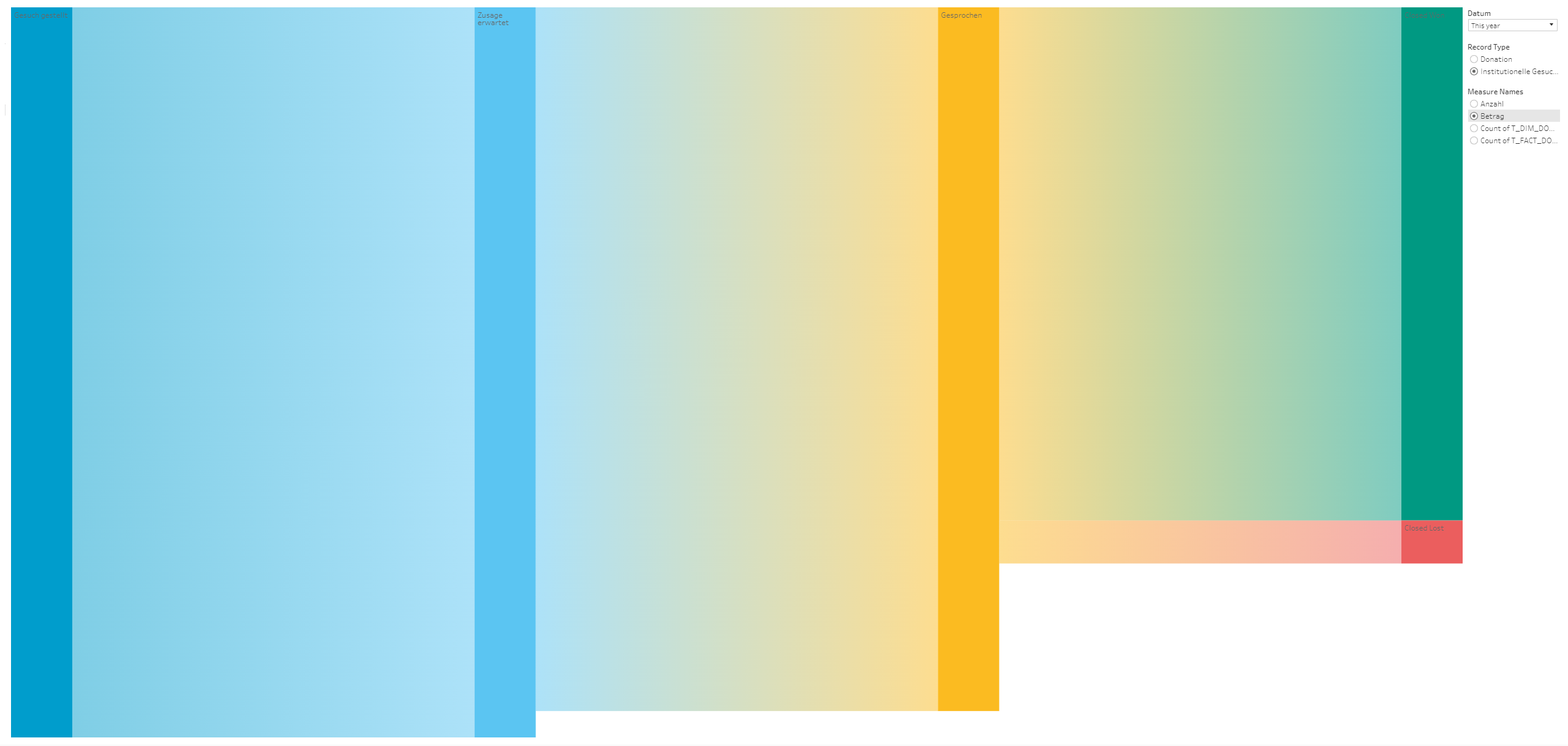
In addition to the user behaviour analysis, ShowMeMore provided them with the capability to construct a donation funnel, allowing them to track the number of donations and the amount of money they’ve received from various sources. Particularly seeking donations from other charities, non-profit organizations, government funds, and companies involves long-term relationships and direct communication.
They examine how many requests for donations were initiated and entered this funnel, the expectations regarding the realization of these donations, the number conversations they’ve had with potential donors, and the number of donations that have already been realized.