How to create a feedback form in WriteBackExtreme
Do you want to track the impact of your dashboards to see if the users are satisfied? This blog is an introduction to the new ratings feature in WriteBackExtreme for Tableau, where we will show you how to create a feedback form in WriteBackExtreme. The easy-to-use design, and improved user experience makes it a comprehensive tool to add/collect information in a more efficient and interactive way.
User satisfaction dashboard
The sample case study is about the analysis dashboard user satisfaction. We created a case study based on responses received from five different individuals, who acted as users of 6 dashboards in Tableau. The analysis was performed responses from everyone consisting of five different rating questions, received over a fixed period of time.
The purpose of the study as mentioned in the previous paragraph was to get insights on how users feel about the dashboards and find action points to update and improve the dashboards. Following is the list of 5 different dimensions, which, when combined, explains the user experience with the dashboards. You can also find the scale in which these dimensions will hold information.
- Overall satisfaction –
- Engagement – Ordinal
- Usefulness – Nominal
- Clarity – Ordinal
- Efficiency – Interval
First we are going to create a schema that defines what kind of information each row stores in the database, like text, number etc. The new WriteBackExtreme comes with multiple database drivers (Snowflake, MySQL, Amazon, etc) . The video below shows how to create a schema in WriteBackExtreme.
In this demo, the default database is MySQL. Based on the requirement there are different types of schemas available in WriteBackExtreme. If you are interested in knowing more about the schemas you can go through the product guide. For this case study we used the data helper module.
First create a dashboard name field in the schema , which stores the name of dashboard. In the extension we configure it as a hidden field with the dashboard name as default value. It is a good practice to use the hidden fields feature to keep the form minimalistic.
Once the user is created in WBE you can login with the username and password to the WriteBackExtreme portal, and create a schema with a required module (more details can be found in the product guide). Follow the video for the steps to create a schema follow the video and in-depth information’s regarding the form fields.
Once the schema is created, it’s time to setup the input fields and assign it to different form of inputs. Video 2 covers the following: first, how to setup the extension, and second, how to choose different input types (slider, star rating, emoticons, progress bar, or like and dislike button). The video will also help you to set up the extension in popup mode, so that you can use it like a button.
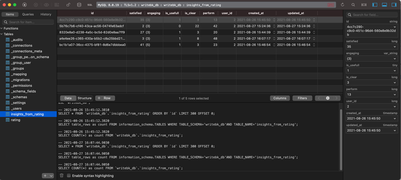
Every entry (ratings/feedback) you make will be recorded in the database, see the screenshot above. All the tables start with an underscore is repository database tables, and the remaining as associated with the schema’s you create. All the records will be stored with a unique entry ID, dashboard name (configurable) and a username.
With the WriteBack extreme 1.4 it is also possible to create form fields which gets populated automatically based on the data from the dashboard (dynamic form fields).
Ratings, Questionnaire design
We prepared 5 different questions to assess user’s cognitive input. These questions cover the 5 different dimensions mentioned in the previous section in order to assess user’s experience with the dashboards. This is a sample case study done in an imaginary situation with the Tableau sample dashboard “Superstores”. The table below is an extract of ratings given by different users for a dashboard. The table was prepared by joining the “_users” table which stores user ID and the schema created to store ratings “insights from data”.

The questions we included in the form with respect to each section are the following:
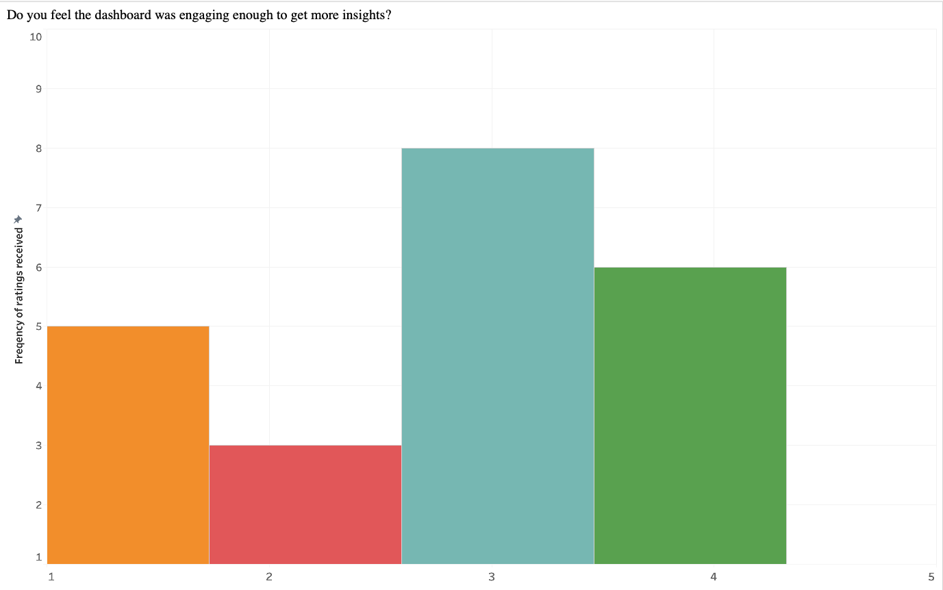

The above histogram shows user response, to questions related to one of the dimensions. The median value indicates the most common response, which is neutral (rating 3). Also, the most frequent response – is neutral(rating :3), which indicates the dashboard has adequate performance on engagement dimension. How ever there is also room for development . The above diagram was prepared with responses from a particular time period and does not indicate the change in satisfaction level over time.
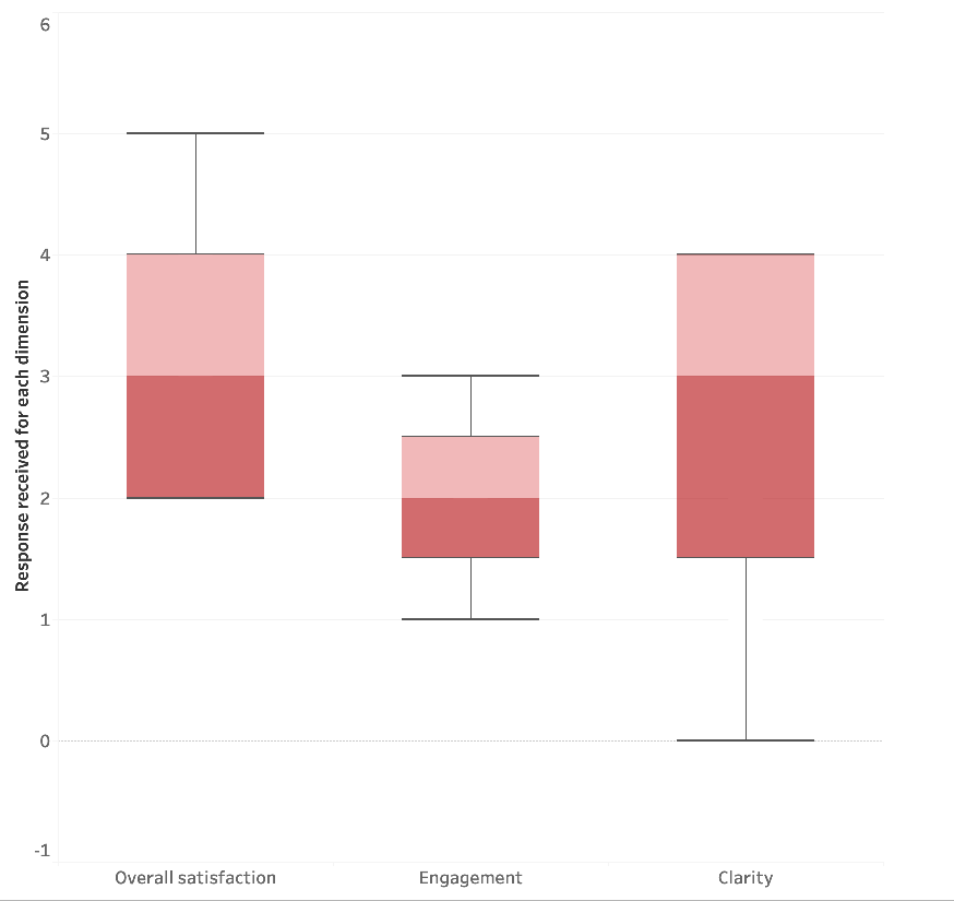
Similarly, we did plot the responses (whisker plot) from a 6-month period, also belong the same dashboard and same dimension. It showed considerable improvement in the dashboard performance in a specific dimension. In addition to that the median, value changed to 4. So, it looks like the dashboard designer took some time to analyze the responses and make changes to the layout and the content of the dashboard. A rating scale aimed at different characteristics like the color, font etc. can bring detailed insights on the aesthetics part.
We did a similar analysis on the remaining dimensions. The following is the questionnaire that we used to collect information in a similar fashion.
2. Do you feel the dashboard was engaging enough to get more insights?
Include an ordinal scale data with 1 = Not engaging 2 = Somewhat not Engaging 3 = neutral 4 = somewhat engaging 5 = Engaging
3. How useful do you think this dashboard is?
Nominal like and dislike like = it was confusing
dislike = it was useful
4. How clear are the visualisations?
Star rating – 0 to 5. 0 = it is not clear at all, 5 = it is very clear and can interpret data very easily.
5. How efficient the dashboard is in terms of performance?
Ratio scale with 0 to 100.
Before jumping to the next sections, it is important to note that the inferences and the methodology followed are primarily indented to emphasize a simple use case of the new WriteBackExtreme features, so the inferences may be different from what is real. A real study requires a well described methodology and statistically significant inferences.
Measurement
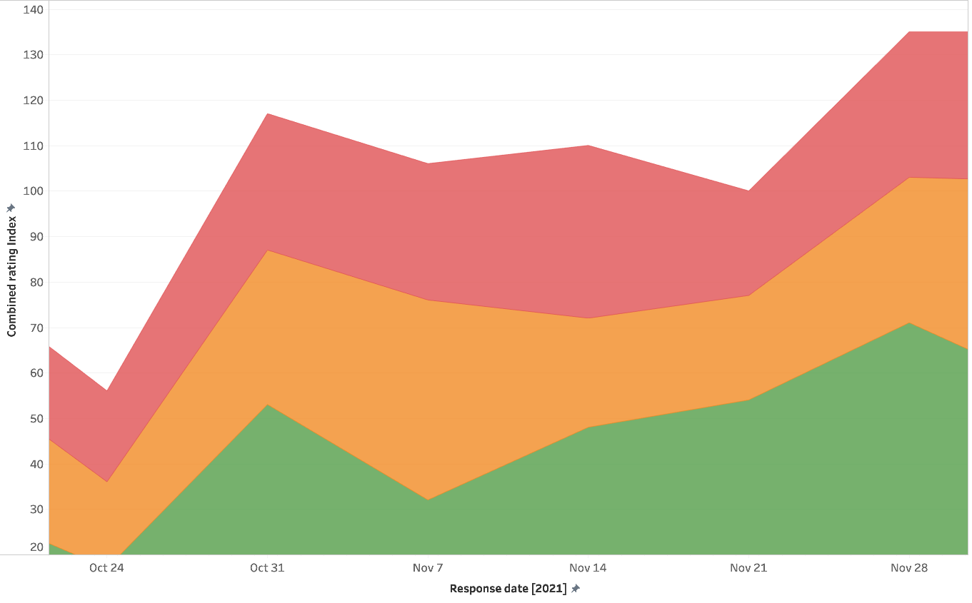

For an overall understanding of the dashboard performance, creating an index combining the responses from all dimensions is important. So, the diagram shows an index of responses from all dimensions. First, we normalized all ratings and brought to the same range and combined them assuming all ratings get same weight. The index was prepared in a 0 to 100 scale, and from the graph you can see how the dashboard improved in the three main dimensions. The remaining 2 dimensions were purposefully excluded due to the limitations of this study.
Analyses of ratings given separately will provide an idea about the distribution of ratings across factors from the data, at the same time, a combined index will give a comprehensive overview of the dashboard performance.
Reliability – Should we trust the ratings?
However, the question is “How reliable the inputs are from the users? Are these rating scales conveying reliable information?” These two questions arise in everyone’s mind while working with data from rating scales. Let’s start by defining reliability: it is the extent to which a Rating Scale would give the same results if it were administered again under the same conditions. Without Reliability we can’t ascertain that data from the Rating Scales is meaningful and not (partially) random. We can quantify Reliability by looking at the similarity between two (or more) sets of measurements. If you plan to take a dive into statistics, there are advanced concepts like “internal consistency”, “T-Retest Reliability” etc. that test reliability of responses. For now, due to the limitations of this blog, we’ll look into responses received from users towards two different dimensions, engagement and clarity.
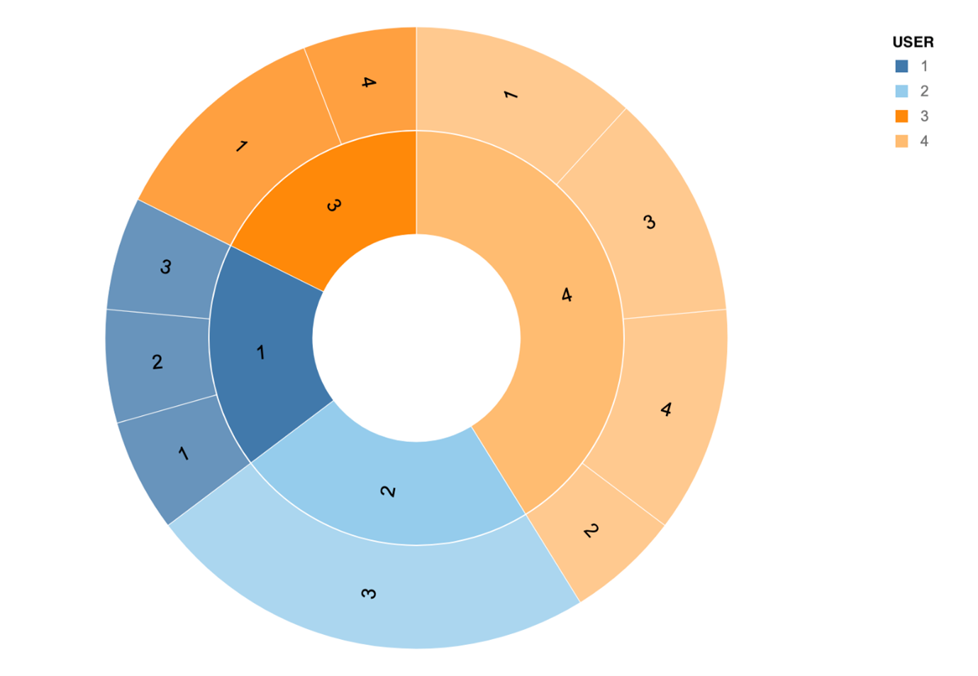
The sunburst diagram represents the responses received from different users over time. The inner circle of the sunburst diagram represents the user, and outer circle represents the most frequent responses received from each user. The size of the arc represents the number of responses from each user, for example user number 4 responded most, followed by user 2, user 3 and user 1.
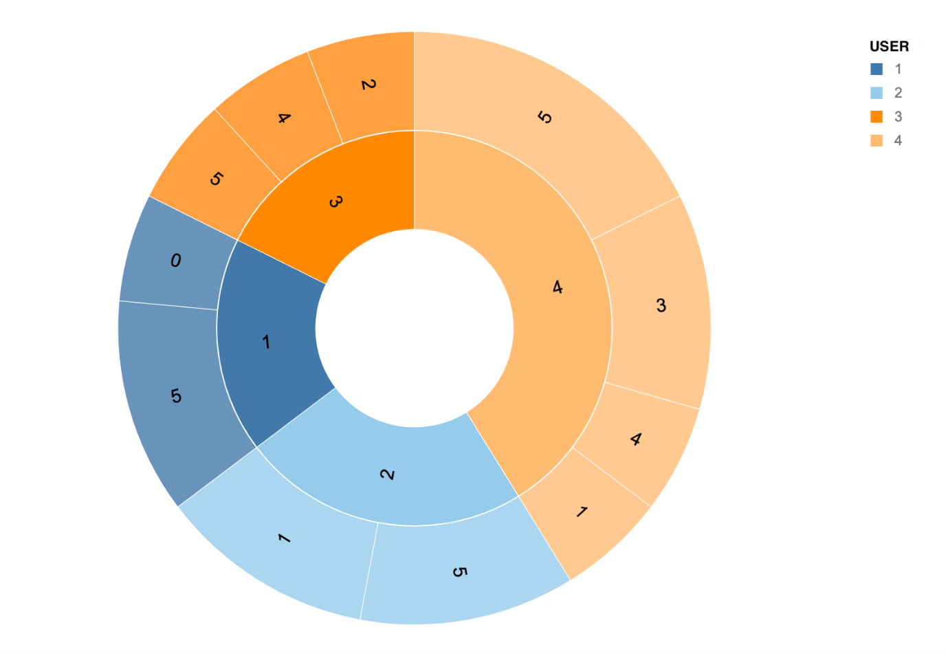
If you compare the two images, you can see the difference in responses especially with users 1 and 2. From this we can assume responses from users 3 and 4 are more reliable compared to user 1 and 2 as they are not consistent across dimensions. This is a very simple example of how to check reliability of responses, for use cases with large number of users, it is advised to use the reliability tests mentioned in the previous section.
For Interval data it’s appropriate to use correlation to estimate Reliability, which measures the presence of relationship between two variables (instead of agreement). Reliability can show how well a Rating Scale resists external factors that might affect people’s ability to respond accurately, such as unclear instructions or choice labels. It’s hard to draw a threshold for what is considered reliable.
Would you like to hear more about the WriteBackExtreme extension and its features or do you need support related to building similar studies/use cases? Visit our WBE page!
We love to make solutions and help Tableau users to do things more efficiently. If you have feedback, ideas, questions or need support, please make sure to share it with us! Also, don’t forget to follow us on social media for our latest news and updates.