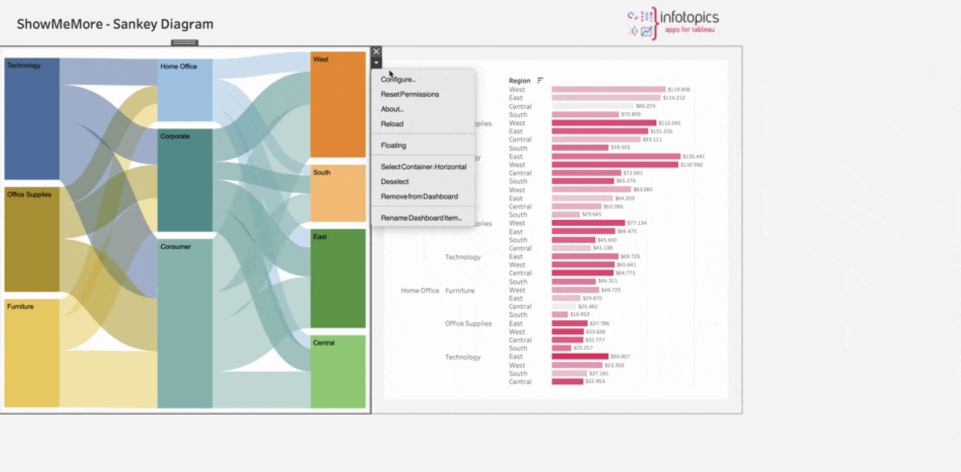
ShowMeMore Update
One of the reasons we love Tableau is because it allows us to easily use various colors to get the best-looking visualizations and gain clearer insights from them. With the new update of ShowMeMore, we bring you faster and easier-to-use functions that let YOU choose your viz type’s specific colors for each dimension! Here’s what you can expect:
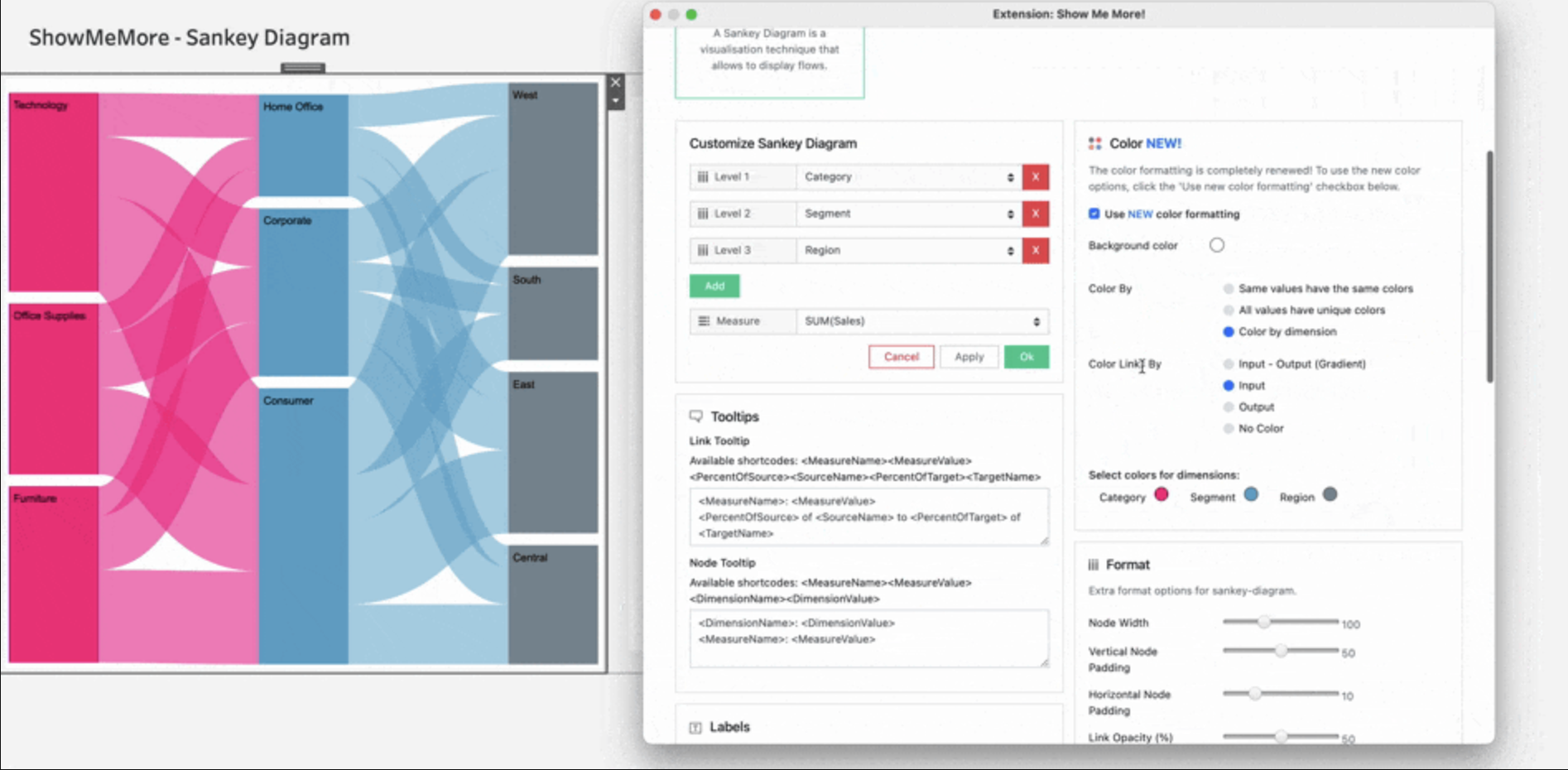
New Color Formatting
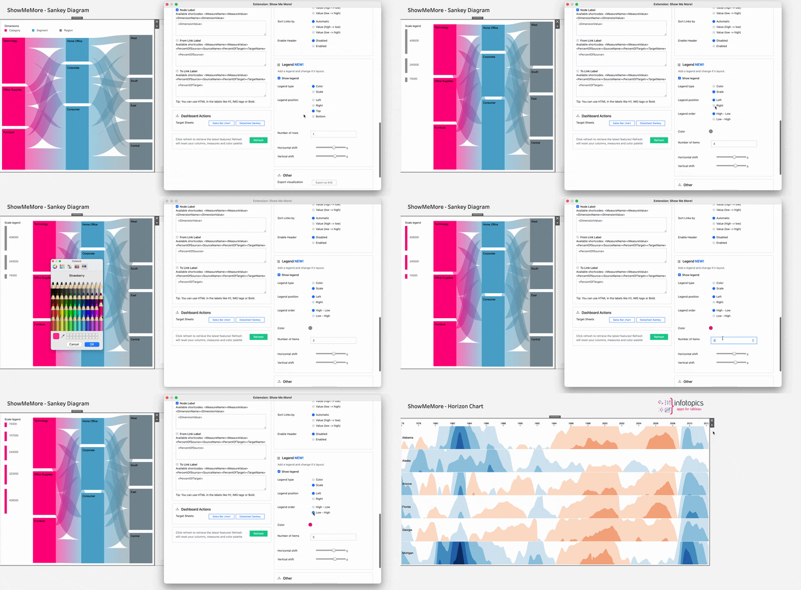
Do you want your visualizations to be the same color as your company’s brand? Do you want to choose the specific color for each dimension and measure rather than have them be automatically assigned? Well, now you can! With the new color formatting, ShowMeMore allows you to pick the particular colors for each element in your viz. In this way, you get to organize your data according to your preferences!
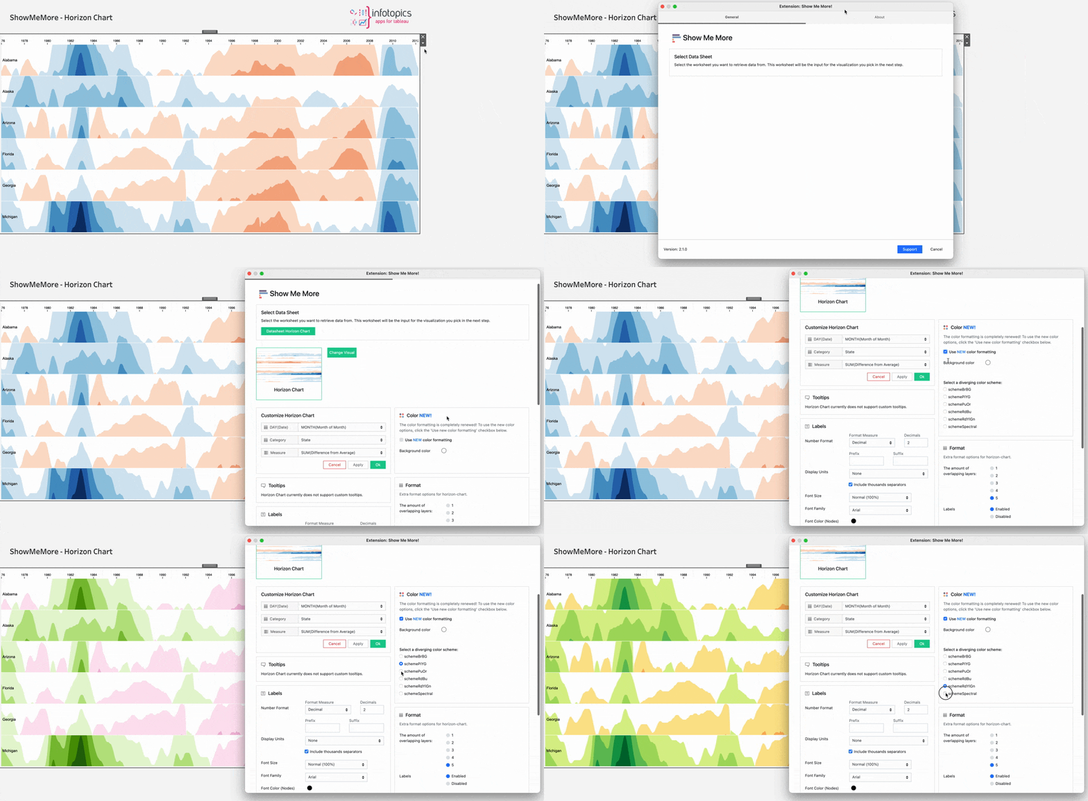
Besides that, for some viz types, such as Ridgeline Plot and Horizon Chart, you can choose from various spectrums. How cool is that!
New Legend Menu
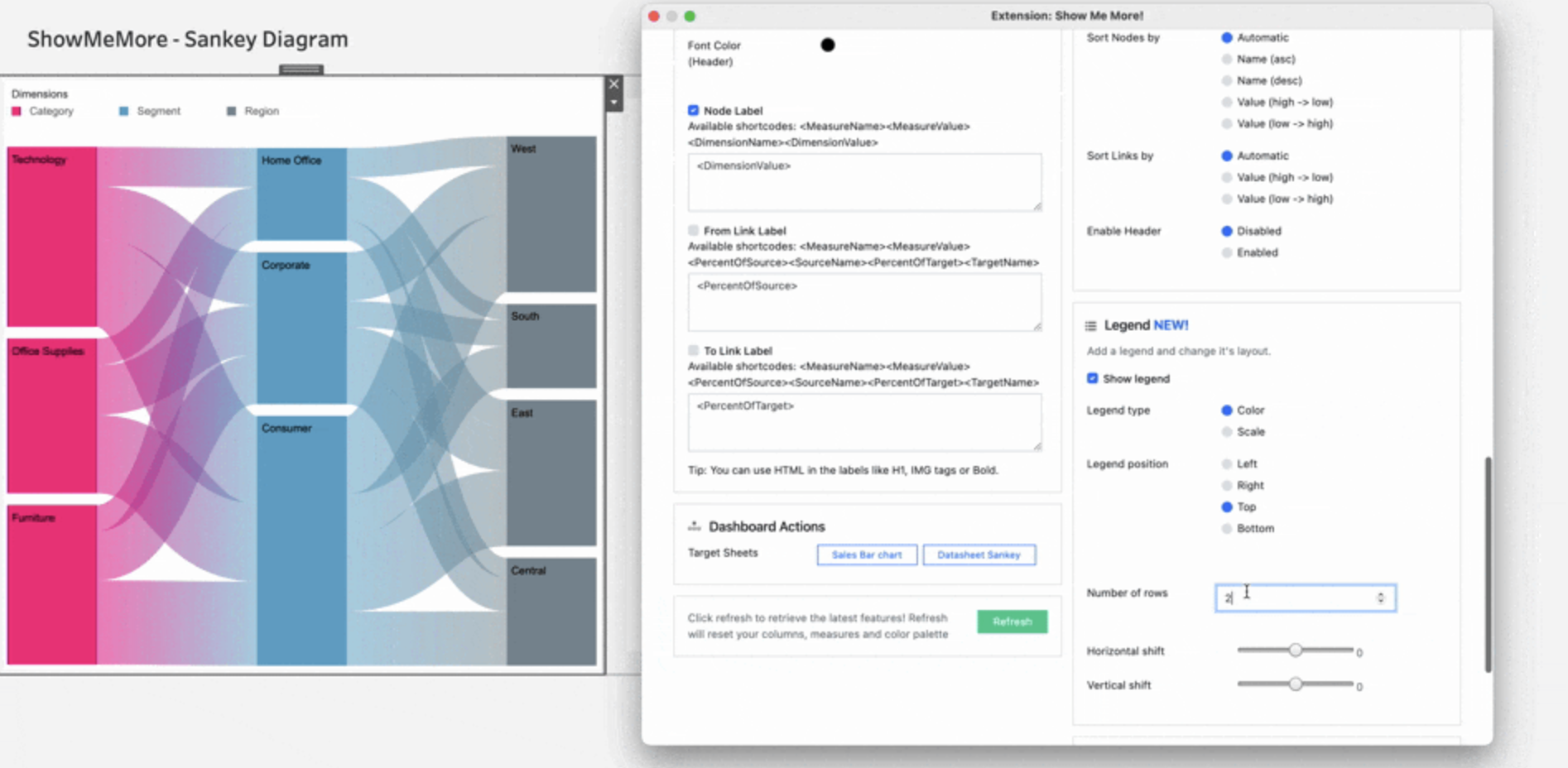
With the new update, you’re able to get a legend for many of the visualization types of ShowMeMore. Additionally, the new legend tab in the configuration panel lets you customize the legend to your needs and makes your work more organized and structured.
Scale Legend for Sankey
And to make it even easier for you to get more valuable insights from your visualization, we created the Scale Legend for Sankey and Circular Sankey Diagrams. The scale legend shows the value of the scale of the bars and links, which gives you an overview of the numbers behind the diagram.
For Enterprise customers, you can download the latest version of ShowMeMore in your portal account here. For Share customers, you are automatically upgraded to the latest version.
We hope you are just as excited about this new update as we are! We love making extensions and help Tableau users to do things more efficiently. If you have feedback, ideas, questions, or need support, please make sure to share it with us! Also, don’t forget to follow us on social media for our latest news and updates.
